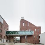
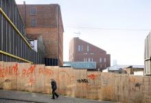
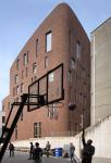
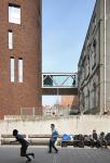
The Brussels campus of the Sint-Lukas School of Arts was the result of decades of phased expansion within a block in the densely woven urban fabric of Schaarbeek. Neo-Gothic convent buildings and a modernist pavilion coalesced with terraced houses, town houses, and anarchic extensions. The students entered the school via an unremarkable front door of what appeared to be just another town house. Over the years, the school evolved into a chaotic but charming labyrinth with snarled staircases, discrepancy in levels, and passageways hacked through shared walls. It was a place where students could get lost, where they could hide or seclude themselves, where they could carve out a space for themselves in which to create and display art.
PERMEABLE CAMPUS
The school was in a decrepit state, however. It no longer met basic safety standards. A major renewal project was sorely needed. Sint-Lukas issued a design contest. The school board allowed the designers to decide whether to go for a new building or embrace a renovation project.
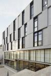
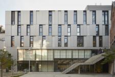
POLO Architects’ design proposal was chosen because it was able to retain the school’s charm and informal nature. No tabula rasa, no overly rational new structure. The design retains several of the most valuable buildings and courtyards. Others were demolished. Two new buildings were added on Paleizenstraat and on Groenstraat. The openings in the facades invite visitors to enter the ‘permeable’ campus, which shows itself as a succession of patios. A ‘delayed entrance’ on Paleizenstraat – you enter and end up right back outdoors again – provides access to the central courtyard.
The renewal presented an opportunity to reinforce the topography and the urban landscape of the Senne river valley. The steep slope of the valley – the campus bridges a twelve-metre gap between Paleizenstraat and Groenstraat – had been removed from sight due to the rampant spread of extensions and outbuildings.
SUSPENDED WALKWAY
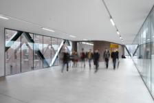
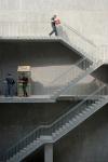
The backbone of the design is a suspended walkway that connects all the buildings. The walkway also acts as the foyer for students, lecturers and visitors. Situated at ground level to people entering the school along Paleizentraat, it quickly rises above the campus, which is situated lower down. The suspended walkway offers both an overview and orientation. By sinking some courtyards below ground level – like the outdoor space for the sculpture studio – the exceptional topography is ‘dramatized’ even further. The valley has been restored to its original identity and is once more recognizable as such.
LABYRINTH OF HIDDEN CORNERS
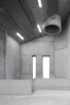
The internal structure of the buildings departs from the classical structure of an art school. It is based on a mosaic of activities. Art is no longer an umbrella term for specific, clearly defined disciplines. ‘More and more, painting and performance, video and installation art, sculpture and architecture are intrinsically interlinked. The partitions between the arts are vanishing’, claims POLO Architects. Hence the lack of a traditional classification by faculty or discipline, and instead clusters grouped by function. This way, classrooms, art studios, and offices can be shared maximally, which facilitates collaboration and cross-pollination.
The renewed campus still offers the somewhat chaotic liberty of yesteryear. It is open and welcoming, and has multiple access routes. The school is still a labyrinth of hidden corners and angles. A casual visitor may get lost in it, but seasoned students will find a place for themselves where they can take their first steps as artists.
photography - © Toon Grobet, Filip Dujardin, Stijn Bollaert
2003
2013
TV: POLO Architects - Greisch - Coppée
Favorited 1 times

