A home is defined by its carefully curated spaces, formulated to create a realm of peace and comfort to ensure a sense of serenity. The plethora of intangible factors of design are given equal importance as the tangible ones at AUM Architects. The founding Principal of AUM Architects - Ar. Manish Dikshit believes in designing spaces with a minimalistic contemporary approach to amalgamate the interests of the client while valuing traditions to impart a redefining design.
Continuing the legacy of exemplary residence design, the team at AUM Architects has created another marvellous residence at Chembur, Mumbai. Located in the heart of the business capital of India, this compact residence built for a nuclear family of three is an epitome of beauty and luxurious design. Given the background and prolonged engagement of the owner in the fields of art, design and architecture, this residence was the perfect breeding ground for experimental ideas. The brief thus provided a huge scope of creating an avant-garde design that was not built on standard terms.
2018
2019
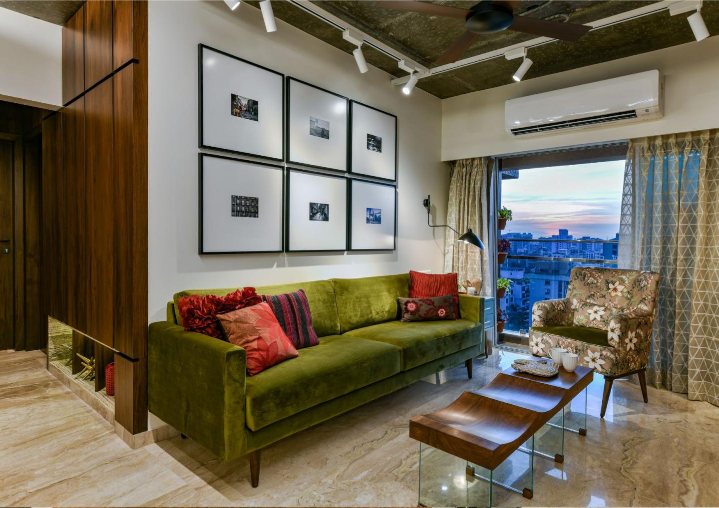
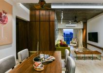
An elaborate impression is created right from the beginning as one enters the home. The entry facade comprising of the safety door breaks away from typical door designs with marble embedded in the wooden door handle. A custom made hand-painted number plate fern green console adorns the entrance lobby. As one enters this humble abode, they are greeted by a quaint yet magnificent entrance area with a unique twist to the classical form. The splendid open dining area, overlooking the living room on one side and the kitchen on the other, is accentuated with subtle canvas paintings. The dining table is incorporated with the parapet slab of the semi-open kitchen and forms and extraordinary rendition of the design. The facade created adjacent to the dining has been finished in veneer with a niche created at the floor level. Hidden storage has been integrated inside and made to look like a usual panel. The niche is finished in precious travertine marble and well lit for an amazing display of luxury while also making the passage look wider than it is. Dwelling further into the design, the living room has an open ceiling which creates 0very strong rich and open self-expression. Art has been carefully culminated with the design of the living room. Custom art frames showcase the abundant use of modern digital art with fabrics and textures displayed within the white canvas. Vertical treatments on the white wall paired with the open ceiling adds to the volume of the space and sets a subtle contrast to the exposed grey/concrete ceiling. Moving further, the pristine white colour scheme of the living room is carried into the kitchen as well. An attractive contrast has been created with matte sage green shutters for counters on the underside and a stone grey laminate for the overhead counters. The use of pen shelves minimizes the bulk of overhead storage and the black accents create a stark contrast to the white.
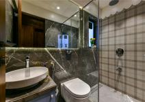
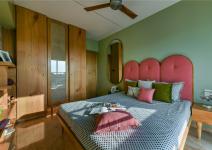
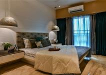
The bedrooms follow the narrative of a luxurious residence that is made with the regal expressionism of the entrance and the living room. The primary bedroom or the master bedroom displays subtle minimalism and warm feel. The walls have been painted in sand tones and an explosion of colour is felt on static elements of décor. A play with a wooden texture finished in PU white has been formulated behind the headboard that turns around on the ceiling as well and gives a rustic yet luxurious appeal. A custom made console has been strategically placed with sculptural legs at the entrance that cave out a separate space within the long room and acts as a dresser and gives additional storage space. Keeping it off the floor gives continuity in the floor and does not block the room. The secondary or the daughter’s bedroom has been designed as a Scandinavian approach to art deco where the form blends the beauty and subtlety of another style. Space is meant for a kid but does not include any clichéd childlike elements. A play of colours and amalgamation of contrasts mark the wonderful charm of the space. The main challenge here was to amplify the space and functionality as it is the smallest of the rooms. The huge circular mirror on the wall along with the muted colour scheme have been instrumental in making the room seemingly expansive. The wardrobe is made of plain shutters to fully encapsulate the attention of the viewer and display the open-grained oak veneer. Of the three shutters, the central shutter comprises of cane weaving with glass. The walls have been painted mint green to compliment the peach tones of the upholstery. The common bathroom has been designed using chequered tiles in Burberry colour and a dark taupe tone marble tile as the highlighter. The master bathroom is cladded in a monotone of Armani brown marble tile for a subtle yet luxurious look.
Manish Dikshit, Sonali Pandit, Nachiket Borwake
