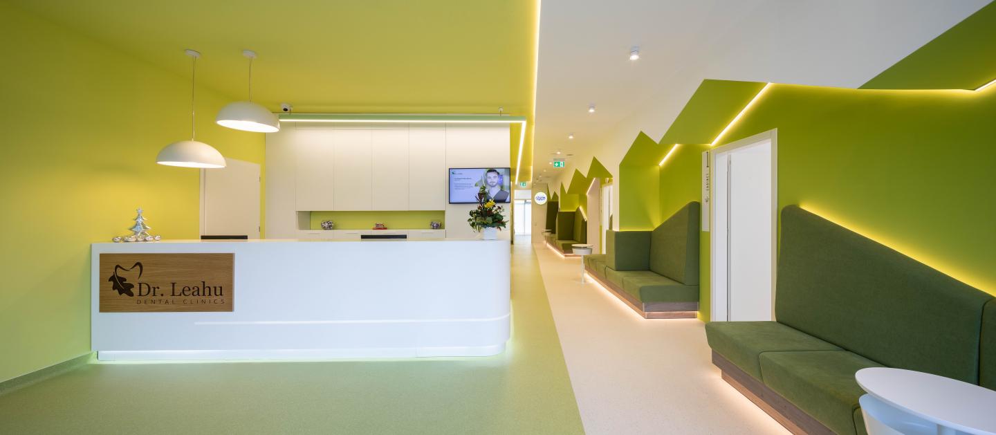
Oradea is the place of the latest branch of Dr. Leahu dental clinic. Here, at the ground floor of an
apartment block in a residential complex, Studio3plus team started from a free, unfinished, “gray” space, which allowed greater freedom of interior design. The additional advantage of this free ground floor was the two available accesses: a main one, from the boulevard, and a second one, from the residential complex parking lot.
The design difficulties concerned the existing planimetry and structure. Developed more in depth, the available surface has relatively restricted contacts with the front and rear facades.
With no equal intersections, the structural grid is made of reinforced concrete columns and piles with no constant area in section. Thus, the spatial irregularities became stimulating elements throughout this project, in tension with the functional program necessities.
The elongated central hall distributes the internal circulation to the cabinets, becoming a true
space of representation. In the main entrance area, it widens and makes room for the reception, and at the opposite end it is segmented to separate the adult area from the one dedicated to children. The dental surgery area develops to the left of the reception through three cabinets, linked to a common hall to which a relaxation room is associated. On the right side of the reception there are two common adult cabinets, the end of the corridor distributing the circulation to an administrative office, a radiology room and a sterilization area, before
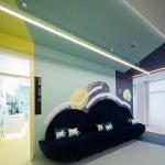
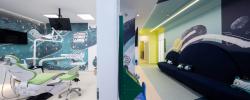
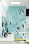
allowing access to the very colorful children's waiting vestibule. A hallway provides here the entrance to three other cabinets specially designed for children. Here we notice a playful character by free expression and vitality instead of obvious unity, and by visual collage between furniture elements and architectural surfaces decorated with drawings. This clinic is the first Dr. Leahu clinic to integrate a unique gamification concept, inspired from a children’s book, whose main character, Dinţica, is present all around the interior design.
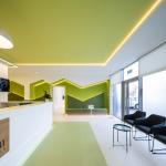
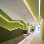
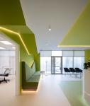
The white light LED lamps reinforce the interior design concept, emphasizing most of the edges and plan breaks, sometimes becoming sculptural points of interest. Aesthetic experience involves a game with perception and space. Surfaces, medical devices and furniture elements seem to float, detached by light, graphic interventions and chromatic effects. Studio3plus team proves on this occasion that the inspired ideas for a medical clinic can alleviate patients' sensation of fear, creating instead a calm, playful and protective atmosphere, even dreaming moments with the eyes open in the magic space of the design.
2019
2019
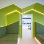
The elongated entrance hall, as the most important space of the clinic, made necessary a special design for furniture elements, adapted to the structural constraints and architecturally harmonized with the dynamic zigzag ceiling, configured in this way to conceal and integrate the existing pillars and beams of the the building on the one hand, and on the other, to generate protective niches for patients' seatings. Using colors for unification and spatial continuity appears to be an essential design gesture. It is noted here the intense concern for the spatial-architectural qualities of the finishes: turning of the colors in all three dimensions “visually” cuts the spaces
and articulates them at the same time in a harmonious whole. This way of working with plans and colors refers to the aesthetic principles of one of the prominent masters of the Bauhaus, Josef Albers, who explored the paradoxical qualities of the painting in relation to the three-dimensional space, also discovering the overlaps between the visual aspects and the psychological effects of the colors.
Dragos Scurtulescu
Andreea Ciocirlan
