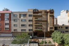
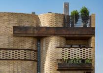
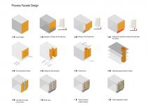
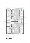
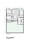
The project is located at the southeast of Shiraz, one of the oldest parts of the city. Today, the attention of the architects in the city, is more focused on the wealthy areas and there is a lack of innovative projects in such poor areas. The site context’s situation is in decline, and architecture is being oblivious, which has affected the city fabric structure and visual aspect of the region. To this end, the initial perspective on the creation of this project, is a slight attempt to revive the recession situation of the project site.
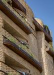
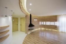
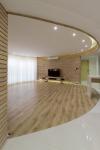
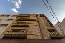
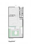
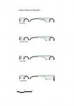
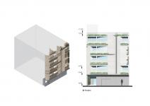
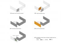
The design idea was based on creating a connecting and reliant element on all floors. This central element which is in the inner shell of the bricks, has the effect of the transition from the two-dimensional façade to three dimension object. By rotating and bend the wall of this core object (ring), a part of interior private space is dedicated to the terrace space and the building façade was formed as the interface between urban space and the building interior. As a result, the living and dining room created on each floor. Accordingly, more and more of the spaces inside and outside were merged, which helped to create more various view angles on the façade external view. The private walls (the rooms) also reached a higher level of privacy with a slight retreat, while having a terrace. The formation of the three-dimensional façade helped to create a hierarchy and distinguish between the private and public area of residential units in the exterior façade.
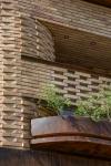
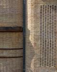
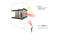
Due to limitations that the municipality faced in the absence of aristocracy in the vicinity of the neighborhood, we had to close the view to a height of 1.7 meters. Our idea to capture the maximum visual aspect of the exterior space, was to create a porous brick shell which merged from the façade itself. Creating these brick lattice walls, in addition to a close direct view of the outside, caused the viewer not to be seen within these spaces and at the same time, using the space. The underside of this lattice wall is open and strips are implemented for vegetation growth which limits the view as well. By using the natural light, instead of unformed lighting, we tried to create an emotional mood in the inhabitants, by creating the optical contrast and passing it from “Fakhr-o-Madins”. In addition, during the night, the illumination of the interior from the outside, helped to create visual appeal and visibility.
In addition to implement the brick grids, in order to sequence and transform the natural light, in parts of the facade bricks, by twisting about 20 degrees of bricks in a 180 degrees arc, it tries to play light and shadow, and eventually create dynamism and change. We had a texture at different times, plus the use of glass bricks as transparent materials and light controllers, in a linear view of the daylight in the interior.
2017
2017
#Safari Residential Apartment #AshariArchitects #AmirHossein Ashari #Architecture #Residential #Apartment #building #Diagram #Brick #metal #Home #House #design #designer #modern house #exterior house #exterior #exterior design #exterior apartment #contemporary #contemporary design #iranian architect #shiraz architect #iran architect #Architect #Architecture #residential architect #residential architecture #interior #interior design #brick #shadow #transparent #transparent material #daylight #safari #brick apartment #urban #lighting #natural light #fakhro madin #iran #shiraz #Archdaily #Architizer #Archilovers #Archello #Archinect #pinterest #Dezeen #Design boom #2017
Architect: AshariArchitects (Amir Hossein Ashari)
Location: Shiraz, Iran
Date: 2017
Area: 1,300 sqm
Status: Completed
Client: Ali Safari
Design Team: Zahra Jafari, Amir Iranidoost Haghighi, Afshin Ashari
Research: Elnaz Amini khanimani
3D Modeling: Mostafa Yektarzadeh, Amir Iranidoost Haghighi
Construction Team: Ali Safari, Asghar Gerami, Ayoob Hashemi
Graphic (Diagram): Sara Zahmatkesh Fard Shirazi
Photo: Parham Taghioff

