Background
Qinhai Neighborhood Community Center is converted from a food market which is located in Guohe Load, Yangpu District, Shanghai city. The original market was first built by the local government in 1995,serving the nearby residents as the only food market within a mile. “Dirty, noisy and disordered” is the first and general impression of the market. The old infrastructure cannot meet the demands of nowadays life, especially the desire for a public space to communicate and interact with.
Undoubtedly, technology makes life easier, but also alienates us from each other, especially the decline in neighborliness. For those middle-aged and elderly people who cannot enjoy the convenience brought by cutting-edge technology, the remodeling of the ancient and tender neighborhood is of great significance in recalling social network that has long been forgotten by the capital market or the society, but an absolutely essential community: the one in which we live. Developed from a bazaar, Qinhai Neighborhood Community Center has a natural "sense of community” and regional attributes compared to other community businesses. However, at present, most of such places lack comfortable spaces for people to settle down and interact with. The design of the project emphasized in creating more communal space and comprehensive functions to meet both physical and emotional needs of people.
Design Concept: Poetic life under one roof
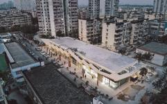
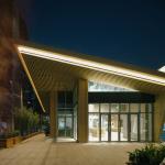
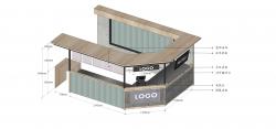
The aim of the renovation was to create a comprehensive community center, while preserving the character of the food market with all of its hustle and bustle and chaotic nature. We added to the whole spatial context to attract the residents coming inside – not only for buying goods but to interact with their neighbors regularly. The design concept derived from the painting Riverside Scene at Qingming Festival by Zhang Zeduan in Song Dynasty, a prototype of bustling market in China, a wonderful variety in unity. The main design language is the shed roof, array of different sized roof contributes to the idea of shared emotional connection in the community, a feeling of belonging or of sharing a sense of personal relatedness.
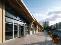
In renovation project, the great effort was focused on how to creatively use the design advantages within the lowest cost control range. Here is our solution: firstly, to preserved the frame structure of the old building and reinforce with concrete and steel; secondly, based on the original column network and the vender stalls, the eaves cantilevered outward to form the main facade language along the street side. Each stall can be set according to different use.
2018
2019
According to the main circulation, the eaves enlarged in three nodes of northwest, west, and southwest to increase the visual impact of the building and strengthen the design concept of "under one roof". The east side of the building faces inward of the community therefore we simplified the eaves as flat, showing the hierarchy of the two sides, ensuring the overall unity and also control the construction cost.
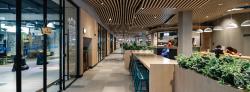
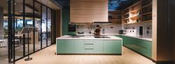
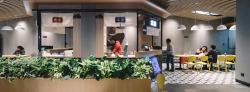
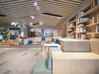
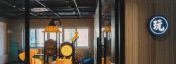
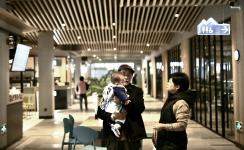
Different from other traditional Chinese food markets, Qinhai Neighborhood Community Center includes 18 distinctive vendor stalls varied in food stalls, catering, gyms, flower shop and also neighborhood center, community service for residents nearby. The interior design creates a "central street " inside the limited space with different vendor stalls distributed on both sides, blurring the boundaries between indoor and outdoor.
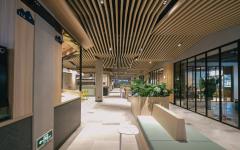
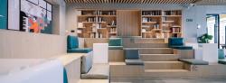
The open shared space provides ample leisure and entertainment places for different functional needs of residents, such as children's playground, shared meeting rooms and kitchens. These three types of shared spaces are usually independent of each other, but in special cases, the glass partitions arranged between them can be flexibly opened to become larger and more transparent shared spaces.
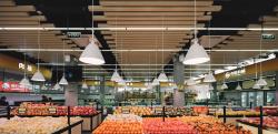
The concept of eaves goes from outdoor to indoor. The design introduces the polyline elements of the building facade into the interior and evolves into a grilled roof. each wooden grid’s optimal size is 40mm which is based on carefully analysis, ensuring the height of 2.9m / 3.3m under the eaves. The interval between the grid and the grille is 80mm, staggered at an angle of 170 °, forming an undulating roof shape. Snack stalls and signage followed certain design standards safeguard the appearance and performance market as a whole.
Color is always present in our work. The whole interior space is treated with warm wood paneling, combinations of rice white texture paint, vegetable green stall decorations and alternating few black generate the overall ambiance.
The design pays attention to every detail, including the visual identity. Traditional Chinese porcelain blue is used as the basic color of the logo design. The calm blue is easy to stand out in the warm gray space. Each function area is named with special Chinese character such as "firewood, rice, oil, salt, soy sauce, vinegar, tea" represent the traditional food market function, and "gym, play, rest, share, taste, accompany, talk" are additional functions to meet the diverse daily needs of today's community residents.
After the project was completed, we’ve made many return visits and captured many tender pictures. These pictures are what a professional photographer would see with flaws, but just those are the ones that carry true meaning and reveal the bustling of a food market should be.
Project Name: Qinhai Neighborhood Community Center
Client: Shanghai Yangpu Commerce and Trade Group
Location: No.115-116, Shiguang Yicun, Yangpu District, Shanghai, China
Area: 1379㎡
Architects: Yushe Design
Interior Design: Yushe Design
Chief Architects: Xu Yi, Chen Xiao, Li Zhiqiang, Gao Shantong
Design Team: Pang Yu, Xu Junfeng, Cao Zhen, Zhou Xueying, Yang Huanli, Zong Qianxiang, Ji Shuai, Yu Haoyan, Ma Jiang
Design Period: 2018.12-2019.8
Construction Period: 2019.8-2019.11
Photos: Xu Haoyu