Designing Torani Flagship store was one of the best design journeys we’ve had. It was exciting to have a client not interested in the modern or the luxury or the eclectic or any style that is usually seen.
Torani draws deep inspiration from Sindhi culture and its design elements and incorporated them beautifully in their clothes. The brief, hence, was simple - Sindhi Architecture.
The brief was to create the space clean, void of any clutter in terms of planning the displays so as to hi-light the product mirroring the very heritage it draws inspiration from the 16th century buildings comprising of magnificent domes and beautiful curvilinear arches.
The brief also required everything unfinished and antique from floor to walls to ceiling. The space had to look bare yet reflection of the rich Sindh cultural heritage.
The store is a small compact space with ample ceiling height in contrast. It was a challenge to incorporate enough, financially viable number of products in the space for display and also create an experience of openness and bareness. The brief wanted it to look like a story unwinding while one is walking around.
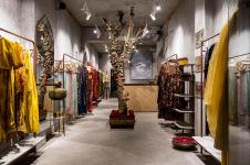
The wide glass door at the main entry takes one inside and is flanked by dressed mannequins on either sides only visible once inside. Then begin the displays.
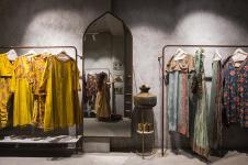
The hanging displays are separated at intervals with accessories’ displays and looking mirrors. This has also allowed the brand to segregate their collection by colours, styles and gender. The trial room is planned right next to the staircase that looms in the store and render some part of it useless. The remaining space next to it is used at storage for housekeeping and is seamless outside. The trial room is large set with full height mirrors and a curtain.
At the far end of the store lies the other entry though smaller than the main one but connects the back alley and draws the customers from that side as well.
The displays here also alternate between hanging and accessories.
The store is compact yet defines its own spaces as one walks around.
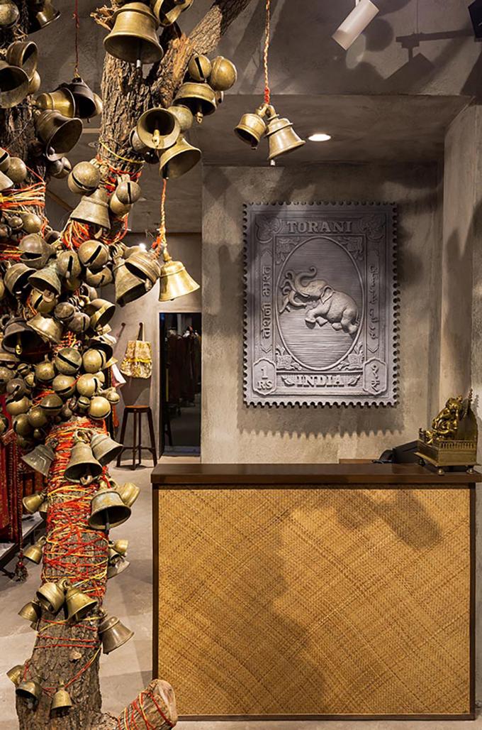
The concept was simple where the design team had to work on the classical design elements reminiscing the Sindhi Architecture while the whole was to be bare. The basic theme revolves around the earthy colours and rawness of materials. The entire store is painted in a grey hue with a rough grainy texture. The fixtures are left in the raw state for implying the very theme. The whole store resonates the idea of simple clean design without the obvious ornamentation. Any element only reflects the very soul of the product and their inspiration.
The walls play a canvas, rather a large expansive canvas for the beautiful, earthy and grainy textured paint. It covers every inch up and down over the beams and ceiling to bind the store in whole. The rugged feel takes one back to the lost architecture of the Sindh Region.
The tree very central part of the store stands tall a bare tree from which are hung bells of various style in brass. The thread is also of Indian cultural identity. The saffron thread suspends each bell from the tree and also spiral around it to remind one of the rituals that are deeply rooted in the Indian culture. This central attraction is the first thing you see when you approach the face of the store. Right ahead of it lies the Nandi, the mount for Lord Shiva. It greets one sitting grandly on the wooden pedestal. It is cast in brass and gives the store a touch of royal essence.
The flooring only ceases to match and flow onto the walls. The grey micro topping lends the required cement rugged feel to the space only to enhance the feel of antiquity and minimalism. It cuts out the very scope of a fine finished floor that may drive away from the very purpose of rawness.
Looking Mirrors are set inside arched shaped frames that draw a strong inspiration from the Persian architecture which also was a major influencer for the Sindhi Architecture. The arches embolden the very theme in the most subtle way.
Lighting is very practical and in tune to the needs of the modern day. The focus lights have been planned accordingly to create the spotlight effect yet without hindering the sight for details in the products displayed. They highlight the product as well also create the right ambience to experience the journey of the very products to the modern world.
The whole store is yes bare and stares wildly at one with deep Indian cultural weariness. The display stands are bare metal with a hint of paint trying their best to stay true to the plaintiff, the drama called upon by clothes.
The accessory displays are made in the same metal along with white marble stone. The knobs used for hanging scarves, bags and so on are casted in the shape of the logo of the brand.
Facade: First impression is the last impression. Hence it is a great stress to plan and design the facade of any space. It must justify from the exterior while equally be in sync with the interiors in terms of layout and design.
The facade at one glance will take one directly to the Sindh Architectural experience. It has the arches and the levels to create an experience where one is stepping into the era. It is finished in the same paint finish as that in the interiors. The huge glass doors are gateway for glimpse of the store and ample daylight. The branding stands proud on the facade in brass and is backlit at night. The unique facade set amidst the neighbouring modernist stores is sure to surprise people walking by and from far, equally.
2019
2019
Area- 400sq/ft
Udaai Batra, Navneet Kaur, Suryan and Dang, Ritu Singh, Mohommad Faisal.


