Concept.
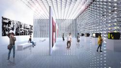
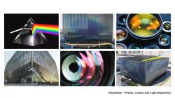
We depart from the basic idea that a Photographic Art Museum should be a celebration of light and how space and architecture can be crafted by the multiplicity of atmospheres and effects it is able to create when traveling through and into materials. Our proposal seeks to provide an inspiring journey through different light atmospheres which are in tune with the specific purpose of each space.
Form.
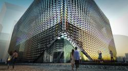
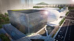
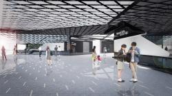
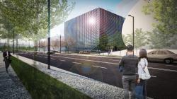
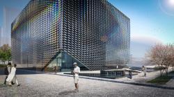
After studying the tension between the deconstructed orthogonal forms of the 50 Plus Campus and the futuristic shape of the RSM, we opted for a more nuanced approach and settled with a cubical shaped building. This cube is then lifted on the corners welcoming visitors into a triangulated shaped lobby. The journey through the building continues through a set of escalators guiding the visitor through the different exhibition and education spaces.
Skin.
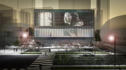
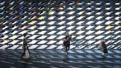
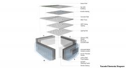
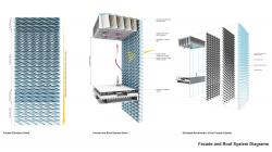
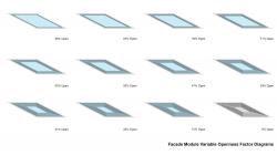
For the façade of the building, we explore the effect of dispersion. In optics, dispersion refers to how a changing wavelength of light, refracted through a material, separates the light into its constituent colors; and so we devised a skin which incorporates acrylic prisms as its outer most layer catching and breaking the sunlight while filtering it purposefully into the different spaces of the building. Through gradation, the prismatic panels increase their tapering angle and lengths as they rise into the building with the aim of maximizing the amount of light, they are able to reflect, refract and disperse.
Conversely, a shading panel with a mirror finish coating at the inner-end of the façade system, reduces the amount of light on each level, shielding the galleries of the museum from direct glare and harmful UV rays while providing diffuse light optimum for the artworks and their observation by the visitors.
The changing light quality and intensity through the day and the year provide an ever-changing glow to the museum, a chameleonic skin changing constantly the character of the building.
Site.
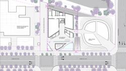
The building is set back on the site opening a compact plaza at the front of the museum. This public space is articulated with the pedestrian street and framed by both the SPAM and the RSM. This open square features two shallow pools reflecting the intricate patterns of the façade, and in between them a sunken courtyard sets the stage for performances, artwork display or simply acting as an extension of the museum café.
Programme.
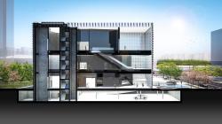
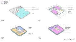
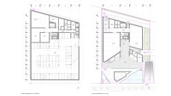
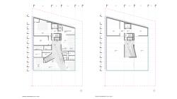
The uses of the museum have been grouped by their height requirements on the programme. Galleries 1 and 2 are lightproof spaces located adjacent to the museum foyer on floor 1. The loading bay and staff entrance are also located on floor 1, accessed via a service road on the north side of the building. Once inside the museum, the artworks can be distributed -inconspicuously to the visitor- into storage, preparation rooms and galleries through a dedicated artwork lift and back of house circulation network leading to the back of each gallery.
Galleries 3 and 4 (clearance of 8m) sit at the top level fully benefitting from the diffused lighting filtering through the deep roof lights; both these galleries are planned as one large open space with the option of having a partition if needed. The dense grid ceiling pattern is equipped with a network of lighting rails allowing for full flexibility of artwork placement.
The artwork storage spaces are placed at the back of the same top level also benefitting from the 8m ceiling clearance, with the option of introducing a mezzanine in the long term. The preparation rooms are located adjacent to these storage spaces.
The basement of the building has been located at -4.5m sharing the same level with the car park of the Robot Science Museum. While the SPAM features its own access and egress car park ramp, both car parks could be connected if the need would arise.
Interiors.
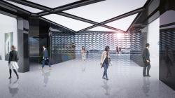
Materials on the interior are a contrast of black and white. While the museum foyer and distribution lobbies are all cladded in black reflective back painted glass resembling photographic film, the galleries are opaque white lighting boxes with white seamless terrazzo flooring allowing full flexibility of artwork display. This basic principle is repeated on each level and is designed to establish an intuitive flow for the visitor.
The museum will be equipped with a raised floor system which will allow for an underfloor ventilation system. This is a more sustainable way to ventilate a tall space and by doing so frees the ceiling for a more refined roof light system. All galleries feature tall sliding entrance doors which can be closed during exhibition preparation times. This makes sure that galleries can be compartmentalized and worked on without affecting the operation of other areas of the museum.
Structure.
We envisage a structural façade in the form of a dense lattice frame steel truss which connects to the reinforced concrete core with steel beams spanning up to 15 meters in length. This system allows for column-free exhibition spaces, allowing for full flexibility of the exhibition design.
2019
0000
Size: 6337 sqm
Type: Museum, Cultural Building
Programme: 4 Exhibition Rooms, Video Hall, Education and Research Centre
Structure: Structural Facade, Dense Lattice Frame Steel Truss
Facade: Prismatic Panels Dispersing Light
Design Architect: AIDIA STUDIO: Rolando Rodriguez-Leal, Natalia Wrzask, Jose Luis Mulás.
Local Architect: ArchiWorkshop: Hee-Jun Sim, Su-Jeong Park, Ho-Sun Sim

