Design Concept: books: the vastest source of knowledge
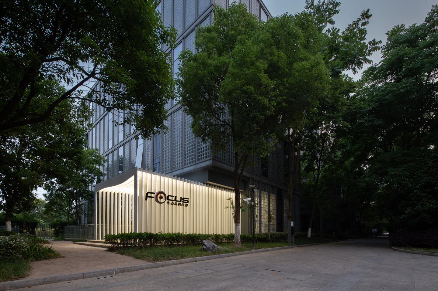
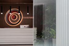
Located at VOM Office Park in Shanghai, among the same ordinary modernistic “cubes”, the office of Focus Advertising Agency can be recognized at first sight due to its graceful installation expanding from the entrance.
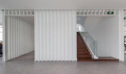
The page-like structure made by pure white waved steel plates creates rhythmically changing curves in the sunlight. Just like the prelude in a piece of music, it invites the audience to hear more about its mysterious story.
As a native Chinese advertising agency who wants a more distinctive office for its new business development based on its enterprise culture—always armed with a vast number of information.
To achieve this, the designers choose a classical symbol of knowledge—book as design concept instead of CPU, Data Cloud, database which seems more suitable for advertising agency after long discussion.
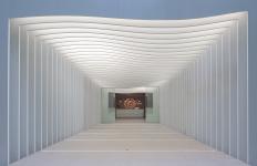
The concept derives from the experience of reading and the definition of knowledge. People who love books may have this specific experience: holding a favorite book, even turning pages can be a ceremonial moment. Sitting solemnly as show of respect, make a long deep breath, use the fingertips to scrub the delicate and crisp texture of the vegetable parchment paper, and revel in the "brushing" sound when turning the page. Therefore, the design team creates a ceremonial tunnel functions as a spiritual reset. When people enter the office via this elegant walkway, they will even deliberately slow down and adjust their expression on the face, and slowly to open start an unknown exploration.
On the other hand, as designers, we can feel the power of knowledge and the common “information anxiety” than anyone else. Today, we have access to information, or the so-called "knowledge" more than any era before. It can be said that all aspects of our lives are filled with information. The information explosion age has certainly saved a lot of time and widened our choice, but also deprived the happiness of discovery and exploration. As the absolute noise and quiet are just a line apart, too much information can cause absolute ignorance. Today, with the rapid development of information, we obstinately return to more primitive standards of knowledge in such a deep and poetic way, because we still believe that books are a permanent form of knowledge.
Open the book of Focus Advertising Agency
All I want is to speak simply;
for this grace I pray.
And it is now time for us to say
the few words we have to say.
Because tomorrow our soul sets sail
——George Seferis
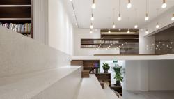
The core concept of "book" is the figurative way of the sheet grid, from the basement to the third floor, continuously wrapping the core-tube of the whole building, like a slowly opened book page.
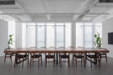
Due to the advantage of floor height, a mezzanine was built on B1 floor to maximize the space to accommodate different use such as informal meetings, staff activities and leisure.
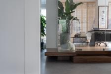
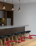
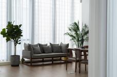
The four-story office provides enough space for dining area, rest area and even a shower room. Lounge areas scattered in different corners use steady colors to create a comfortable and quiet space for employees.
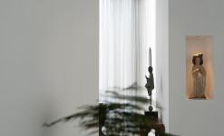
The furniture is furnished according to the owner's collection and unique taste, using a modern minimalist style to create a Zen atmosphere. The more high-pressure modern city life is, the more simulative people’s desire to return to their hearts and souls. This is like the tranquility that all good books bring to us. The higher we go up, the deeper we walk into the inner peace and freedom.
Some amazing moments further strengthen the spirituality of the space, and we call it "a sparkling moments". It is these details that reflect the atmosphere and quality of the space, as well as the designer's ability to control the materials.
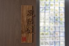
As a modern design language, glass bricks are flexible in the whole space, with dynamic reactions under natural light, artificial light and customized logo used to divide space.
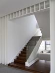
The calmness of the wooden staircase corresponds to the lightness and transparency of the glass handrail.
For Yushe Design, the most important additional value of office design is to help clients enhance their value and convey their corporate image rather than create a subjective aesthetic paradigm. We hope to give each office space a unique concept and soul, and to convey its own corporate culture.
2018
2019
Location: Vanke VMO No.3 Building, Lane 2049, Shanghai, China
Area: 1403㎡
Design firm: Yushe Design
Director: Xu Yi, Chen Xiao, Li Zhiqiang, Gao Shantong
Design Phase: 2018.11-2018.12
Contraction Period: 2019.1-2019.3
Photography: Liu Anqi
Main Material: Wood veneer, white wooden grilling, white lacquered stainless steel,
Emulsion painting, terrazzo, PVC
Mao Lili, Zong Qianxiang, Chen Peng, Xu Jianguo
