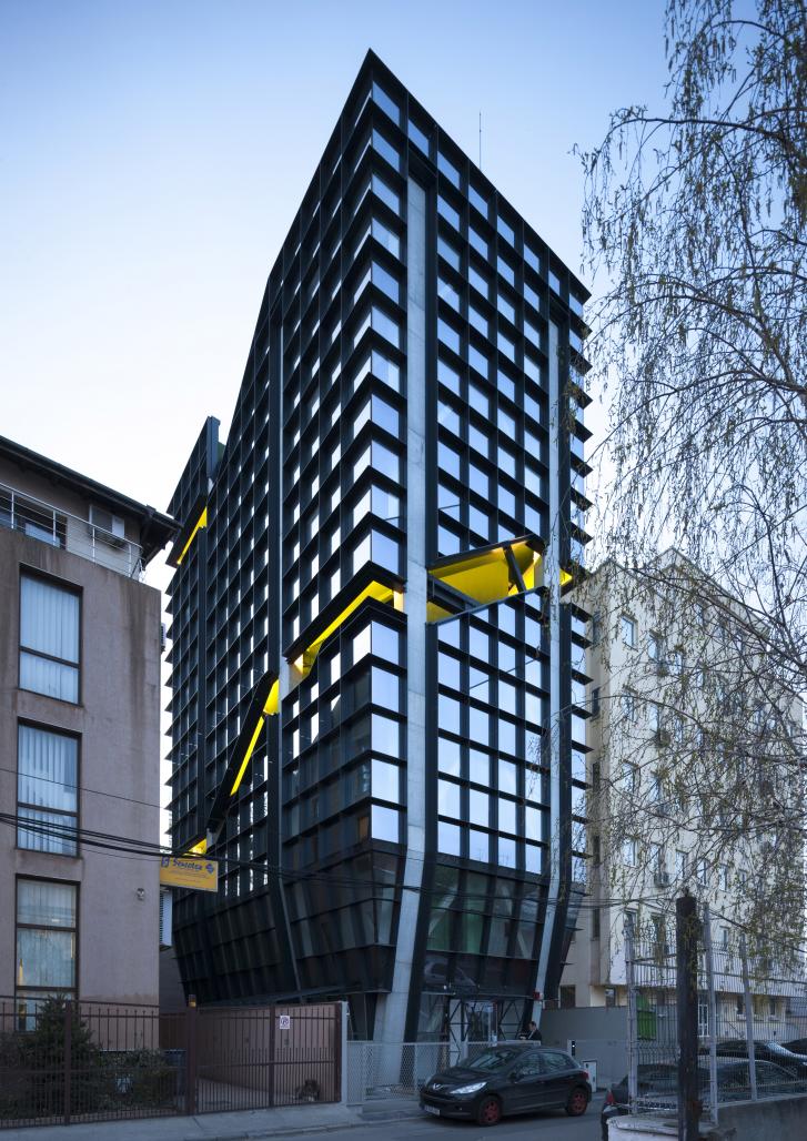
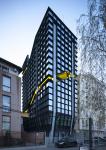
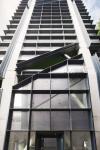
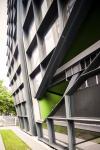
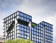
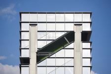
There are two main guidelines for the architectural concept of Paloma Offices: the connection between the interior space that flows into the surrounding exterior and site constraints that generate the need to create a symbol for the area. The challenging requirements of the context led us to design the structure and escape paths towards the outer sides of the building, taking full advantage of the plot’s dimensions. We aimed to emphasize the building’s height, concealing its proportions by dividing the façade into modules. The rhythm of the cell grid pattern creates a dynamic continuous mesh, without indicating the height of each floor. As a result, the cells become sun protected private niches.
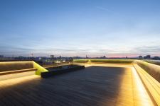
The façade becomes a belvedere, an inhabited space through the exterior staircase that embraces the building. The gallery culminates with a larger open terrace that offers extensive views of the city. All the fragmented views collected along the route are pieced together like a puzzle in this complete panorama.
We attempted to solve the issue of poor illumination on the site by introducing a filter: color. Color can obturate, camouflage or even transform the exterior.
On the other hand, the plot is located between two streets of different importance. In this situation, “front” and “back” become relative terms. The cardinal orientation of this tall and narrow building is justified by the upper terrace that acts as a periscope. The Paloma building becomes a landmark for the area.
2017
2017
Architecture: CUMULUS, arch. Liviu Zăgan, arch. Costin Beekman,
arch. Alexandra Nicolau
Photography: Andrei Mărgulescu
