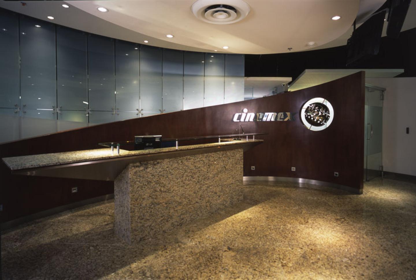
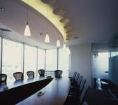
The concept of design for the Cinemex Offices responds to its line of business –film projection. The reception area was built to look like a grand theater foyer with the idea of exposing the original stone of the building, which was painted black to give depth to the space and the impression that the suspended partial ceilings are floating above. The sloping walls gradually cover areas where more privacy is required, creating an interesting illusion of movement within the space. The sand white space predominates and together with the walnut wainscoting, these elements introduce a touch of elegance. The lighting in the hallways, vestibules and reception area has a theatrical effect. Natural light is used to its maximum owing to the open areas and semi-open areas of the rooms.
2006
2007
Art Architects
Art Interior Design
Favorited 1 times

.jpg)
