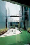
The corporate headquarters of the Apollo Tyres Group is an instrument to address issues that are central to the rapidly evolving Indian workplace. The approach was to ensure that the project sits within the conceptual, functional and aesthetic framework of a Contemporary Corporate Design Agenda. The site is a vast expanse of an empty field in the middle of nowhere. Flat and lacking any topographical character, it was extremely difficult to contextualize an iconic corporate office building that the design brief specified. This helped to generate a morphology that goes against the typical corporate office as a building type in India; that of a sealed box, within which the office environment is predictably placed.
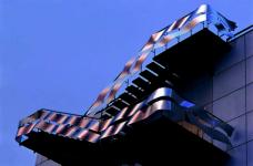
The notion of a mini-urban centre was conceived conceptually, which would have a texture and fabric similar to that of the older cities such as Jaipur or Shajahanabad. Devoid of any context, a fragmented morphology was hence developed, which helped to generate the conceptual intent of the office campus being a ‘micro city’. The strategy that was evolved was that of Striations and Layering vis-à-vis the traditional point centric planning. Spatial and programmatic Striations are manipulated to create overlaps between the built/ open spaces and the programmatic requirements. 9 meter wide parallel linear strips running SE-NW are grafted across the site. These help to create the main programmatic zone divisions into Presentation, Processor, Nature zone, Work zone, Social Zone, Recreation zone, Transaction Zone, Chance Event Zone, Instructional zone etc. which provide an interface and permeability between the striations. Courtyards and terraces are provided right up to the second floor level with various linkages in the form of steel bridges in order to bridge the resultant diverse fragments. A movement spine traversing the programmatic striations stimulates the activity zones and restructures the office space.
This morphology further helps to articulate the Thermal banking and Day lighting strategy. Internal and External courtyards abut the striations and terraces are provided to bring in maximum daylight. The intention was to create a virtually blinds-free environment. The terrace gardens also provide a high level of thermal insulation. A staggered skin treatment further enhances this function; the skin is developed as 2 sets of planes (solid and glass) - the solid set of planes is staggered to shade the glass surfaces to give protection from the sun and keep the glare out. This also ensures that solar ingress is limited to the winter months. The resultant of this strategy is an air-conditioning system which averages about 250 square feet per tonne of air conditioning which is far better than the industry standards.
An integrated building management system is employed to link all services to human occupancy. This is done to monitor Entry/Exits through three main access points in order to sense where each occupant is in the building and thereby, activating all services such as Air Conditioning, Electrical systems and Lighting based on occupancy. The building is preset to a standby mode wherein all these services are operational only in a limited capacity. On an occupant entering the building, the proximity readers sense the activity and shift all zones to occupied zone where all the services work in full capacity and the system works vice versa on the occupant leaving the building. This leads to the creation of pre-cooled environments and adoption of a skeleton lighting procedure as and when required. Hoteling further adds to the flexibility of this system and permits dynamic requisitioning of the work spaces. Also, it further helps to achieve an interactive control of the facility management system and complete energy efficiency in a well integrated environment.
The architecture is a consequence of an ‘arts and crafts approach’. Varied and tectonic use of material extends through out and infests itself d
1999
2000
.jpg)
.jpg)
.jpg)
.jpg)

.jpg)
.jpg)

