DAG: Reconfigurable . Dynamic . Performance Space
The Delhi Art Gallery is an endeavor to create a simplistic space to retail the best of contemporary art in India, while positioning itself in the new Indian Contemporary Art Retail Paradigm. The architecture aims to generate a new genre of art retail; a calm and introspective retail store conducive to the appreciation of art in a gallery-like environment for the art aficionado looking to invest money in these prized possessions. A pre-requisite to art retail is the maximization of wall space, which is designed for maximum exposure of a quantum of art works. The store was intended to house the complete bandwidth of art works; from high-end solo shows of a few works to huge group shows with segregated and mobile spaces.
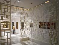
Conceptually conceived as an exuberant, glowing event space, the intent was to create an optimal setting for exhibiting art, which would be flexible, to present an array of art works in their varied forms and sizes, while at the same time ensuring that the limited wall area is best optimized. This was done by create more wall area for the retailing of the art works by means of a combination of fourteen movable/ reconfigurable panels and 3 Fixed Panels to create six rooms instead of one. The interplay of the panels provides the entire space with an intended dynamism which expresses itself by way of a constantly transforming architecture; by creating an event space and an experience which can display the art in an innovative, yet elegant manner. Passersby have the chance to glimpse the action inside; the repetition and variation of the panels and the performance itself.
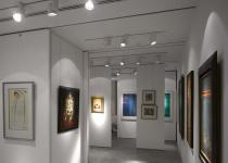
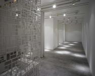
The flexibility offered by the an array of sliding, movable panels allows for the creation of a multitude of display spaces which aid in the positioning of each work in a secluded or collective environment. The Heights and spans of the panels were derived from feedback from the curator in order to obtain lengths and widths that allow for easy configuration, display, and circulation within the store. These are created and re-created within the different parts of the otherwise flowing space, which allows for the framing of distinct and unanticipated views. Eventually, it even allows for positioning in a manner which generates the largest viewing space. Spatial compositions are configured through dialogue, between the user of the space and the contents that inhabit the space itself. Each panel offers a surface as a means of display, which can be as dense or as sparse, deemed necessary by the artwork that is on display. Eventually on short listing, deeper spaces are created in order to get the largest viewing space. Lighting is easily configurable and flexible in accordance with the arrangement of the panels and panel sizing. Simplicity is achieved through the materiality; the flooring is in a subtle grey natural stone and the gleaming whitewashed backdrop provides a blank canvas for the works of many nationally and internationally acclaimed artists. All lines are straight and minimal in order to create an architecture that is impactful and yet does not challenge the artworks or vie for attention.
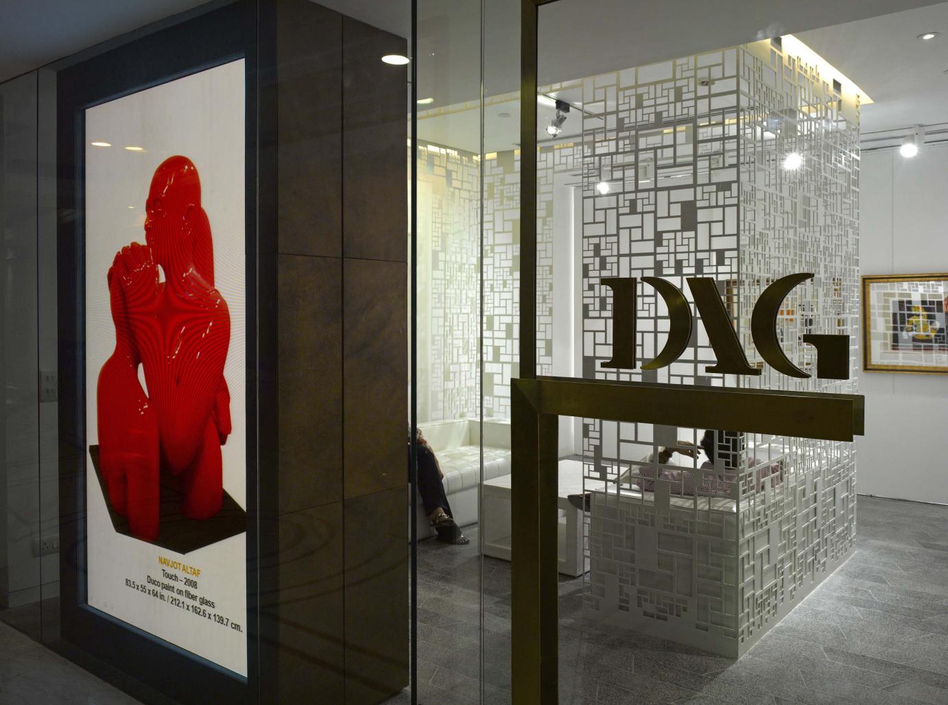
A partially imposing box made of muted white, fretted-screen panels anchors and encloses the formal entrance space/ meeting area while creating a private space for customized retail and viewing of the shortlisted artwork before its final sale. An information hub characterizes the entrance space by generating interest, before one actually steps into the gallery. A composition of shelves dominates the entrance space, and is used for displaying catalogues and other publications. A flat screen tabletop endorses the customized, luxury retail environment; through its e-functions of information, data, publications of each of the artworks. A full wall-sized multi-media projection screen at the entrance façade exhibits the gallery collection, the pedagogy of the artist and information on the art works itself.
Art Retail needs to be viewed differently from a gallery, with the intent of engaging the luxury retail customer and even engaging those not yet initiated into art. DAG defines a new vocabulary in the art retail paradigm that encourages encounters and plays with perception; the spaces within the store are read and used independently by each visitor. The design balances aesthetic simplicity with functional complexity, creating a new muted lexis, allowing for a seamless connect and complete flexibility.
2009
2009
AREA Sq.ft 82
CONSULTANTS
Electrical - Morphogenesis
HVAC - Morphogenesis
PMC - Morphogenesis
Engineering - Morphogenesis
Signage - Morphogenesis
Product Design - Morphogenesis
CONTRACTORS
Electrical – dca workshop
Civil - dca workshop
HVAC – dca workshop
PMC - Morphogenesis
Engineering – dca workshop
Signage – dca workshop


.jpg)
