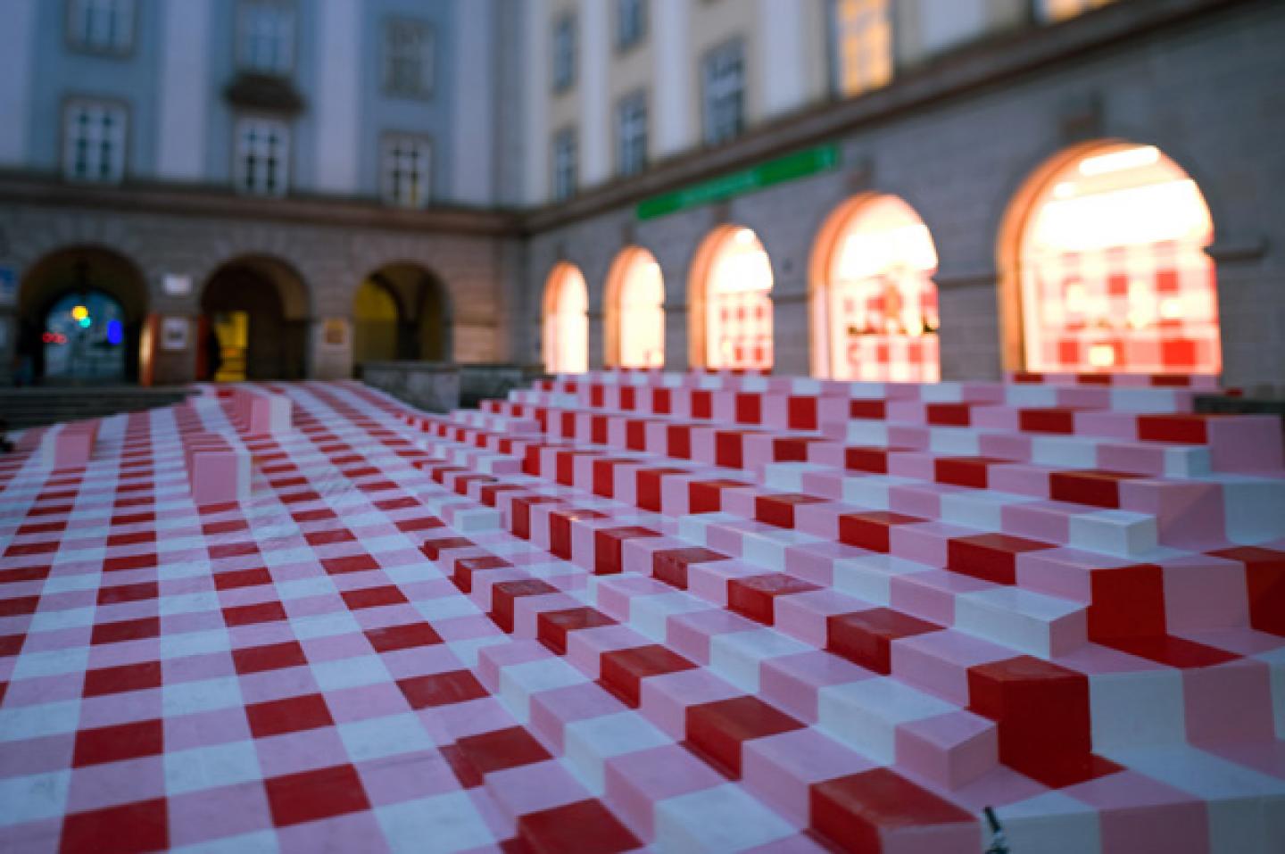
the design for the infopoint central information office is based on three main themes
the extant physical structure:
separating the actual façade and the main square was a solid, continuous stone wall like a barricade keeping visitors at bay; a wooden structure of steps devoid of handrails and other distracting features was built onto the front of this wall, in this way neutralizing the implied barrier and encouraging the visitor to walk over or lounge on the artificial landscape.
the material used for this landscape extends through the thermal façade (whereby in the portals the windows, which were originally made of small panes of glass, have been replaced by large glazed surfaces that employ as few framing members as possible). this creates a kind of interior landscape of presentation stands and counters – a uniform element running through the interior and exterior. the bright lighting of the interior space makes the actual façade recede even more into the background. the main square extends into the info zone, while at the same time the info zone flows out onto the main square.
the historical structure:
above all we sought not to design just another stylish downtown shopping area, but as far as possible to “avoid contact with” the historically tainted structure. thus after clearing out the interior space (all built-in units were removed, the walls and ceilings smoothed and freed from the various design influences that had collected during the second half of the last century), we achieved our ive through a single measure: a new layer was spread across the floor like a bolt of fabric, billowing and arching into counters and benches, and finally forming a partition wall that stands in front of the massive central wall without actually touching it. this temporary layer has been erected as inexpensively as possible using ordinary engineered wood, and it can be dismantled with little effort. the visitor should sense the temporary character of the structure.
the second wall layer mounted in front of the permanent walls consists of a wooden structure perforated by plastic boxes (mass-produced, € 1.50 each). lit from behind, they serve as compartments for product presentation.
the pattern:
“linz ist provinz” – it’s a catchy phrase, and it’s true too: linz is unmistakably provincial. and one thing that definitely won’t work is for linz to try to present itself as urban and “chic.” our design involves a tongue-in-cheek reference to regionalism and a welcoming gesture wrapped into one: the red-and-white checkered tablecloth as a symbol of hospitality. the visitor is confronted with only this enormous tablecloth; there is no other information inscribed on billboards, banners, or building façades – the infopoint information office should be self-explanatory…
2008
2008
construction walls: timber construction with ded plastic elements
floors: osb – exterior with a polyurethane coating, interior with an epoxy resin coating


