Internal addition
It is specified that the book-shelve-type building in PaJu Book City should have a certain shape such as `U` or `L`. Based on the code-shape, building ratio and floor area ratio-the site could have a building with its total extended floor area of about 2,000 square meters, but the client wanted to have a building with about 1,300 square meter extended floor area including the basement. In general, buildings are constructed to have the biggest possible floor area, but in this case, the client himself did not want to see his building expanded later. Even when a future addition is taken into consideration in the design, only some parts of the building are constructed first to be added up later, but in such cases, the problems occurring long after construction will involve design consistency, unavailable exterior materials and construction itself; the examples may be Gwathmey & Siegel of Guggenheim Museum. Michael Graves of Whitney Museum, Ando Tadao of Kimbell Museum and the like. In order to solve such problems, a concept called `internal addition` was invented. Above all, while accommodation the floor area of 1,300 square meters, it dictates creation of the maximum possible building volume allowed for by guidelines and code. The result is an interior of the building consisting of a set of diverse spaces, which is intended to surmount such disadvantages, while being prepared for possible future additions. Such a concept of `internal addition` may be advantageous in terms of constructibility and cost of addition as well as diversity of interior spaces.
Inside and Outside-Diverse Landscapes
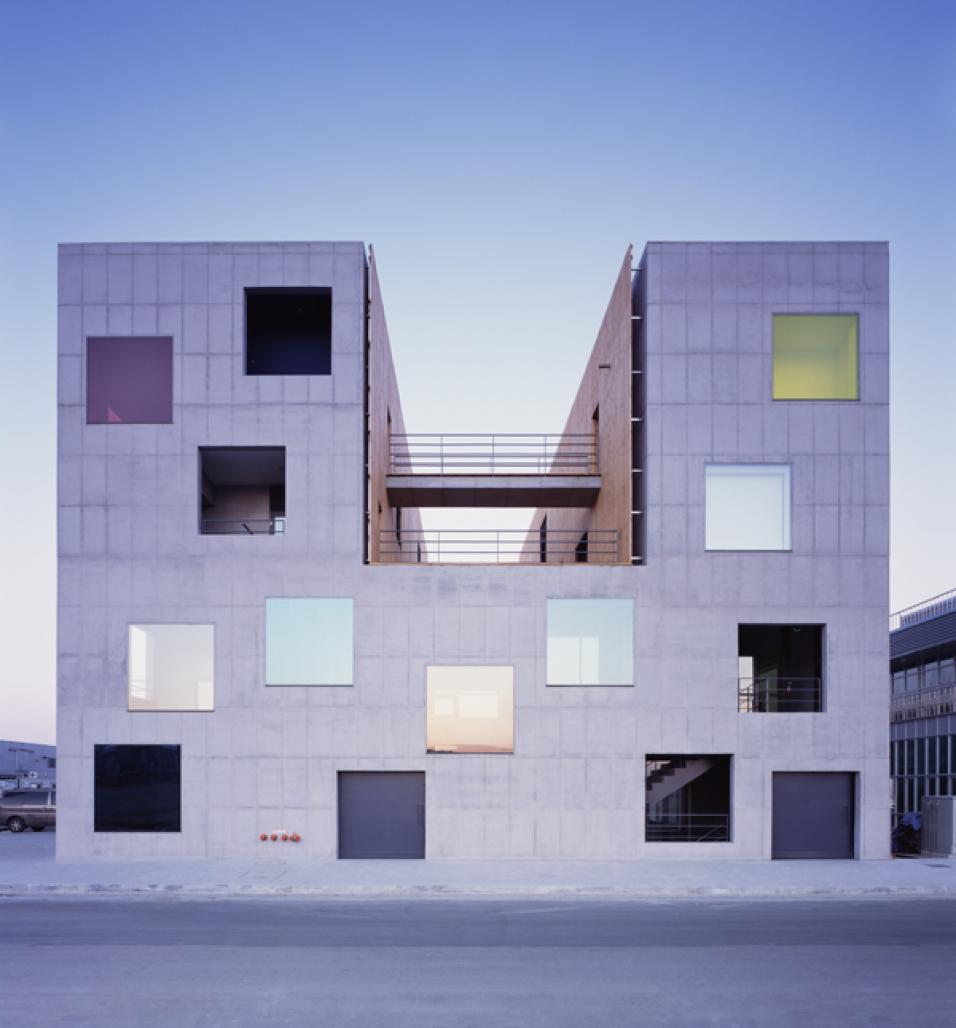
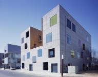
PaJu Book City is a kind of town with buildings and natural environment controlled very delicately compared with other towns. While reviewing how to set the diverse views, it was necessary to establish a new relationship between the internally added spaces and the skin. First of all, it was essential not to allow passers-by to recognize clearly how many stories the building has, although its interior space is diversified into levels, and hence, I decided on an irregular layout of the windows of the same size on the exterior. Such a window layout may enable you to enjoy the landscape not as an uninterrupted whole but framed into the diverse views. To this end, various design elements were examined including positions of view frames, structure of the exterior wall plane, energy efficiency, frequency of indoor ventilation, proper glazing size, lighting effects at night and so on. After all, 66 openings of 2.1x2.1 m size were designed to occupy 22% of the whole wall plane area to introduce the natural lights into inside. The other windows were finished for difference experiences with transparent, reflecting, translucent, colored or sliding glazing; the outside of the sliding skylight was refinished with an anti-insect net.
2004
Favorited 1 times


.jpg)

