Submitted by WA Contents
Review:Pop Art Design
United Kingdom Architecture News - Oct 22, 2013 - 12:44 6484 views
Barbican, London
Partying meets pragmatism in an enjoyable new exhibition exploring the exchange of ideas between pop artists such as Andy Warhol with the bold, playful designers of the day

The 1970 Bocca sofa designed by Studio 65, from the Barbican's Pop Art Design exhibition. Photograph: Alberto Peroli/Barbican
Pop art: what more could we possibly want to know about pop art? The imagery of Warhol and Lichtenstein runs unfadingly through contemporary culture like the colour red in a through-dyed plastic chair, not least because they chose the imagery that was saturating the world even without their help. And, in design, what need do we have to see again the work of Charles and Ray Eames, the impossible to dislike geniuses of postwar industrial design, whose chairs and cute visuals are as thoroughly looked at and reproduced as the face of Marilyn Monroe?
The new thing, according to the Barbican Art Gallery's imminent exhibition Pop Art Design, is to show them together. The idea is that both are the products of the age of pop, a time when artists like Warhol found beauty in the mass-produced objects and imagery of daily life, and when designers like the Eameses used new technologies to make those objects and images beautiful. It was a time for obliterating hierarchies, of high and low art, oil paint and petrochemicals, artists and designers.
Also for blurring the distinctions between shops and museums, and a wall in the show carries photographs of installations by artists in department-store windows, and of supermarket products in museums. Everything came down to the desirable and consumable modern object, whether it was the elegant fibreglass tulip chair designed by Eero Saarinen, or the stylised depiction of one in Patrick Caulfield's painting Dining Recess. Pop Art Design makes a good sequel to the Bauhaus exhibition that the Barbican ran last year: that, to oversimplify, was about art inspiring industrial design, but in pop art the process tends to work in reverse.
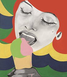
Evelyne Axell's Ice Cream 1, 1964. Photograph: Private Collection © ADAGP, Paris and DACS, London 2013
The combined effect, at first sight, is a bright celebration of the energy and output of postwar America, and of its admirers in Europe. With an exhibition design by the architects AOC, the show lights up the grey cave of the Barbican's gallery, with backgrounds in pistachio and pink, illuminated as highly as conservation requirements allow, calling to each other across a shadowy central void. The large letters of the word MINT, taken from a photograph of a hotel sign in Las Vegas, preside over a party of stunt-pulling and cultural gambling. The high art/low art game is at work in the design too: a vista such as you might find in a baroque palace terminates not with a statue of Apollo but with a cowboy by Jann Haworth.
There is nerve, verve and freedom, the nonchalant ability to do things never previously thought of as art. This party is a happy one – the anxieties of the age, such as the bomb, Vietnam and urban riots, mostly don't get to cross the velvet rope. One of the feelings aroused is envy – why does art of our own time have to be so canny, so calculated, so emotionally pre-programmed even when it's striking, and why is so much industrial design in a cycle of repetition and refinement? Why can't there be as much fun as in pop art, and as much invention as the Eameses had?
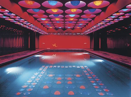
‘Nerve, verve and freedom’: a swimming pool in Hamburg designed by Verner Panton in 1969. Photograph: © Panton Design, Basel
If you look from one side of the show to the other, from pink to pistachio and back, 1970s pillars, in the Barbican's elephantine concrete, intervene. They form a septum of time beyond which the 1960s can be glimpsed as a sunny lost world. The work on show – a stars-and-stripes sofa, Eero Aarnio's lime-green polyester armchair – makes everything else look grey, and the Barbican, already grey, still greyer. For all the current ubiquity of pop art imagery, it was also the creation of a moment, one not able to extend itself for long.
The art, however, was not and is not just about partying. There is ambivalence in pop, starting with the work that has been called "the birth certificate of pop art", Richard Hamilton's 1956 collage Just What Is It That Makes Today's Homes So Different, So Appealing?, whose title signals that we are not supposed to take entirely seriously its bodybuilder and its H-bomb-breasted woman in their weirdified dream home.
The embrace of the products of consumerism is at once hearty and satirical. As an essay in the impressive catalogue describes, pop and the Mad Men of Madison Avenue had a love affair, each admiring the other's ability to create compelling images and use them to sell – products in the case of the advertisers, in the case of the artists, their own careers. But the artists kept to themselves the weapon of irony, as protection against being plain whores, which is one reason why the movement couldn't last, as it's hard to live off irony for ever.
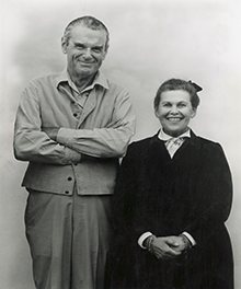
Designers Charles and Ray Eames ‘didn’t really do irony, abiguity or satire’. Photograph: John and Marilyn Neuhart
There is usually doubleness in pop art – it is complicit and protesting, sexist and feminist, individual and universal. As the exhibition's curator, Mathias Schwartz-Claus, says, it plays with the confusion of the real and the artificial. If anything can be reproduced in the age of mass production, you no longer know what is authentic and original and what fake.
All of which is easier to do with art than with design. Design tends to be more optimistic and wholesome, and Charles and Ray Eames, who looked like a midwest farm couple, didn't really do irony, ambiguity or satire. They wanted to make good things that would make the world better. Italian designers, such as Achille and Pier Giacomo Castiglioni, came closer – their 1948 design for the national radio exhibition in Milan, in which a giant radio set was suspended off the front of a building as if in the process of being hoisted by construction workers, was pop before its time.
The Castiglionis might have been surprised to find themselves in this exhibition, but another Italian, Ettore Sottsass, was more explicitly inspired by pop, to make furniture and electronics that resembled totems or sculptural objects, to make design more like art. The more he did so, the more his chairs and wardrobes were bought and experienced like art, as singular collectibles more than functional objects.
Pop Art Design originated with the Vitra Design Museum in southern Germany, which was created by the Vitra furniture company, whose chairman Rolf Fehlbaum appears in the catalogue as a young man. He is discussing one of the most important products of the age, the Panton chair, with its designer Verner Panton. It's not surprising that Vitra wants to talk up the importance of design in this legendary movement, and it does so successfully, even if the evidence of this enjoyable and thought-provoking show is that art and design were not, even in the age of pop, identical.
> via TheGuardian