Submitted by WA Contents
LubanEra Design completes Resoul Photography Base & Concept Store in Zhongshan
China Architecture News - Oct 23, 2024 - 13:40 1561 views

LubanEra Design has completed the Resoul Photography Base & Concept Store in Shaxi, Zhongshan, China.
Named Resoul Photography Base & Concept Store, the 2,000-square-metre project breaks conventions by expressing the space's distinct personality and attitude while providing clients with emotional and spiritual fulfillment.
Bobo Chen, the founder of LubanEra Design, aims to use aesthetics to give spaces commercial value rather than following a particular design aesthetic.

The designer aims to empower the space beyond the confines of design and provide the client with unmatched value by embracing possibilities and uncertainties.
By creating a space that is accessible, inclusive, open, and unrestricted, he uses a lifestyle philosophy to metaphorically tell the brand's story. It invites guests to experience the transformational power of fashion and radiates a sense of purity that is exclusive to the modern setting.
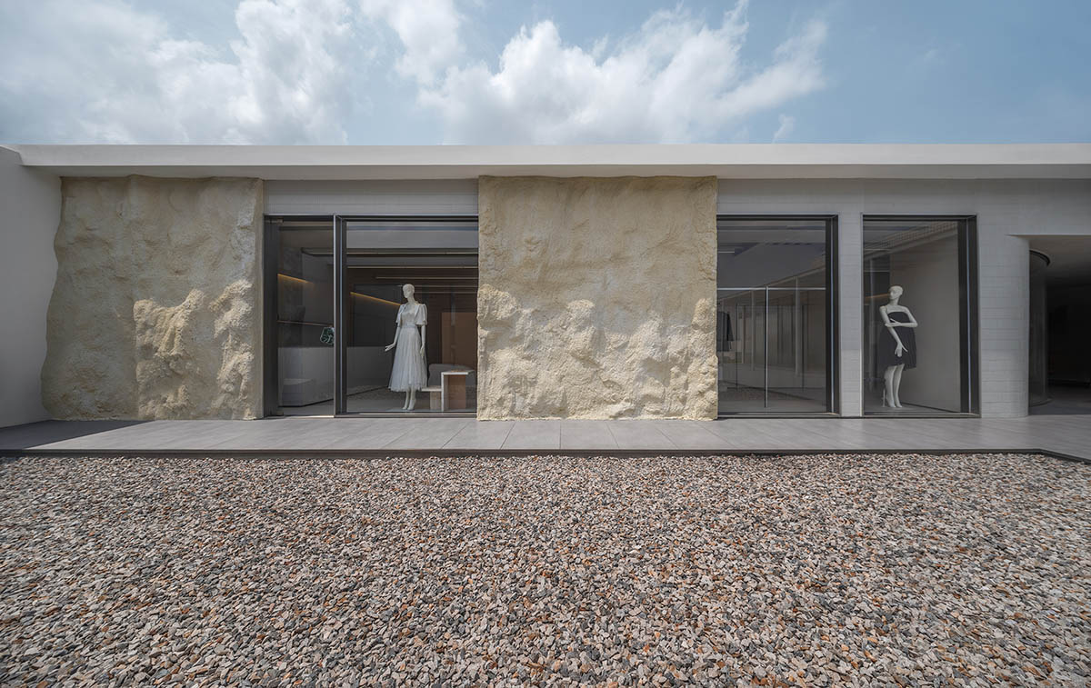
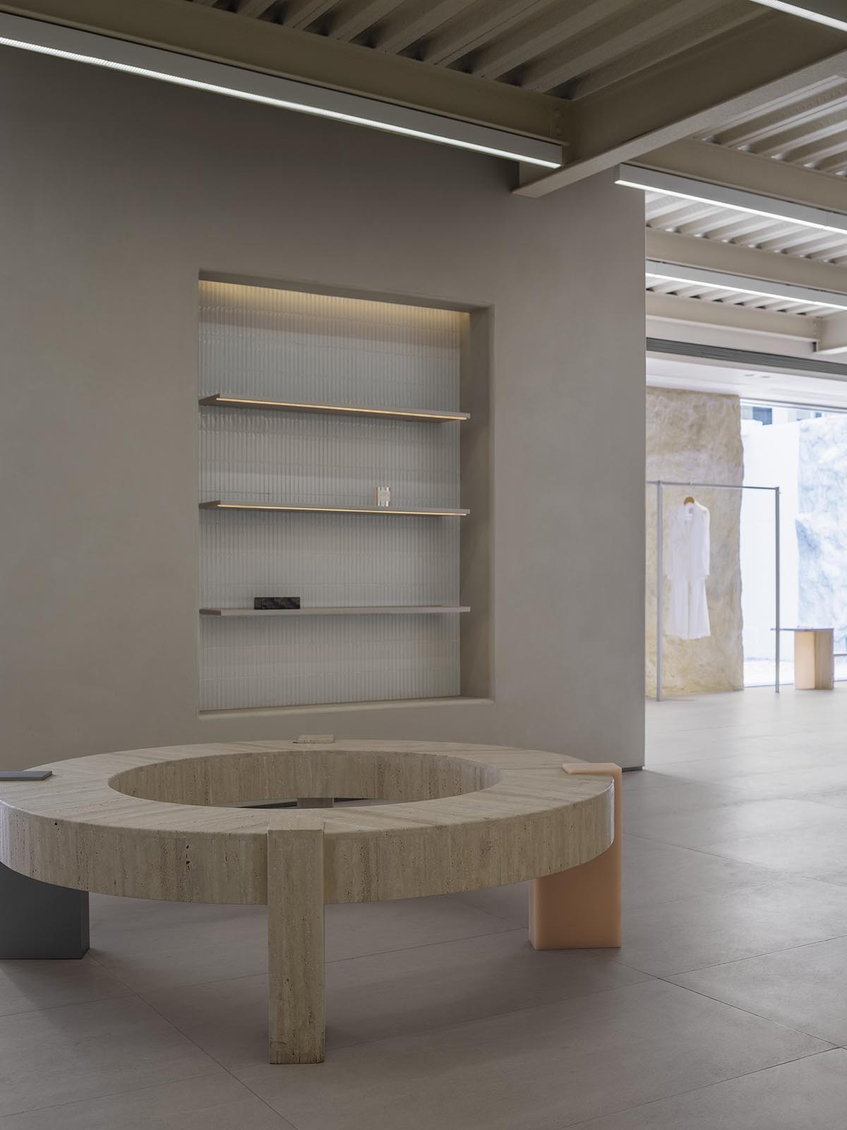
Space takes center stage in Bobo's welcoming and organic setting, which is enhanced by product displays. Each exhibit showcases its distinct beauty against a calm background thanks to a succinct yet well-considered spatial arrangement.
By creating partitions, the distinctive structural forms blur the lines between the interior and exterior while preserving a visual dialogue. The project's creative design solutions produce a delicate balance between atmosphere and style as well as a smooth transition between the interior and exterior.
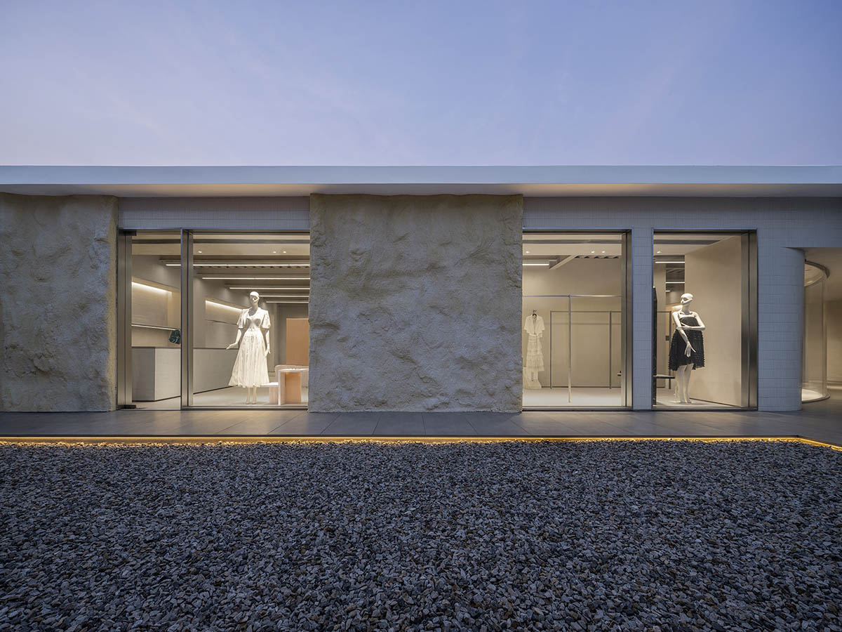
The Transformation of Fashion
This project was formerly an abandoned warehouse situated on the rooftop terrace of an industrial park. Stepping onto the rooftop during the site visit exposed a bleak, desolate scene in the intense sunlight. The client made the decision to revitalize this abandoned space in an effort to improve their business model.
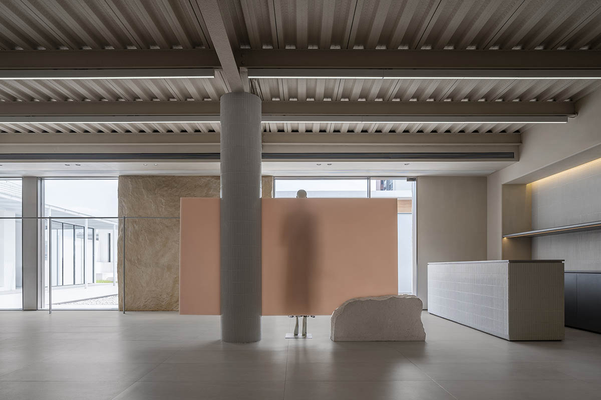
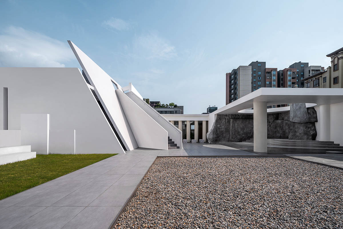
The views from the rooftop were vast, but the harsh sunlight made it uninhabitable. The challenge was accepted by Bobo Chen, creative director of LubanEra Design, who built stairs and corridors, created a courtyard around water, and skillfully combined architecture and landscape while maintaining the original structure. As a result, the entire rooftop is alive with a natural oasis.
The area provides a distinctive and calm experience for work or photography, capturing the essence of the brand's flexible transformation.

The Rhythm of Space
A naturally cozy ambiance is created by the design's dialogue between structure and nature, which brings in natural light and the changing seasons. The room opens outward along the path of light, displaying a creative beauty that both contrasts with and enhances the untamed beauty of the natural world.
The interior and exterior are connected and blended through a window, preserving their independence and unity. This design offers a more profound, spiritual sense of independence than just defining the structural contours.
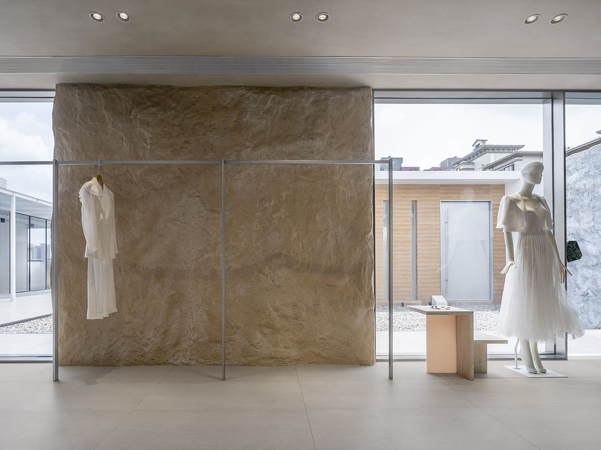
A natural sense of space is created by the design's emphasis on fluidity and spatial division, which strikes a balance between comfort and aesthetics. The interior spaces are carefully planned, emphasizing the passage of time with the introduction of natural textures and the contrast between light and dark.
Nature and Modernity
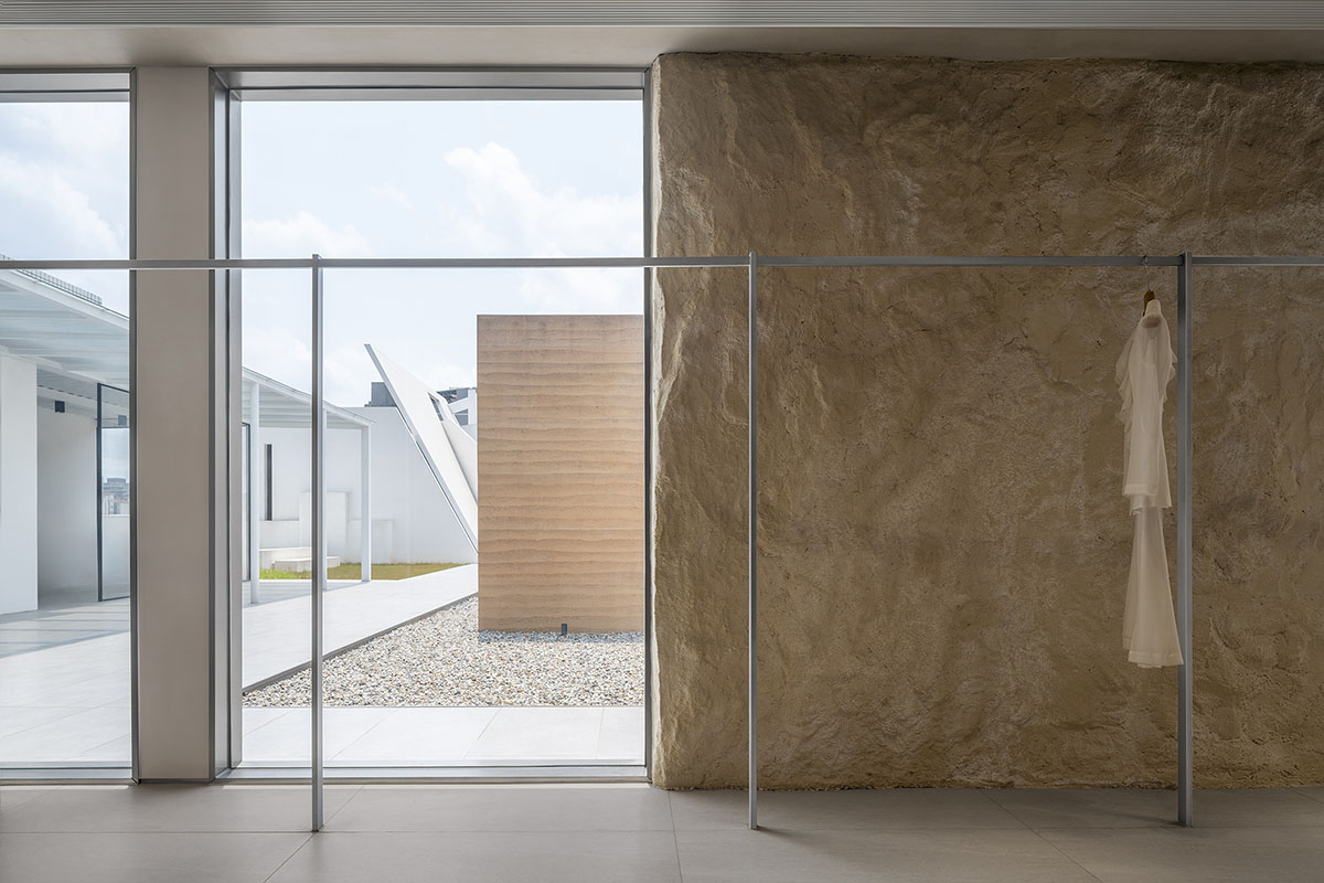
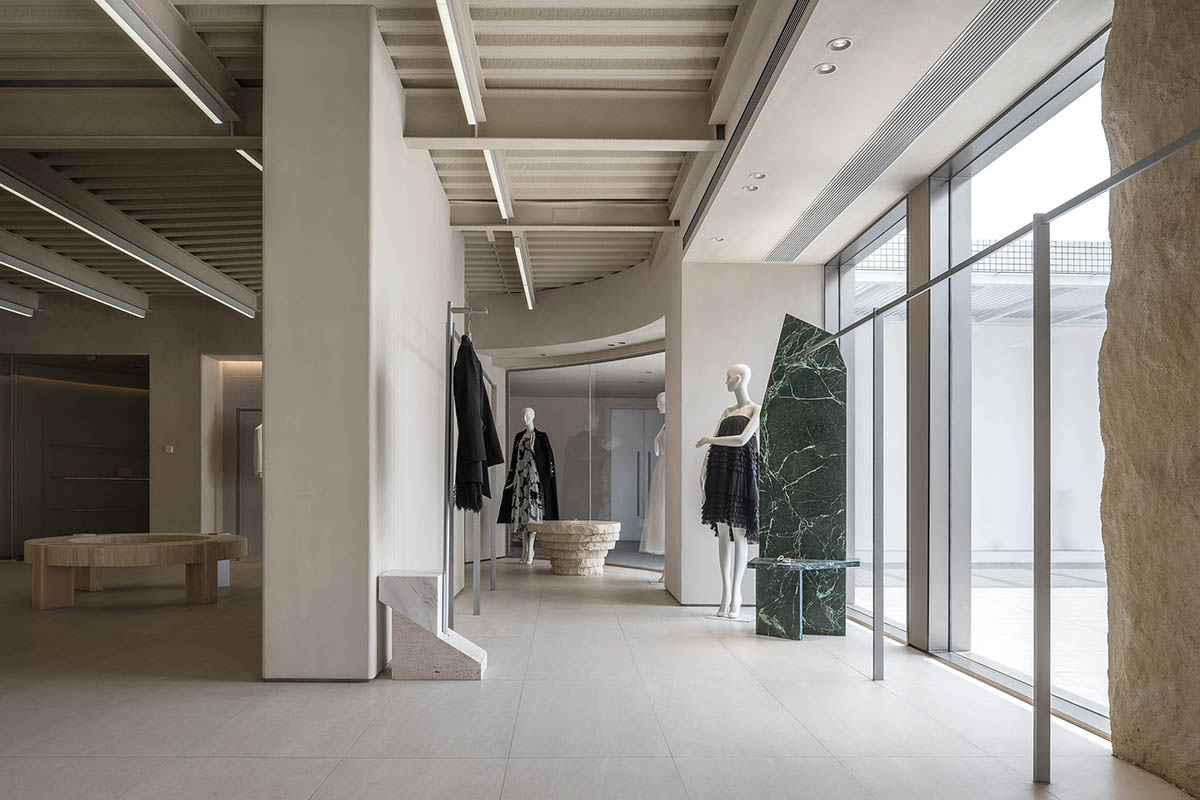
The textures formed over time are carried by the stone patterns, which go beyond simple form. By combining with other elements, these natural stones produce contrasts between massiveness and lightness, solidity and void, and nature and modernity.
This interaction gradually calms and soothes the atmosphere as it moves from the outside to the inside. Geometric relationships are highlighted by the building's varied depths and the transition between warm and cool tones, which separate but seamlessly blend the interior and exterior.
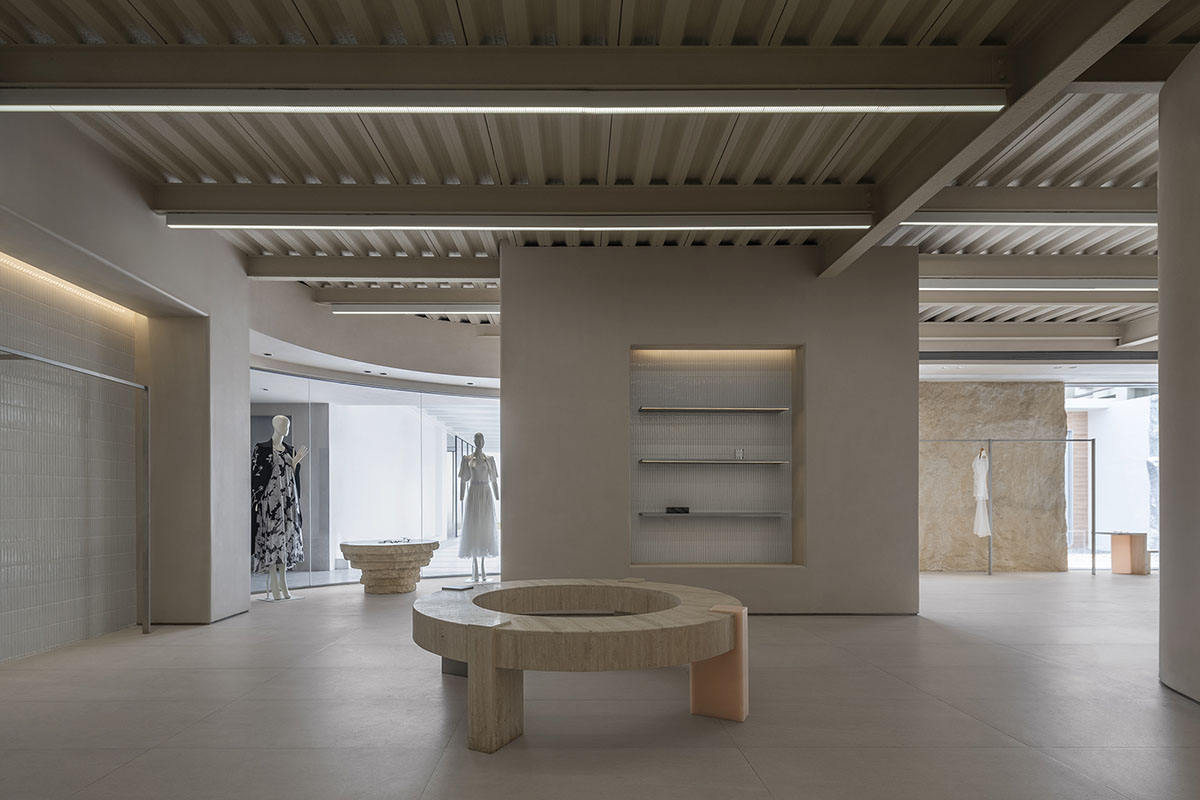
Bobo changes the emphasis to an artistic, sensory experience by eschewing traditional showroom spaces that are characterized by overt branding components like logos.
This creates a stronger bond between people, space, and brand by allowing the essence of the brand to quietly seep into the area.
Fluid Circulation
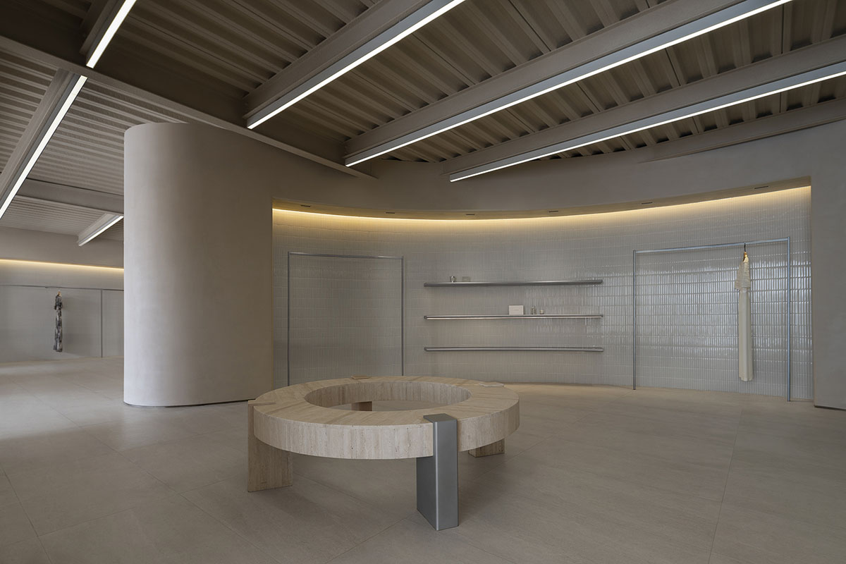
Movement through the room is guided by the flowing curves, and the sightline is directed across a variety of scenes by the ambient soft lighting. This broadens one's field of vision and encourages one to sense the space's rhythm.
A calm and modest display area that provides guests with a relaxing experience is created by the use of simple, restrained materials that define delicate and clean lines.

Fusion and Symbiosis
There are countless possibilities created by the interaction of various materials. The careful blending of rough natural stone and smooth resin results in a cozy, organic shopping space that is accentuated by the play of light. While expressing a spiritual and artistic sensibility, the space caters to the emotions and experiences of visitors with a tangible warmth.
In the early stage of layout design, the design team carefully planned spaces for artistic experiences and functional scenarios. By connecting different areas with fluid circulation, the brand's products are seamlessly woven into the spatial narrative, with subtle shifts in scenes introducing a diverse environment.
Simple yet Powerful
The process of building a space starts with investigating particular uses, which then inspires the space's personality.
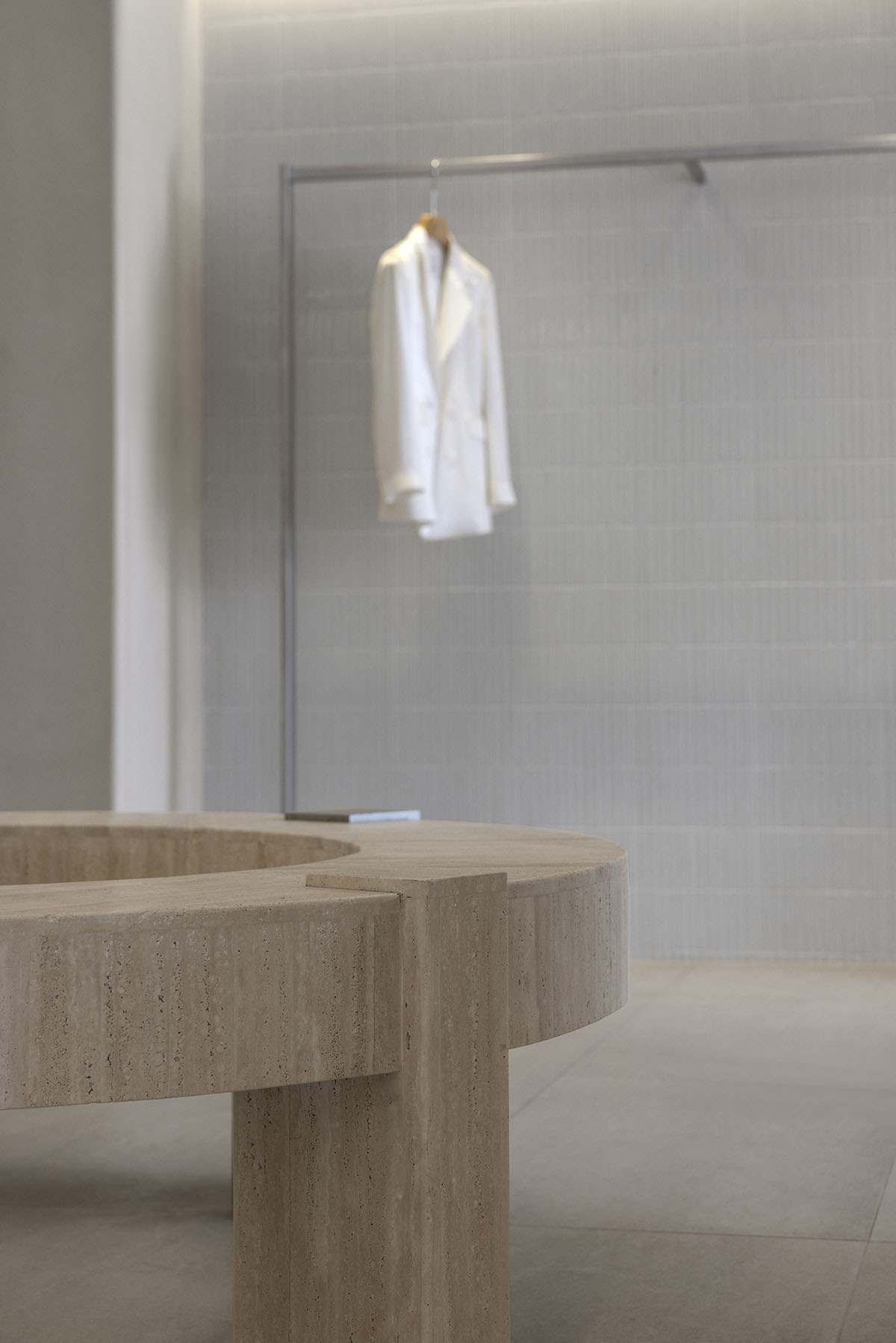
These components work together to produce an immersive, three-dimensional setting. Regular and irregular geometric shapes combine with simple yet effective forms to create a unified whole.
A compact and potent overall spatial form is produced by the building's integrated structural design, which highlights the shapes and contours with its staggered heights and dynamic lines.
The Rhythm of Time
The building's sense of scale and spatial presence are enhanced by the water yard's mirror-like reflections, which also make it harder to distinguish between different areas.
The rooftop's design transcends spatial constraints, showcasing the shifting light and clouds. Time is revealed along with the sky and clouds as a result of this shift from the material to the immaterial, from physical space to spiritual essence. A genuine and approachable brand experience is created by combining function and space.
Whiteness and Vitality
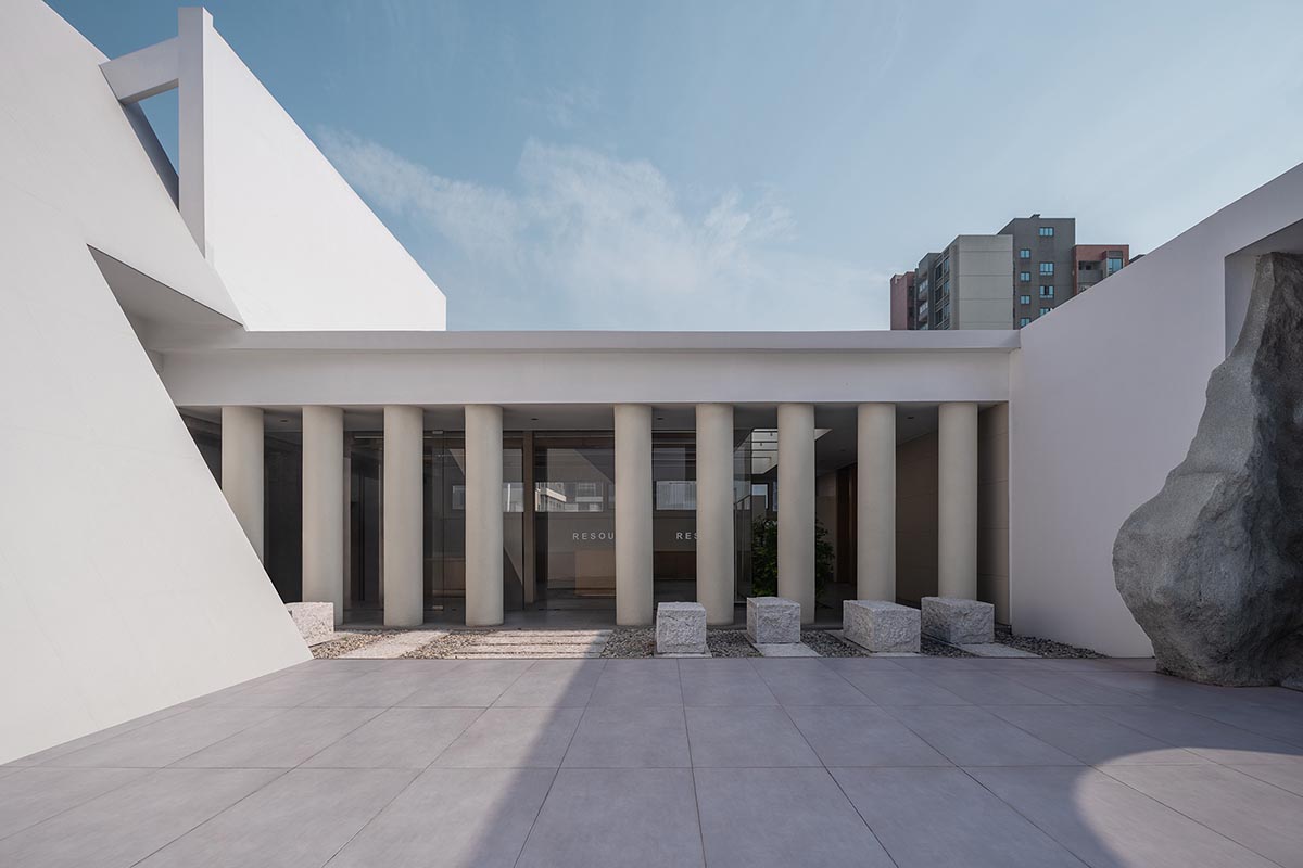
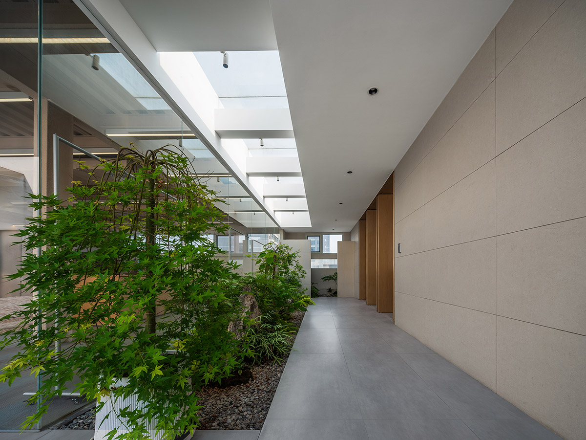
Vigorous green plants blend in perfectly with the surrounding environment, and the white space creates a calm atmosphere without the need for strong forms or vivid colors. With delicate grains echoing the vibrant plants, the materials selection aims for a harmonious balance between texture and tactile sensation.
Sunlight creates a multi-layered interplay of light and shadow as it falls across the greenery and empty space surfaces. The ultimate goal of spatial aesthetics is represented by the combination of each element.
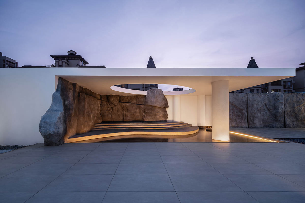
A series of cylindrical columns define the corridor, which flows smoothly into the courtyard via natural stone steps that provide a variety of spatial experiences while defining the courtyard's boundaries.

Fusion with Nature
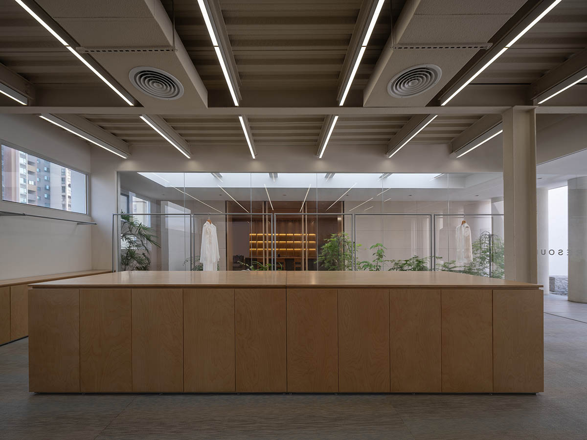
Glass that extends from floor to ceiling creates a natural frame, lets in greenery, and broadens the view beyond. Views of the changing seasons blend in with the interior as the natural light floods the room. There is a harmonious symbiotic relationship between the office space and the natural landscape.
Each area is unique but connected by the various materials in their changing forms. Each scene in the area embodies the brand's natural symbiotic philosophy. The distinction between the interior and exterior is blurred by the delicate integration of nature, the interplay between space and greenery, and the exquisite interplay of light and shadow. Despite being surrounded, the calm interior harmoniously interacts with the natural world.

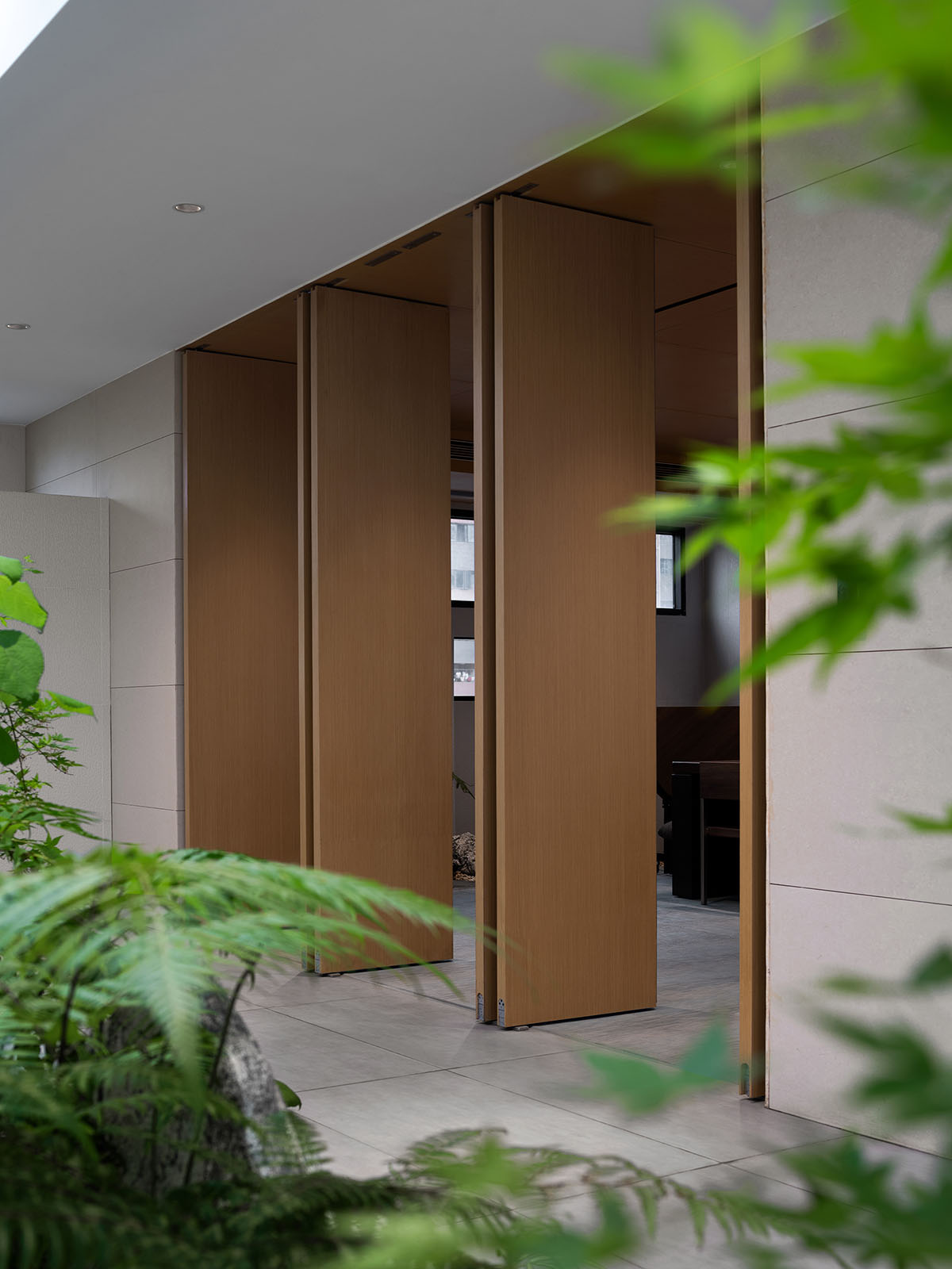
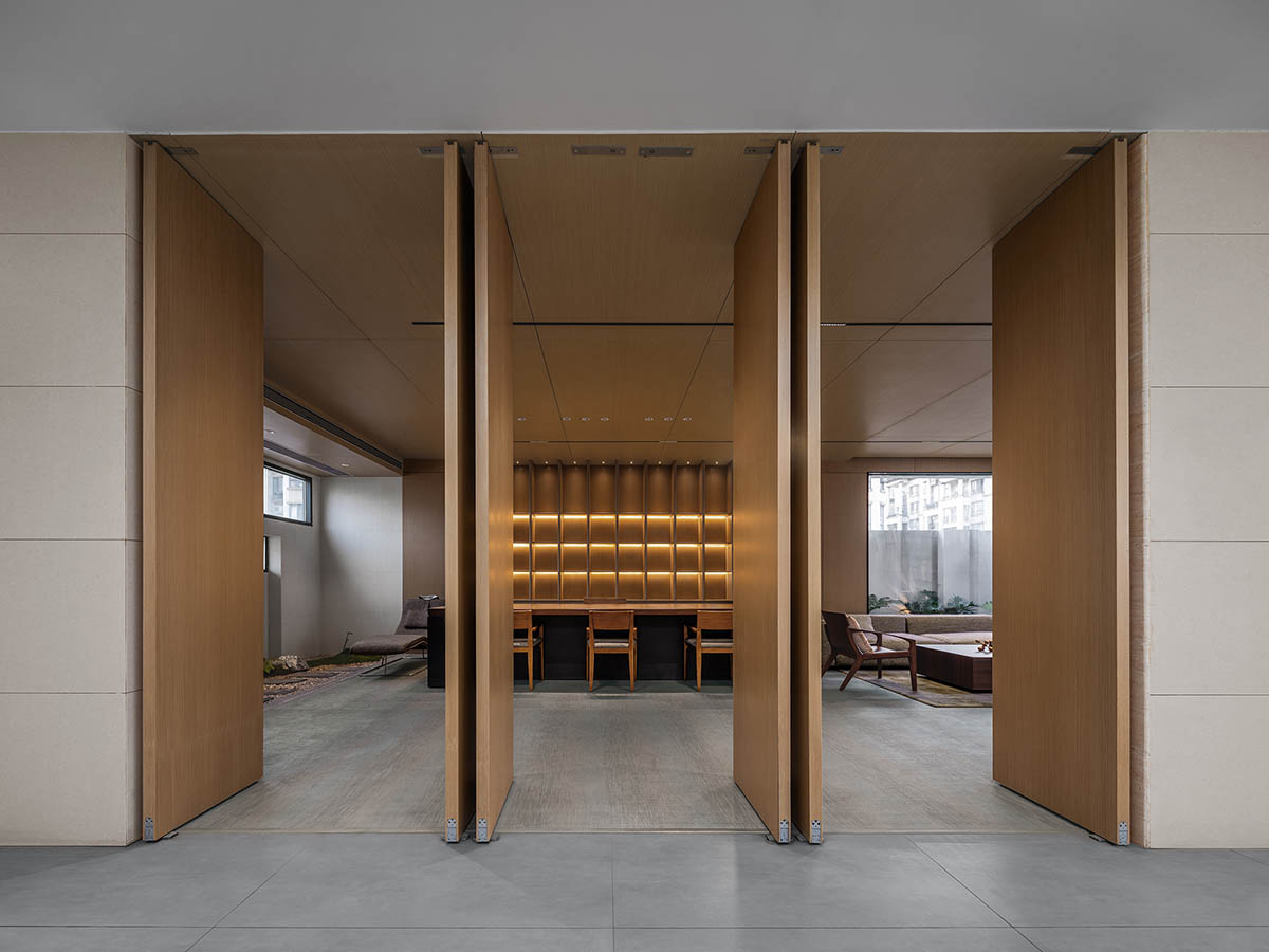
The office is softened by a hint of green, which is visible through the clear windows, and the revolving door discreetly divides the area, encouraging calm and relaxation.
A carefully designed tea room that serves as a haven for relaxation and reflection welcomes guests to explore every inch of it and lose themselves in its calm Zen ambiance.
Light in the Quiet Night
Ambient lighting improves the building and space as night falls, creating an air of openness and spaciousness. Under the stars, the ambient light creates a commercial space that is infused with order and complements the architectural structure, white space palette, and natural forms.



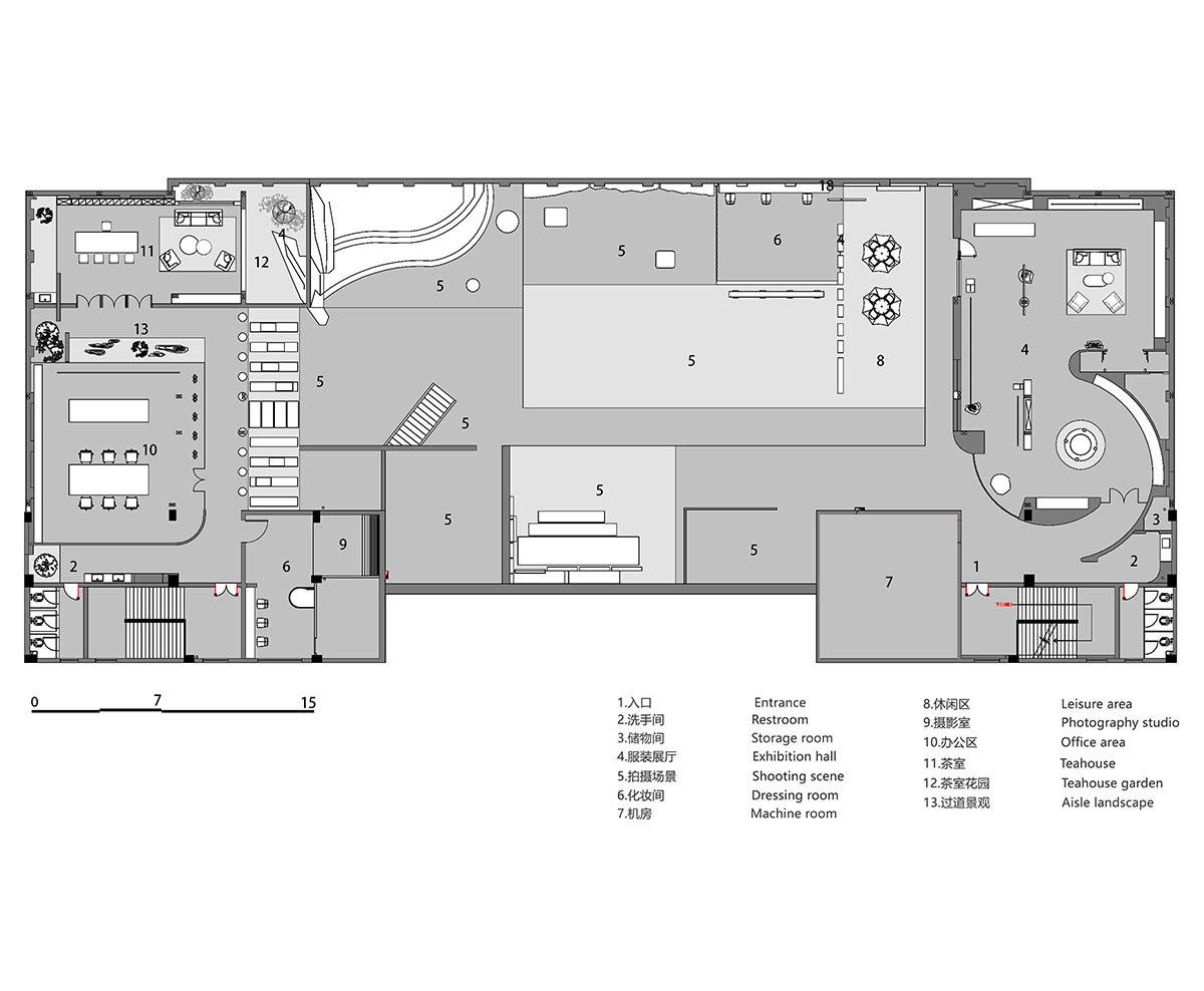
Floor plan
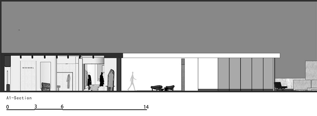
Section

Section

Section

Section
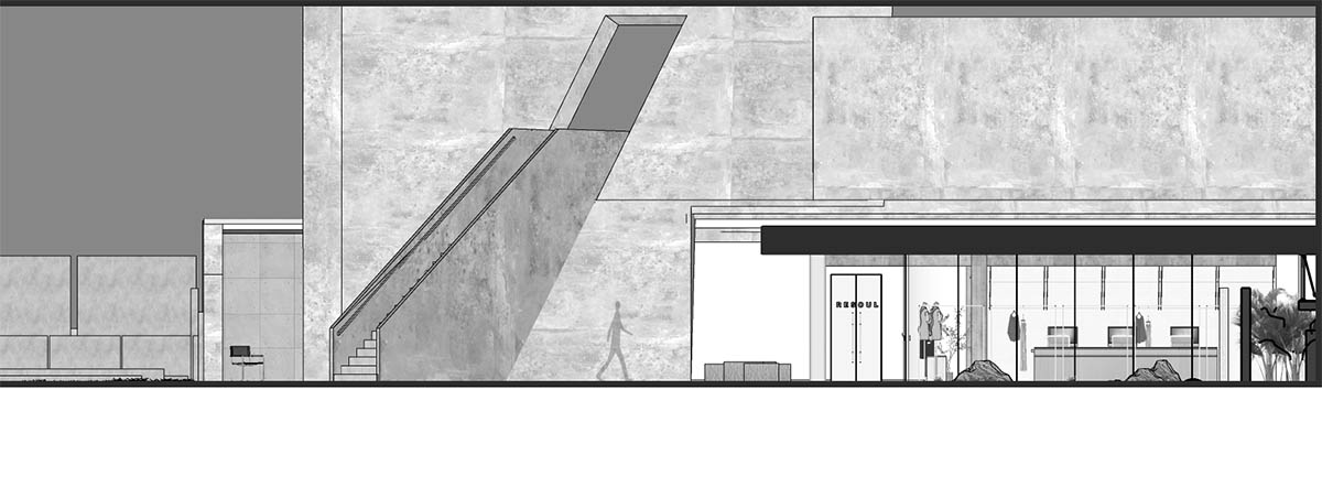
Elevation
Project facts
Project name: Resoul Photography Base & Concept Store
Design firm: LubanEra·Design
Creative director: Bobo Chen
Location: Shaxi, Zhongshan
Area: 2,000m2
Completion time: June 2023
Design team: Qiu Wendi, Gan Ao, Zhang Le
Video can be watched from here.
All images © Nie Xiaocong.
> via LubanEra Design