Submitted by WA Contents
Snøhetta designs subterranean museum extension glistening in landscape for Ordrupgaard Museum
Denmark Architecture News - Aug 13, 2021 - 12:43 4137 views
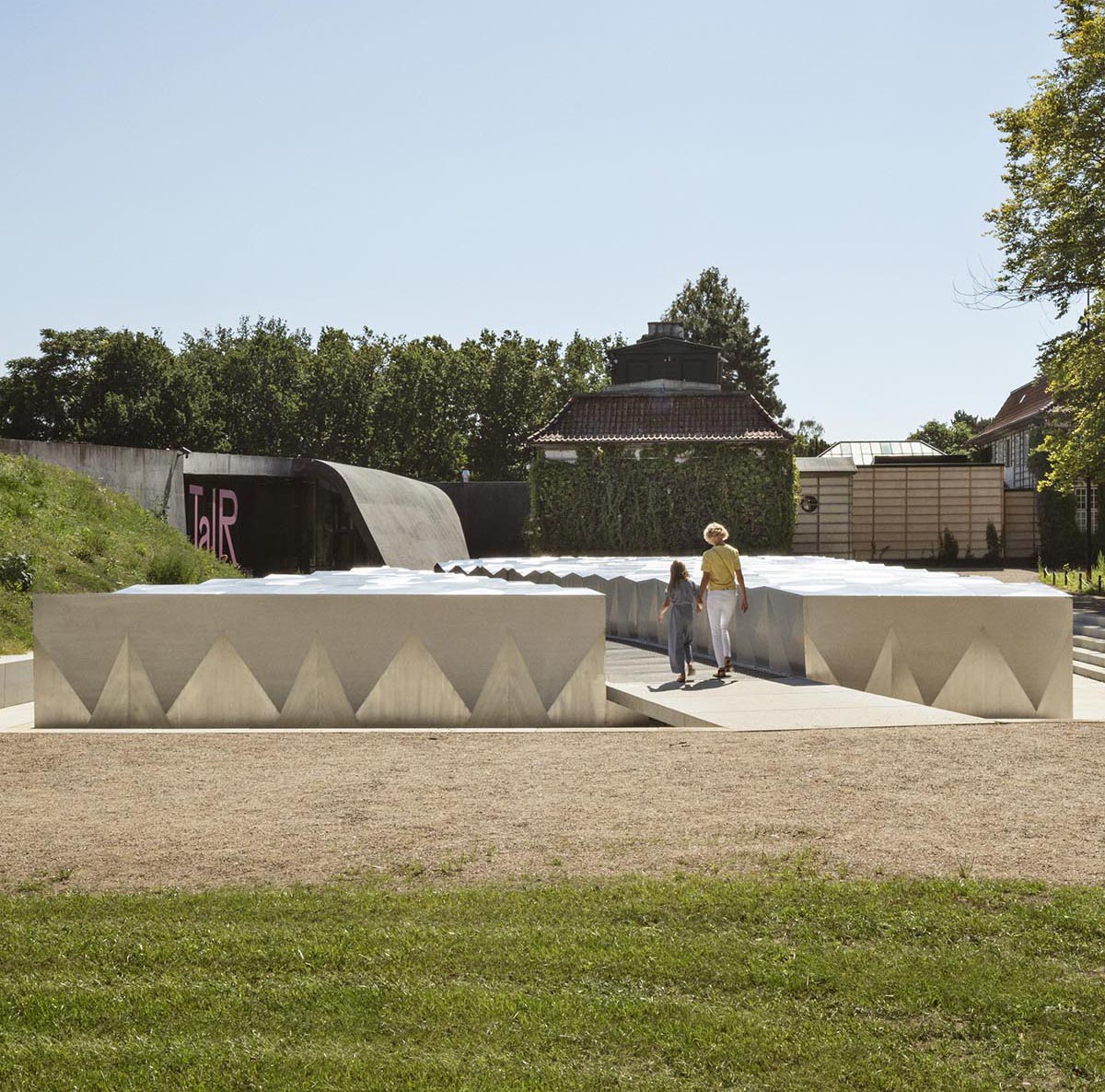
Norwegian architecture practice Snøhetta has designed an extension for the Danish Ordrupgaard Museum that glistens in the landscape with its "jewelry-looking" appearance.
The new extension is situated near Jægersborg Dyrehave, north of Copenhagen, for the Ordrupgaard Museum that houses Northern Europe’s most comprehensive collection of French and Danish art from the 19th and early 20th century. The museum was originally built as a three-winged country mansion in the neo-classical style during World War I.
Snøhetta-designed new extension is linked to Zaha Hadid's extension, which was completed with a modern 1,150-square-metre glass and black lava concrete building in 2005.
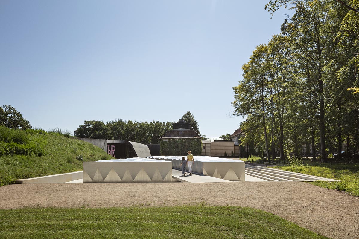
The studio's new expansion, most of which is designed underground, but also partly excavated from the landscape, creates a holistic and continuous path throughout the entire museum and its surrounding park and gardens, connecting Hadid’s extension for special exhibitions with the museum’s original building and permanent collection.
In the project, Snøhetta was also responsible for the design of landscape interventions as well as five brand new, subterranean exhibition spaces.

Two of these spaces create a continuation to Hadid’s exhibition space, and three of them are specially dedicated to one of the museum’s main attractions to house its extensive and permanent collection of French impressionistic paintings.
Thanks to the studio's innovative yet subdued design, the new extension and its exhibition spaces allow for a circular movement through Ordrupgaard, creating a continuous movement through the museum’s rich collection and lush gardens.
The design further lives up to the highest international standards when it comes to exhibition design and art conservation and display, providing a comfortable and intuitive museum journey that is accessible and tangible for all.
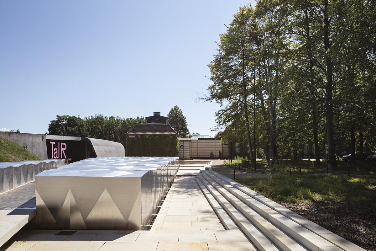
The museum becomes a play of light
While offering a mysterious atmosphere from afar, the largest of the three main exhibition spaces can be partly seen from the outside as a monolithic, steel-coated sculpturesque structure that seems somewhat excavated from a larger volume below ground.
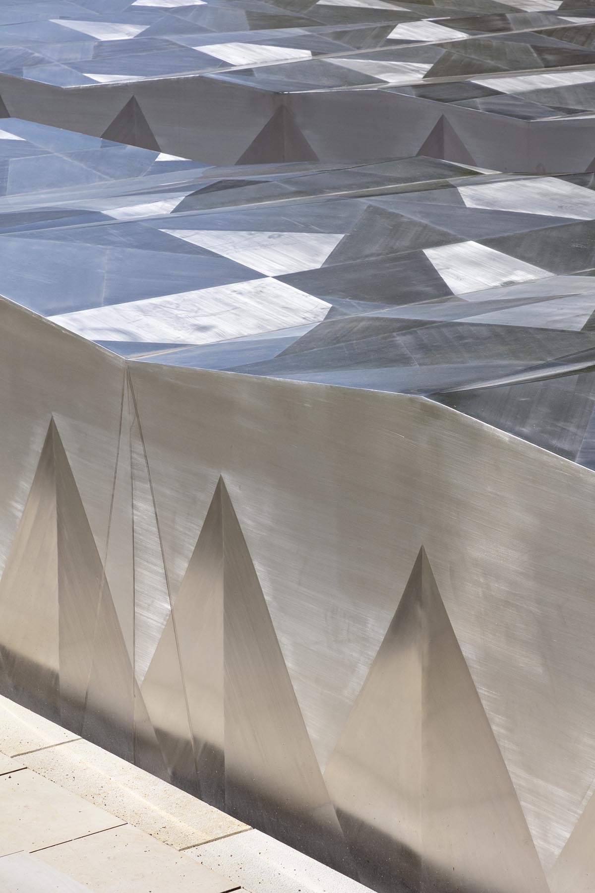
Described as "a hidden treasure that reveals itself as it appears during excavation", the structure glistens in the landscape. The outer façade of the structure features several cuts in a wide range of different facets and is polished in different directions. Snøhetta's structure creates a play of light throughout the days and shifting seasons.

"Conceptually dubbed “Himmelhaven” (“Heaven’s Garden”) the extension exterior is very much a “clin d’œil” to the impressionistic art period, characterized by its constant efforts to capture light and its changing qualities, and immortalized on canvases by world-renowned artists such as Manet, Monet, Degas, and Renoir," said Snøhetta in its project description.
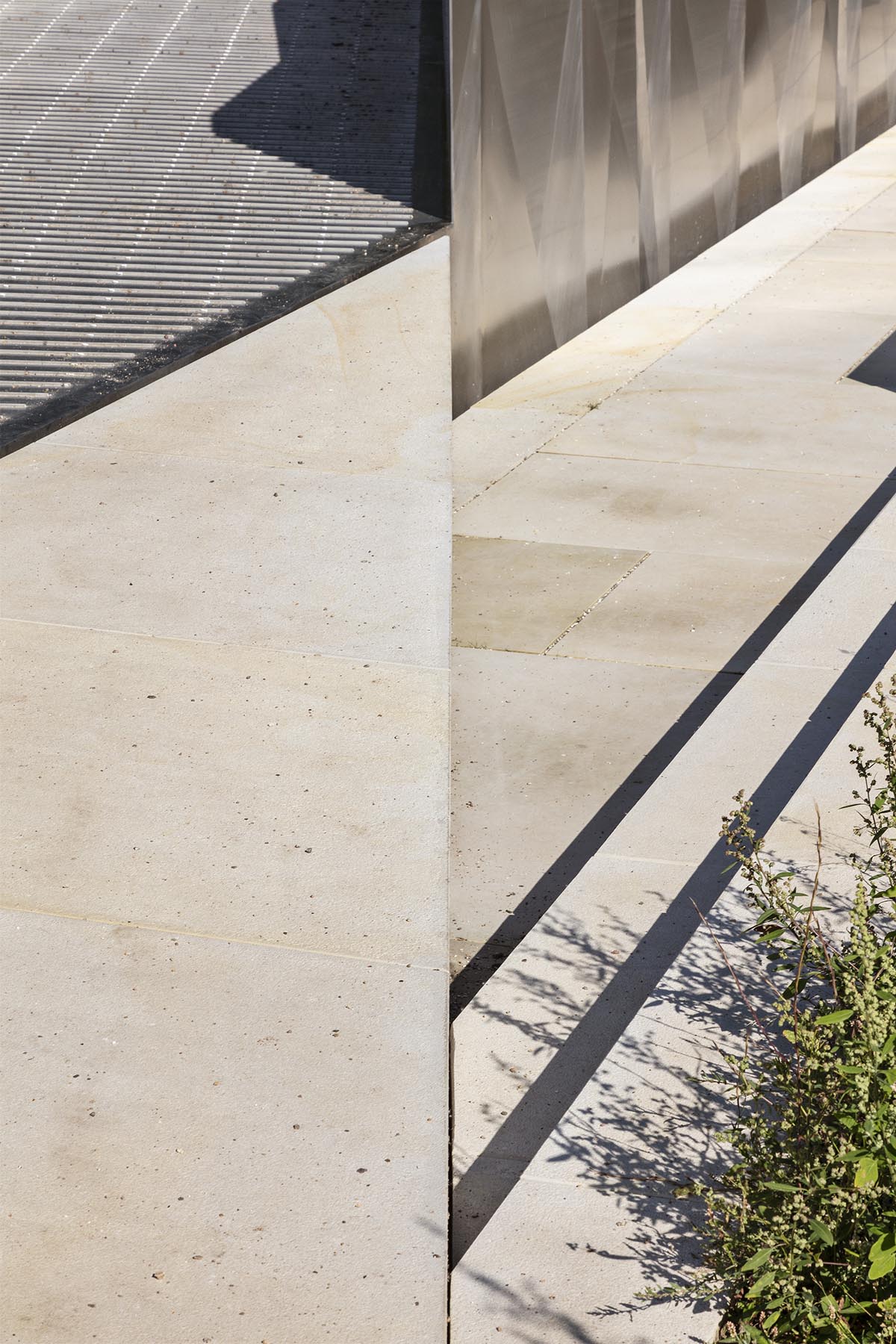
"The structure is further characterized by a diagonal cut in the landscape that intuitively leads visitors to the main entry by Hadid’s 2005 extension."
"The cut forms a bridge of natural stone linking entry and garden," the firm added.
The illusion of Himmelhaven being excavated from the landscape is further emphasized by the structure’s surrounding mini-atrium which is half sunken into the ground.
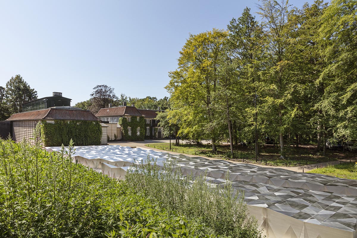
With its integrated lighting and seating areas it becomes a space where visitors can sit down and linger, enjoying the views of the lush century-old park surrounding the museum.
Referred to by the architects as a "third parterre”, Snøhetta’s extension marks a continuation of the landscape and is placed at the intersection of Ordrupgaard’s English style park with its deciduous trees, many of them fruit bearing, and an adjacent smaller French-inspired rose garden.
During the construction phase, Snøhetta’s landscape team worked meticulously to safeguard the protected park, ensuring a surgical-like cut between the surrounding park and new extension.
Snøhetta has also altered the landscape surrounding Hadid’s extension with great care, planting the hillside with meadow flowers, and excavating the building somewhat, as well as integrating the building with the two Hadid-inspired subterranean exhibition spaces.
The museum looks like "a jewelry box"
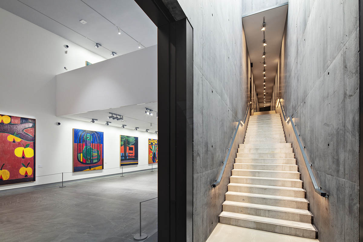
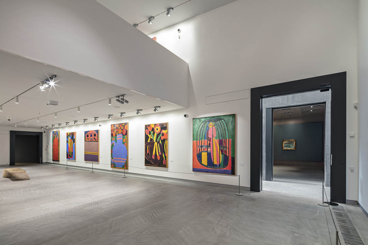
While the two exhibition spaces expanding the 2005 building mark a continuation of the dark concrete materiality palette characteristic for Hadid’s design, the additional exhibition spaces are dedicated to the museum’s impressionistic art. These spaces are made up of two smaller and one larger space in a much lighter color and material palette.
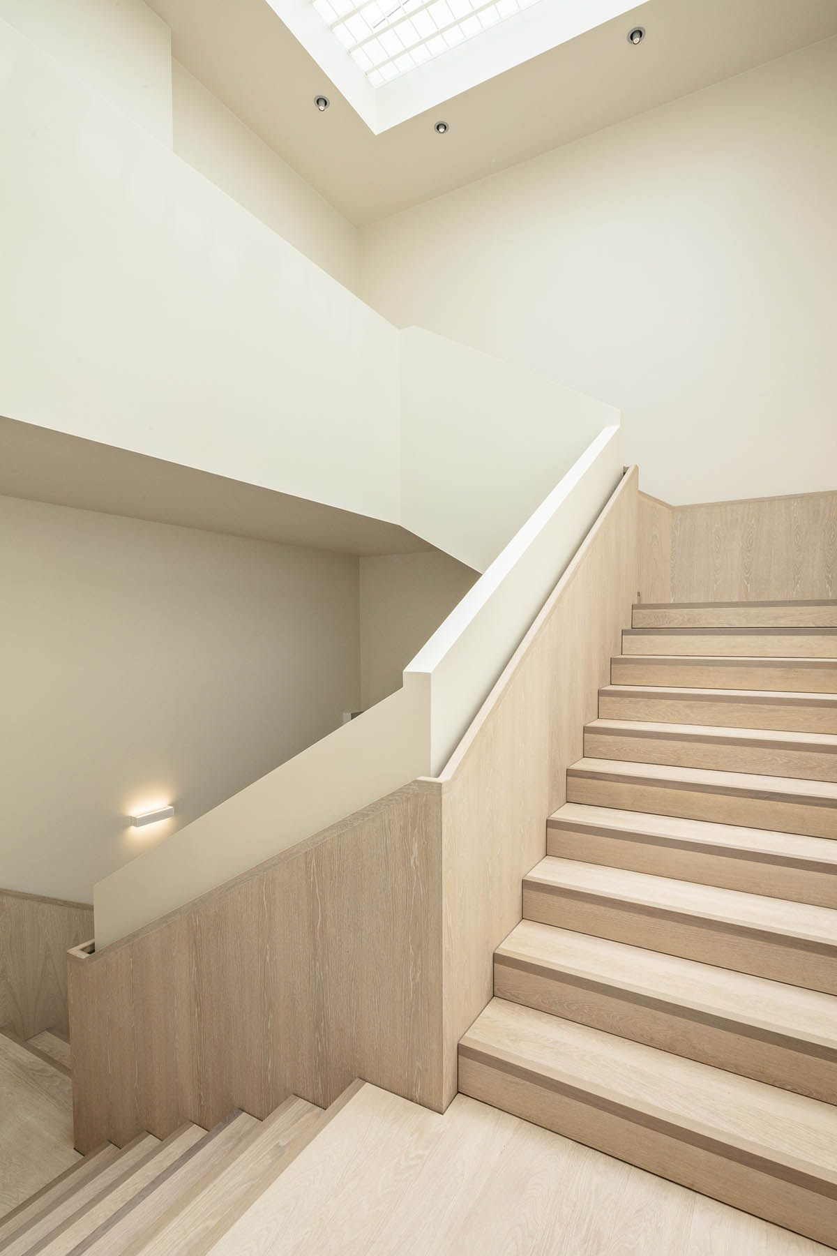
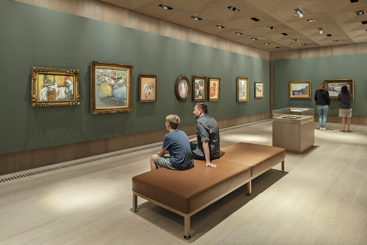
Snøhetta designed the interior spaces in close collaboration with the museum and they are all furnished with oak floors, walls, and ceilings, providing a light, organic and warm atmosphere.
The team used gypsum boards that are mounted on the walls allowing for the museum to effortlessly curate art pieces and change the color palette of each exhibition room when needed.
The exhibition ceilings are covered with oak veneer cassettes with carefully integrated light installations, providing a seamless and harmonious design that places the art pieces at the center of attention.
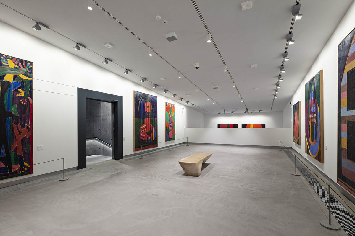
While the outer skin of the museum contrasting with the reflective steel exterior that is partially visible from the outside, the inside of the exhibition spaces forms a sense of softness and comfort, evoking almost the design of a classic vintage jewelry box, with its hard, metallic exterior and soft, velvety lining on the inside.

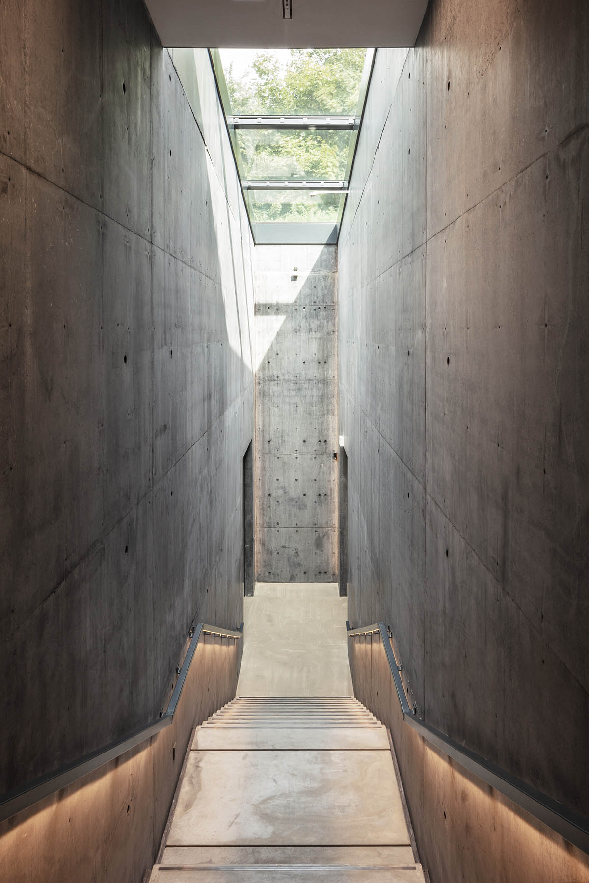
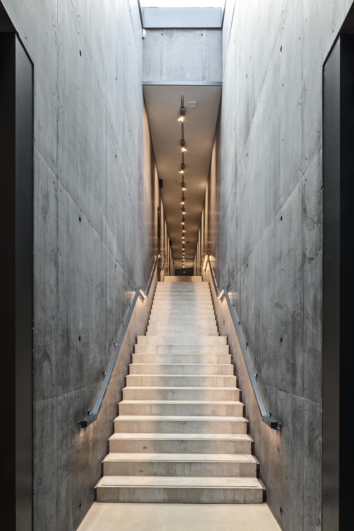
Throughout the museum journey, Snøhetta has also accommodated for natural daylight to penetrate the building, both as visitors leave the exhibition spaces linked to the 2005 extension, but also as one exits the permanent impressionistic exhibition and enters the original museum and its winter garden.
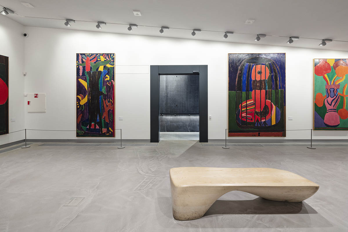
"These slots of daylight create a clear transition from one building to the other, leaving room for visitors to appreciate the individual design of each part of the museum as they move through the building," added the firm.
Through its subdued yet powerful design, the Ordrupgaard extension by Snøhetta respectfully blends in with its existing surrounding, whether vegetal or built, historic or contemporary, all while adding its own interpretation of time and space and bringing all elements together in a circular and enhanced museum experience for future generations to enjoy.





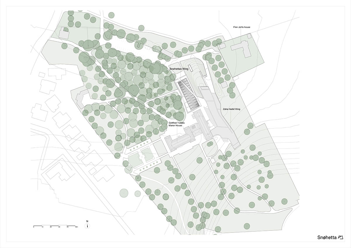
Site plan

Ground floor plan
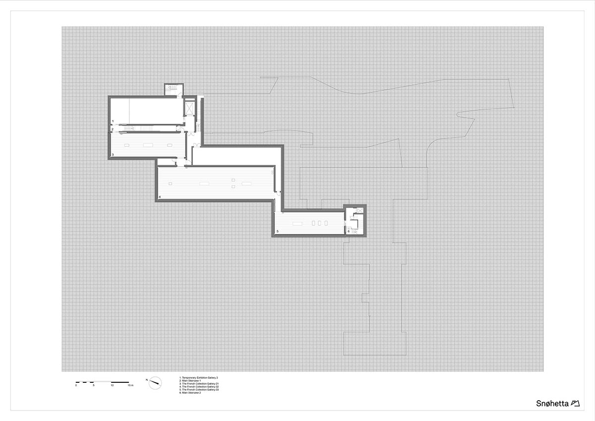
Exhibition plan
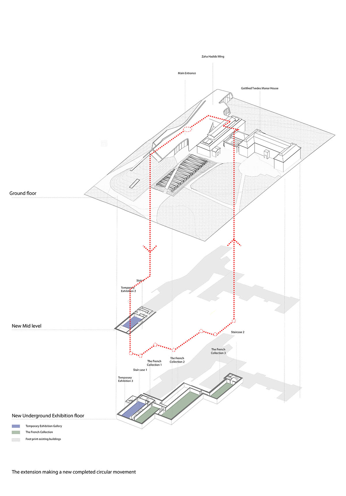
Circular movement diagram
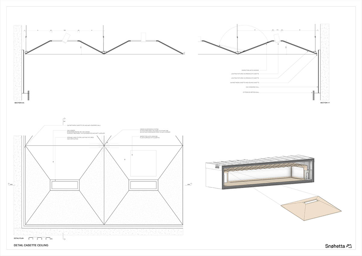
Detail ceiling casette
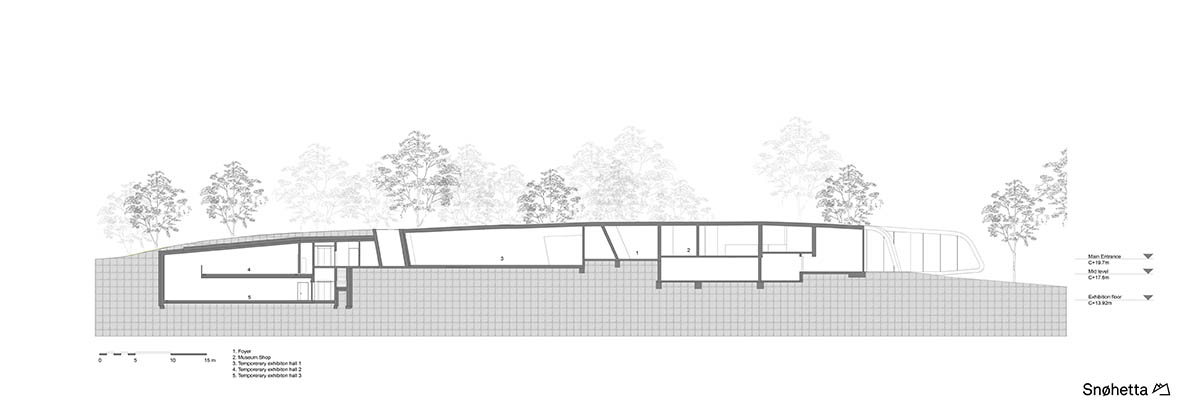
Section
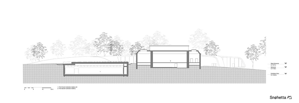
Section
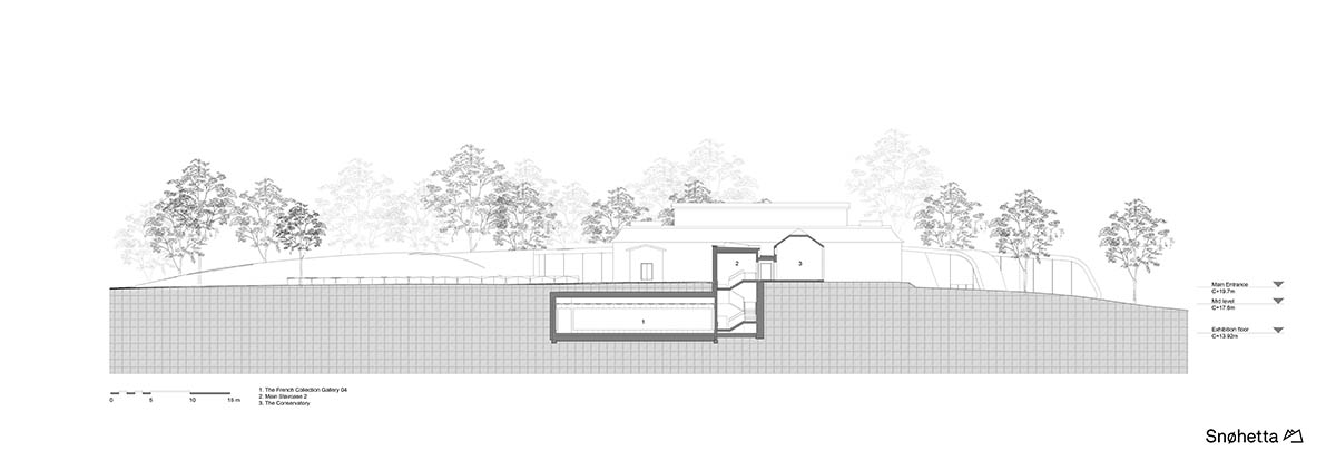
Section
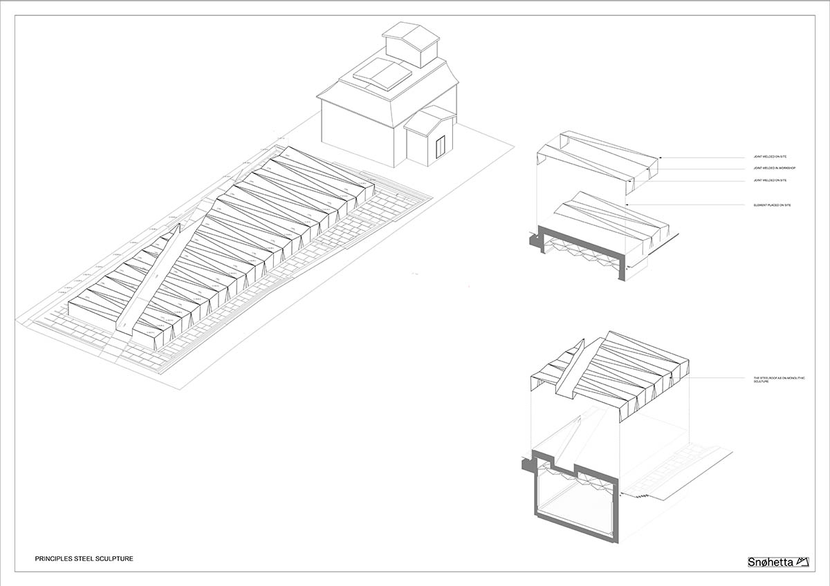
Steel roof
All images © Laura Stamer
All drawings © Snøhetta
> via Snøhetta
