Submitted by WA Contents
CUN FF uses a play of substraction in a wedding dresses customized store in China
China Architecture News - Nov 04, 2021 - 15:44 2093 views
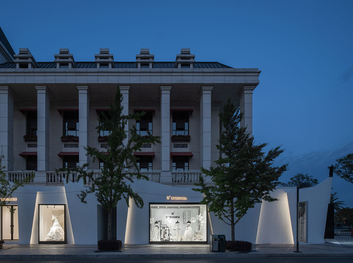
CUN FF has designed a wedding dresses store by using a play of subtraction method to create a customized space to promote only the wedding dress.
Named W.DRESSES Customized Space, the 900-square-metre space is located at the Park 1903 shopping center in Kunming city, Yunnan province, China.
The designer sets the main theme of this wedding dress space as purity and pure white. There is no complicated structure and no colorful colors here. He does subtraction in the space and revolves the construction of the main stage around the protagonist.
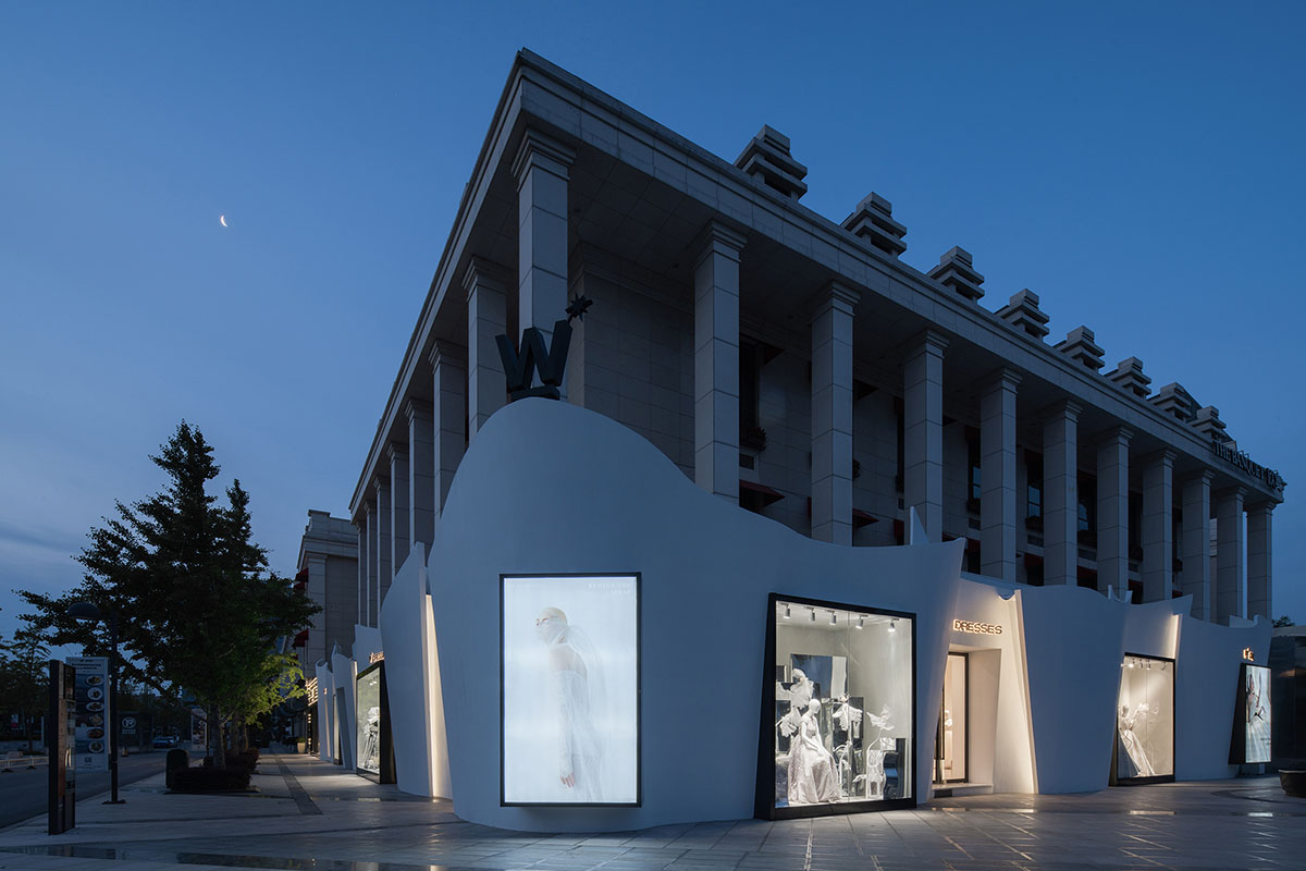
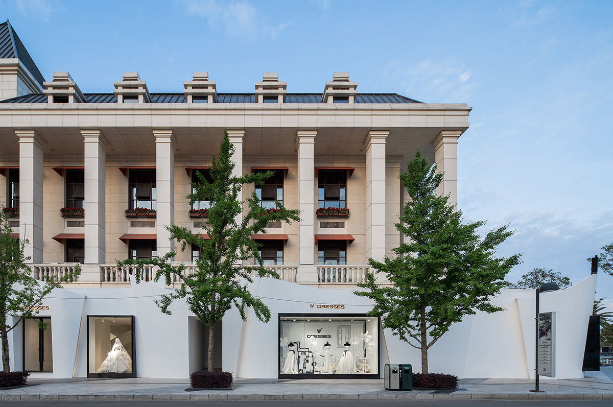
Exterior facade
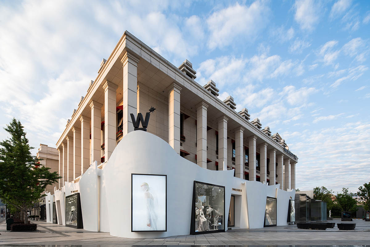
Row upon row of the silks and satin of wedding dress constituted by the flexible modern wall line surrounded French architecture behind. The aesthetic formed by the conflicting between modern and retro sets the tone from the first look. The light belt that does not compete with the main character set off the display window and advertisement logo in the white wall outside more soft and quiet.
The collision and interweaving between French architecture and modern avant-garde expression in 1903 presents an extra harmonious and elegant atmosphere when getting along with the surrounding environment. The appearance of light and sunshine presents completely different textures at different times of day and night, and the designer's delicate expression of details is all showed in smart lines.
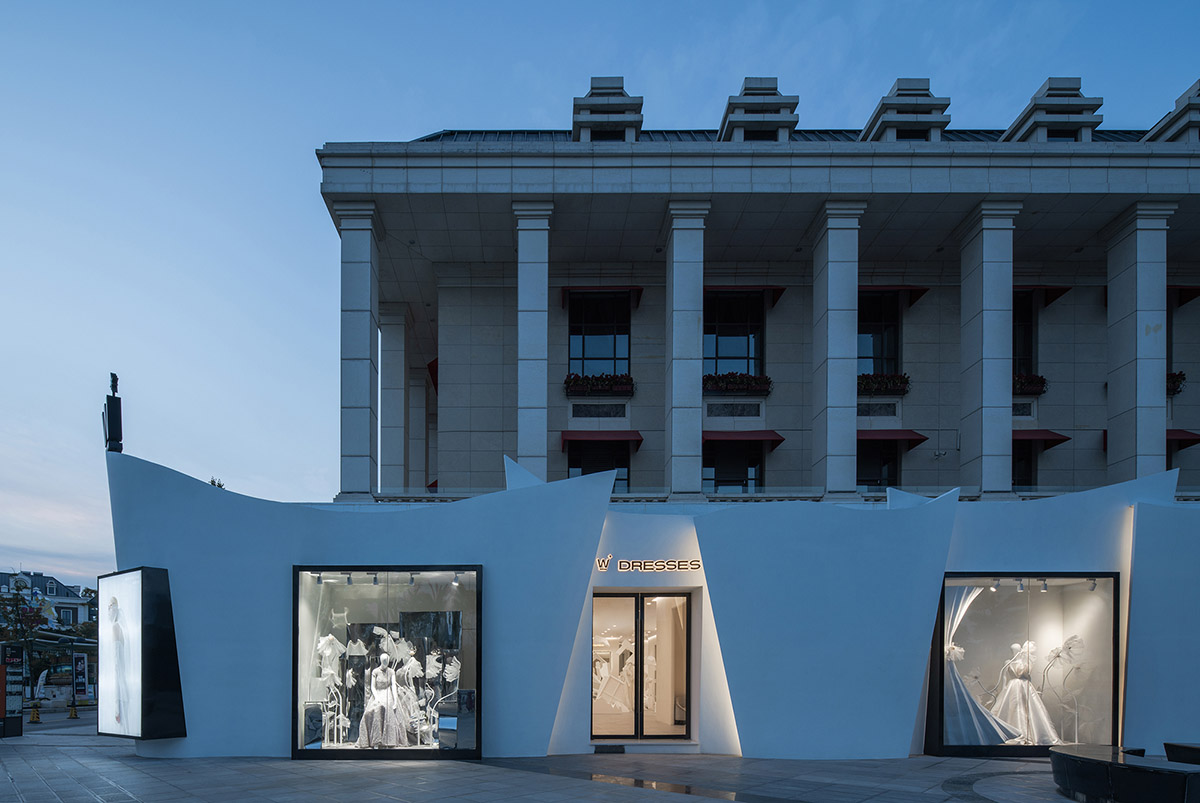
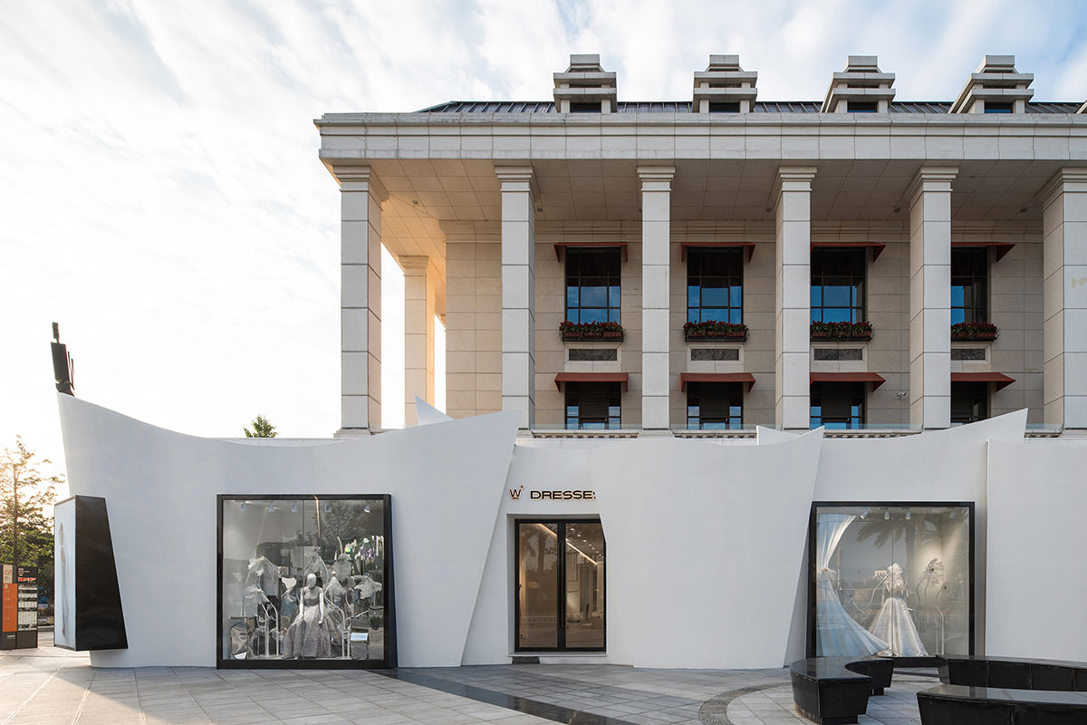
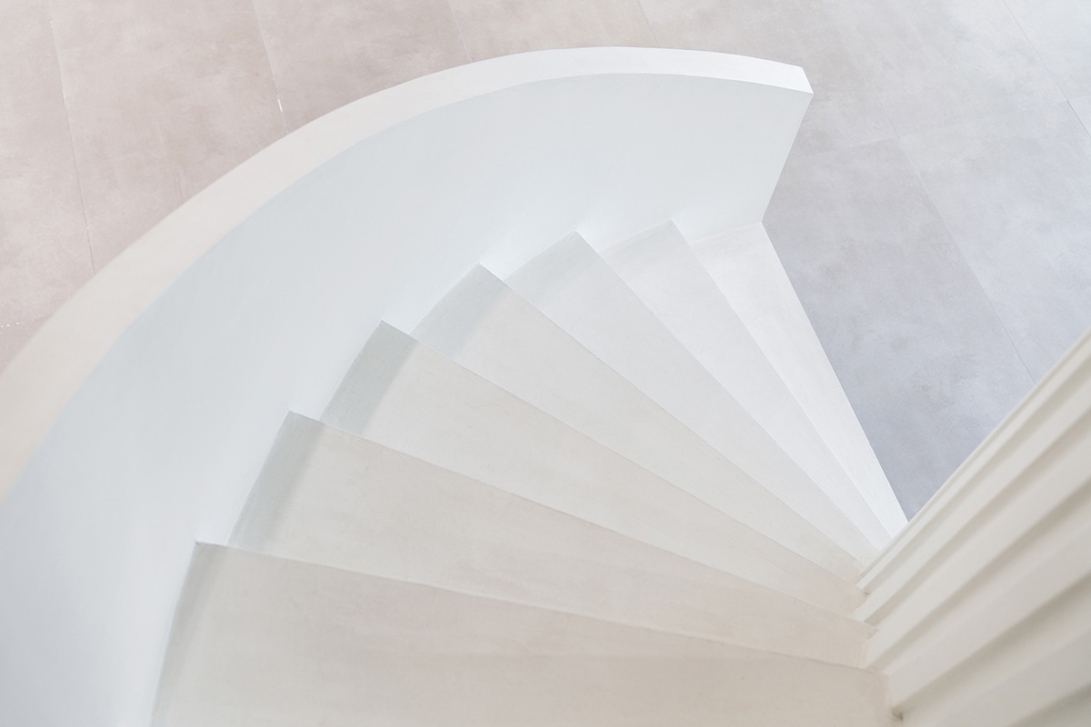
The parallelism of concave-convex relationship and the echo of mosaic relationship, the radian of curve and the proportion of straight line are formed and determined after repeated scrutiny. The window is edged and closed in black bright stainless steel, and the curved wall is embedded in the white background.
The designer carefully designed the contents displayed in the window. What he wanted to show was not only the wedding dress, but also an attitude, confidence and pride for Party A, thereby making a design expression for the tonality of the brand.
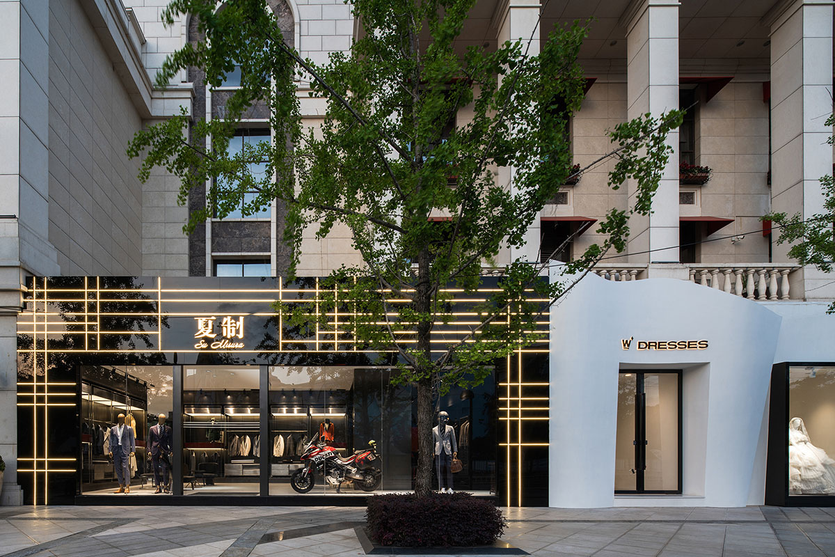
The two main entrances are set on both sides of the left and right corners, forming a tandem concave and protruding echo relationship with the window. The window is highlighted for the purpose of attracting more attentions of the guests, and the entrance is concave inward, giving guests more sense of ceremony before they enter the store.
The designer puts the simple logo in the southeast corner of the highest undulating line, which is conspicuous but low-key. It waits for the last sight of the guests entering the store and makes a perfect ending for the whole appearance concerto.
Interior Space
Conflict and harmony are the hazy and inadvertently conveyed themes given to the whole facade by designers. It is easy to create visual conflicts between wedding dresses and suits, European styles and modernity, but it is rather commendable to find a harmonious balance in conflicts.
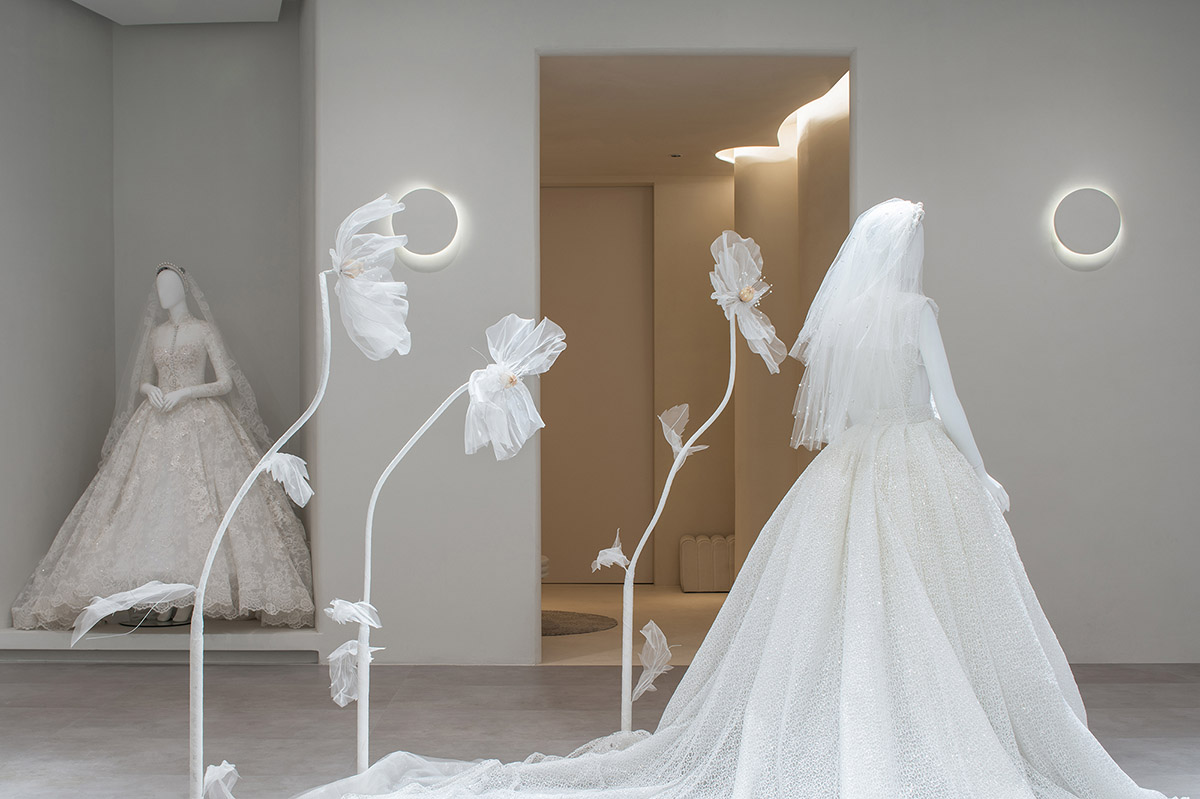
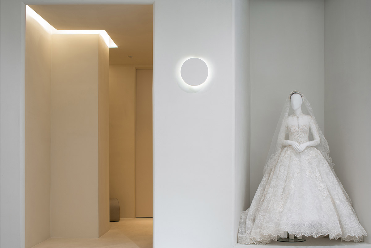
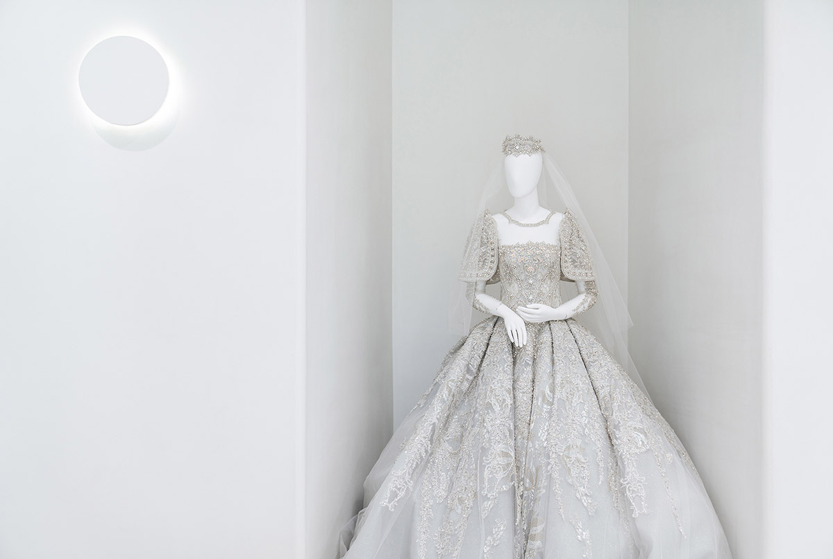
The designer sets the main theme of this wedding dress space as purity and pure white. There is no complicated structure and no colorful colors here. He does subtraction in the space and revolves the construction of the main stage around the protagonist-the bride and the wedding dress.
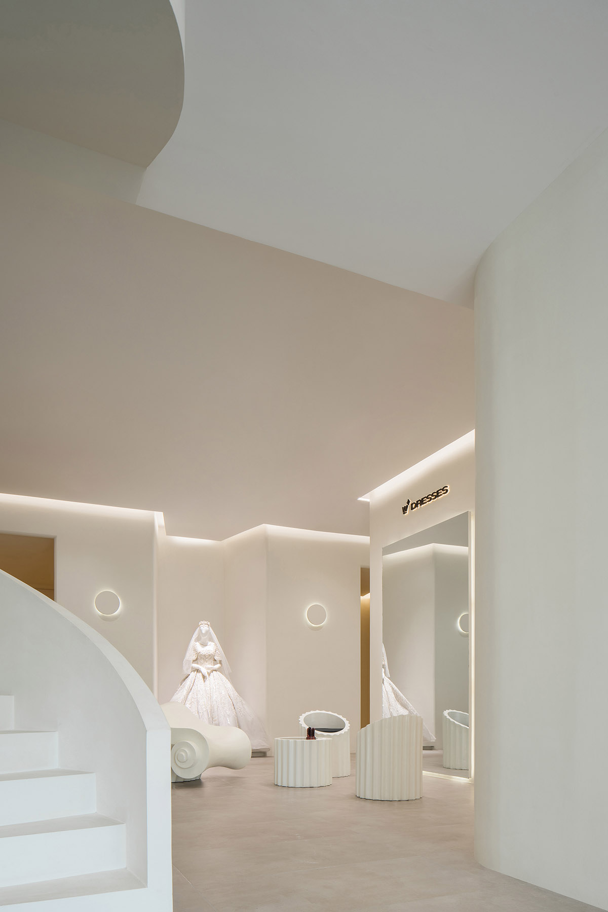
The designer laid out the fitting room, makeup area and wedding dress display area on both sides of the main stage by adopting the concept of runway show, and formed a catwalk "stage" with a large passageway in the middle.
Every bride who came out of the fitting room would walk to the huge floor mirror in the middle under the attention of everyone, and every bride would become the leading role at this moment.To accurately grasp the mind and psychology of customers is necessary professional quality of the commercial space designers.
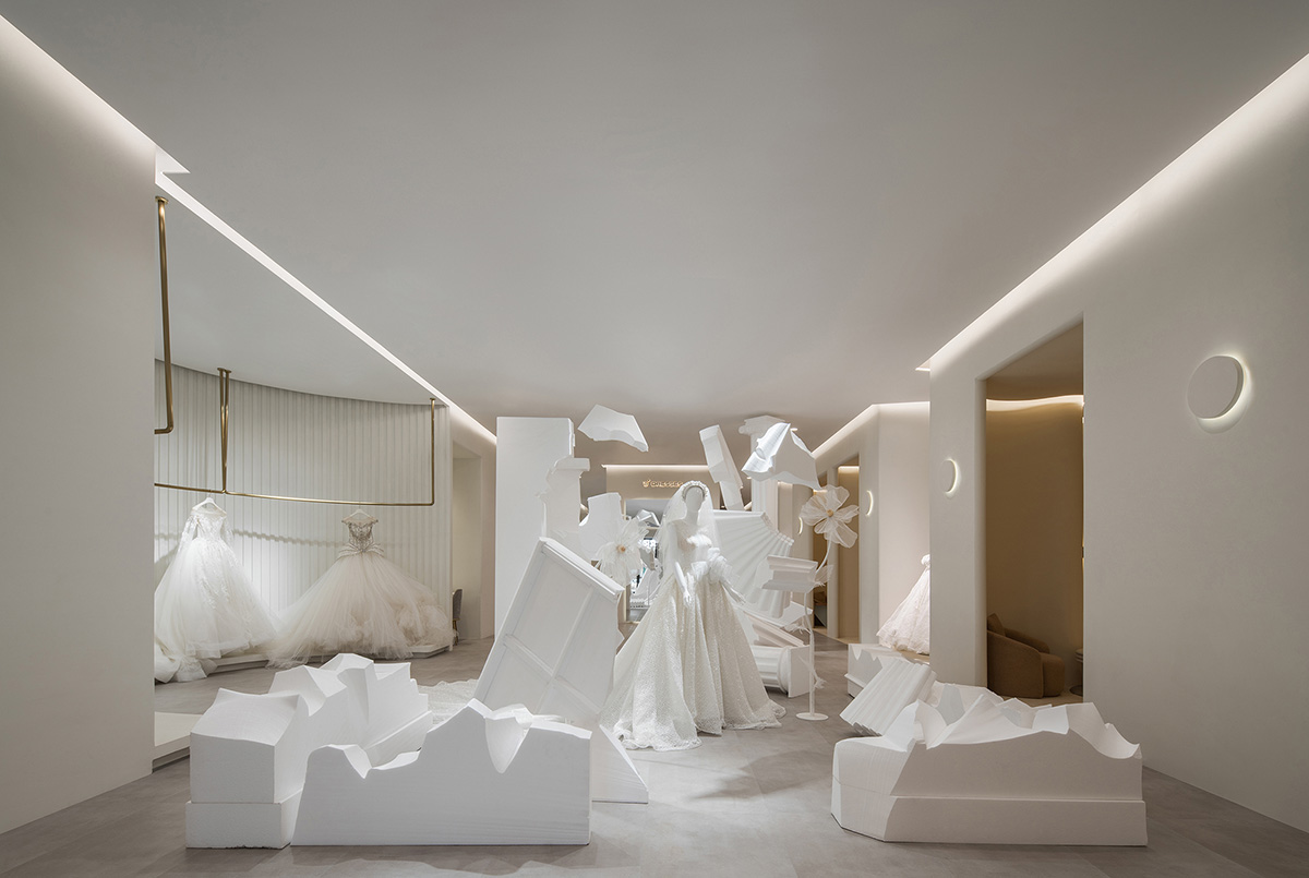
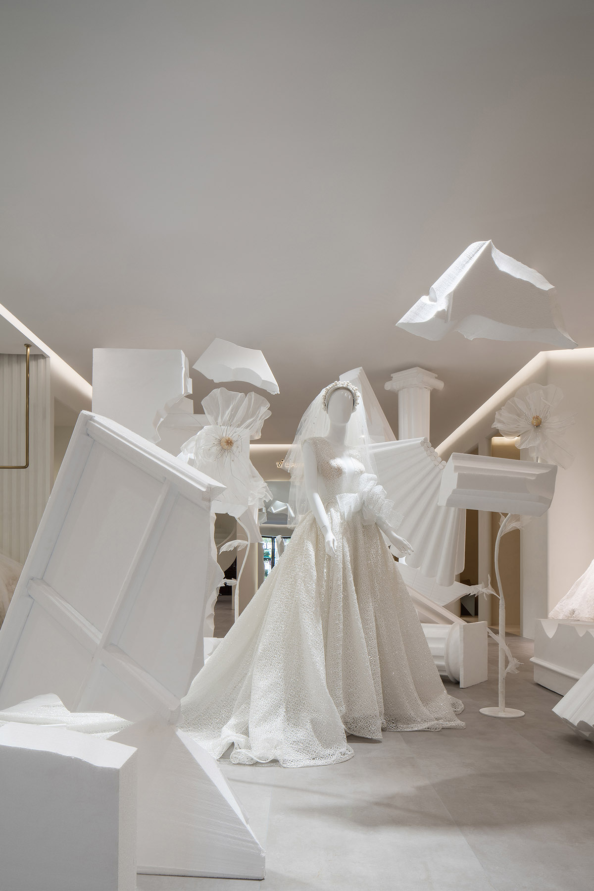
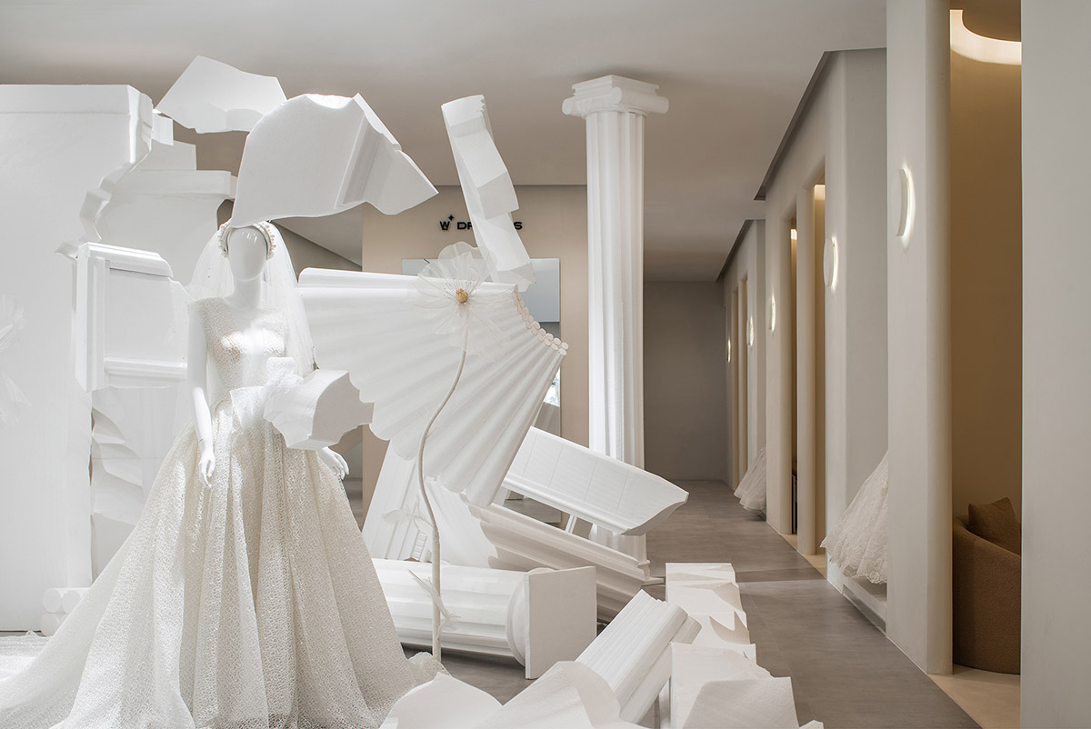
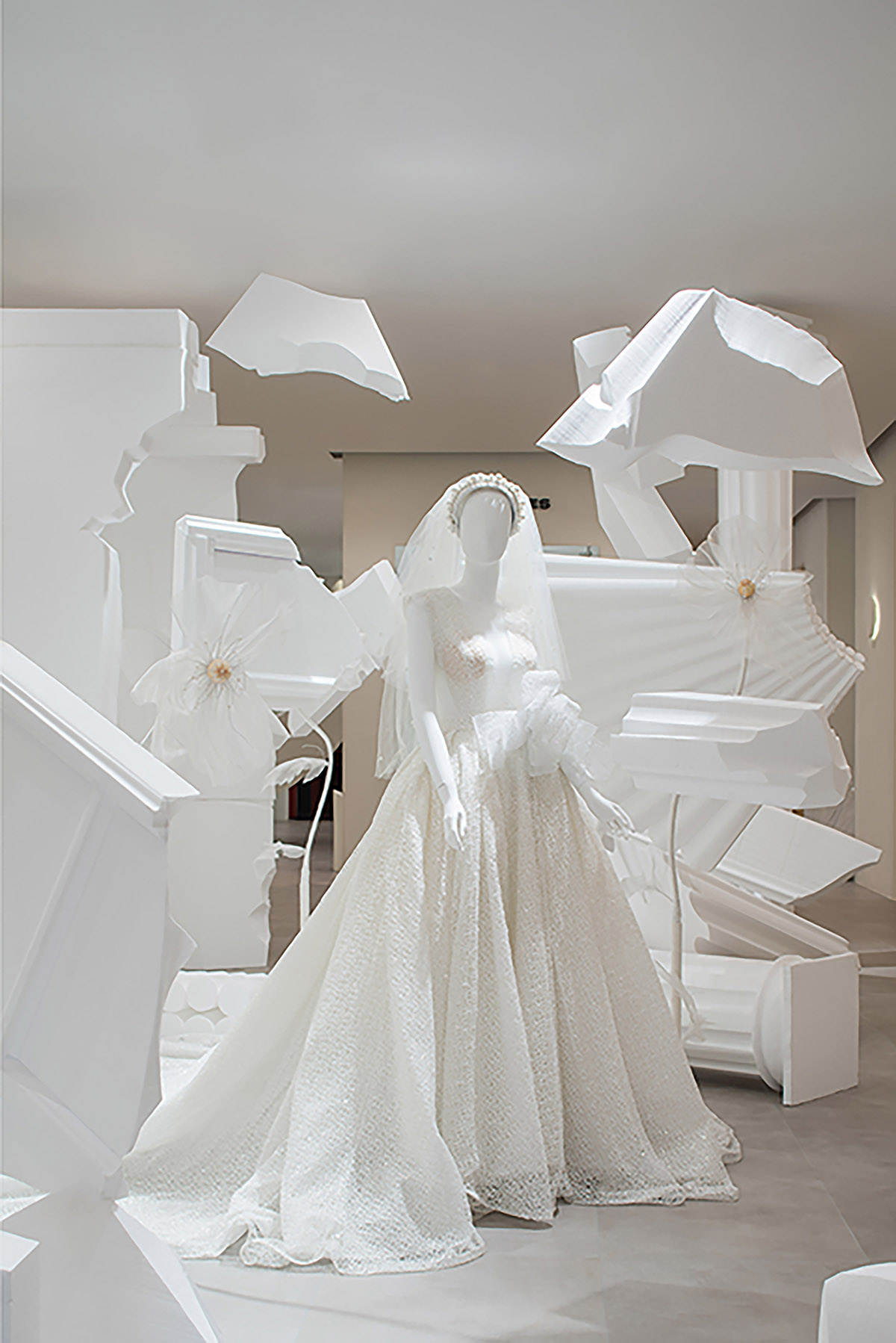
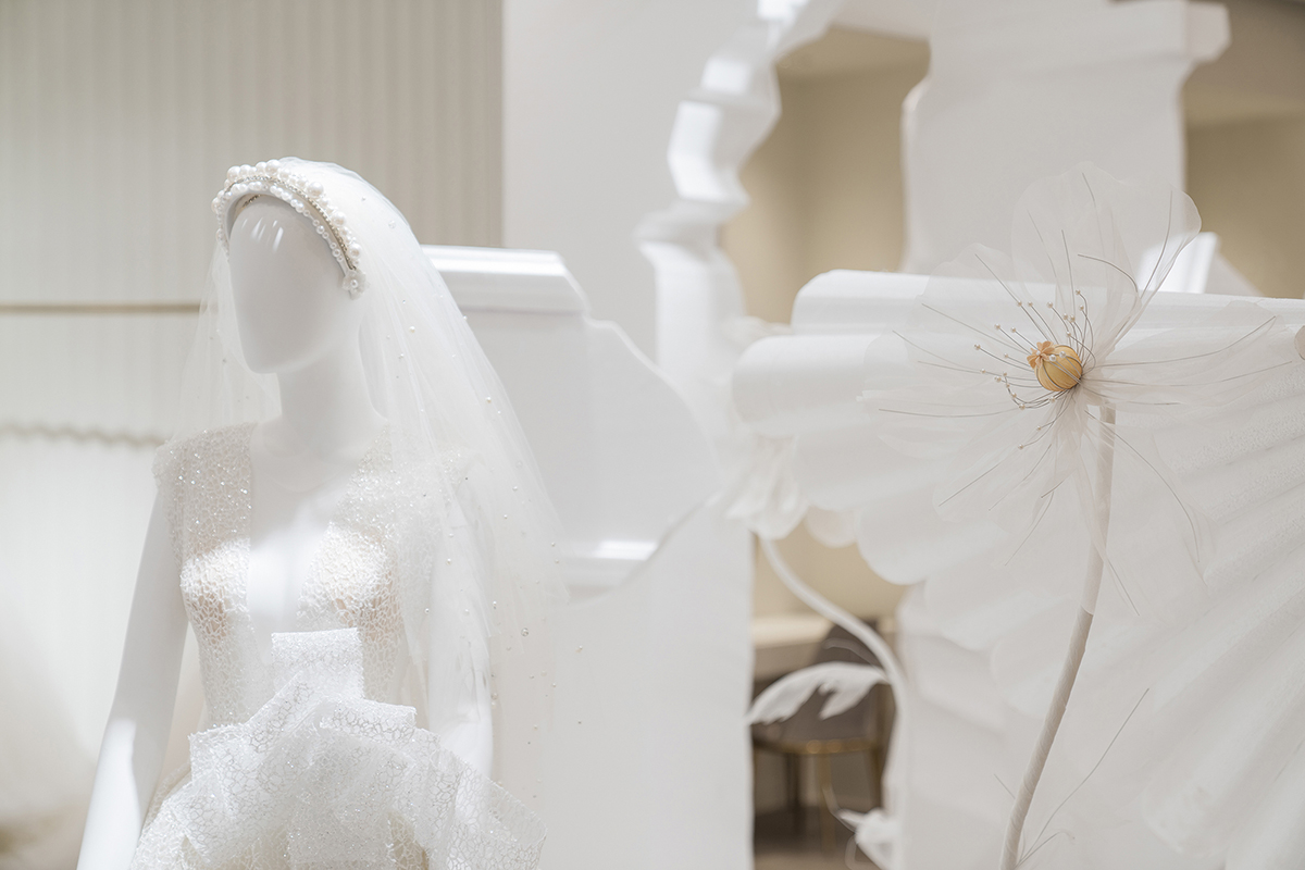
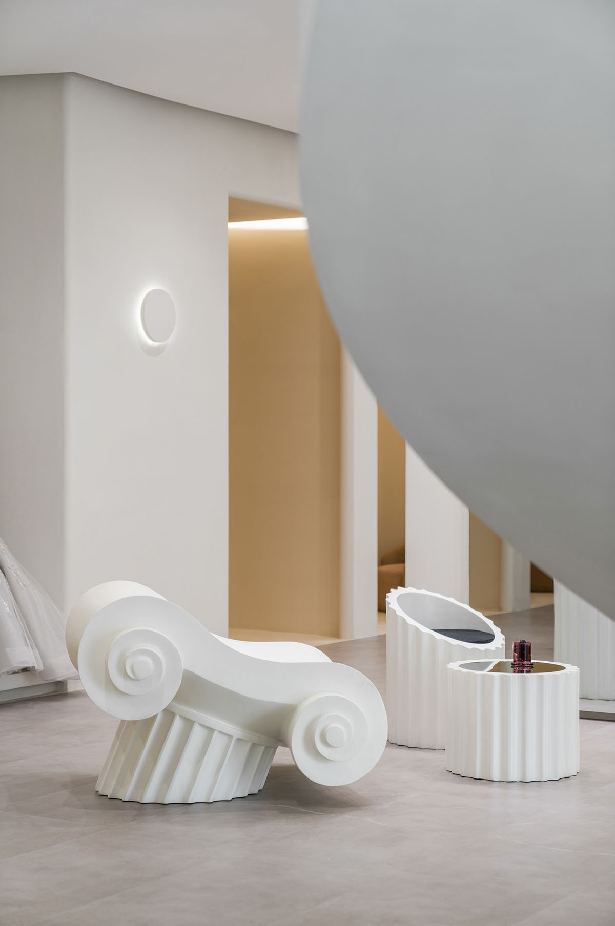
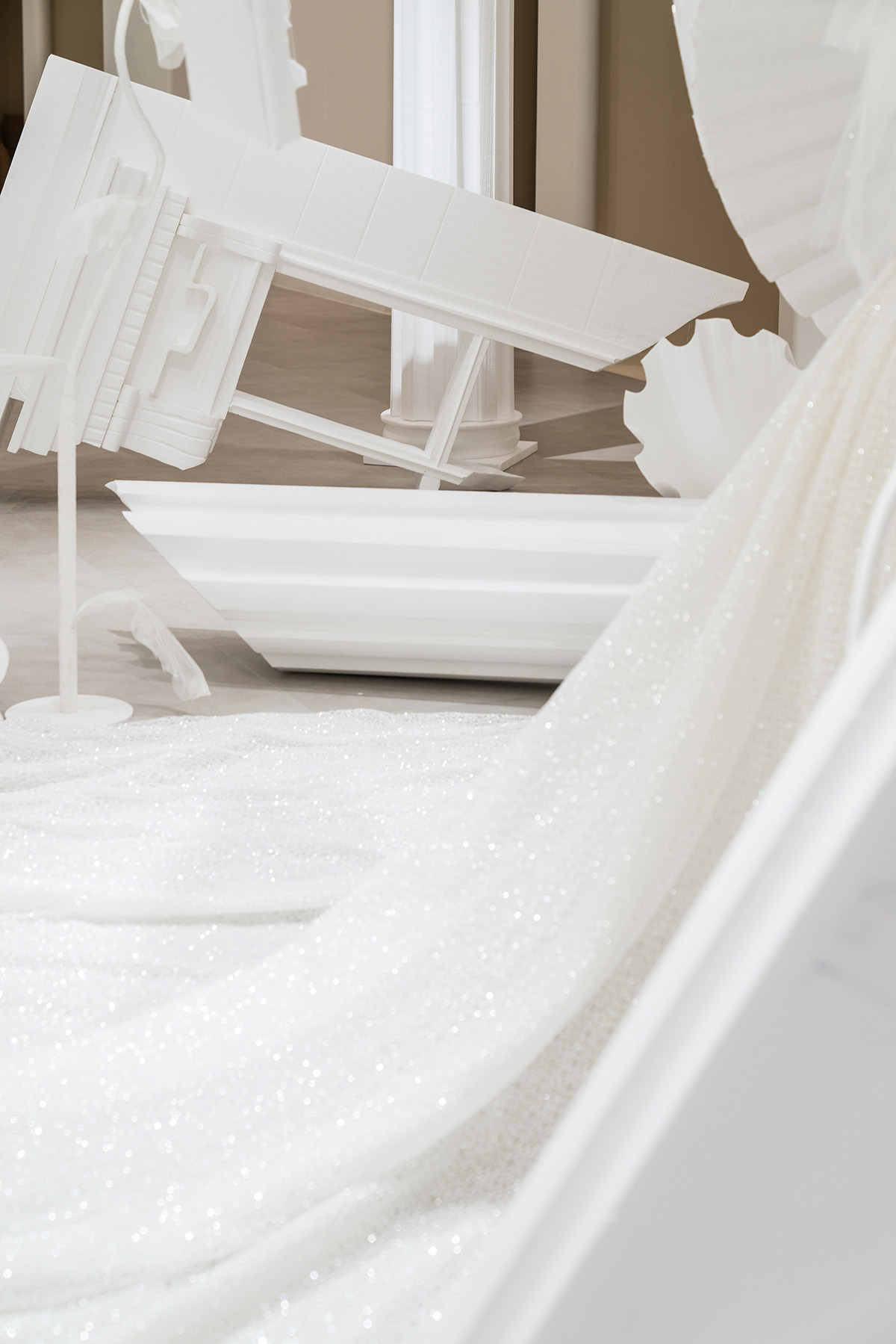
The "T-stage channel" has a multi-functional role. When the art decoration of carving and the beautiful wedding dress are arranged in the center of the “T-stage”, such a “T-stage” immediately turns into a booth for new product release. The designer also applies the conflict language between the fragmentation of European traditional elements and the modern minimalist background.
Specifically, the broken Roman columns and European window edges indicate the origin and inheritance of wedding dresses, and the floating, scattered and surrounded in fragments indicates the innovation that breaks the routine. This practice is not only the innovation of brand tonality, but also the innovation of design communication.
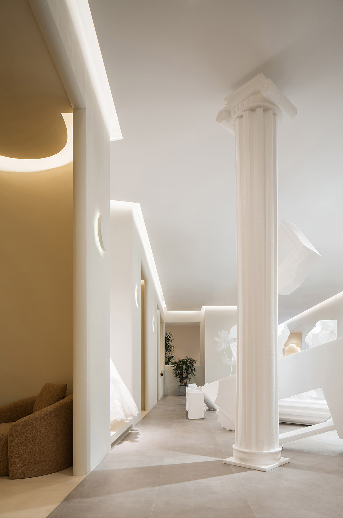
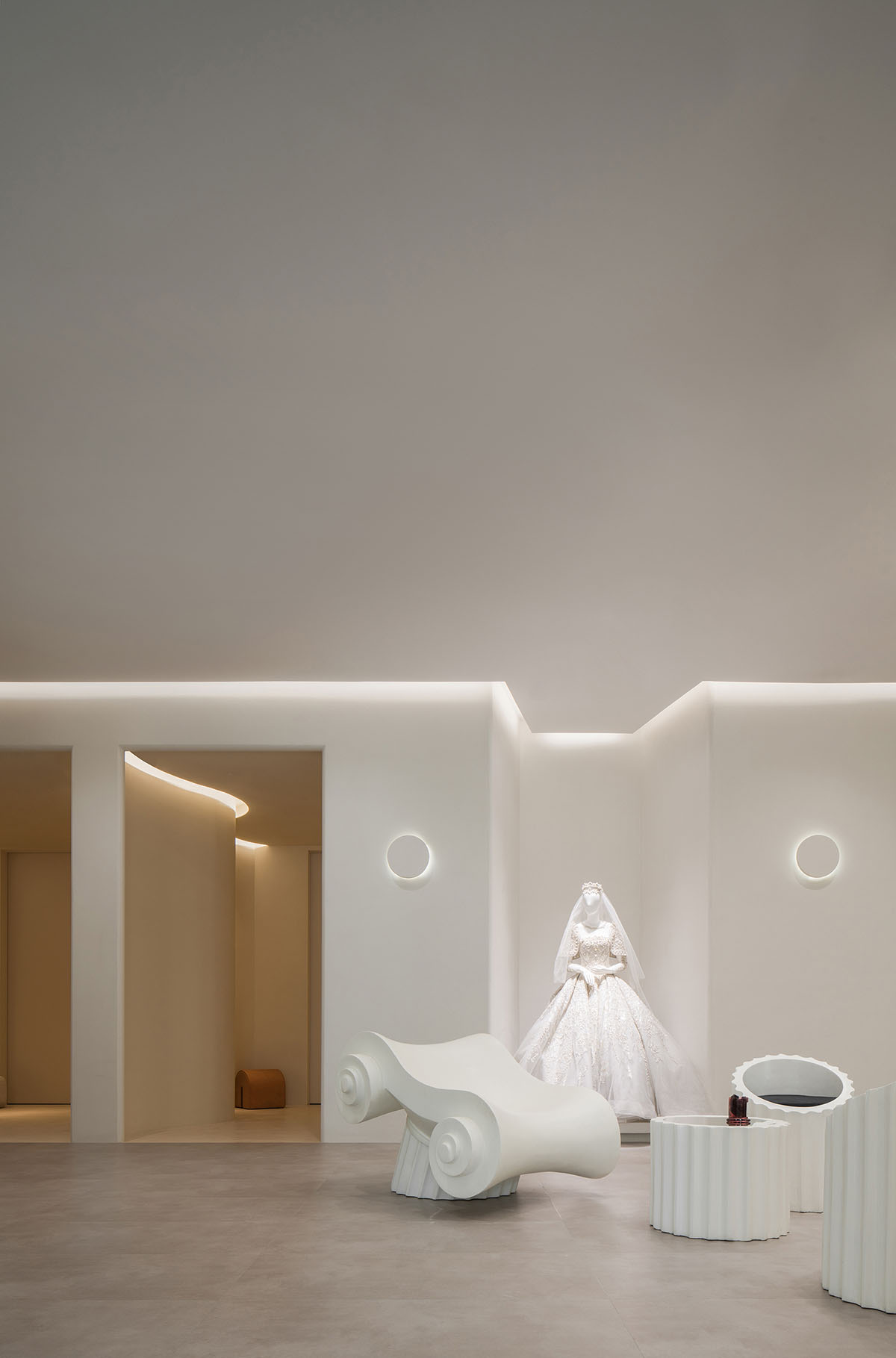
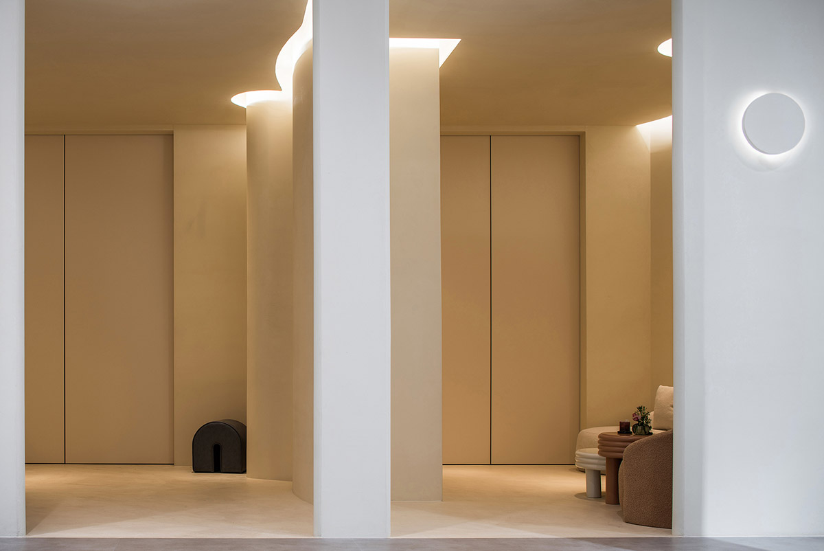
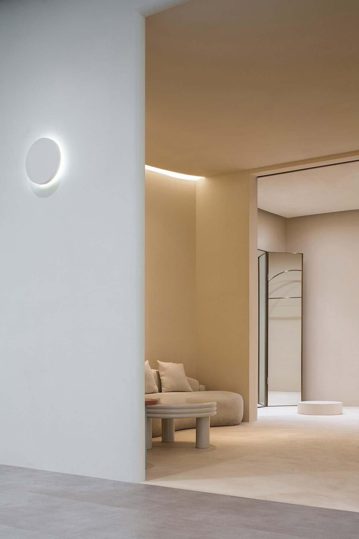
Although the theme is purity and whiteness, it will not bring people coldness and alienation in space. Designers use softer wall lines in the whole space, and performs the reasonable collocation and adjustment of cold and warm lights, so that the lights in open areas are brighter and more transparent, and the lines tend to be tough.
The lighting and lines of the fitting room are softer and warmer, and the camel carpet gives customers relaxation and freedom like living bedrooms; The collocation of cold and warm light forms a contrast between yellow and white on the facade using white matte texture paint, which is calm but warm, and also contains rich details and touch in the expansive decoration.
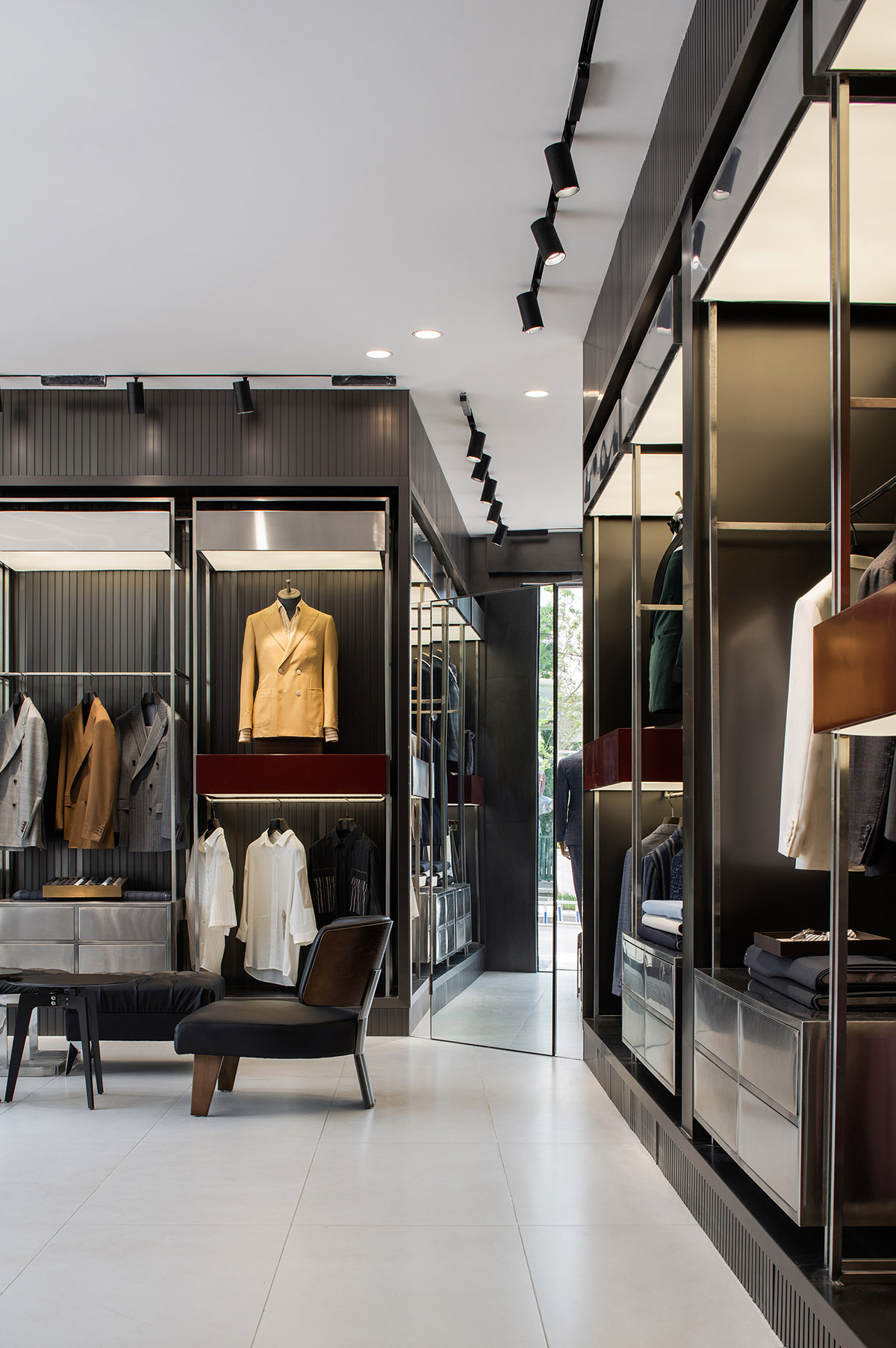
In the space treatment of men's suits, the designer echoes the indoor and outdoor main tones. The cool black facade, locomotives and armor form a more hormonal air and atmosphere. The display of suits is more casual, but the color matching and their positioning are performed after repeated scrutiny, and it is not just a simple stack.
Whether it is interior design or exterior design, designers make a more concise treatment in the way of expression. To realize this practice, they need more accumulation and courage. Designers intends to convey this idea through visual expression based on the fully understanding of the brand idea, and then convey it to the hearts of every customer.
Designers tries to present the space completely by dealing with the balance of contradictions and conflicts, the high unity of vision and feeling, and the bearing and foil of products and space.

Floor plan
Project facts
Project Name: W.DRESSES Customized Space
Location: Park 1903 shopping center, Kunming city, Yunnan province, China
Project Area: 900㎡
Opening Time: 2020.12
Completion Time: 2021.02
Design Company: CUN FF
Chief Designer: Fei FANG, Xuewan YANG
Construction Team: Reshape Construction Co., Ltd.
All images © Chuan HE from Xingzai Photography
> via CUN FF