Submitted by WA Contents
Colored neon lights bring 1920s Art Deco feeling to LULU Bar and Restaurant designed by DC.AD
Portugal Architecture News - Dec 29, 2021 - 15:42 4975 views
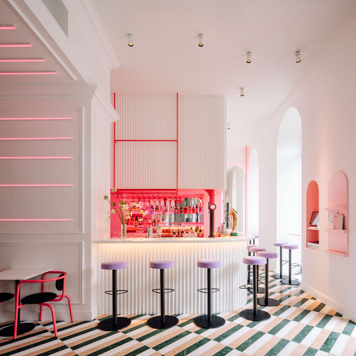
Lisbon-based architecture studio DC.AD has brought 1920s artistic Art Deco feeling into the interiors of this restaurant dressed with colored neon lights in Lisbon, Portugal.
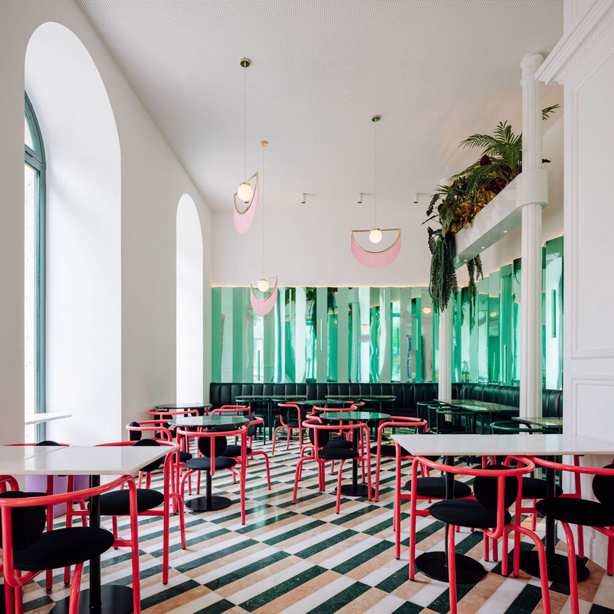
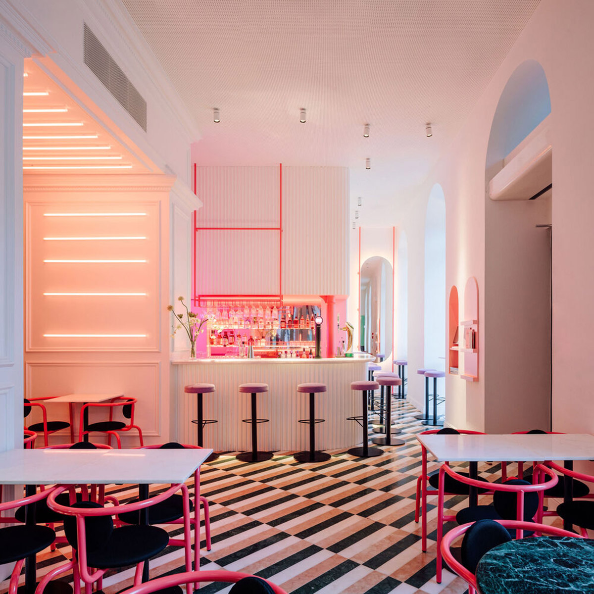
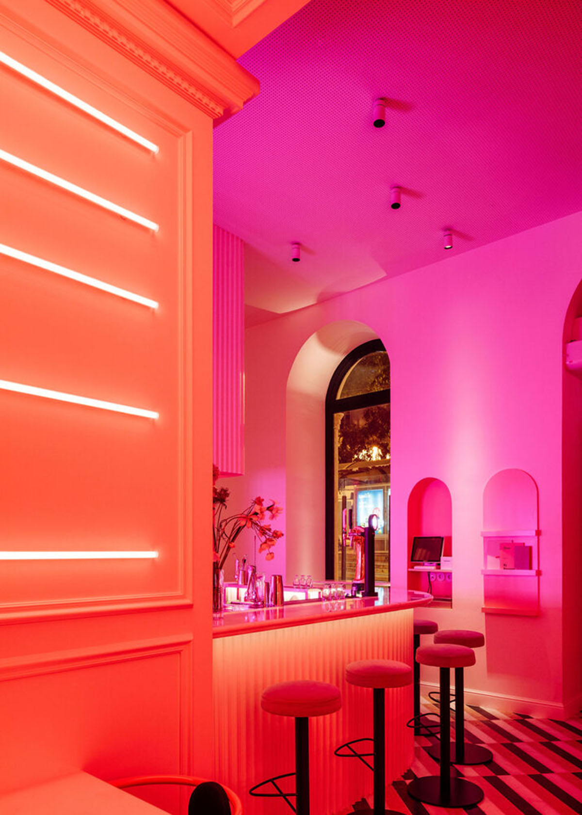
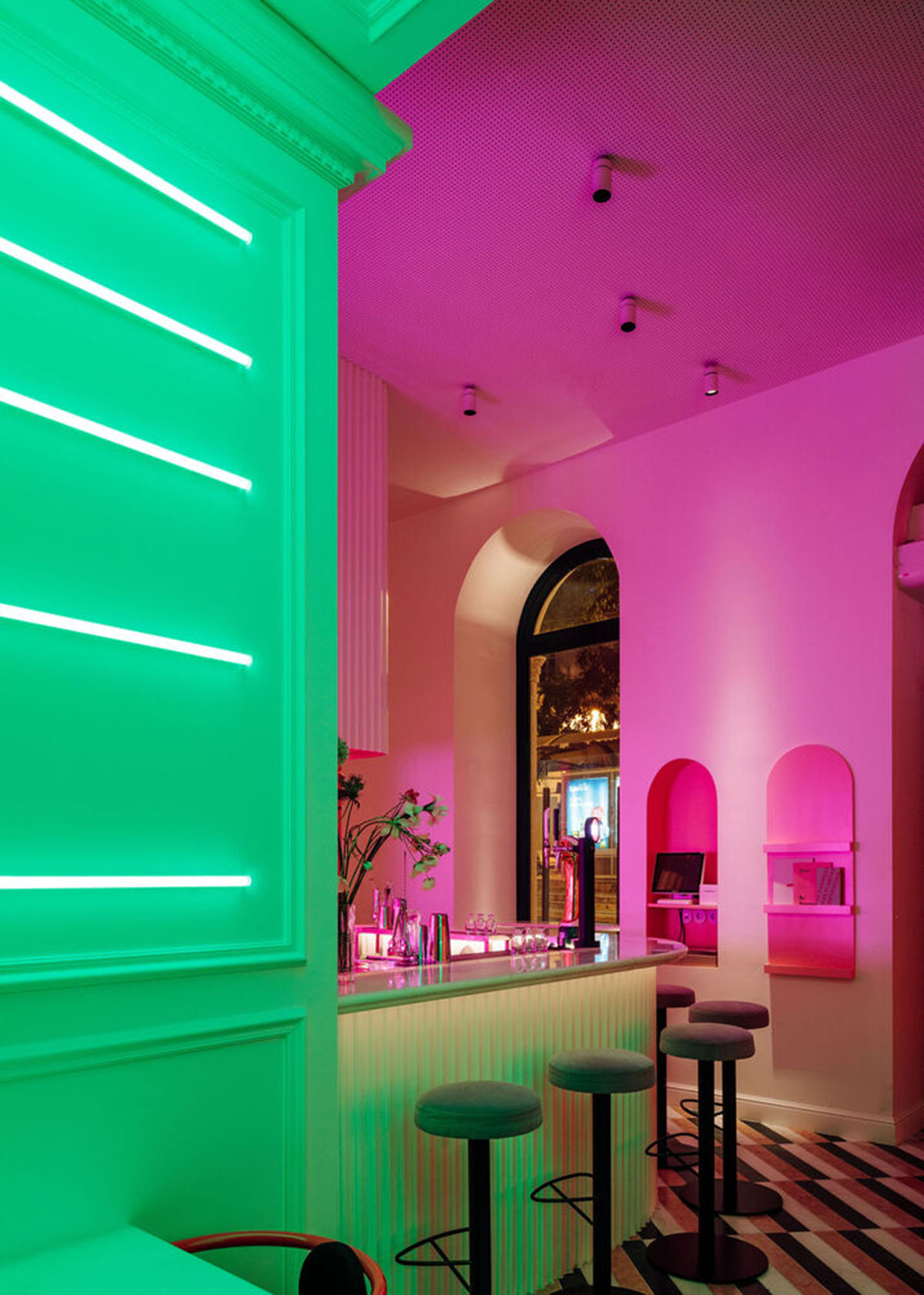
Named LULU Bar and Restaurant, the 170-square-metre restaurant has a specific character that is pointed out with the hues of pink, blue, dark green, and white combined with geometrical patterns in floors.
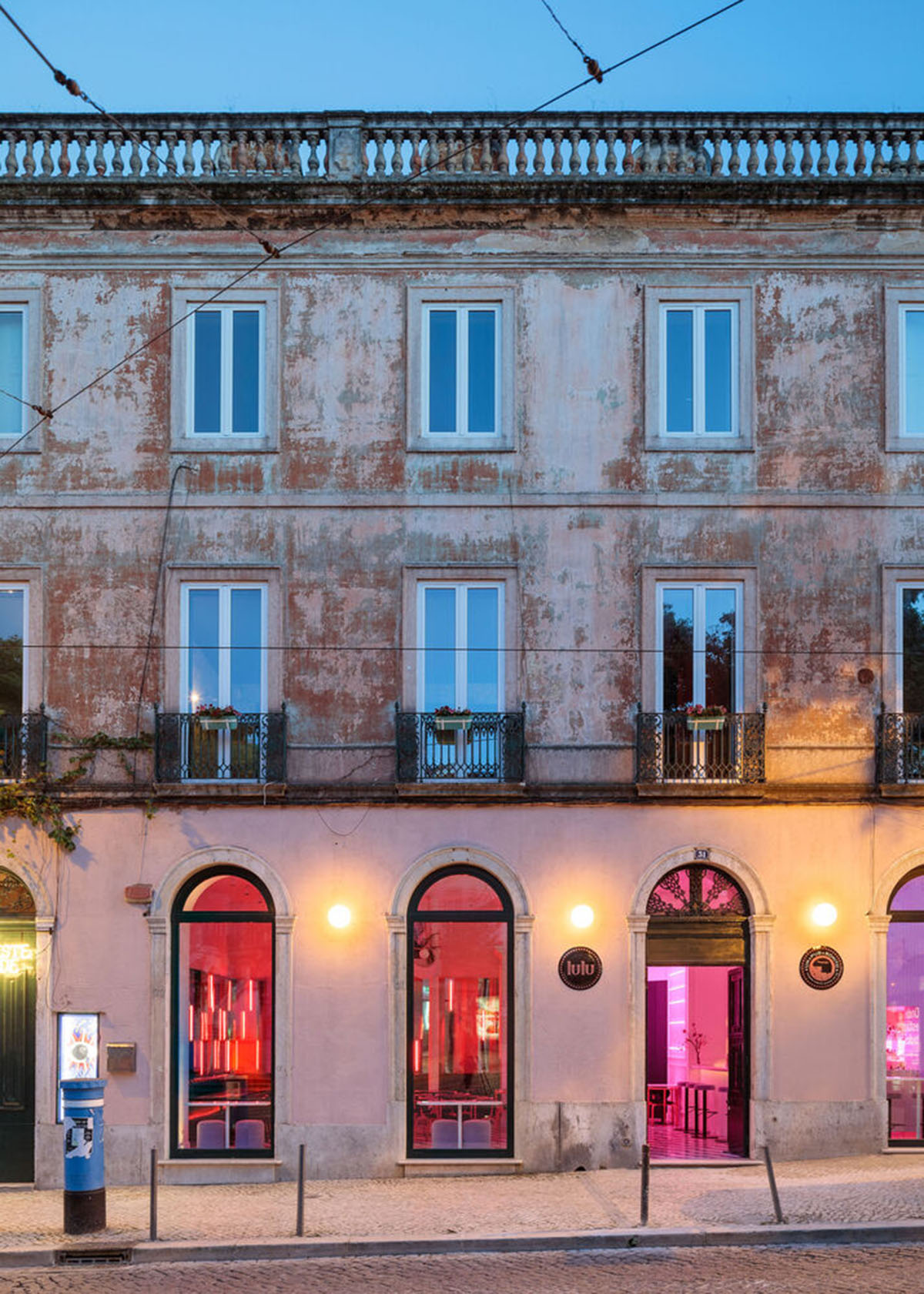
Located on the ground floor of an early 19th-century building in the Santos parish, in Lisbon, the building presents a colorful, luminous and bold appearance from outside to attract visitors' attention.
The project based on the idea of creating a more interesting ambiance inside, the architects' intention was to create a space inspired by the artistic period of the 1920s and specifically in an Art Deco style – as personified in the figure of the actress Louise Brooks, who gives the restaurant its name.
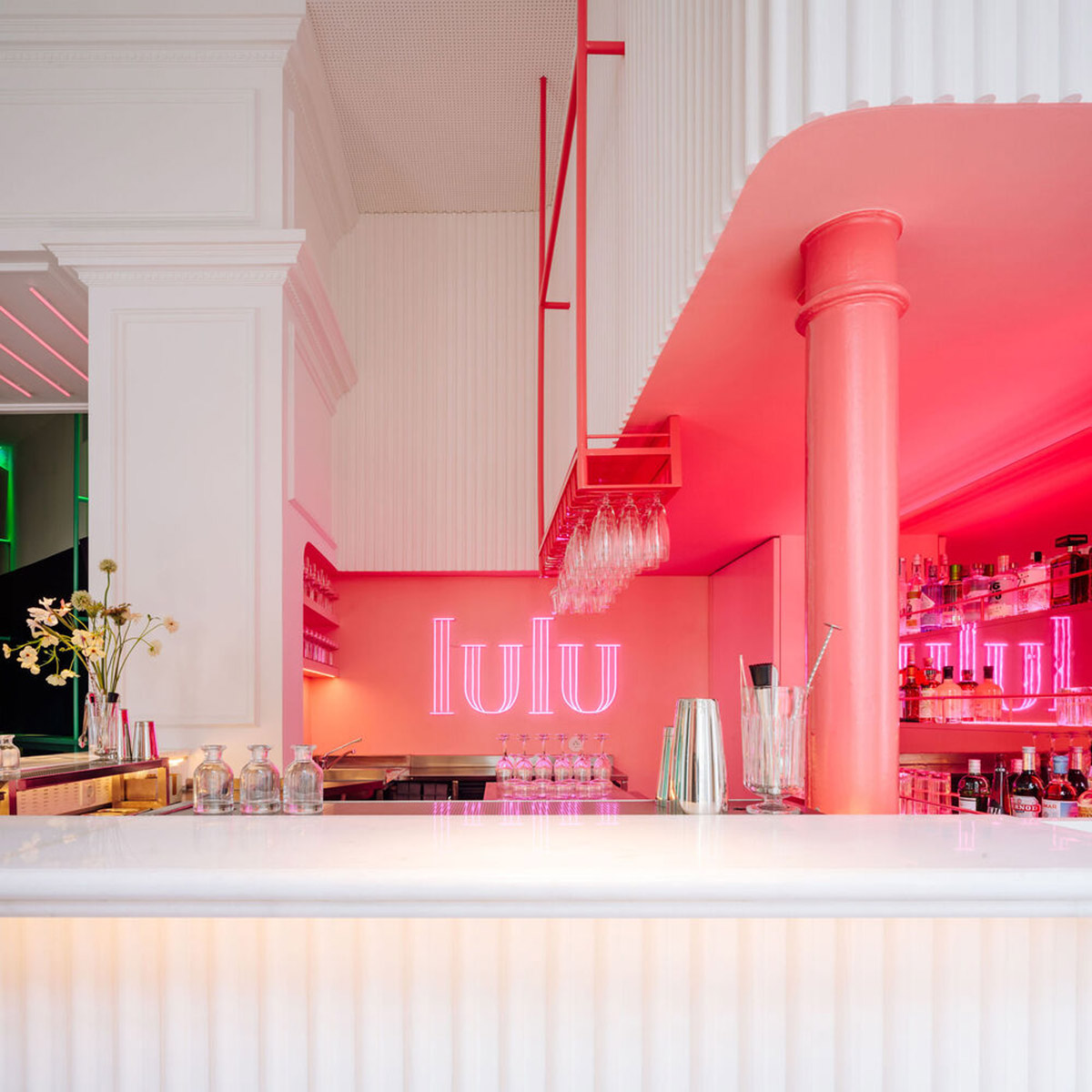
The functional program consists of a bar area, with seating and service counters, a customer area, with seating and a dance area, customer sanitary facilities, and technical areas with restricted access, such as the kitchen, pantry, and storage.
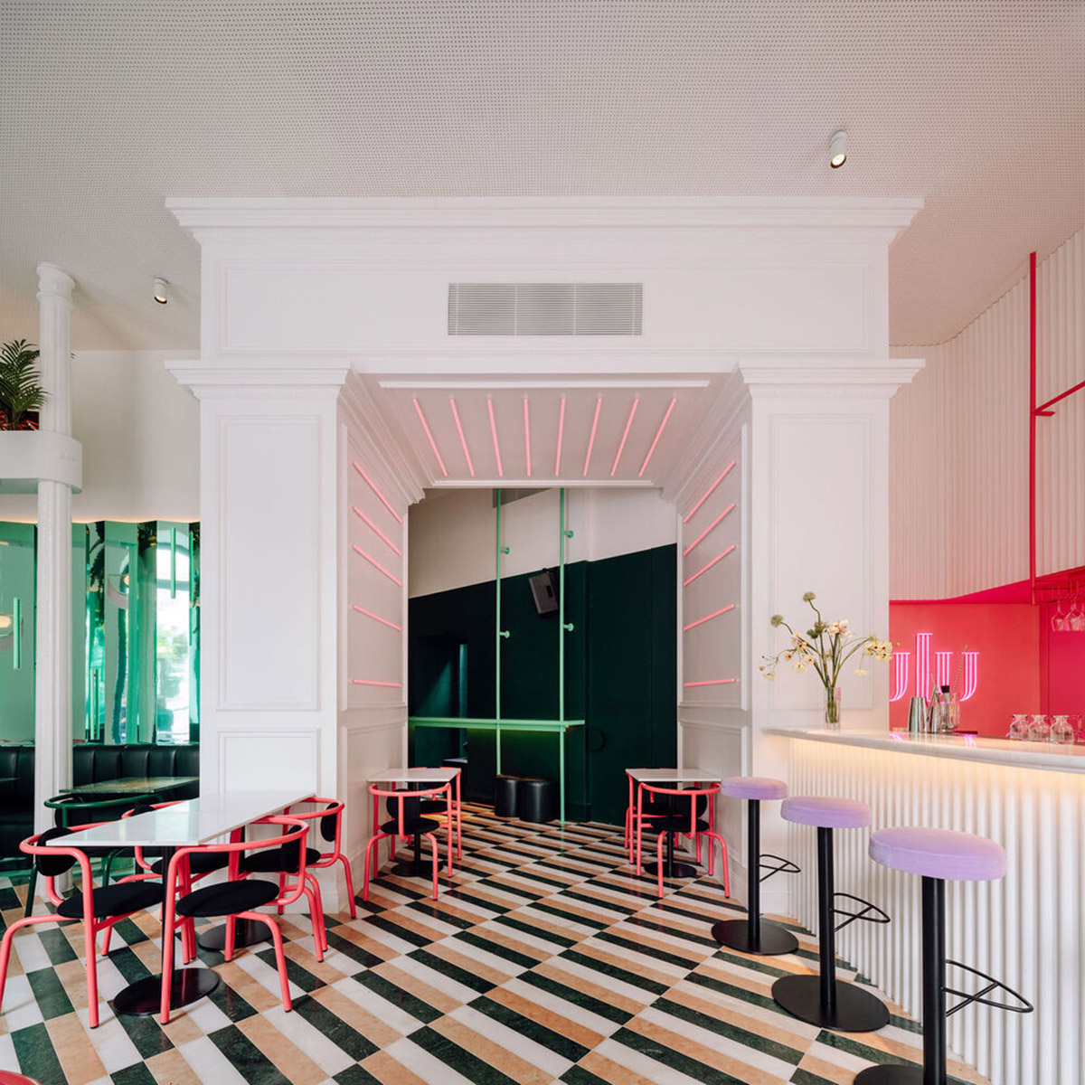
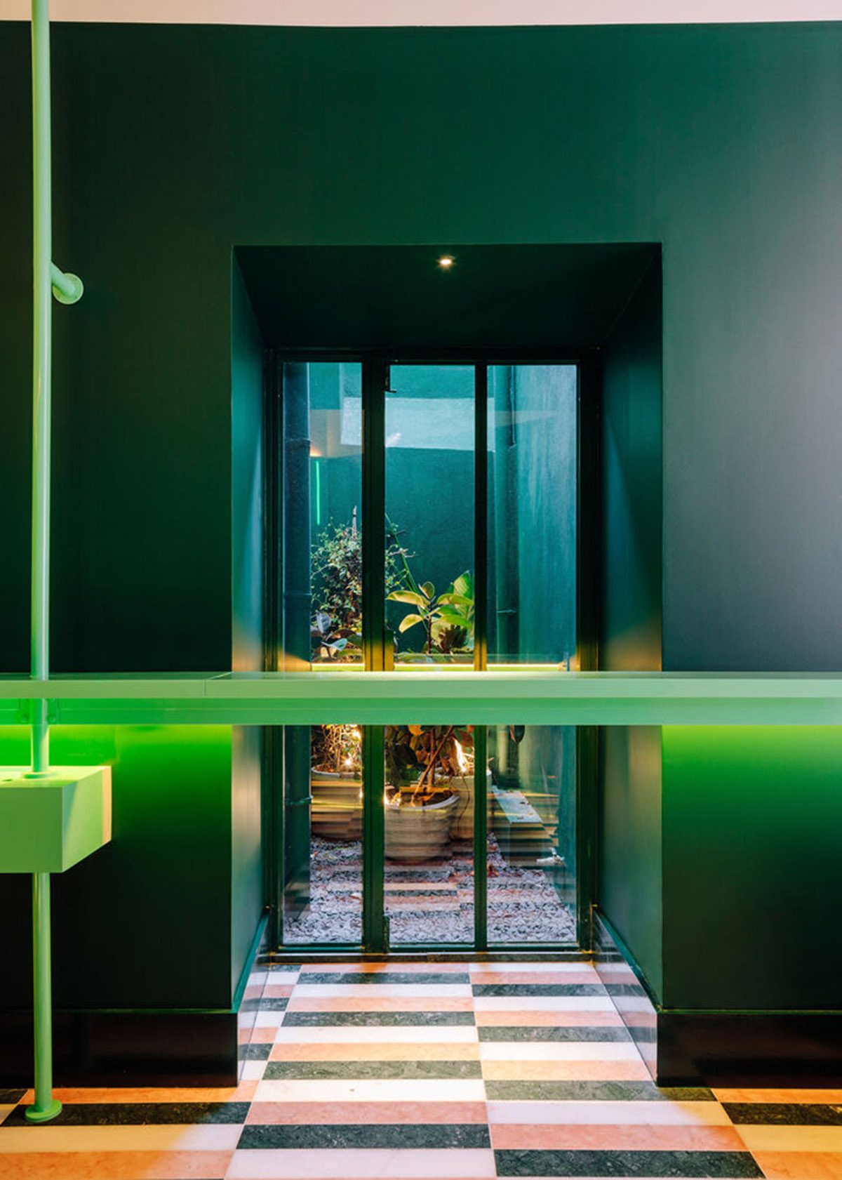
As the architects explain, "the initial idea of the project was to insert the technical program in the secondary areas of the space, without natural light and close to the existing patios, in order to enable the installation of the technical equipment for air conditioning and ventilation."
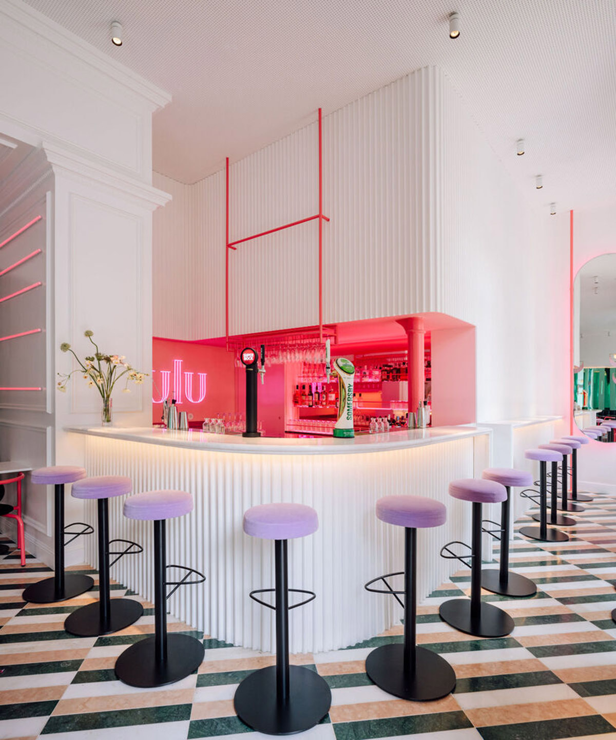
"As regards the positioning of the bar, was considered a solution facing the entrance, which faces directly onto the restaurant’s main façade, serving both as a waiting and customer service area."
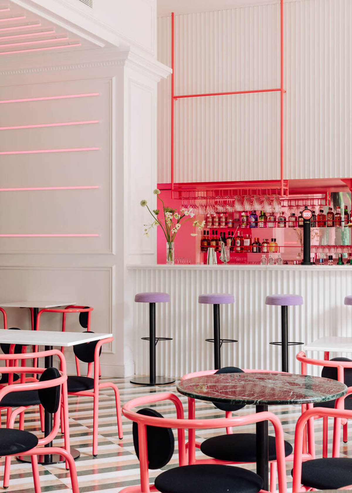
The layout is divided into two volumes that branches out. One of the volume is dedicated to the restaurant across a mini bar, other volume is used as a lounge - vestibule and service counters are placed across the lounge.
By using the historic features of the building, the studio used a generous ceiling height of the building as the “core” of the space, without using any intervention.
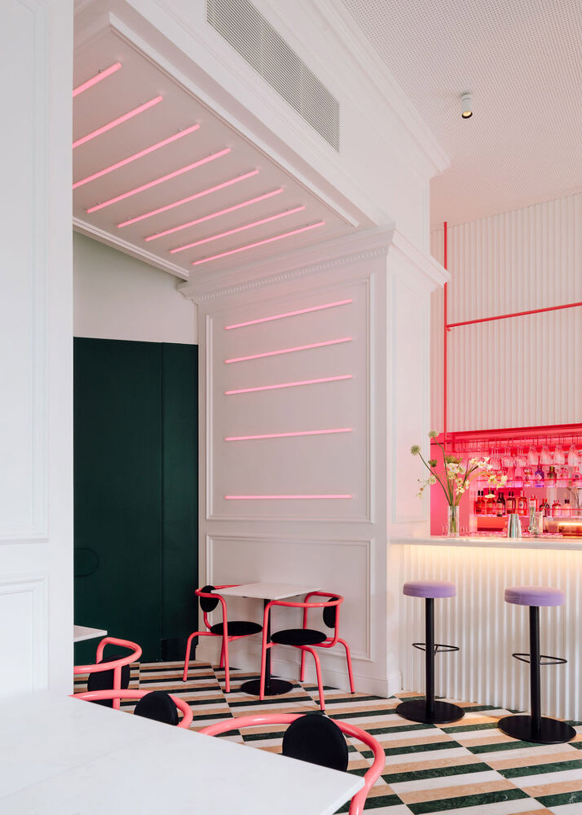
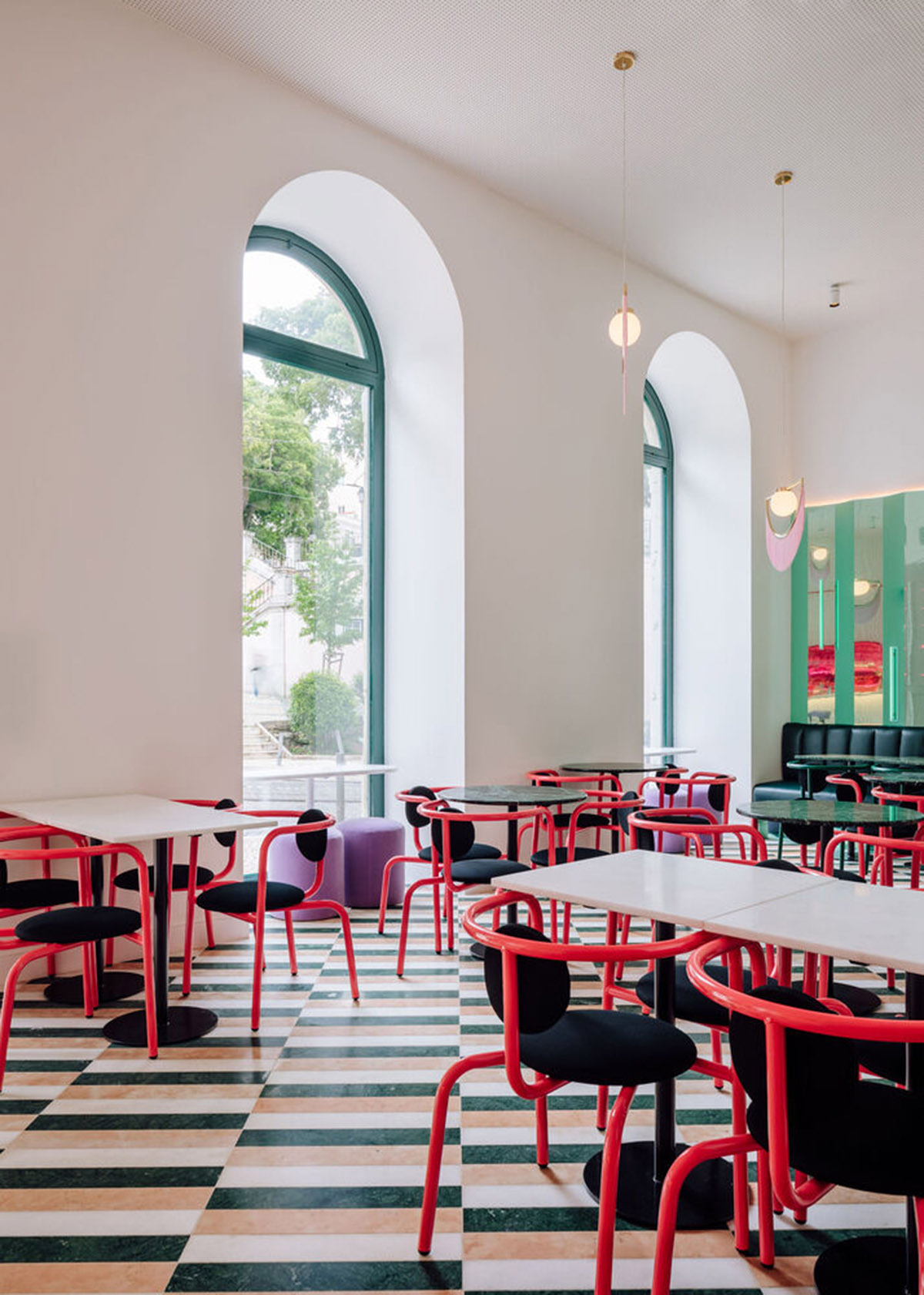
To create a diversity inside, given the geometry of the lot itself, two rooms are used for the restaurant and the lounge area. The first one, adjacent to the main façade, is characterized by the strong entry of natural light and clear visibility to the public thoroughfare since the previously opaque shutters have been replaced by shop-window type openings.
The design team designed a fixed L-shaped sofa along the bordering walls to combine with individual tables that can be freely grouped, while next to the exterior openings, two-person tables can be arranged for more intimate use.
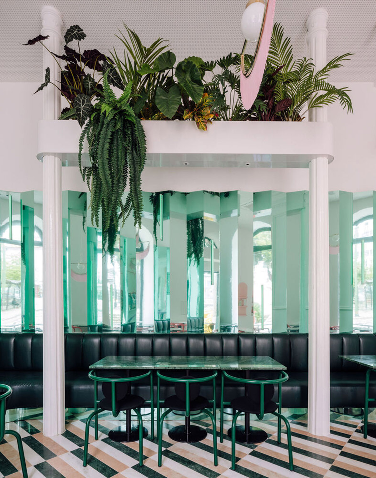
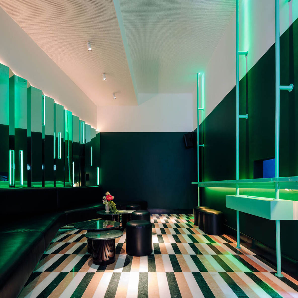
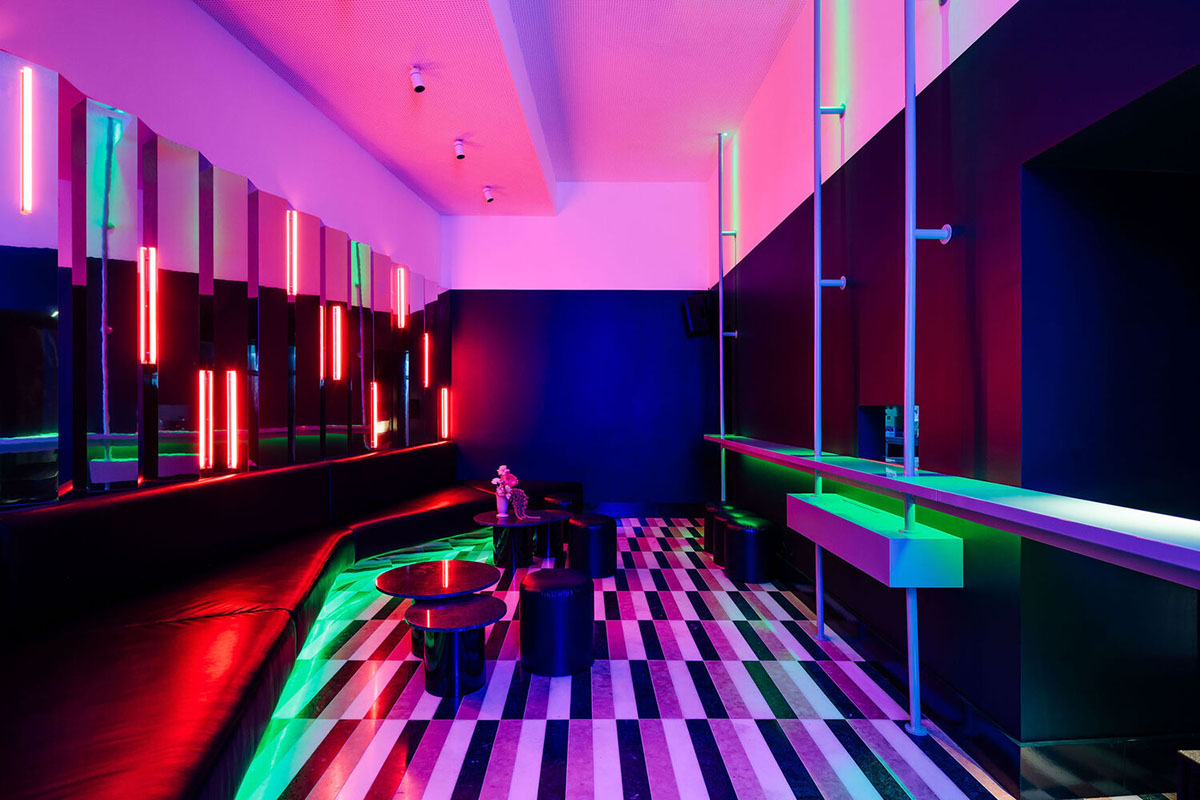
On the other hand, in the second room, there is an interior having limited natural lighting, to be used for a more relaxed environment through the positioning of a single ample sofa that. Thanks to this, the space creates a fluid organic design, which is able to streamline the use of the space.
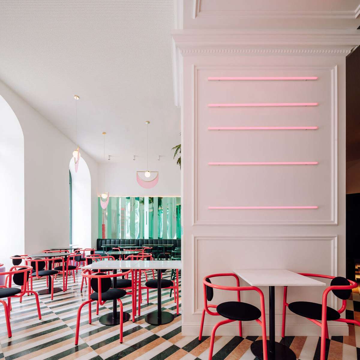
"With a central focus on a DJ table and punctuated by low tables and separate poufs, this room can be used freely, somewhere between a bar and a dance floor," added the studio.
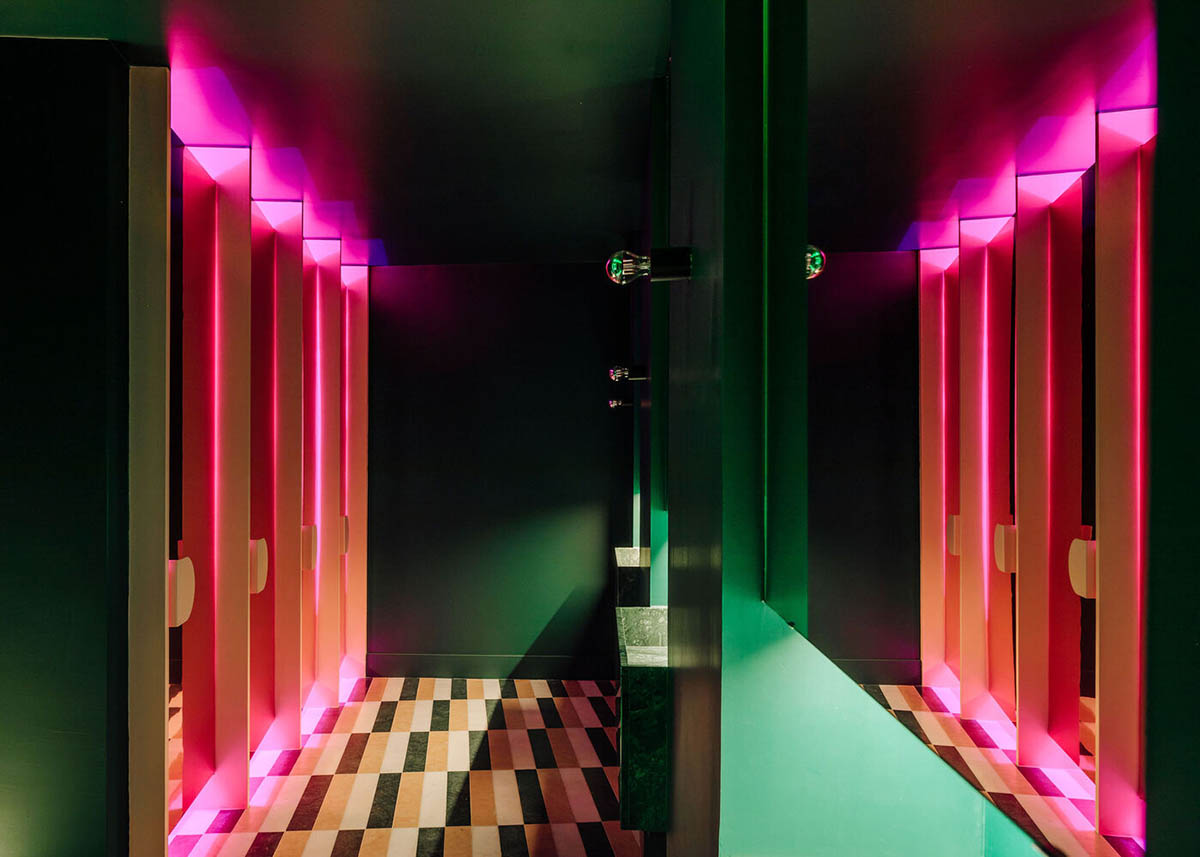
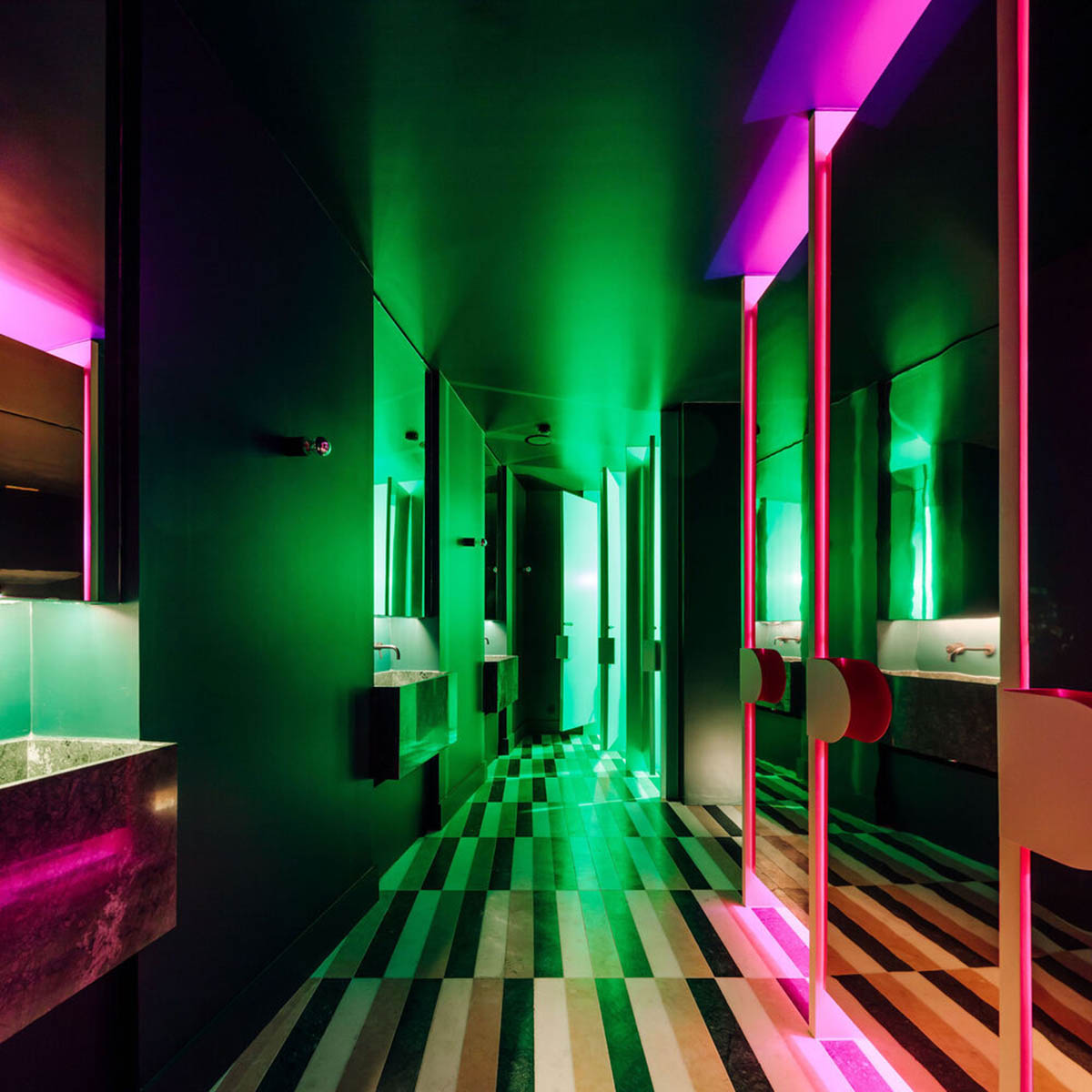
"The customer toilets were placed in the annexed volume, adjacent to the western façade of the building, and these can be accessed via a flight of internal stairs."
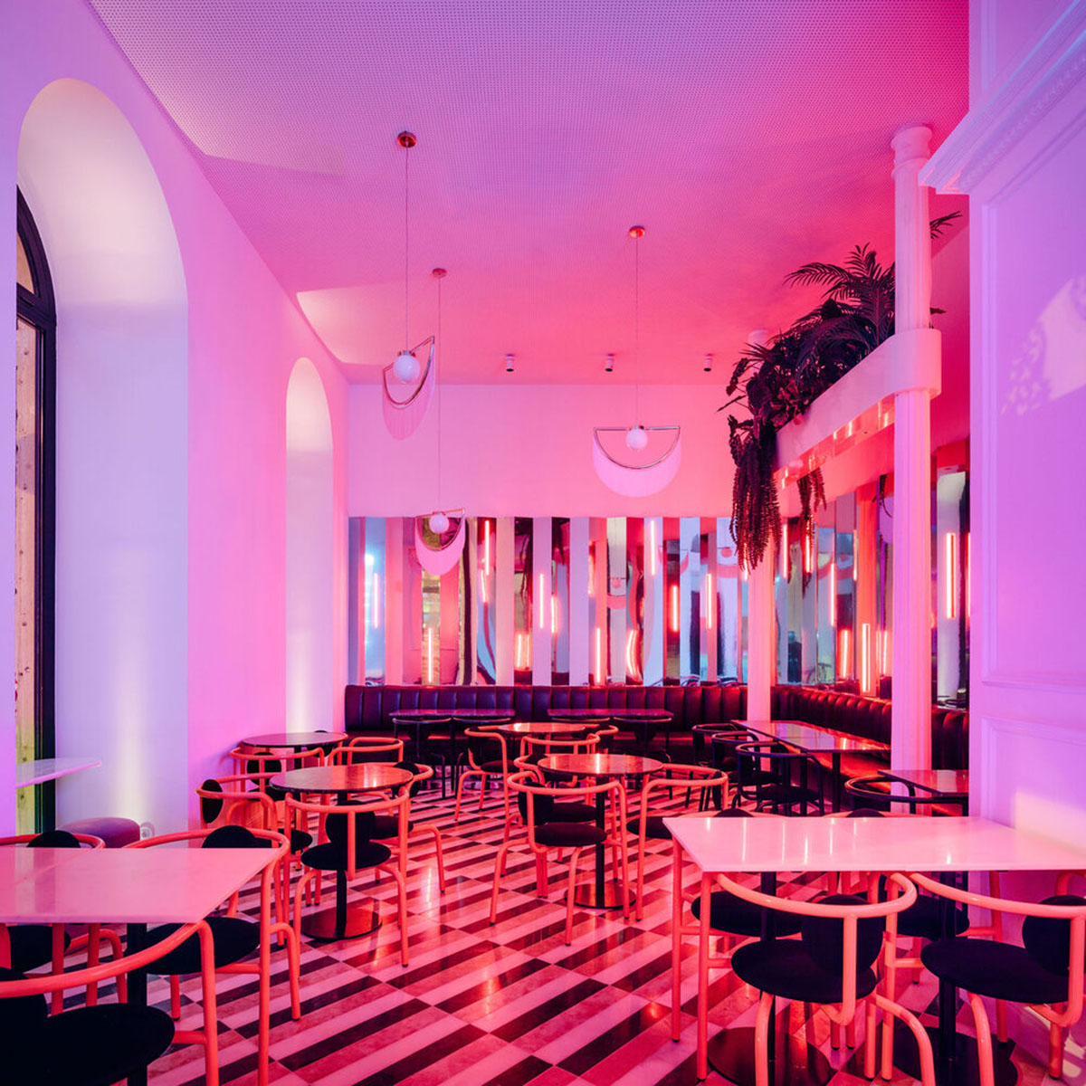
Taking cues from the artistic period of 1920s Art Deco style, the studio tried to bring a new interpretation of the aesthetic characteristics of this movement.
Paying attention to exhaustive details, the careful selection of the textures, colors, and finishes make the space more inviting and take customers on a retro-style journey where they get lost in colours.
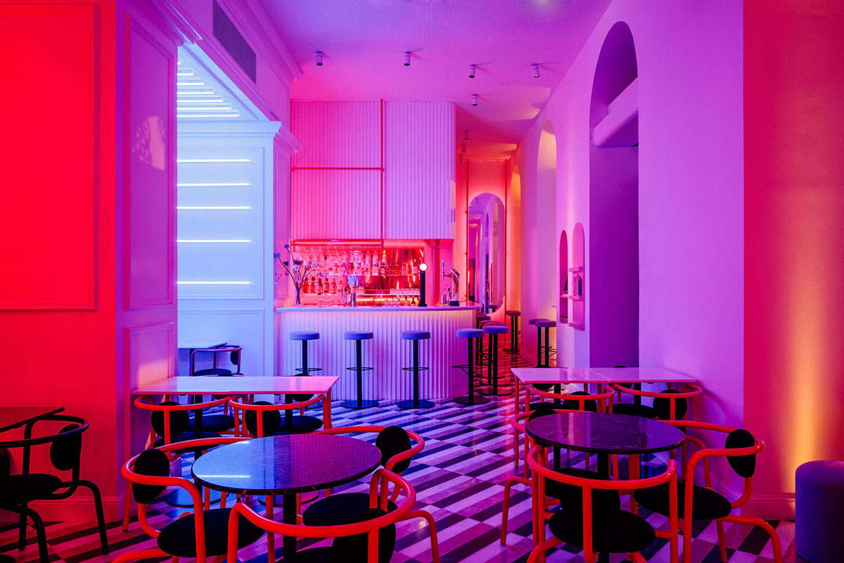
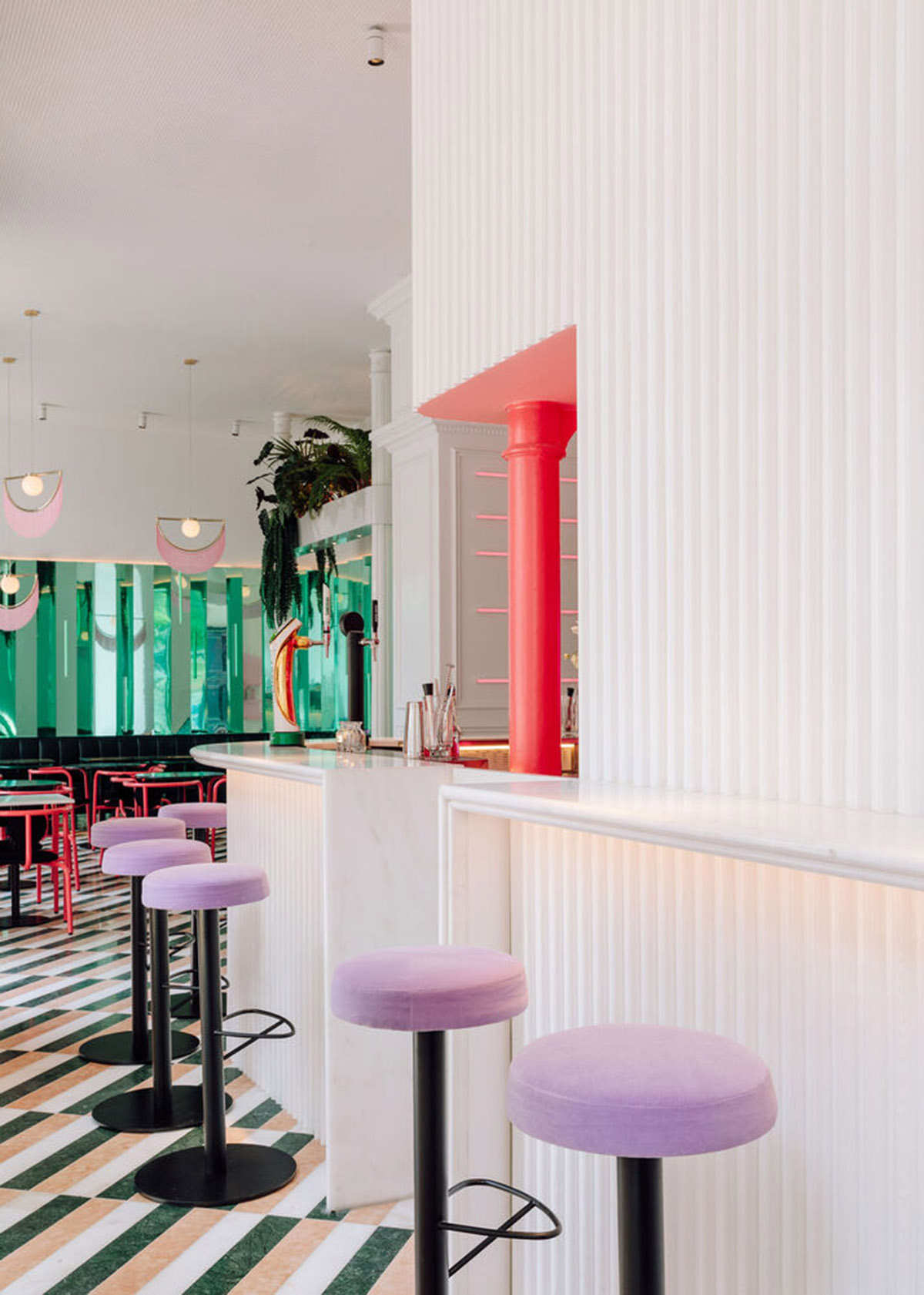
The geometric patterns of the natural stone floor, the rhythmic lacquered wooden slats, or the multifaceted surfaces in colored mirrors add various dimensions of graphic, luminous, and sensorial intensity.
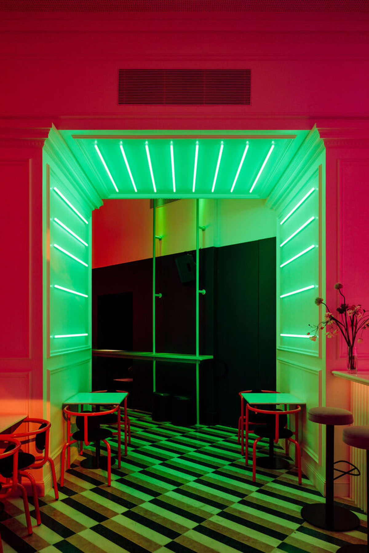
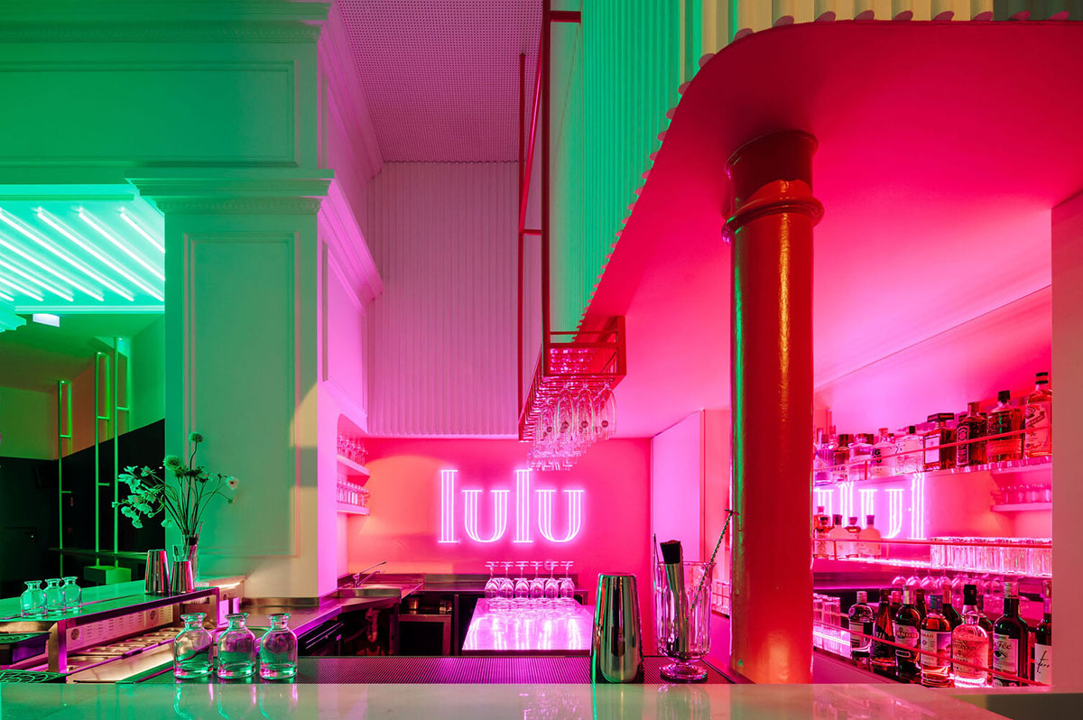
The studio softens these colors and intensity of geometric patterns with the introduction of vegetation or intensified by the rhythmic harshness of colored neon lights.
Meanwhile, the decoration becomes an essential part of this balance of the general ambiance of the space, which intends to be somewhat nostalgic but simultaneously up-to-date.
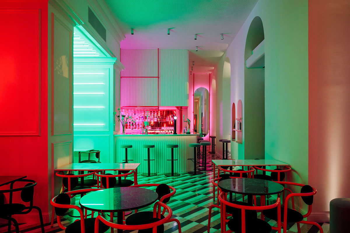
Inside, the heavily used color palette includes pink, dark green, and white – "which was based on the colors of the main façade, creating a strong visual connection between the interior and the exterior," according to the architects.
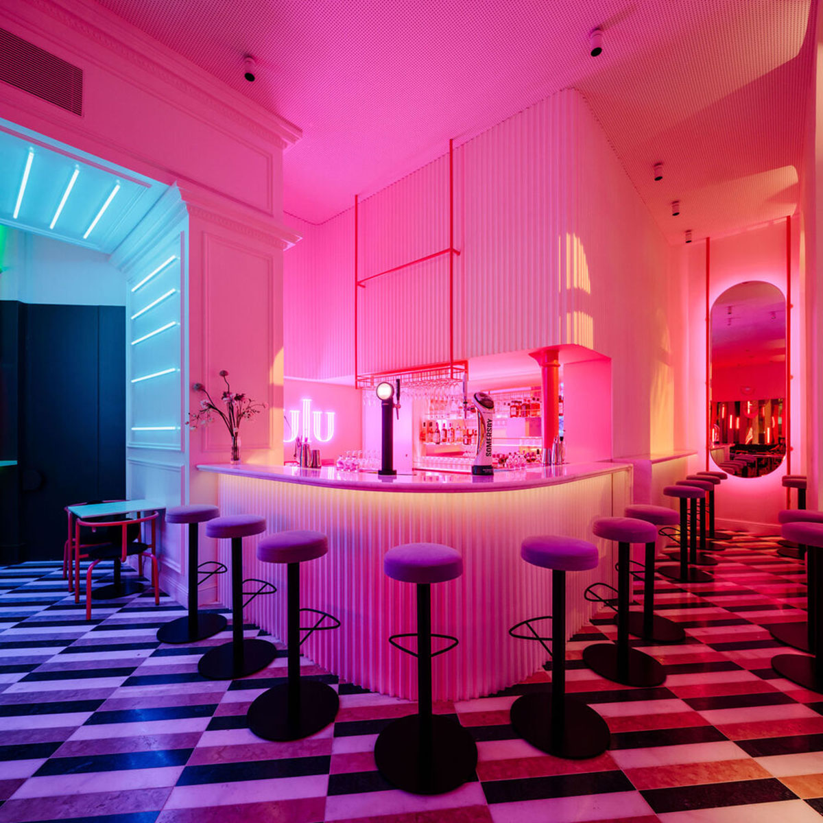
"The use of each of these colors was also measured, creating various moments in which a certain color is predominant, thereby marking the function of each space," added the studio.
"There is also meticulous artificial lighting which, through a control system, provides for changes between various scenarios and, consequently, a total alteration of the space throughout the day and night, resulting in an exuberant, enveloping, and specific atmosphere for each use."
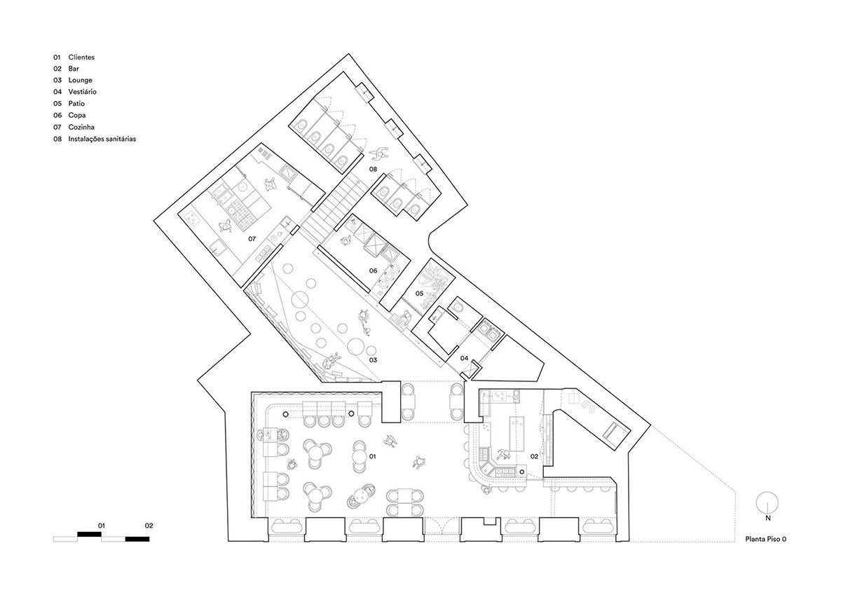
Floor plan

Section
Duarte Caldas. Architecture Design (DC.AD) is a Lisbon-based studio established in 2014, focused on architecture, interior design, furniture and lighting design.DC.AD's project portfolio ranges from architecture, interior design to exhibition design.
Meanwhile, find out WAC's most-read interior design news in 2021. See all interior design projects showcased on World Architecture Community's Interior Design Projects page.
Project facts
Project name: LULU Bar and Restaurant
Architects: DC.AD
Location: Lisbon, Portugal.
Size: 170m2
Date: 2021
All images © Francisco Nogueira
All drawings © DC.AD
> via DC.AD
