Submitted by WA Contents
JST ARCHITECTURE creates dark-colored palette by adding a geometrical aesthetic to this showroom
China Architecture News - Aug 12, 2020 - 11:57 4858 views
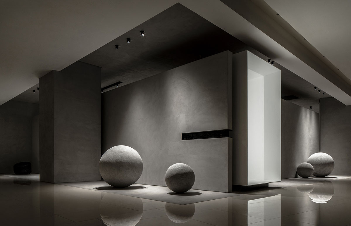
JST ARCHITECTURE has completed a showroom, featuring dark-colored palette, materials and textures by combining it with a geometrical aesthetic for the customized wooden furniture brand Xinyi Meigu in Fuzhou, China.
"Where there is matter, there is geometry" — Johannes Kepler.
Named Physical Geometry Exhibition Hall, through the utilization of geometrical shapes such as rectangles and rounds, the design team created an artistic exhibition space that perfectly combines commercial value and visitor experiences.
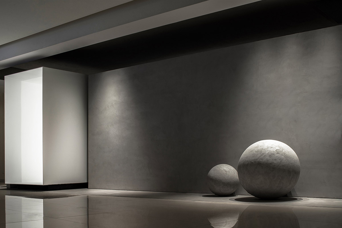
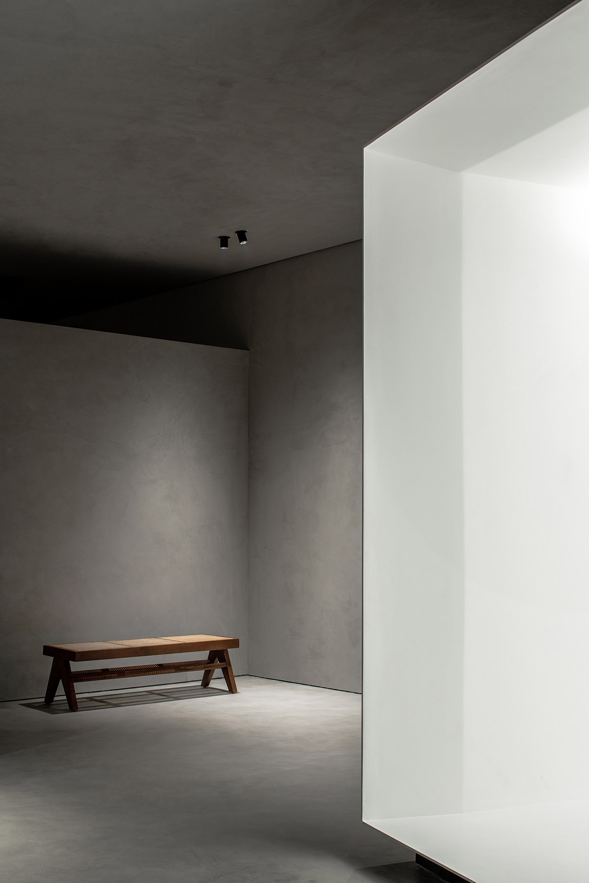
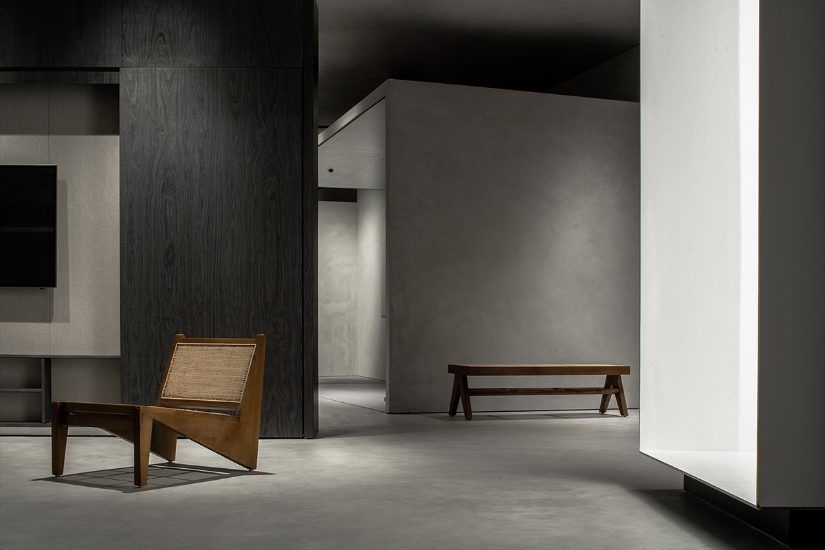
The entrance area is highlighted by an elevated white box, which functions as a passageway and leads visitors to the inside display area. With a pure and tranquil ambience, it stimulates visitors' curiosity and produces a sense of ritual.
An optimized layout that makes the best use of space
The spatial pattern of the original space was irregular and full of turns, which posed great challenge to the design. Based on thorough consideration and analysis, the designers reorganized the space and divided it into a rectangular zone and a fan-shaped section, to make the best use of the space.
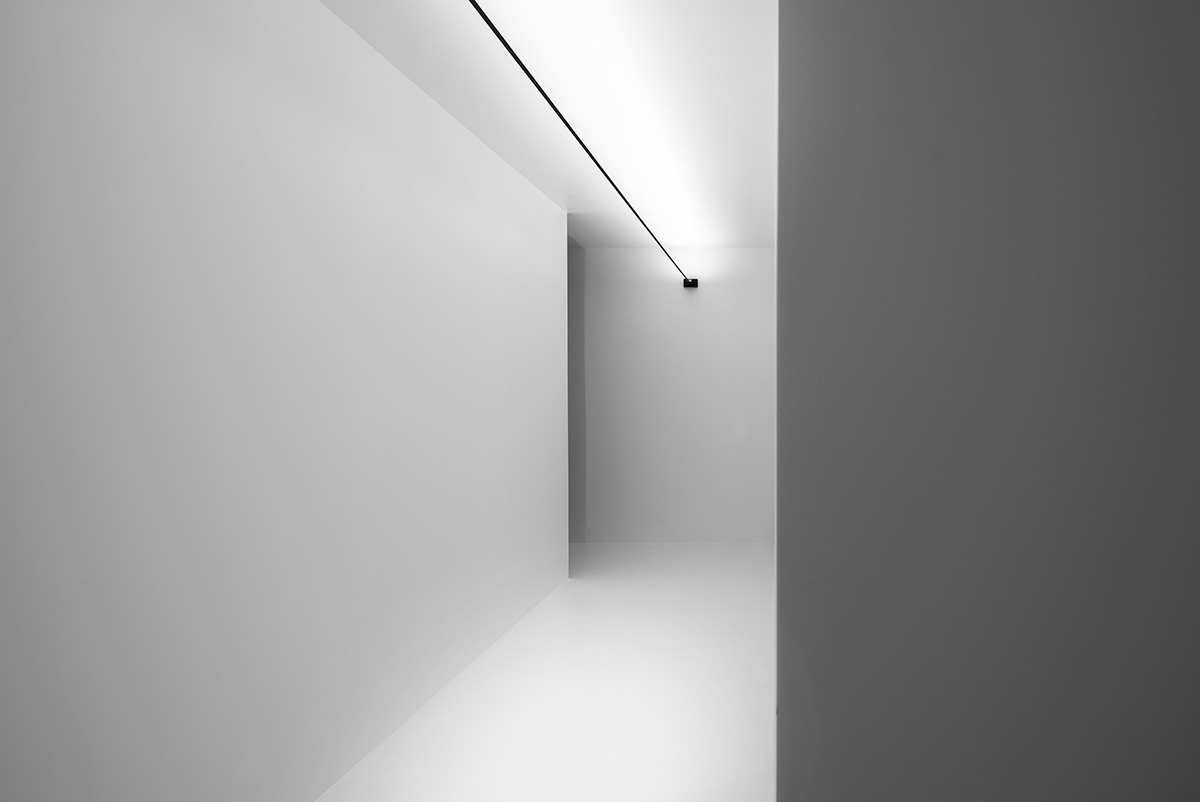
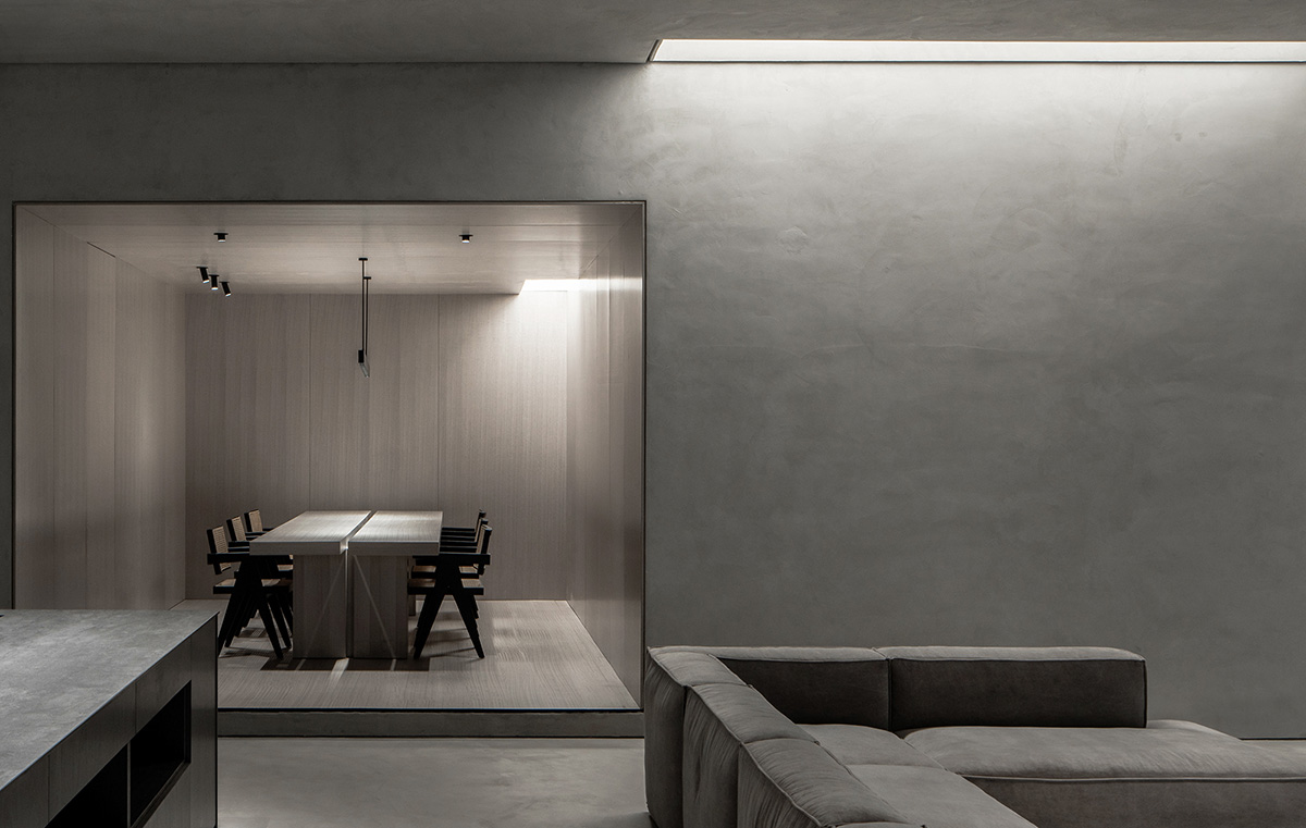
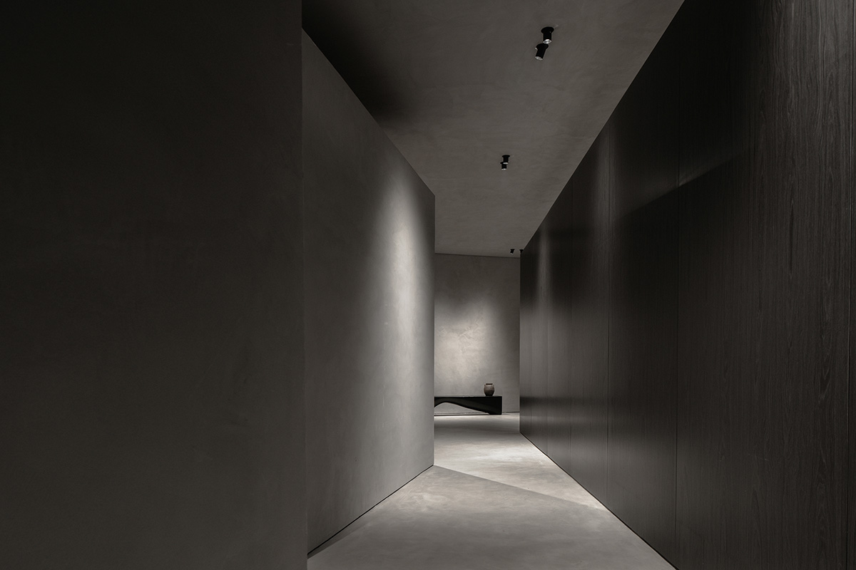
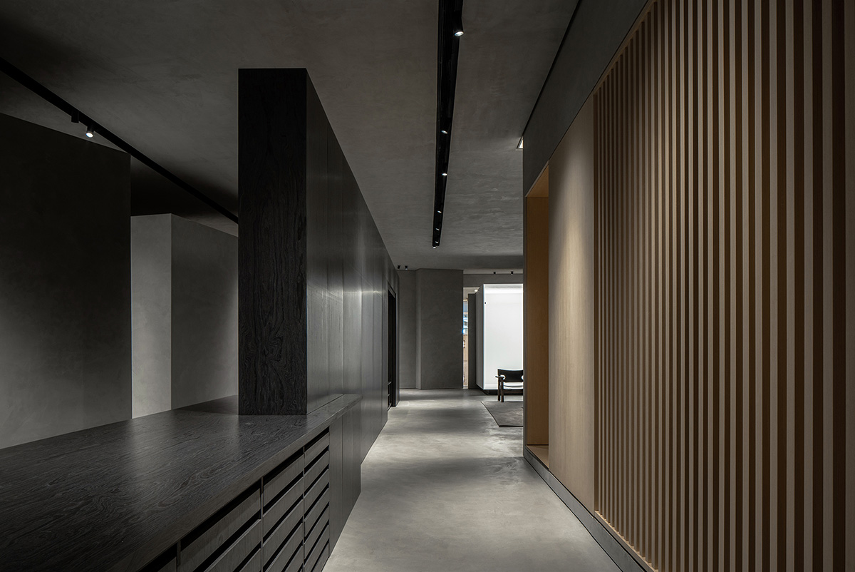
The rectangular zone mainly accommodates reception function. It features the combination of frame structures, which convey a sense of order. Different from a conventional door, the long and narrow rectangular passageway acts as a transitional space and generates a sense of ritual as people passing through it.
The spatial layout is open and free, which well coordinates the relationship between neighboring functional areas. The circular-arc-shaped plane makes the space more flexible, while also activating the corners through evoking interaction with visitors.
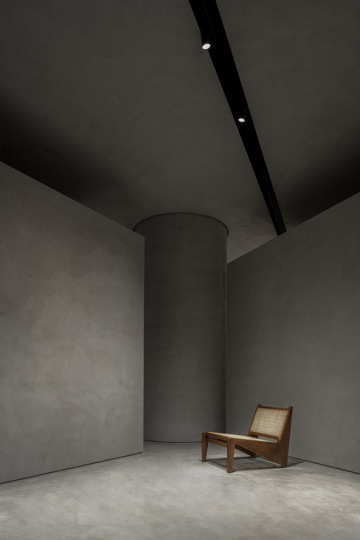
The designers enveloped the load-bearing wall by a cylinder, so as to achieve harmony with the surrounding boxes.
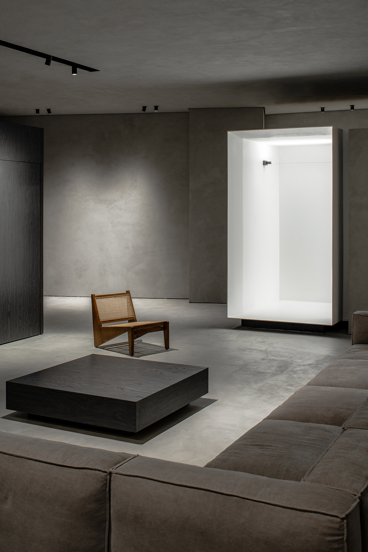
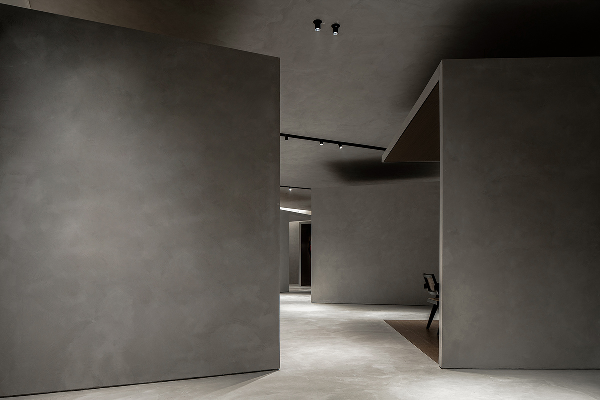
The fan-shaped section is on the right side. Nine sample display areas are flexibly scattered, looking like customized boxes. Keeping a certain distance from the ceiling, those boxes are either open or semi-open, independent from yet interactive with each other.

A twisting circulation route formed by interior structures
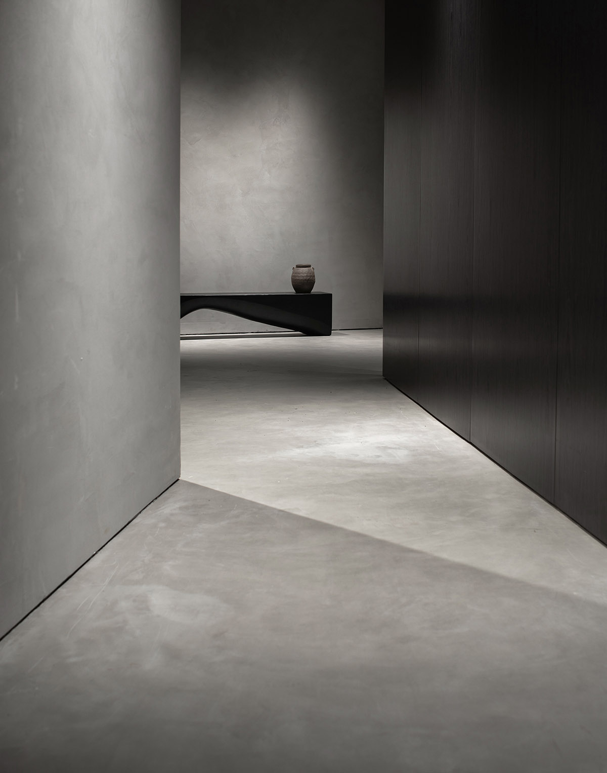
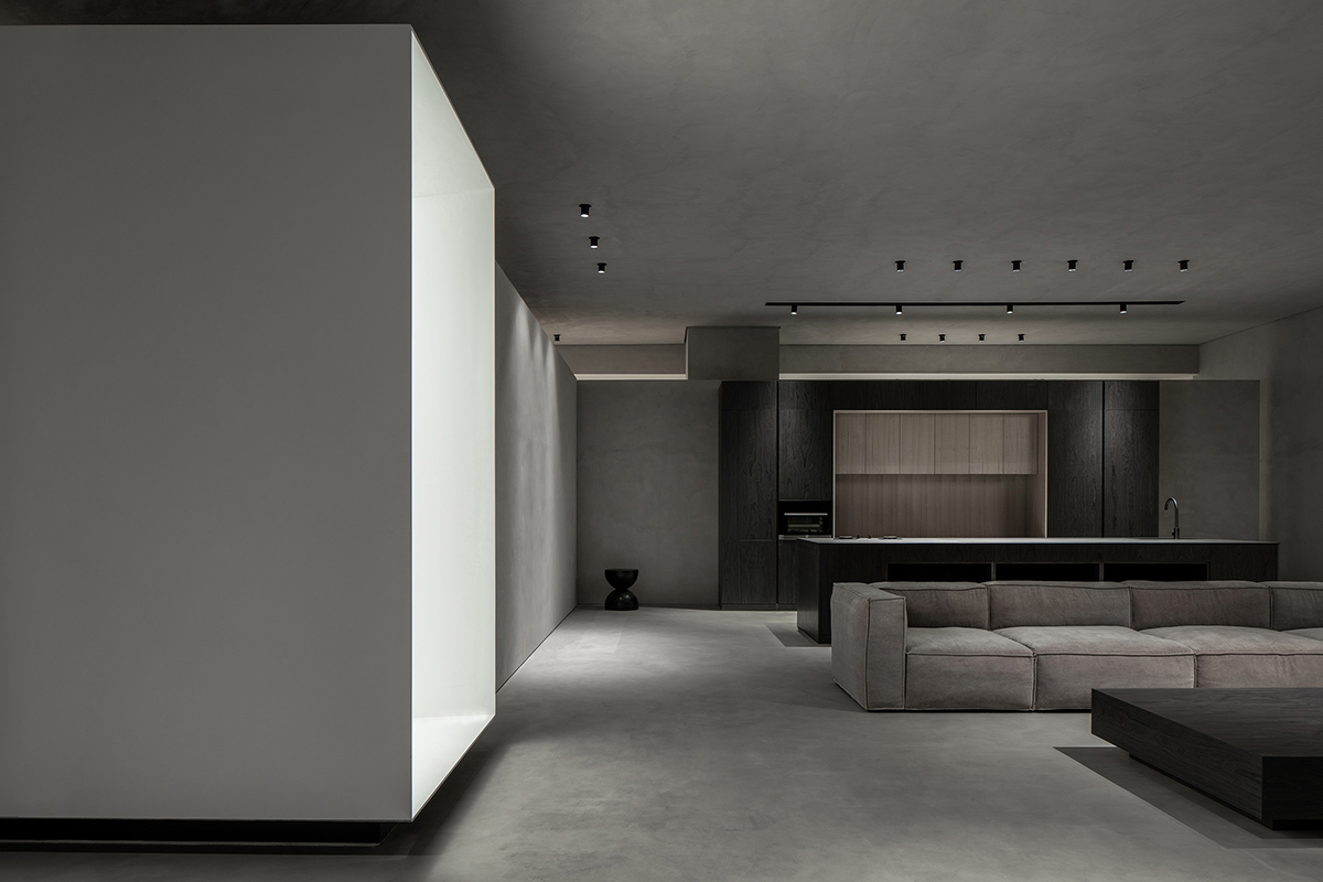
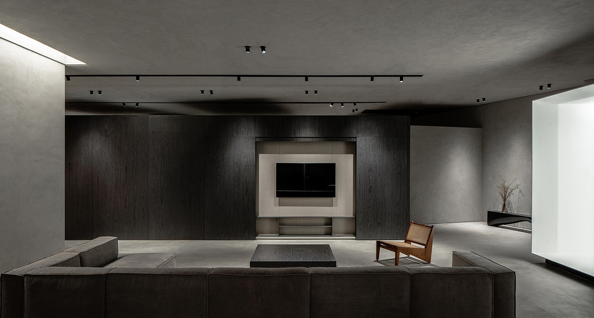
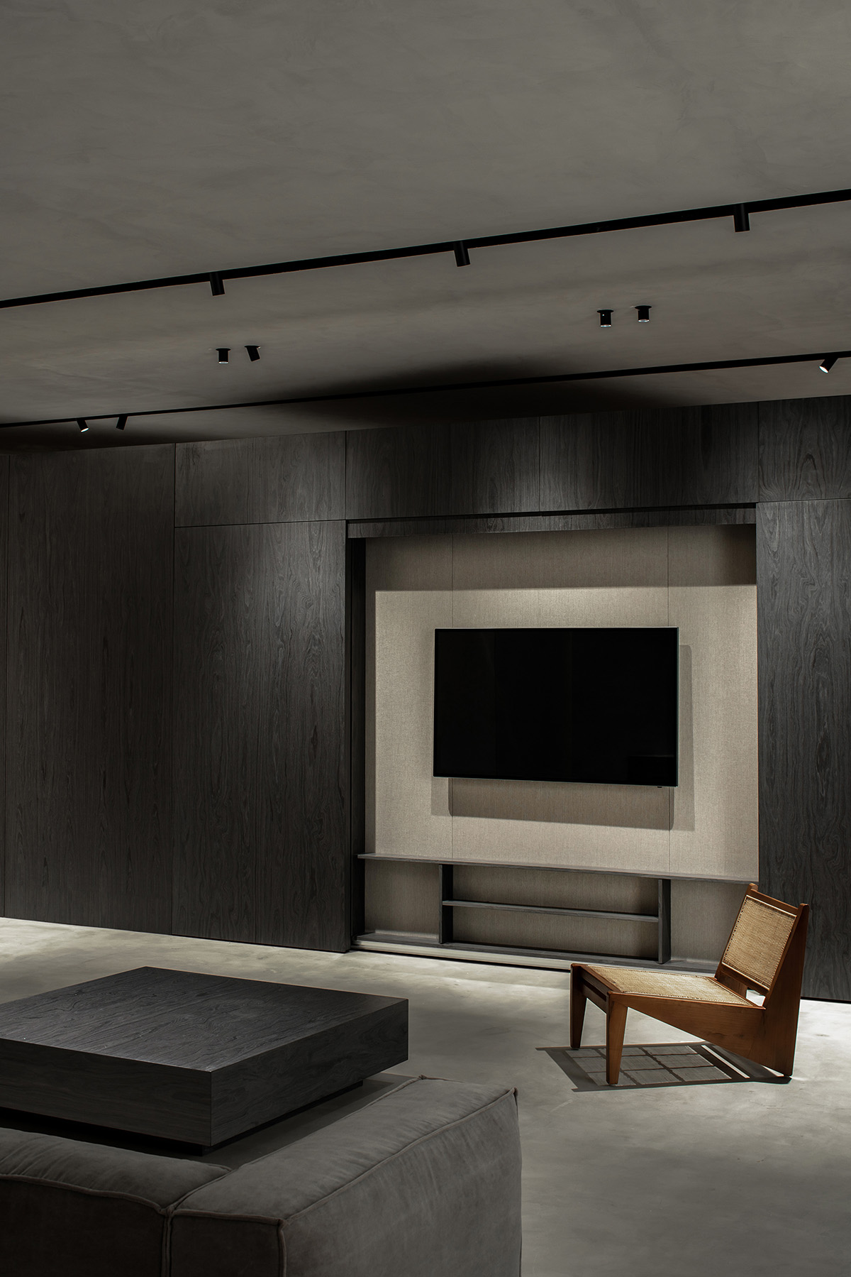
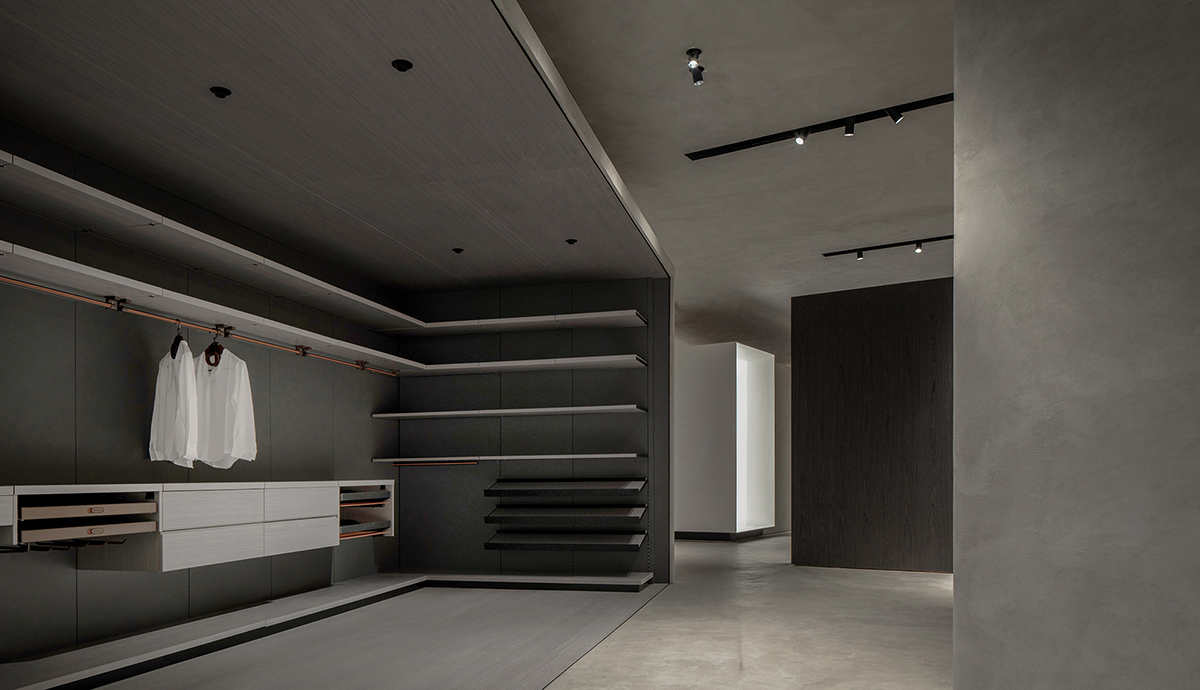
Fair-faced concrete structures and wooden veneers complement the stylish yet simplistic color palette, which mainly consists of black, white and gray.
Different gray shades and textures bring out differentiated yet balanced visual effects. The rectangular structures and spherical art installations form a contrast, which injects playfulness into the space and also generates artistic scenes for interaction.

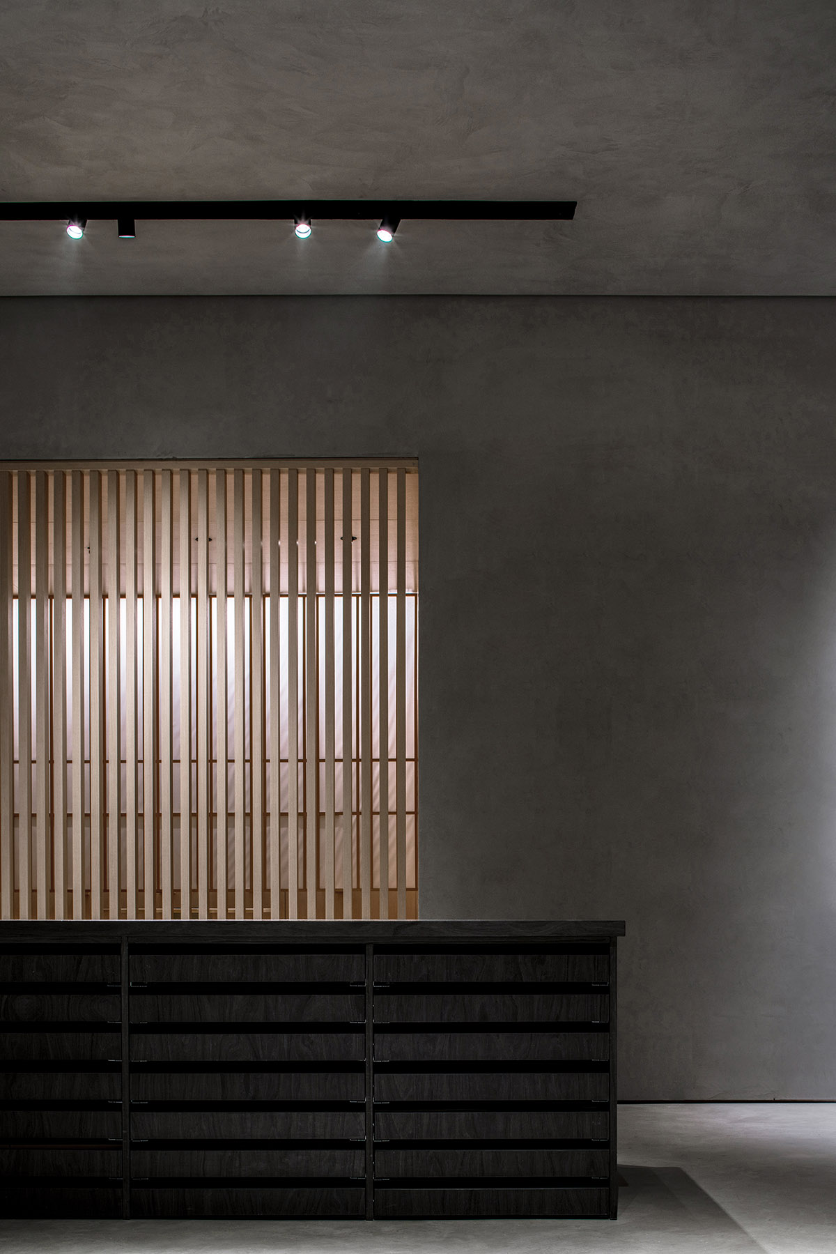
A series of partition walls are set along the nodes of the display route, helping to shape the spatial pattern and enrich details of interior structures.
Those partitions separate different areas but at the same time ensure the continuity of the overall space. Besides, they evoke visual connection, and act as the medium that promotes interaction between people and the architectural space.
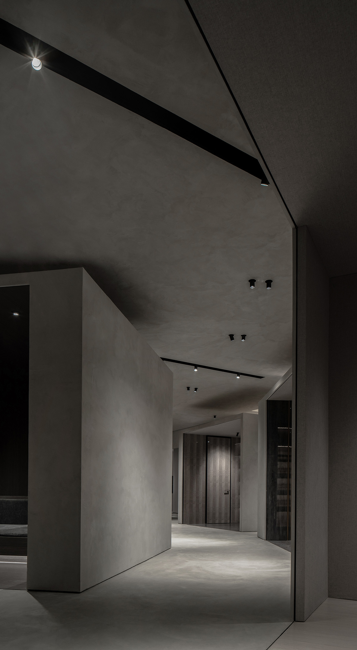
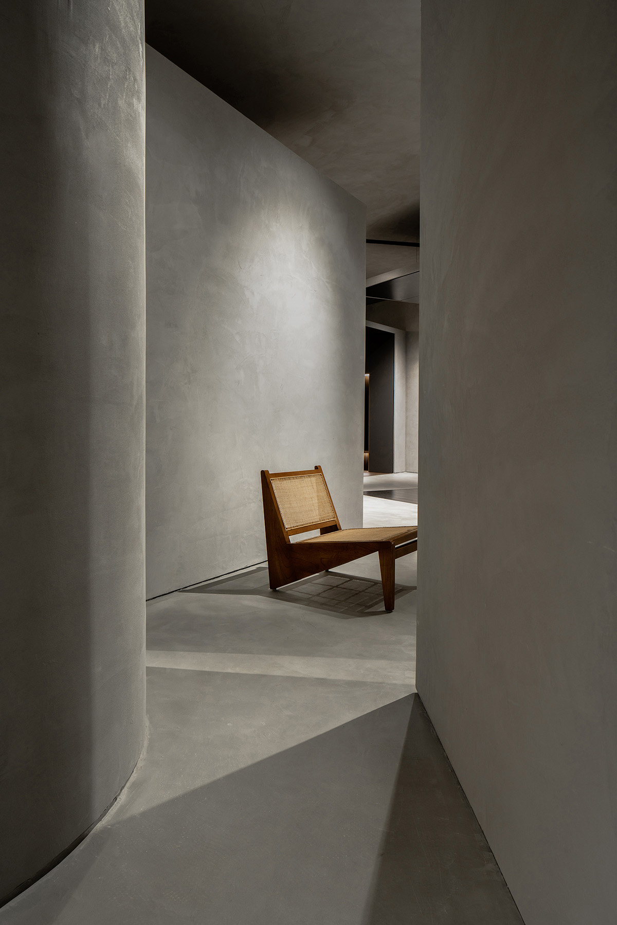
Moreover, those partition walls contribute to form a twisting circulation route, extend the space visually, enrich experiences and create a sense of layering.
Some of them intersect with the pre-existing interior architectural structures, showing an asymmetric aesthetic and making the spatial form more diversified. The interpenetration and combination of curves and lines, as well as the transition between different material textures, generate immersive visiting experiences.
A space that evokes emotions and conveys spirit
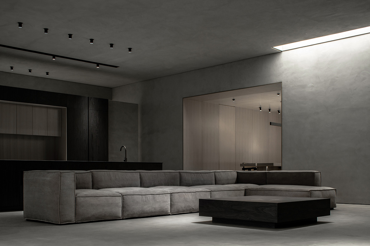
Drawing inspiration from the open-air space enclosed by walls in local traditional residential buildings, the designers brought in several rectangular stretch ceilings, which are illuminated, looking like skylights and adding an intimate home-like ambience to the space.
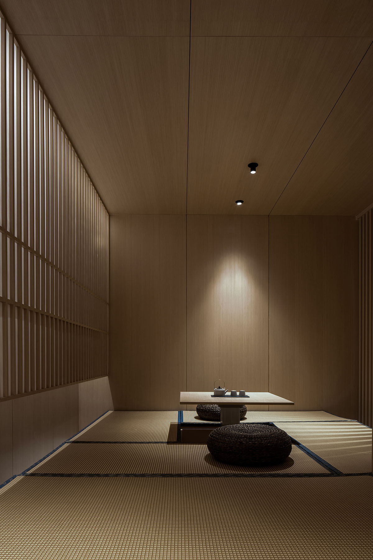
The light-gray space accentuates the displayed bespoke wooden furniture, which showcasing natural beauty. With the varying light and shadows, the furniture's wooden textures present subtle changes. It seems that the furniture is dialoguing with visitors.
The utilization of rounds, rectangles, light, shadows, material textures as well as combined or cut frames and lines are based on a human scale.
The interior design strengthens the emotive and spiritual quality of the space, enhances its interaction with visitors, shows a pure state of life, and conveys the brand values to visitors so as to evoke spiritual resonance.




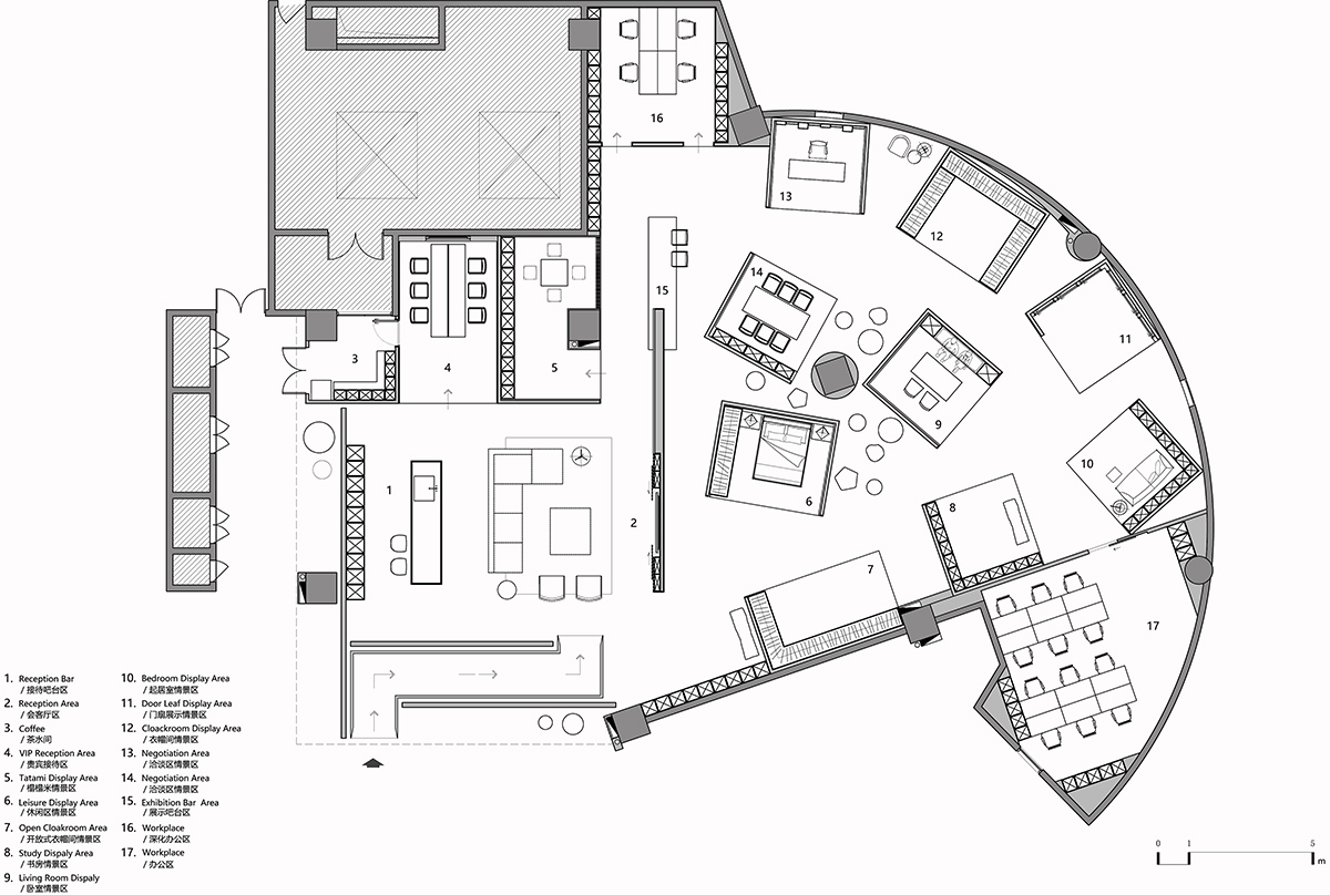
Floor plan
Project facts
Project name: Physical Geometry Exhibition Hall
Client: Xinyi Meigu Customized Furniture Exhibition Hall
Design firm: JST ARCHITECTURE
Chief designer: Xie Suting
Design team: Chen Shengzhong, Jin Jiao, Huang Qiong
Lighting consultant: Xu Fengbing
Video: Xia Zhi
Location: Fuzhou, China
Area: 530 m2
Completion time: May 2020
All images © He Chuan
All drawings © JST ARCHITECTURE
> via JST ARCHITECTURE
