Submitted by WA Contents
Sò Studio combines metallic and pinkish-colored interior for Beijing store
China Architecture News - Oct 31, 2019 - 15:26 6787 views
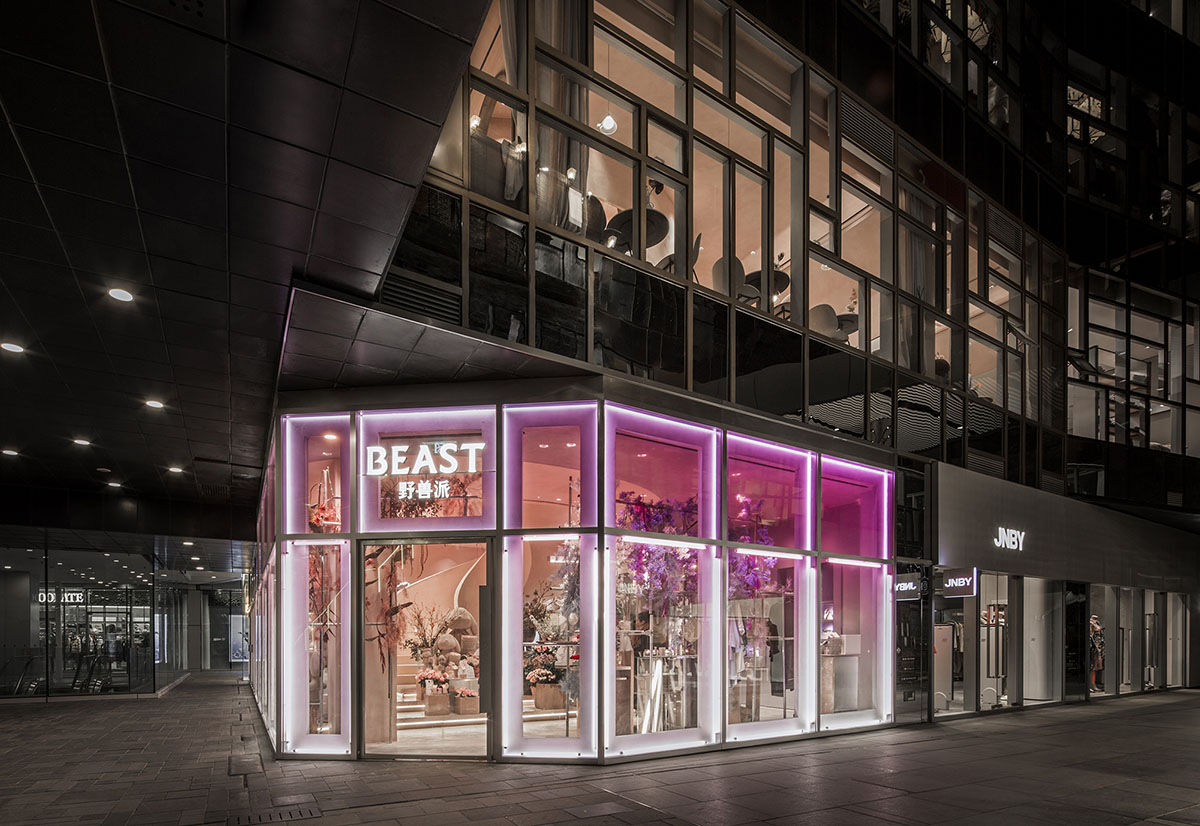
Shanghai-based architecture and interior design practice Sò Studio has created a floating box for the interior of a store in Beijing, China. Named THE BEAST BEIJING Taikoo Li store, the new store acts like a floating box in the air by integrating different hues of pinks, oranges and yellows, creating its own facade without effortless.
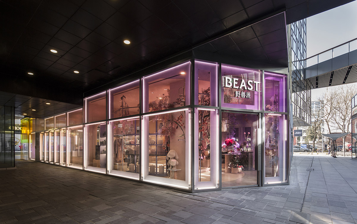
Located on Chaoyang District, Beijing, the facade of the 245-square-metre store is inspired by American Hard Edge artist Josef Albers. Extracting the expressions in his work, exploring the subtle relationship between color and styling. The store has been designed for two different brands, and combined in a unique volume and hierarchy.
"The progressive color relationship between the two sister stores also distinguishes between two sister brands, making the entire facade uniform and hierarchical," said Sò Studio.
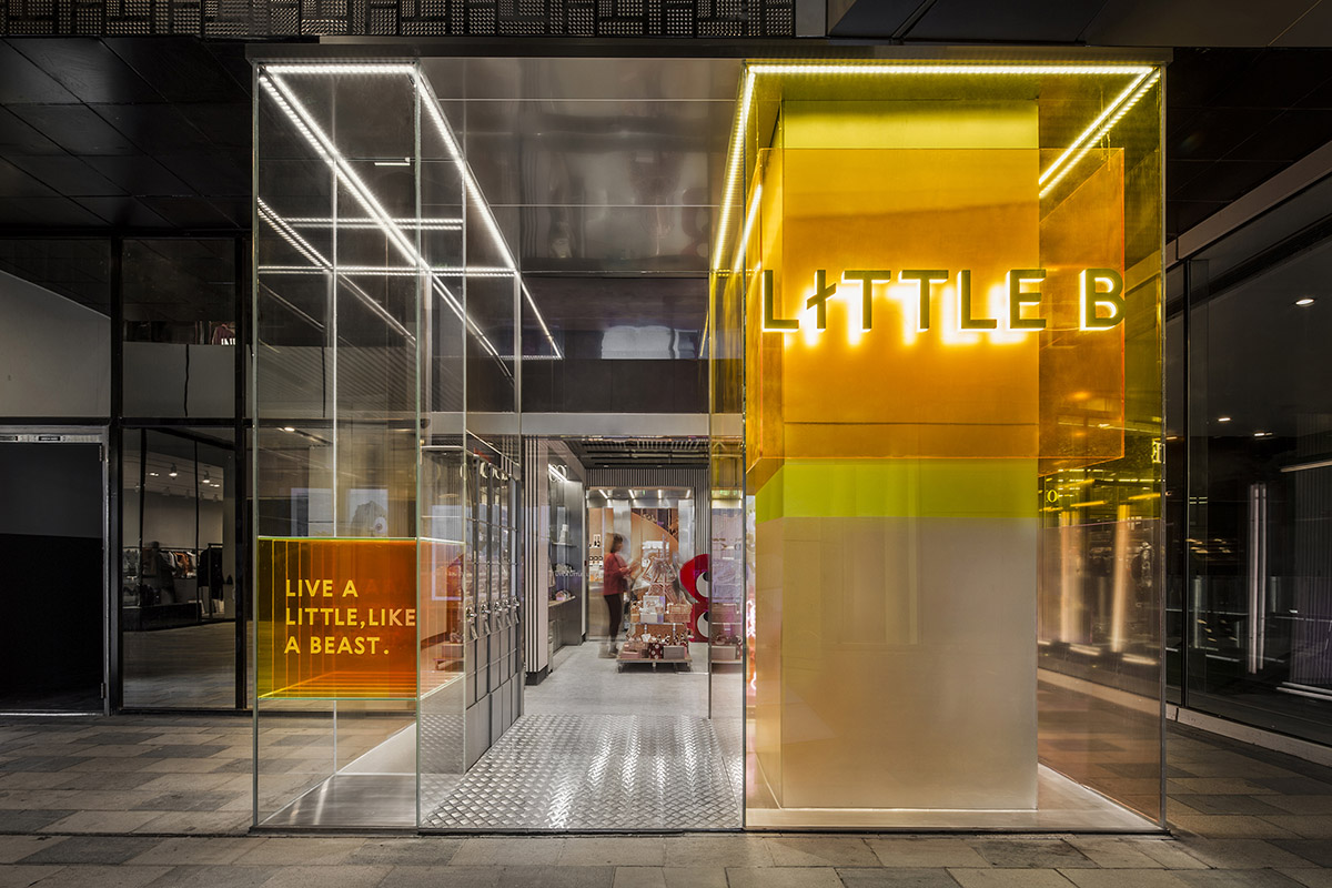
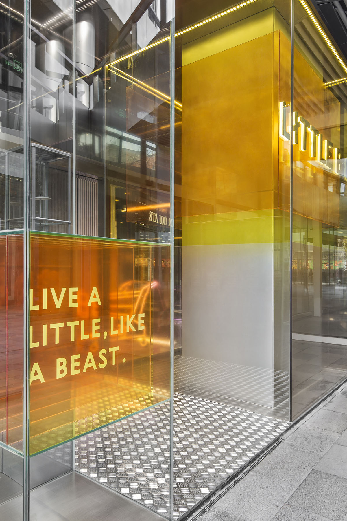
Through second layer structure, progressive expression of avant-garde attitude and different style between the two brands. The facade on the first floor is overall soft and tough, starting from purple to pink and finally coming to LITTLE-B's ginger yellow.
With the light, the entire facade is like a luminous box floating in the air, which becomes the visual focus of the whole street. The layered yellow glass reinterprets the hard-edged art from the perspective of space.
Floor 1 - Recreation
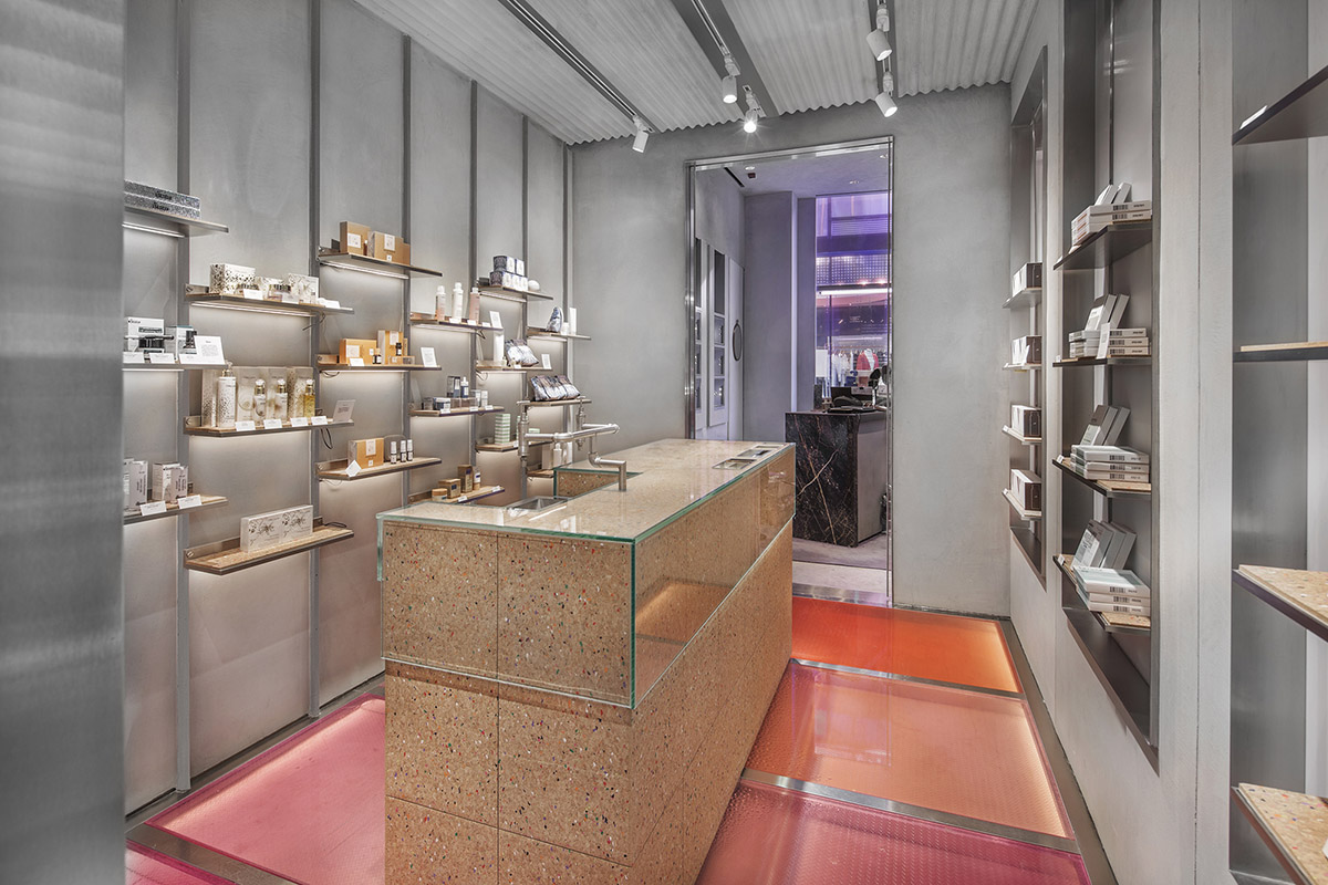
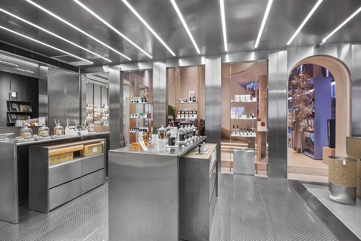
The first floor inherits the avant-garde language of the facade, the jewellery area uses a bold pink-purple collision; the contrast of different materials is used in the details to collide, crushing stone and metal; the old wood fireplace and glass tube with historical memory Combine re-creation. With a pink spiral staircase and floral jewels at the corner, create a fairyland. The adjacent LITTLE B inherits the metal genes that have been used all the time.
The studio added colored cork to the neutral space on the basis of the original, and added some playful warm colors. In the overall spatial planning, the partition wall between the two was opened, shortening the distance between the sister brands, and allowing people to walk freely through two identical modern genes but different styles of space.
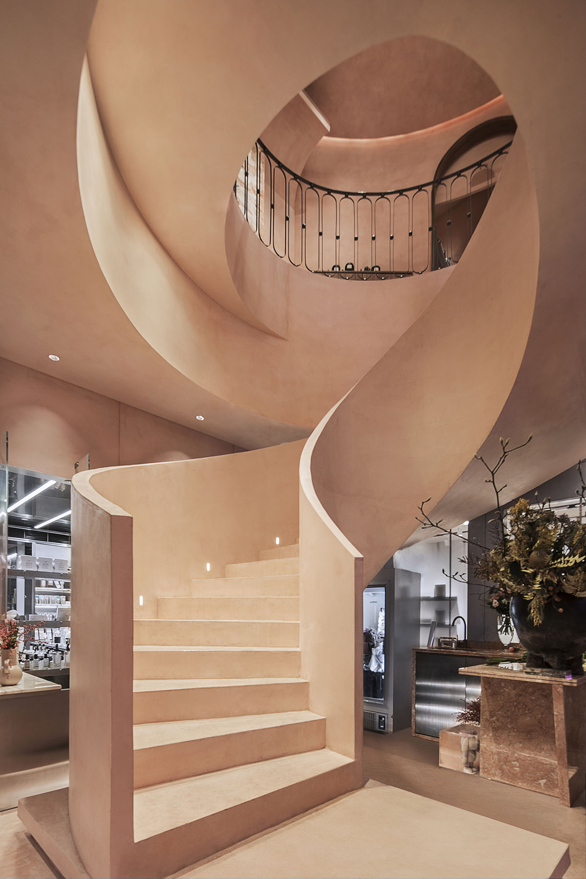
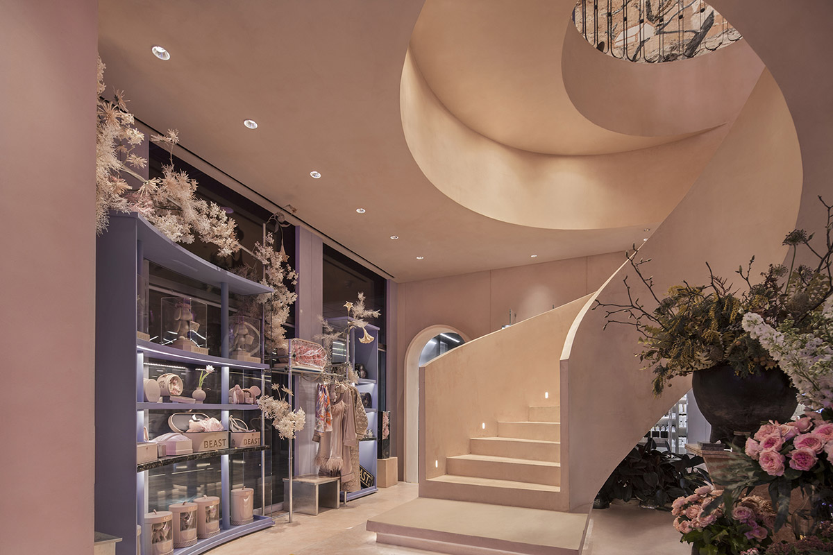
Re-creation is a bold experience in this design, bringing the recycled old wood fireplace to the factory for random cutting, blocking the “memory” in a transparent glass box, and matching the tube to form a clear contrast between new and old.
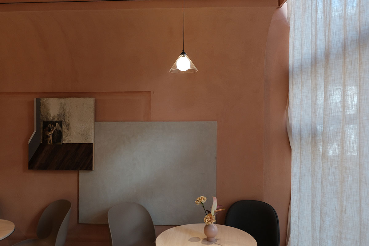
Image © Sò Studio
Floor 2 - New definition
The coffee area on the second floor retains the genes of the past, elegant, classical, calm, and incorporates some surreal elements. In the spatial planning, the layers are re-defined and a new style, which is in sharp contrast with the first floor.
The process of going up along the super-swirl stairs seems to walk in the shuttle channel of the parallel space, into another new space, just like the movie "Midnight in Paris", let us "mistaken" in the last golden age, the film texture. The texture and color of the color, the studio hopes to feel the light here, feel the "sentimental feeling", carry out a "past" afternoon tea.
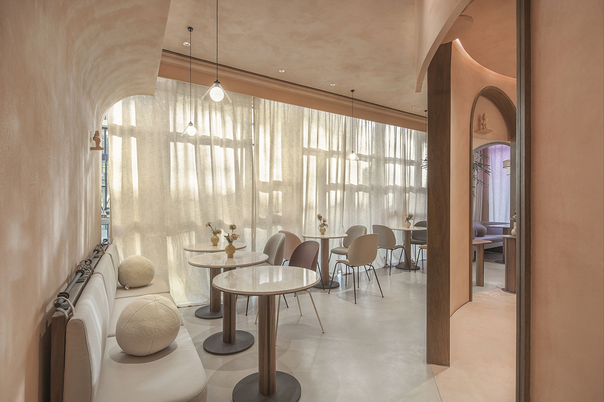
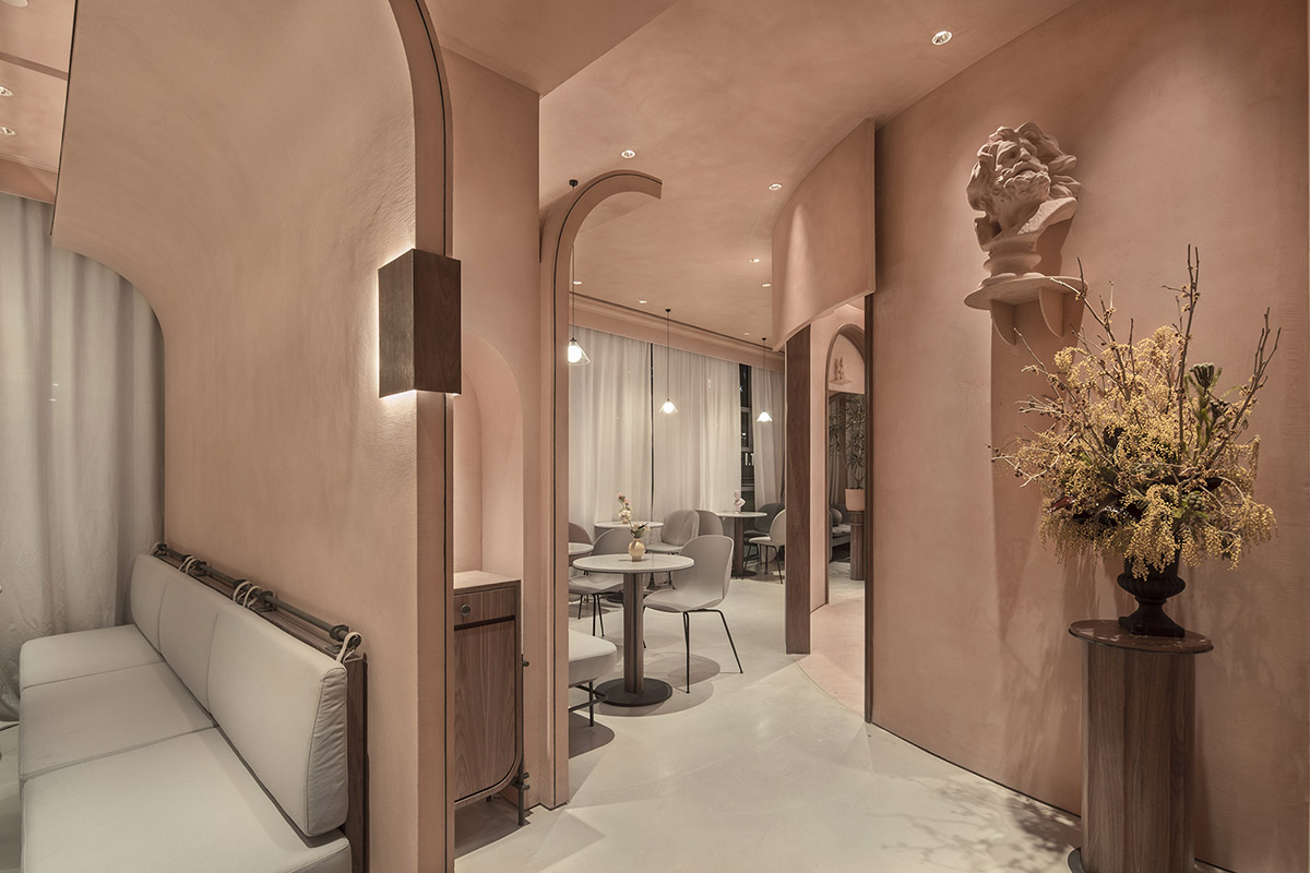
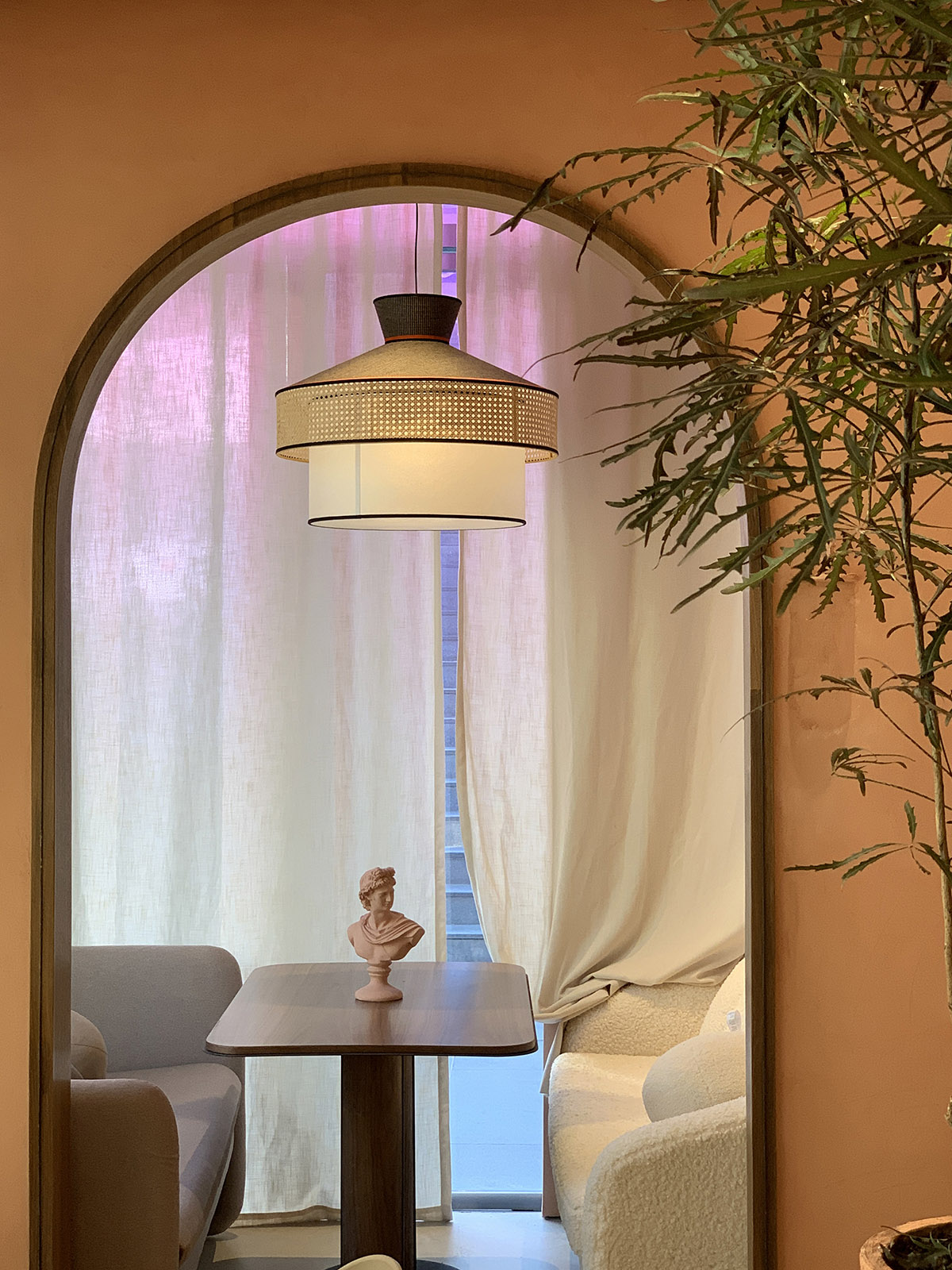
Image © Sò Studio
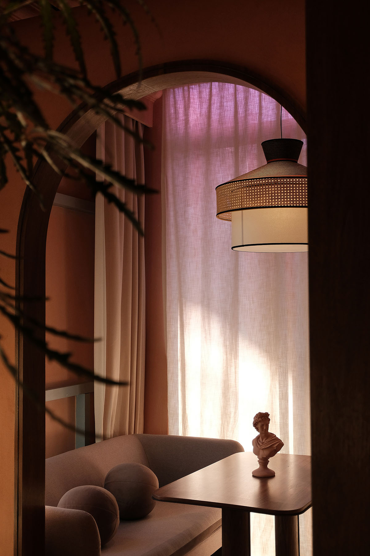
Image © Sò Studio
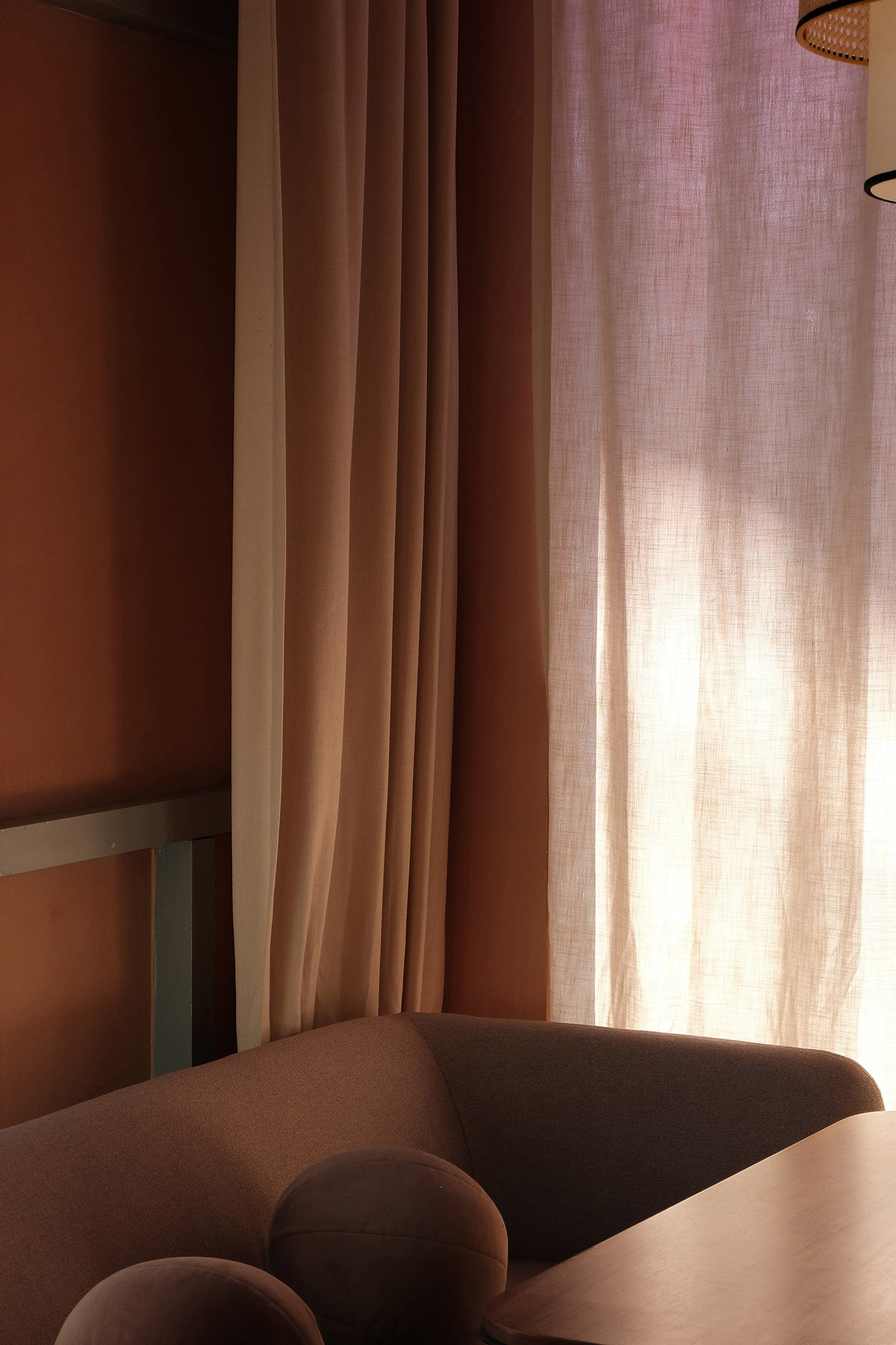
Image © Sò Studio
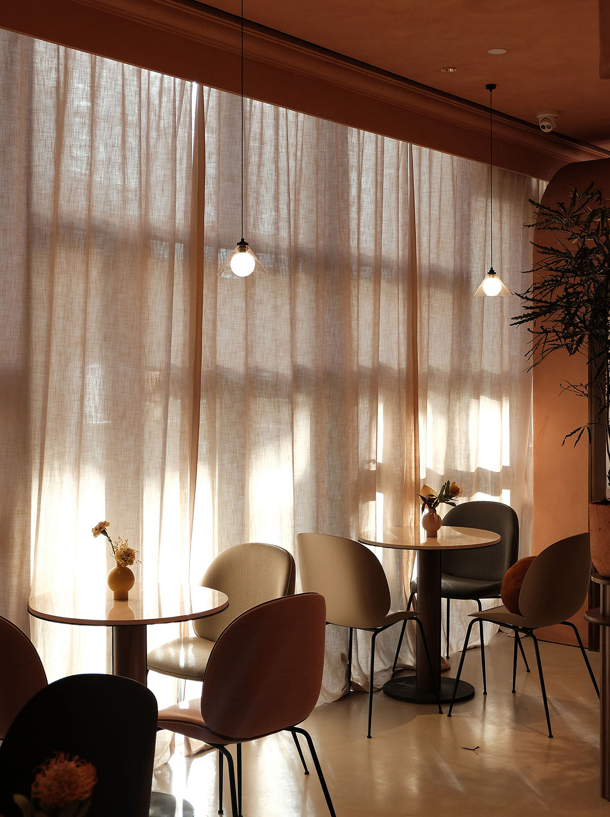
Image © Sò Studio
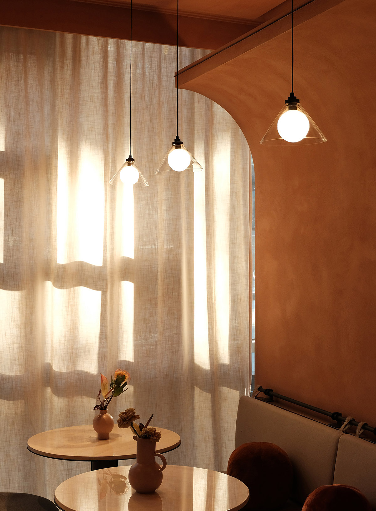
Image © Sò Studio
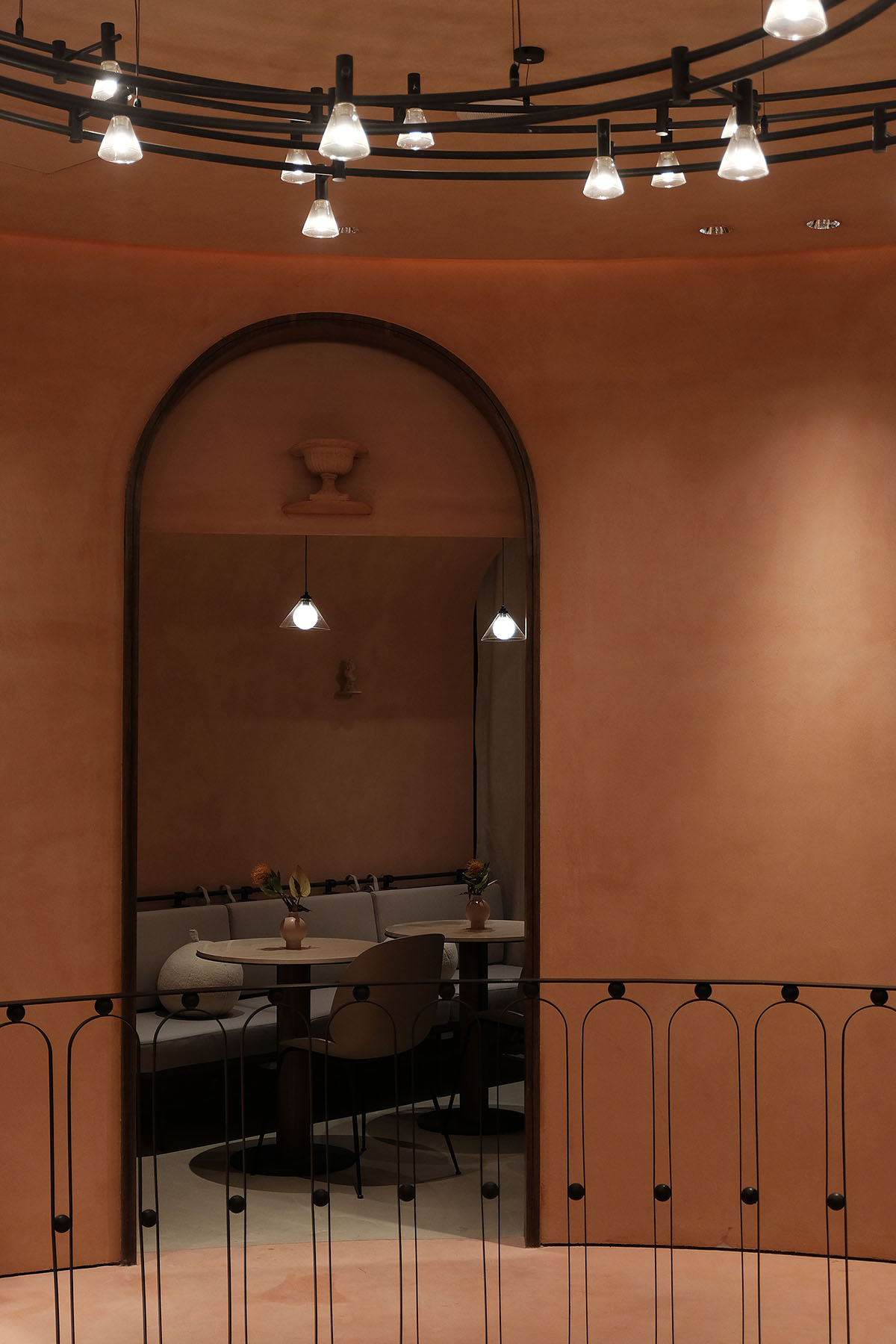
Image © Sò Studio
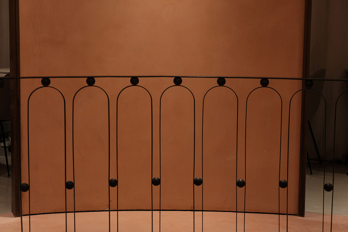
Image © Sò Studio
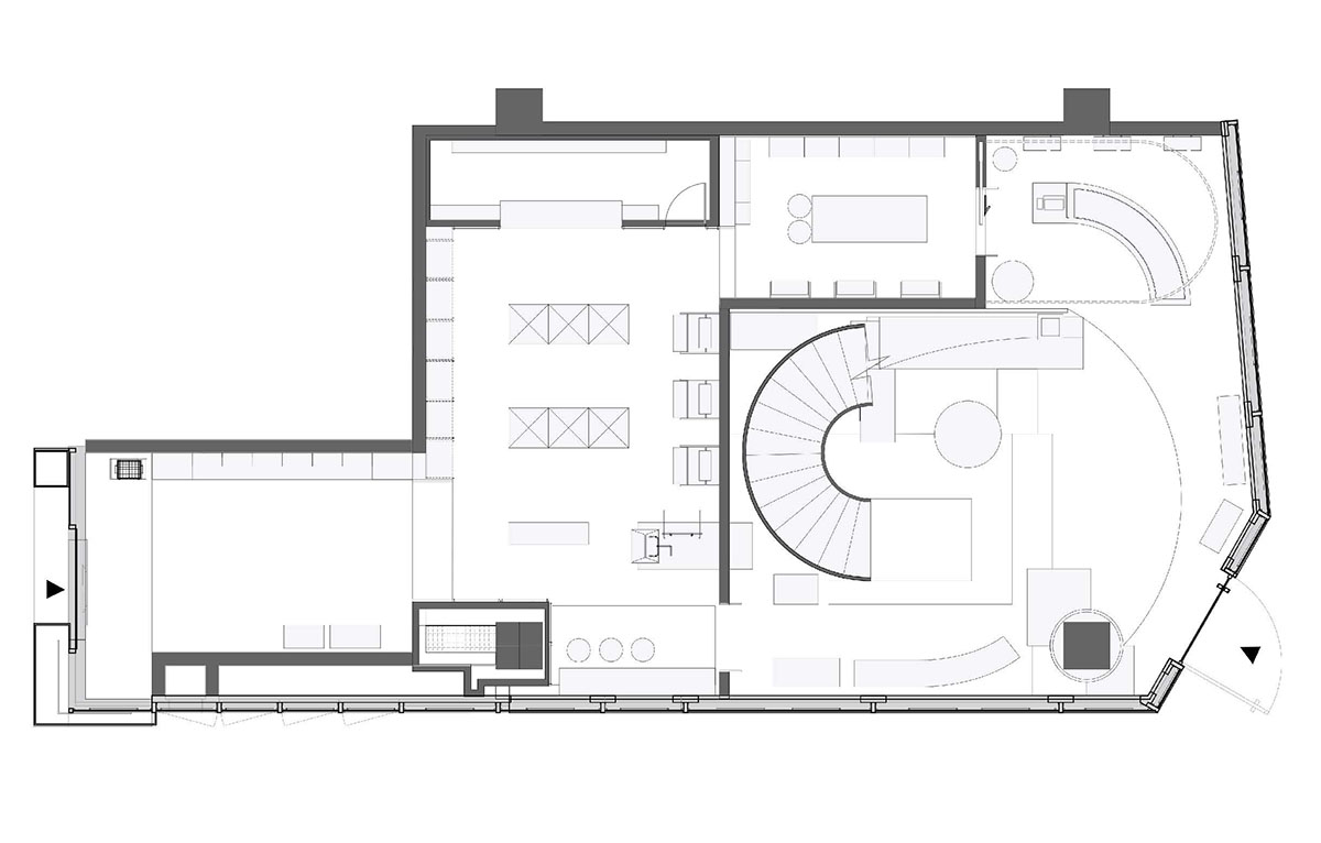
1st floor level plan
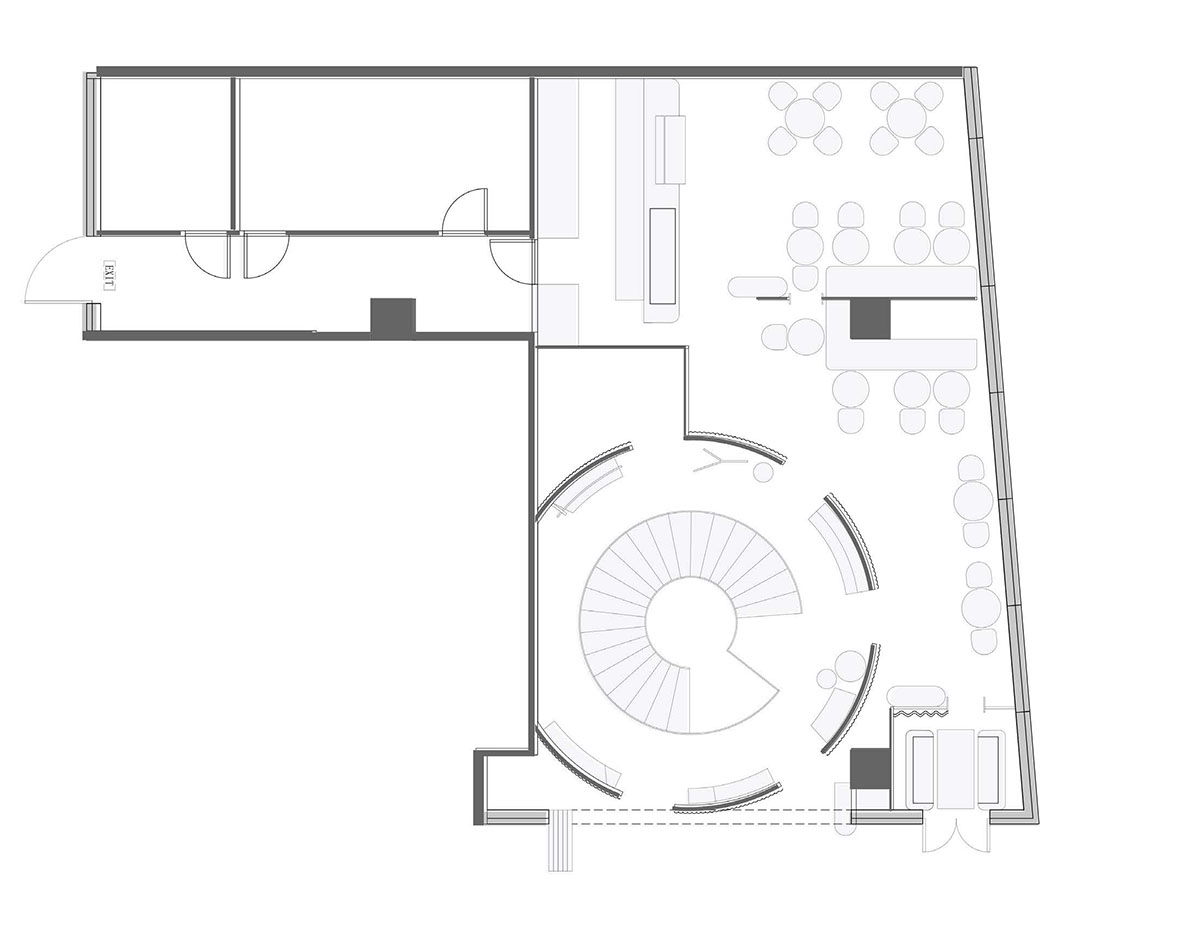
2nd floor level plan
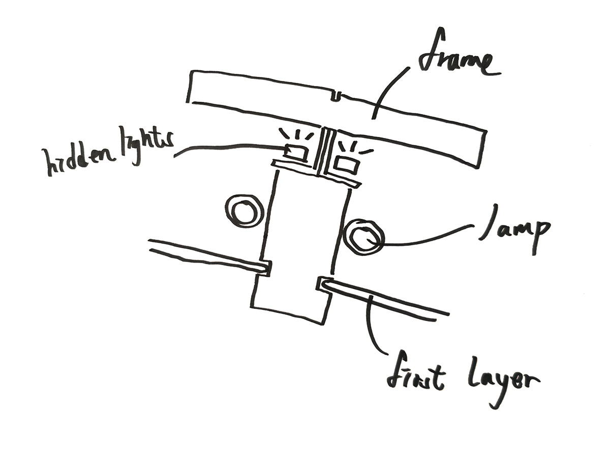
Façade Structure diagram
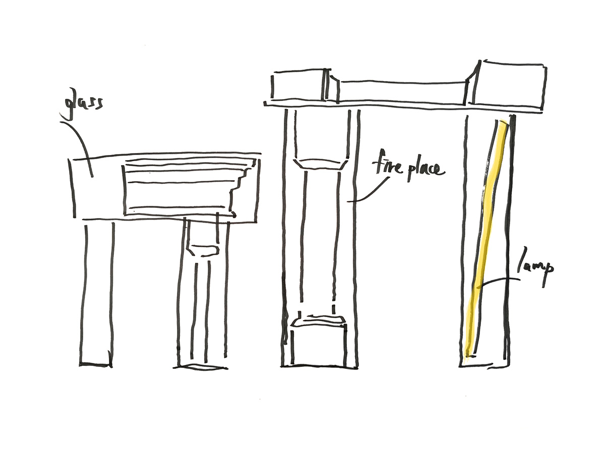
Recreation diagram
Project facts
Name: THE BEAST BEIJING Taikoo Li
Concept: “A Floating Box”
Idea and key words: Steps, Scales, Ladders Sunny Side Up
Gross Built Area: 245 m2
Address: F1, Taikoo Li, Sanlitun, 19 Sanlitun Road, Chaoyang District, Beijing, China Client: Beast
Design team: Sò Studio
Completion time: 2019.01
All images © Hongbin Wang LINSHAN FILM & Sò Studio
All drawings © Sò Studio
> via Sò Studio