Submitted by WA Contents
Grey and red colours combined with geometric shapes and shimmering ceiling for fashion store in China
China Architecture News - Jan 13, 2020 - 14:38 5142 views
Shenzhen-based architecture and interior design firm AD ARCHITECTURE has renovated an old boutique for TROUNGREE, situated in Shantou, China, which sells clothing from designer brands.
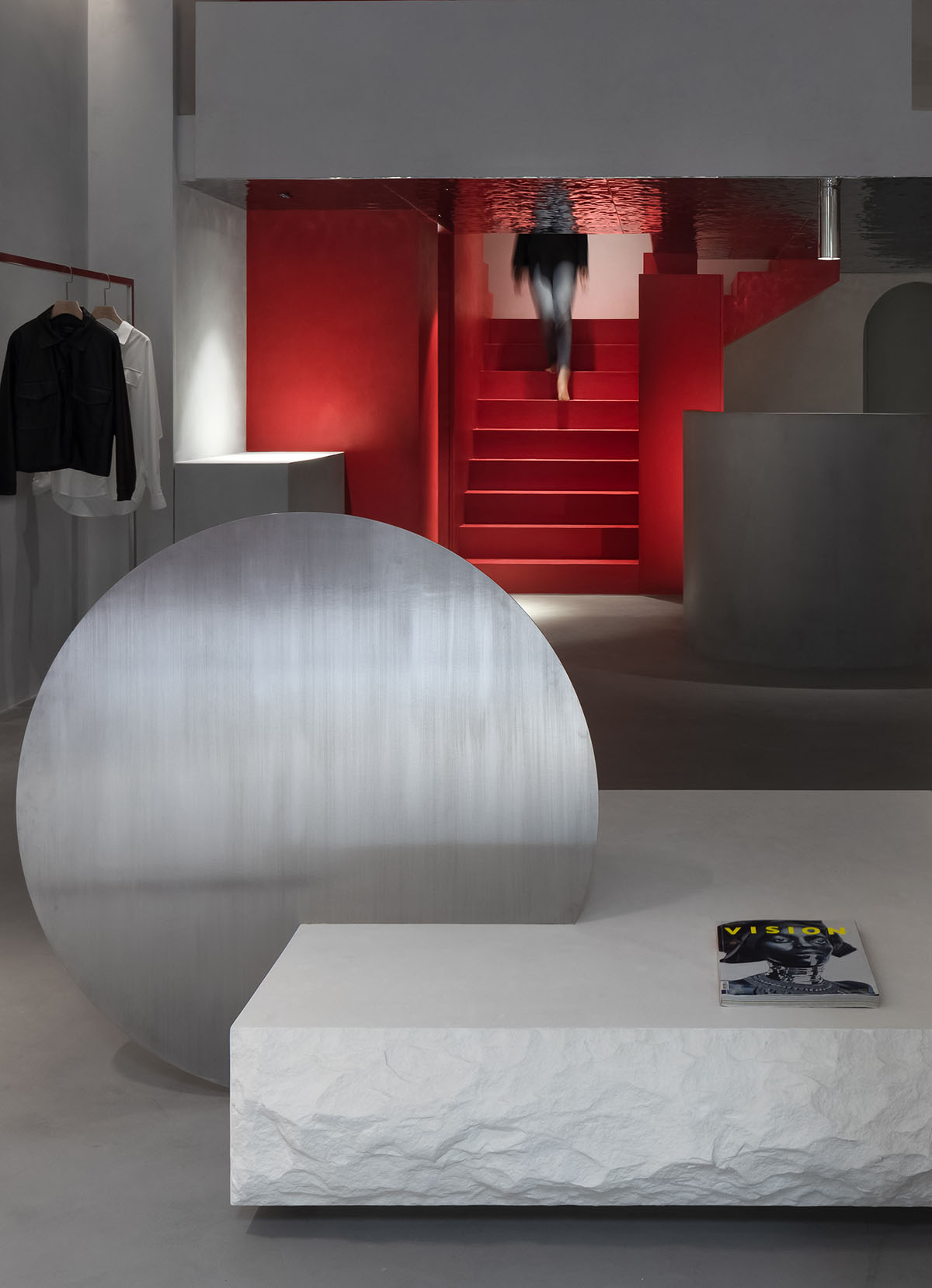
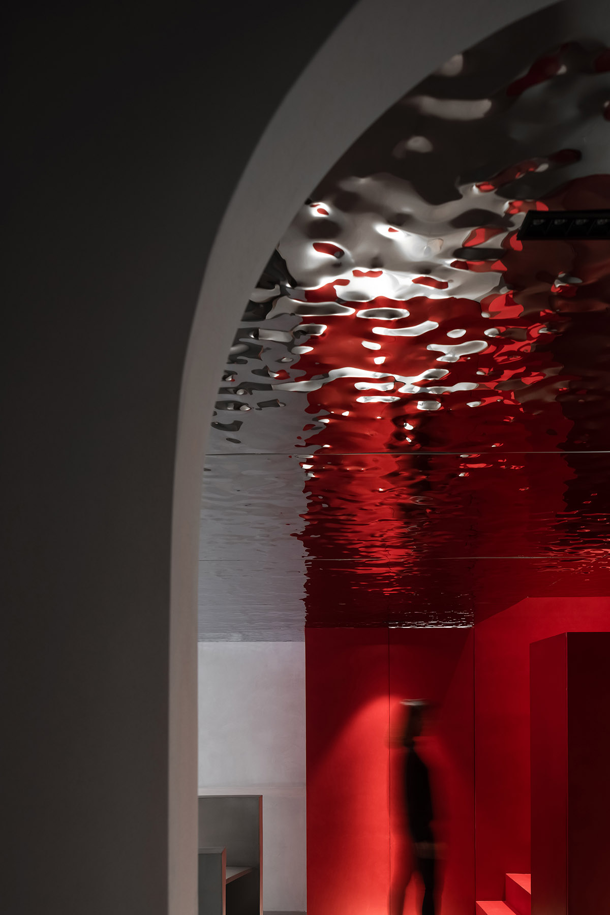
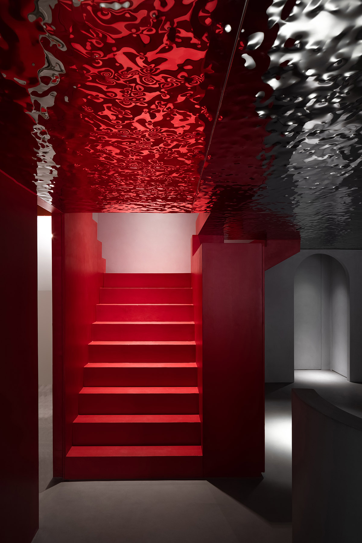
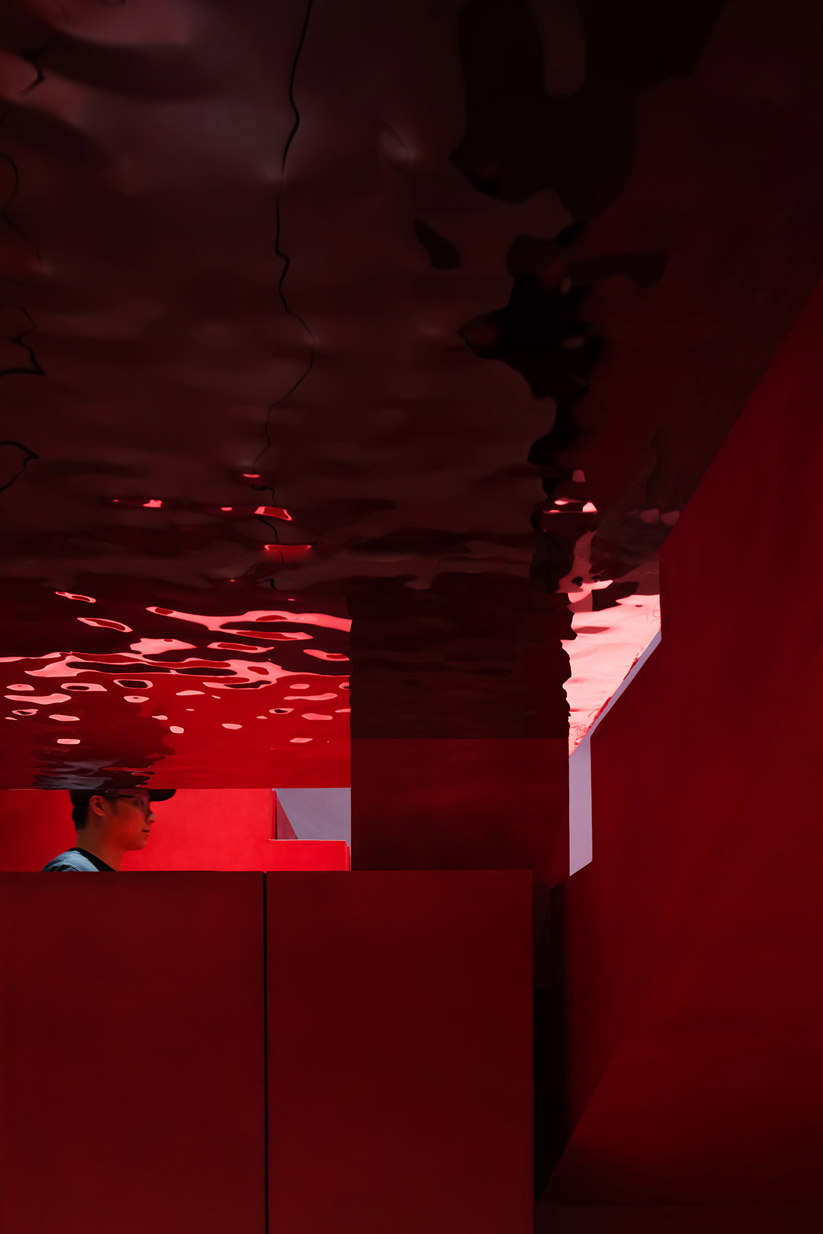
Named TRONGYEE Boutique, the 90-square-metre fashion store embraces variations of spaces made from red and grey colors and different geometric shapes that dominate the interior space. A shimmering effect of the ceiling adds a different lighting quality to the space to enhance the scale.
The interior design was approached based on the concept of "Deriving". "Deriving" indicates evolution and developing something new from the matrix. For a brand, continuous deriving helps to lead it to a future of infinite possibilities.
TRONGYEE is a brand established in 1999, dedicated to selling womenswear of multiple brands. It entrusted AD ARCHITECTURE to reshape a store situated in a bustling commercial block in downtown Shantou.
The upgraded store was planned to offer garments exclusively from designer brands, through which TRONGYEE hoped to reactivate its brand identity, and bring new vitality to the city's commercial field.
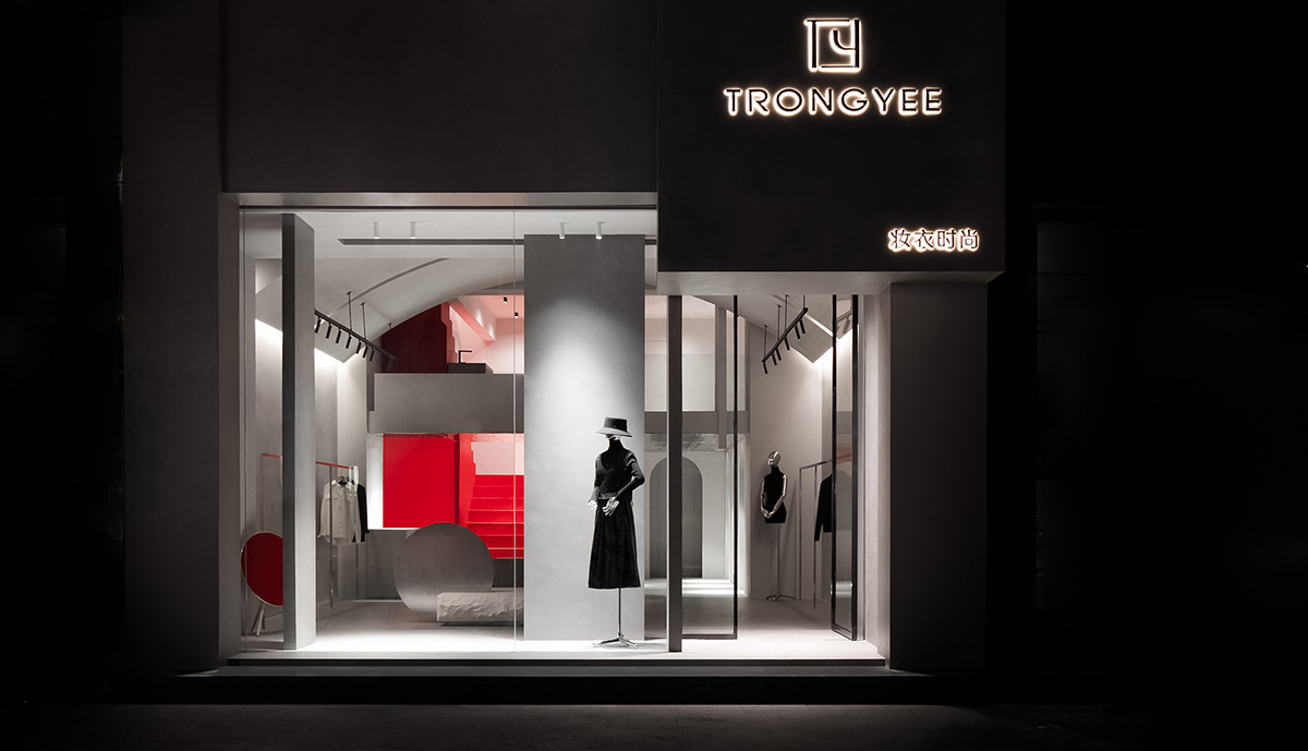
The boutique store occupies an area of 90 square meters. AD ARCHTECTURE applied the design method of art installations to approach the project, injected artistic quality and modern aesthetics into the design.
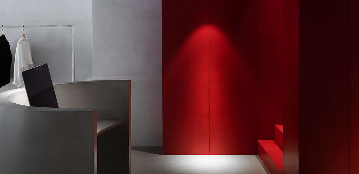
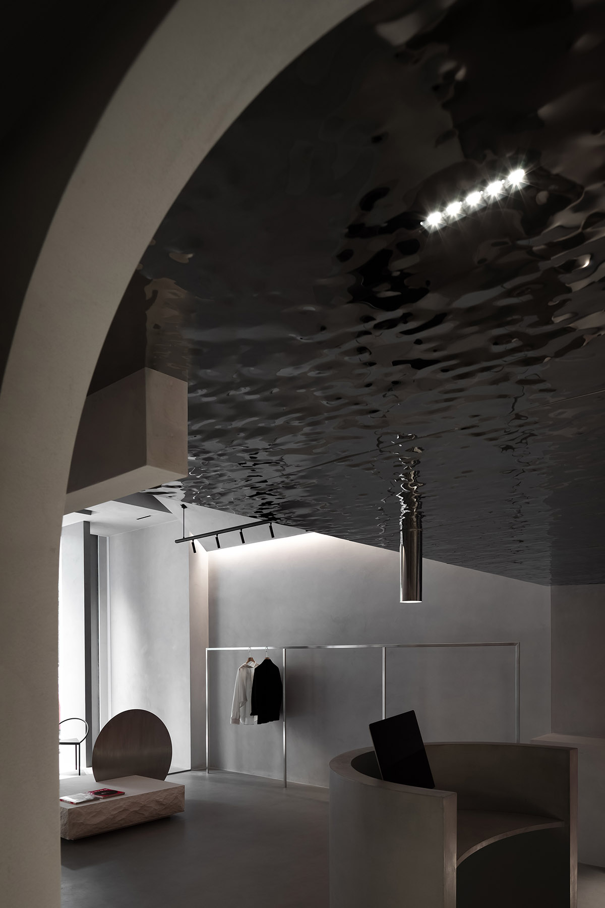
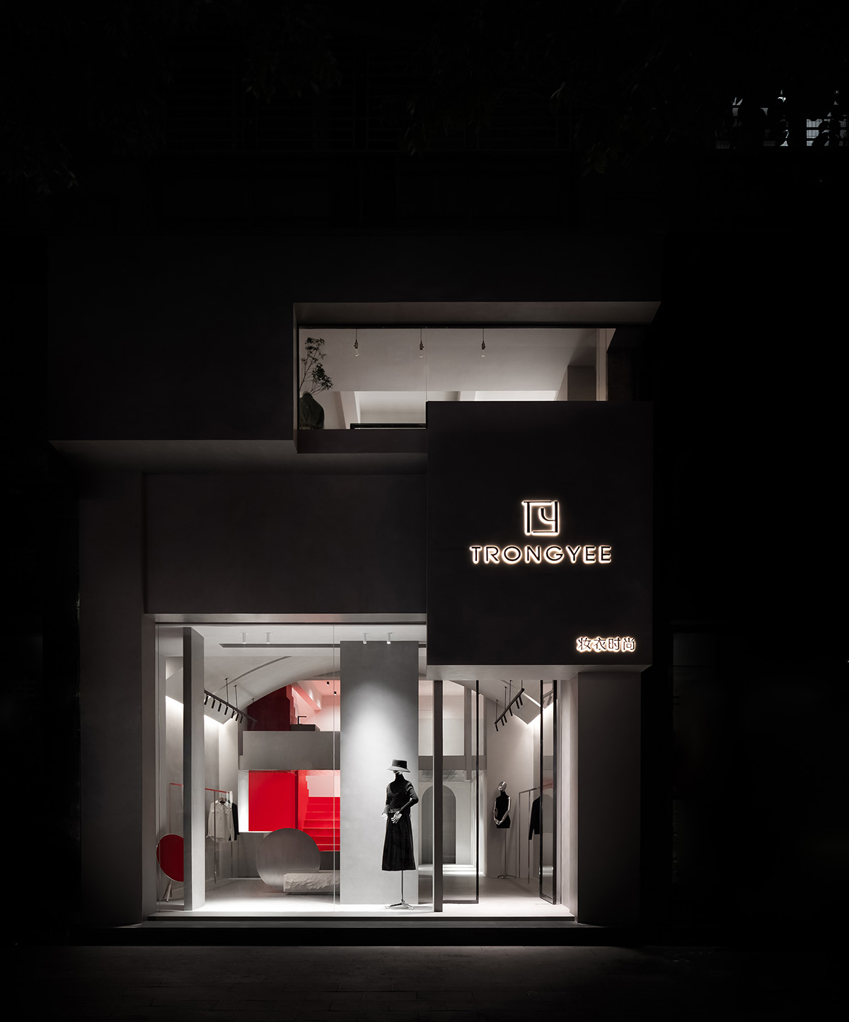
The storefront is an important part that needs to be considered carefully, since it directly presents the store's image. The designers adopted a neat facade and low-intensity lighting through reverse thinking, so as to directly guide the sight line to the indoor space. The ultra-clear glass exposes the interior, which breaks the surrounding noisy ambience of the street.
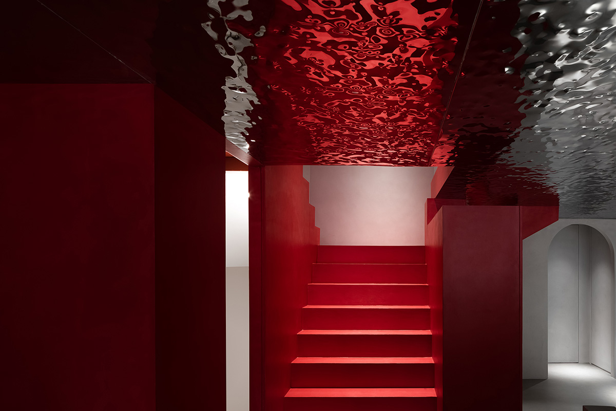
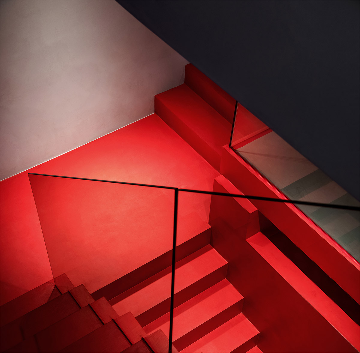
As for the interior space, the designers utilized a "flat" design idea in line with current trends. The floor, walls and ceiling use the same material, to alleviate the three-dimensional sense of the space.
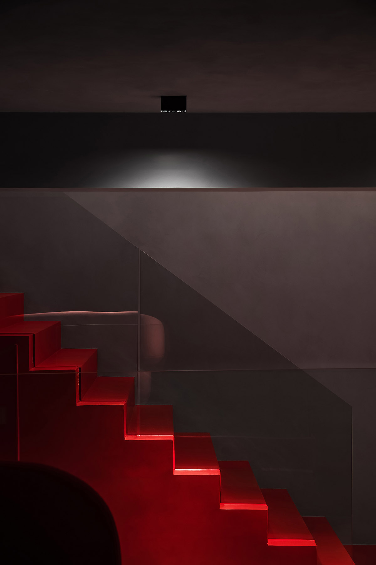
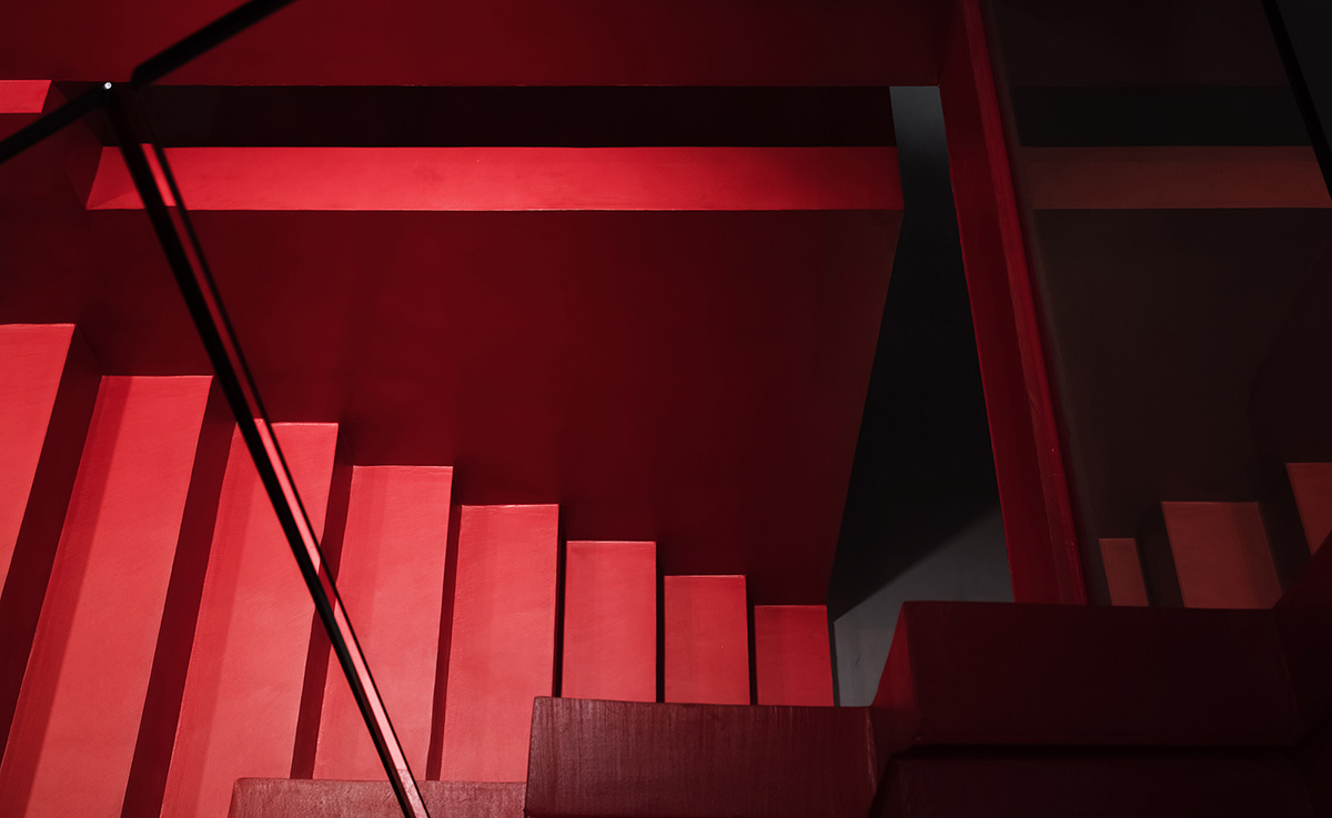
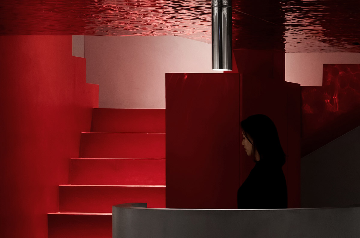
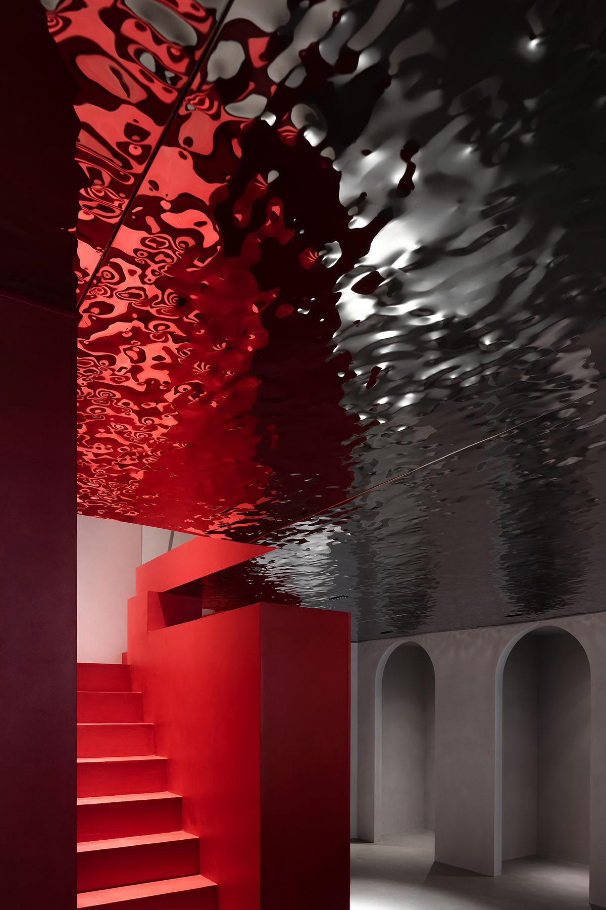
The red staircases functions as a vertical circulation route, which is also a visual highlight. The combination of gorgeous and plain shades generates a dramatic tension, and results in a serene yet fervent spatial atmosphere which is isolated from the surrounding din.
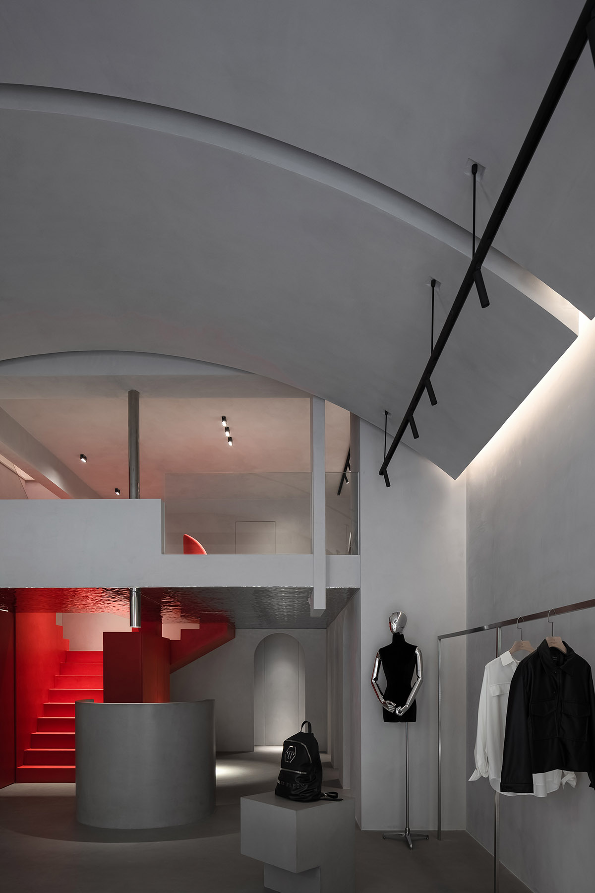
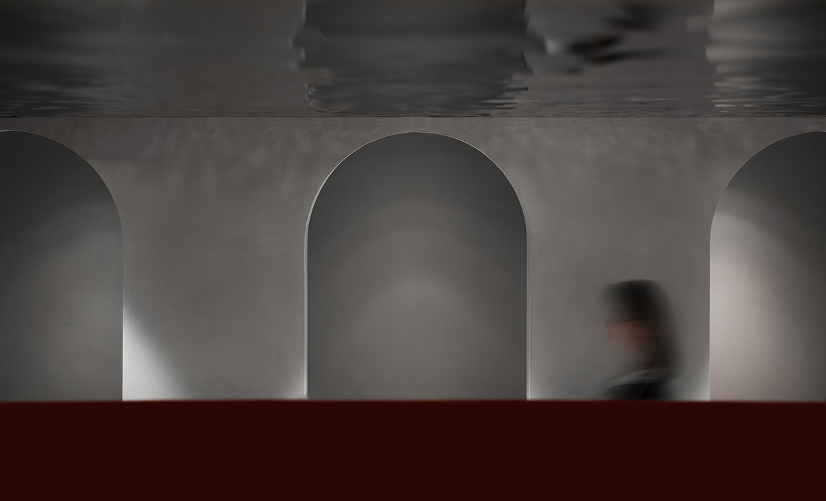
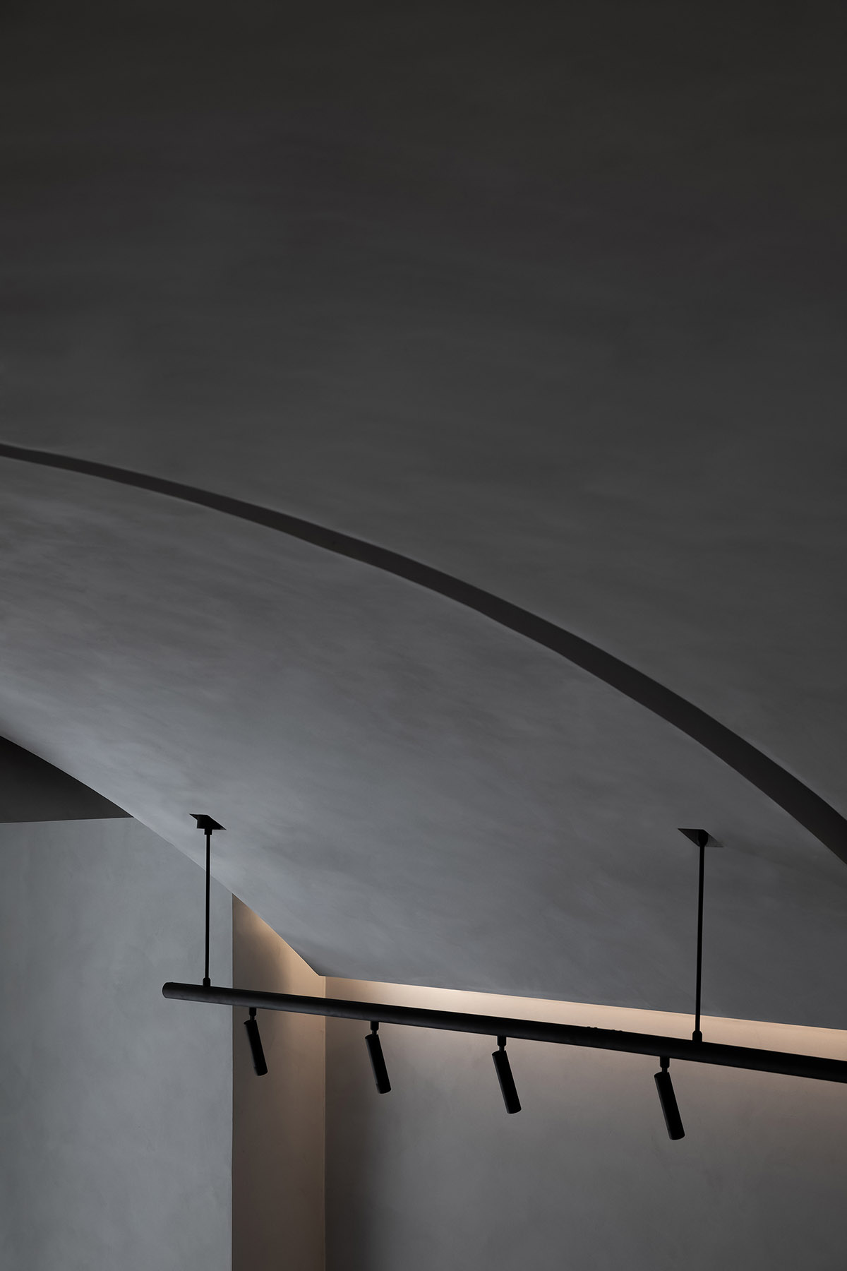
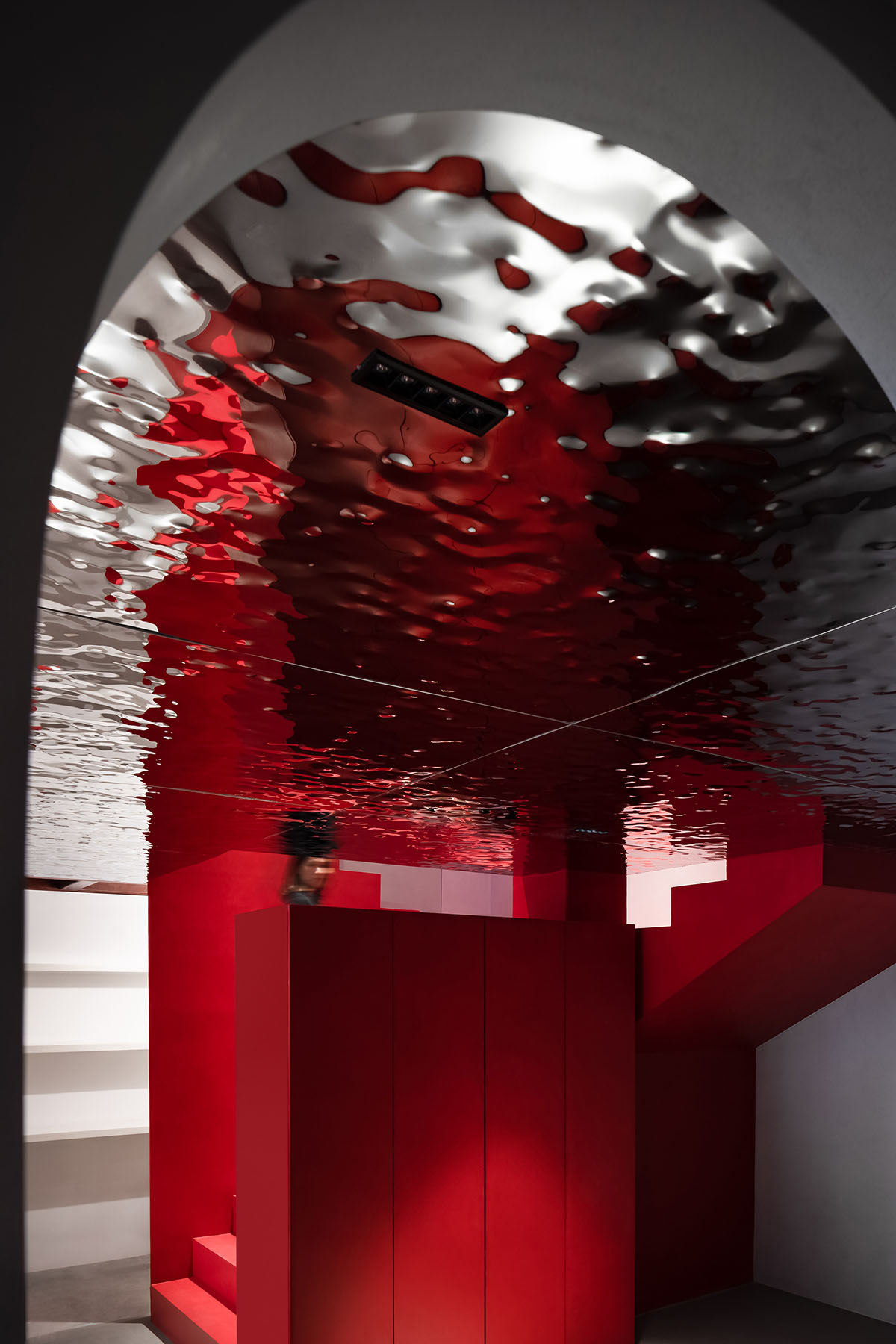
Geometric shapes and curves are interwoven, which enriches the form of the space and creates visual illusions. The space widely utilizes regular square blocks, which are complemented by the vaults on the ceiling and arched door openings. Those arched structures break the calmness of the space, and add a vivid temperament to it.
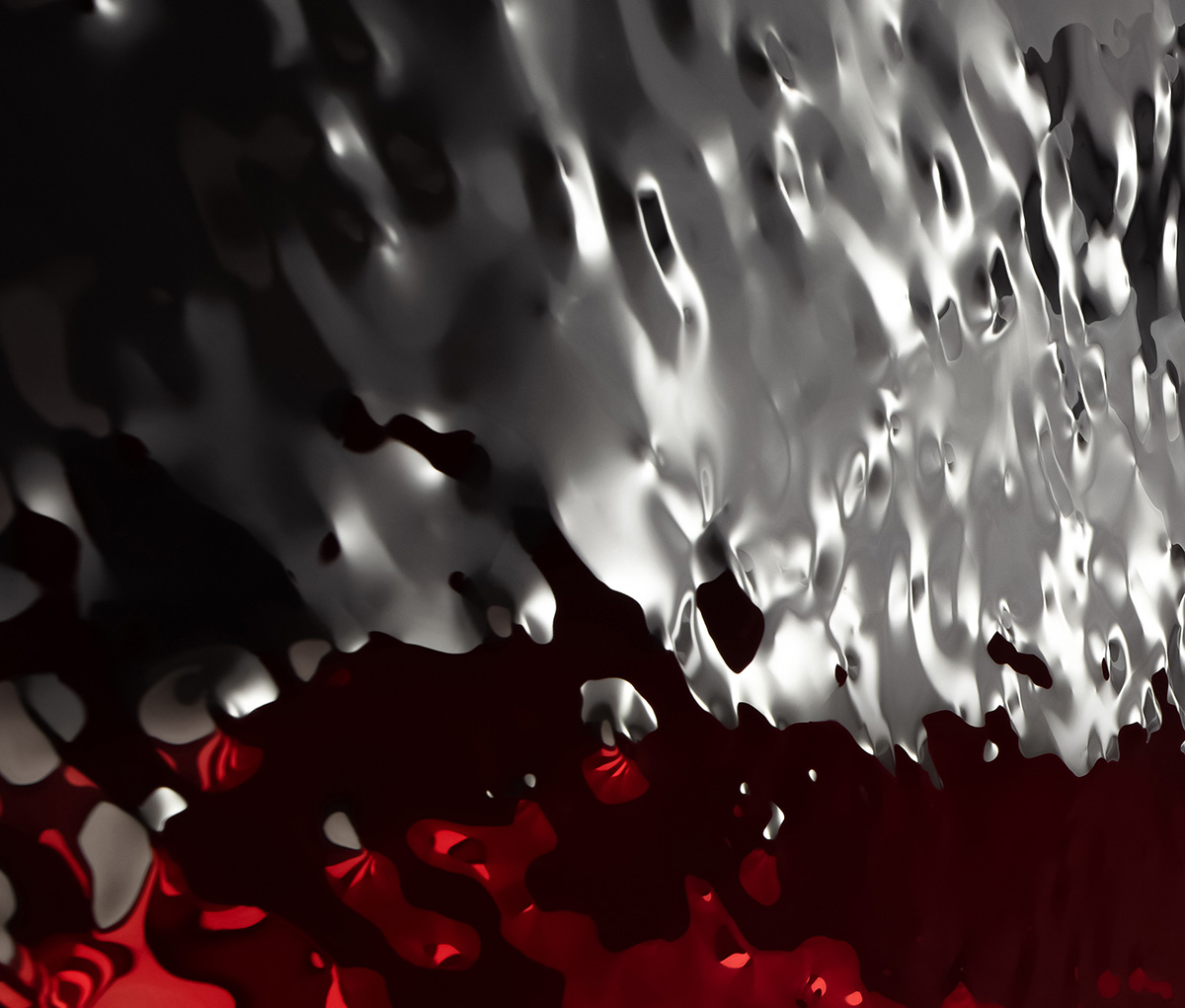
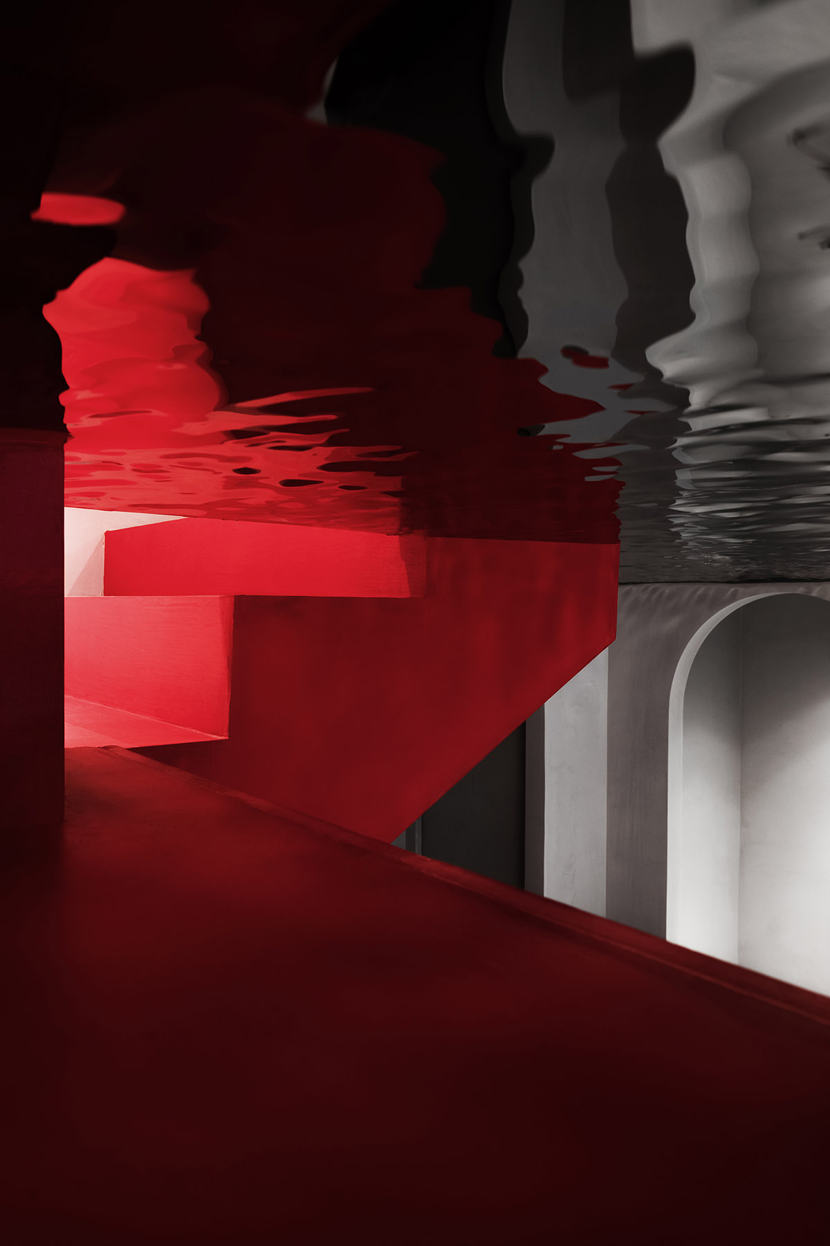
The mezzanine is merely 2.2 meter high, so the design team clad its ceiling in a reflective material featuring ripple-like patterns, which eliminates the oppressive feeling and at the same time blurs the boundary of space.
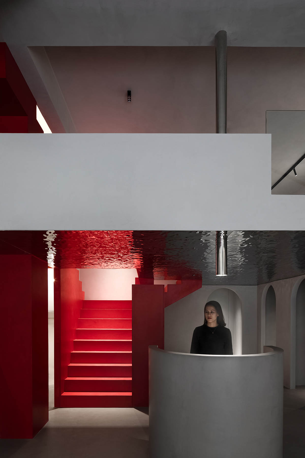
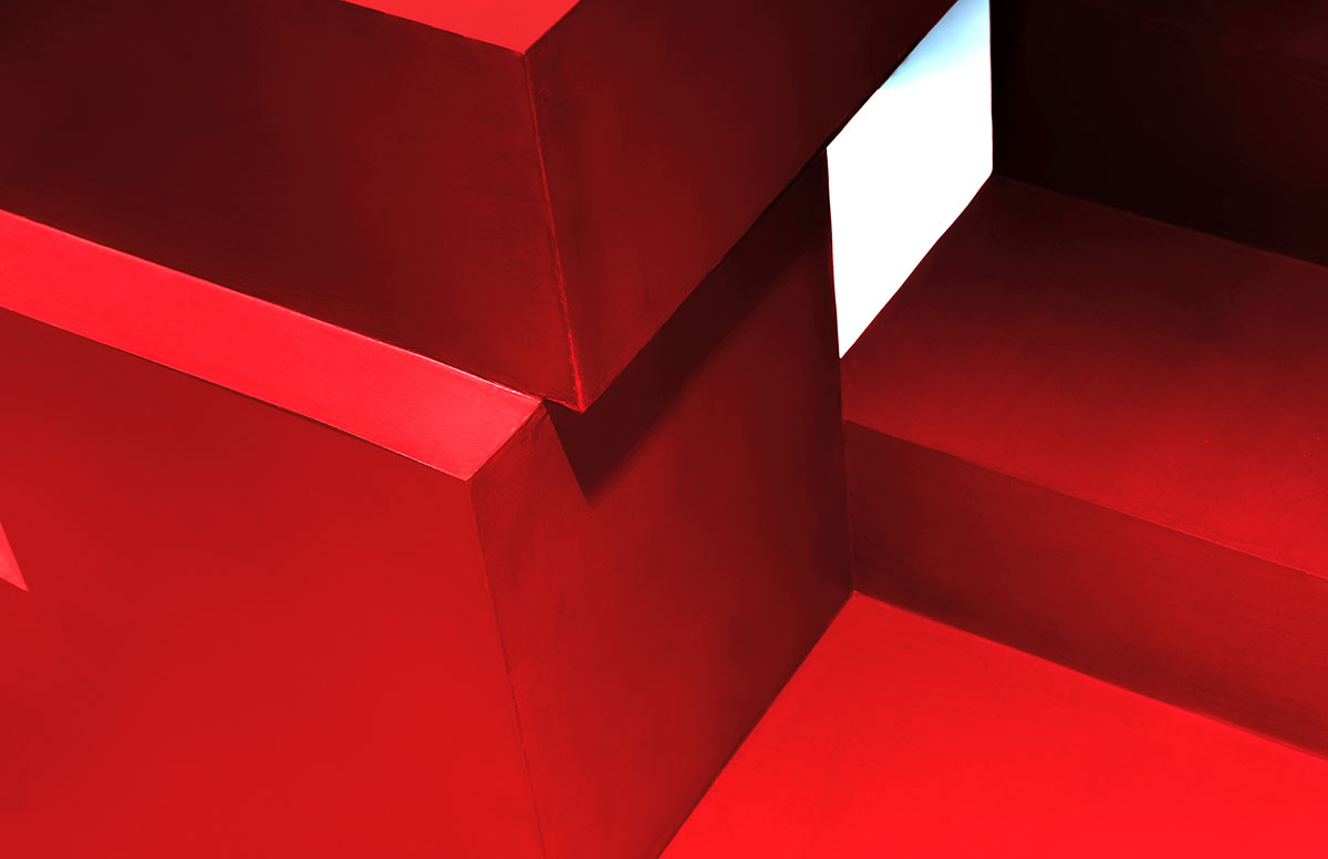
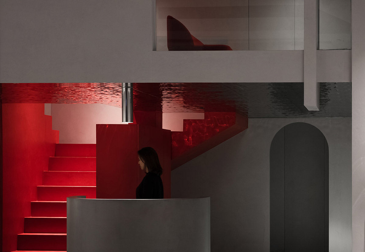
The overall space is dominated by a gray hue rendered by cement, and highlighted by red. The two hues form strong contrast, and present an impressive brand image.
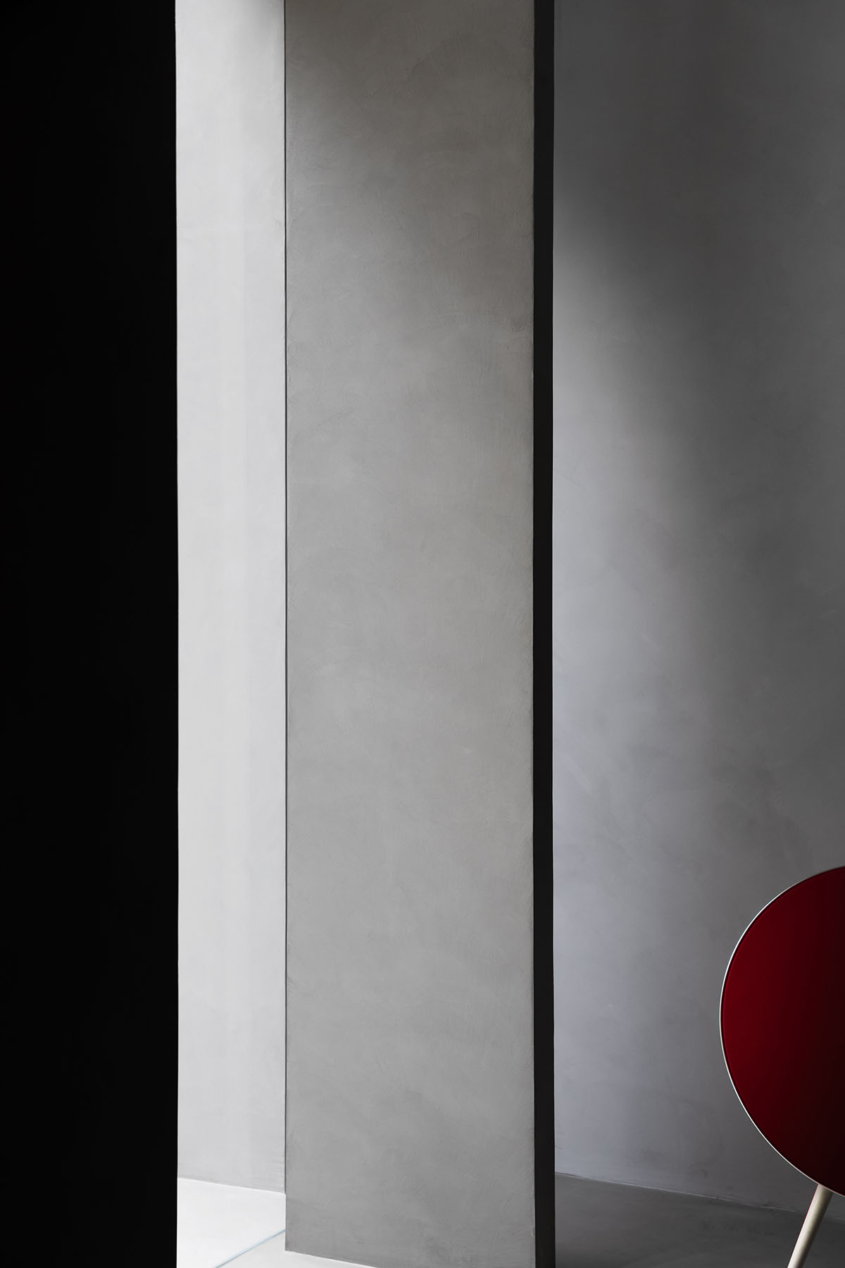
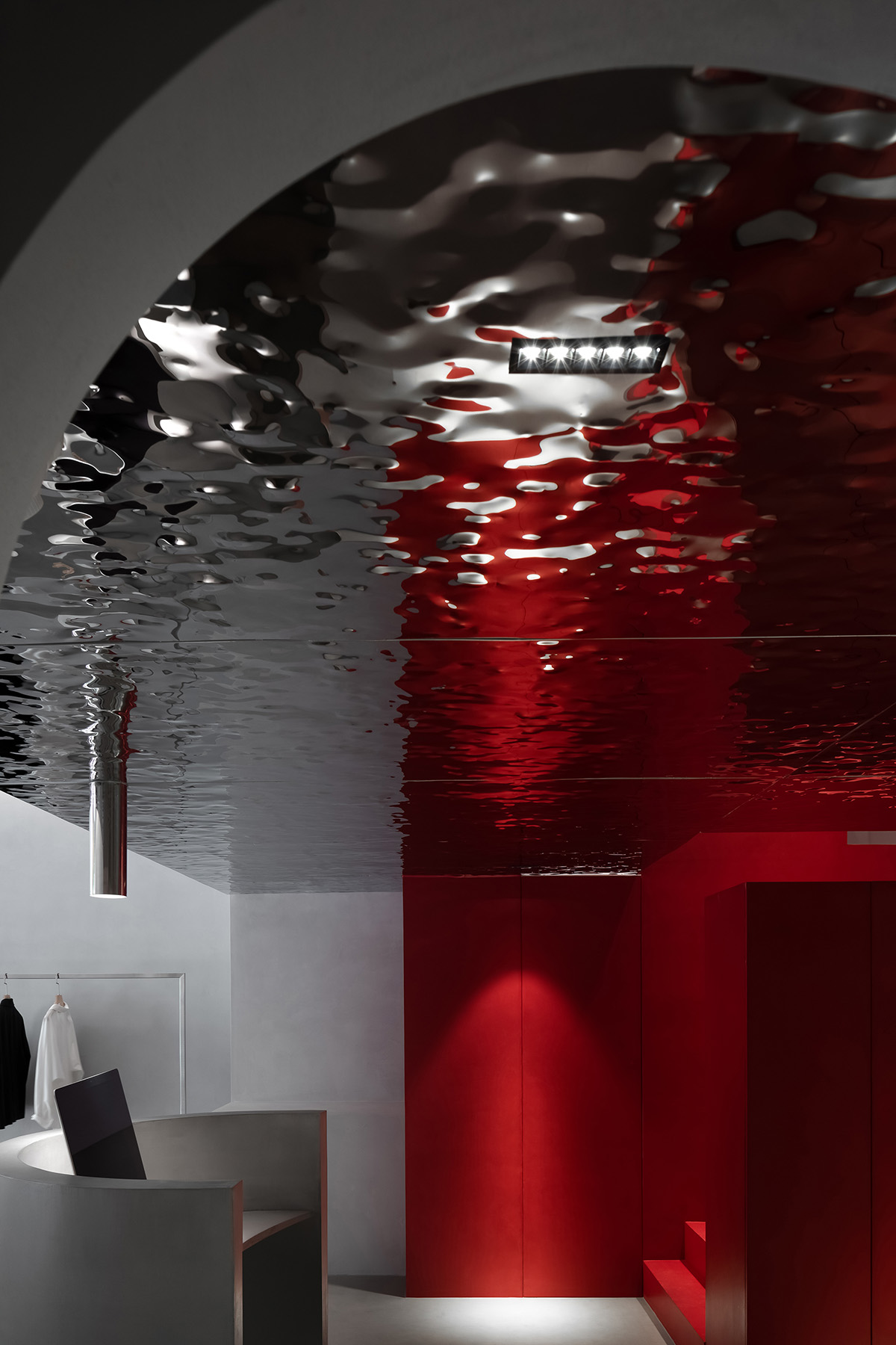
The project is an exploration of sustainable value for future urban commercial spaces. AD ARCHITECTURE conceived the design solution by taking commercial value as the starting point, and eventually created a design that is derived from the core of the brand TRONGYEE.
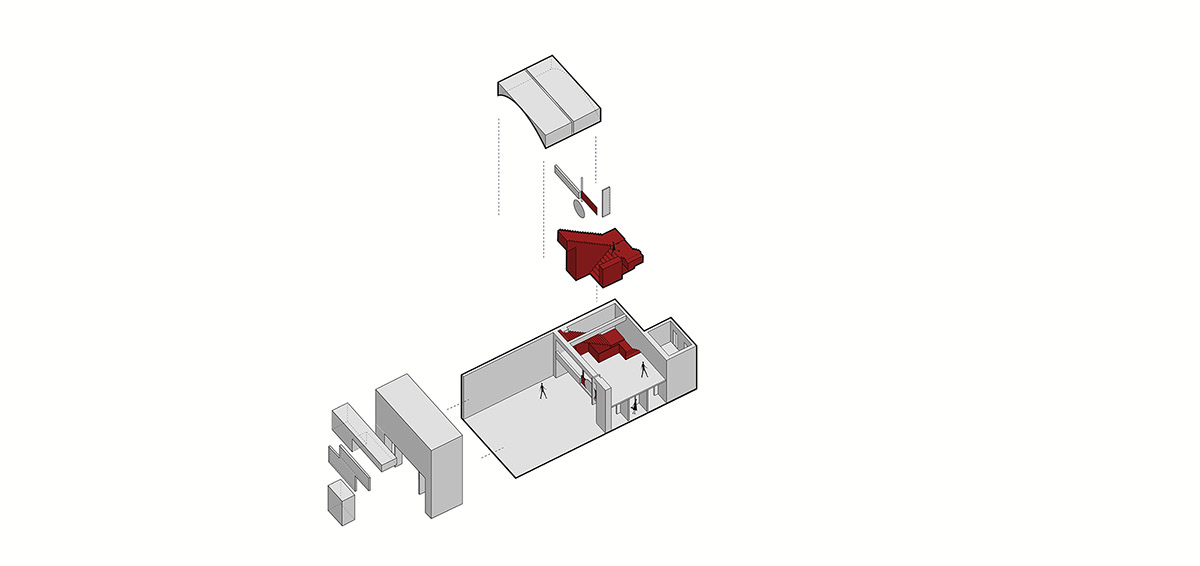
Spatial composition diagram
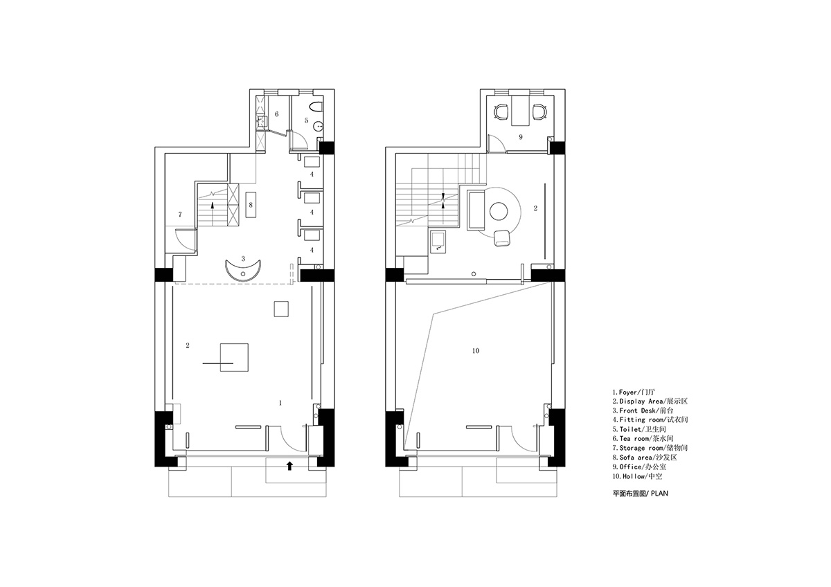
Plan
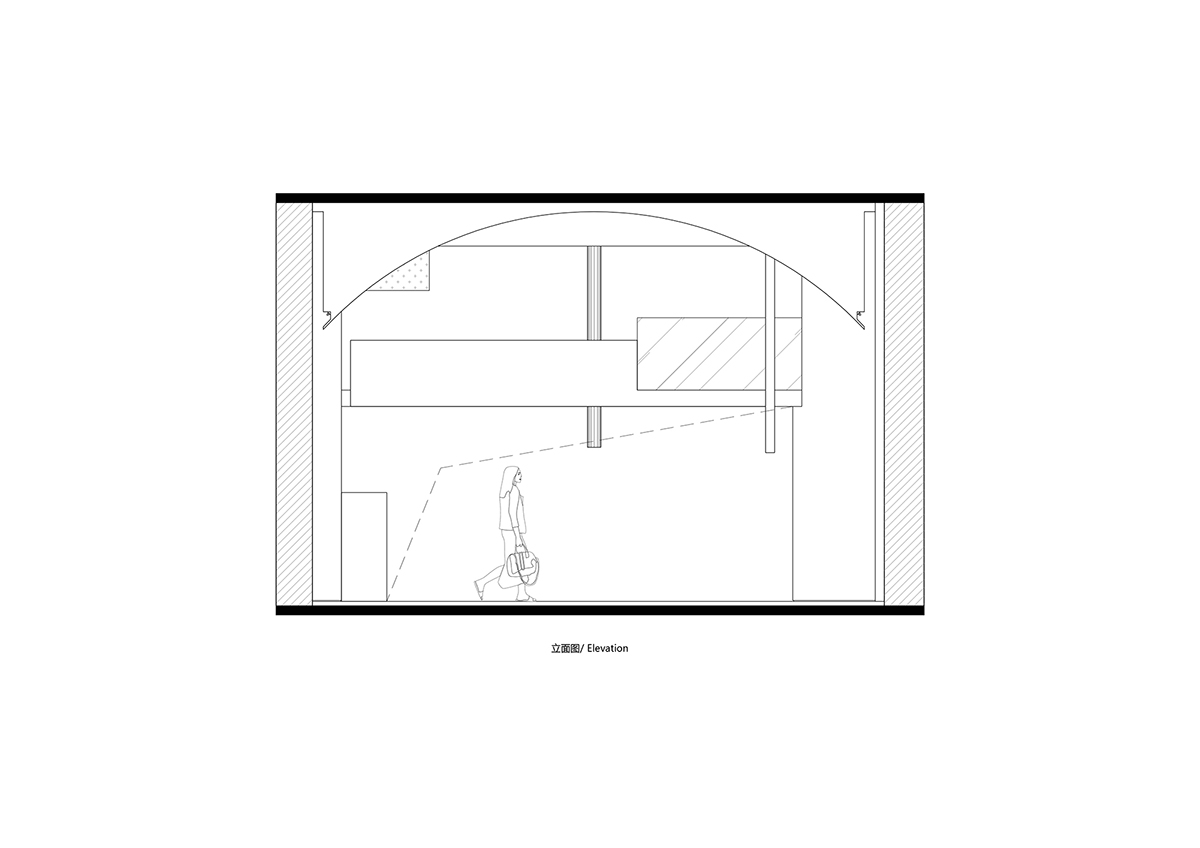
Elevation 1
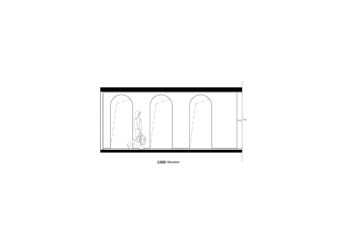
Elevation 2
Project information
Project name: TRONGYEE Boutique
Design firm: AD ARCHITECTURE
Chief designer: Xie Peihe
Design team: AD ARCHITECTURE
Project location: Shantou, Guangdong, China
Area: 90 m2
Main materials: microcement, handmade paint, metal, glass
Start time: October 2019
Completion time: December 2019
All images © Ouyang Yun
All drawings © AD ARCHITECTURE
> via AD ARCHITECTURE