Submitted by WA Contents
Roberto Di Donato Architecture gives "unfinished feeling" to Valencia's 20th Century apartment unit
Spain Architecture News - Feb 23, 2018 - 02:07 20651 views
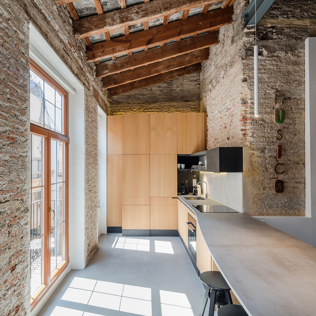
London-based architecture firm Roberto Di Donato Architecture has completed the challenging renovation of an apartment unit located in an early 20th century listed building in the heart of Valencia.
Named Musico Iturbi, the overall interior of the flat entirely looks like "an unfinished apartment building" as some of existing elements are keeped as they are, while adapting modern fixtures and furnitures to the historic materiality of the unit.

Located in the heart of Valencia, the apartment unit has remained abandoned for many years and the unit was an empty shell when it was bought by the client, creating numerous opportunities but also challenges to the design team.
The approach to the project was guided by the ambition to create distinct, yet fluid, modern living spaces almost leaving undisturbed the existing structure.
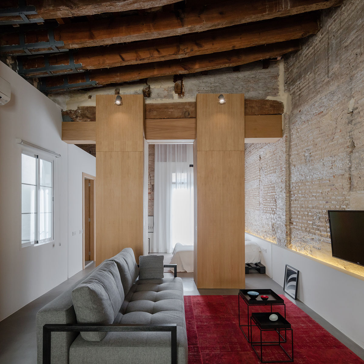
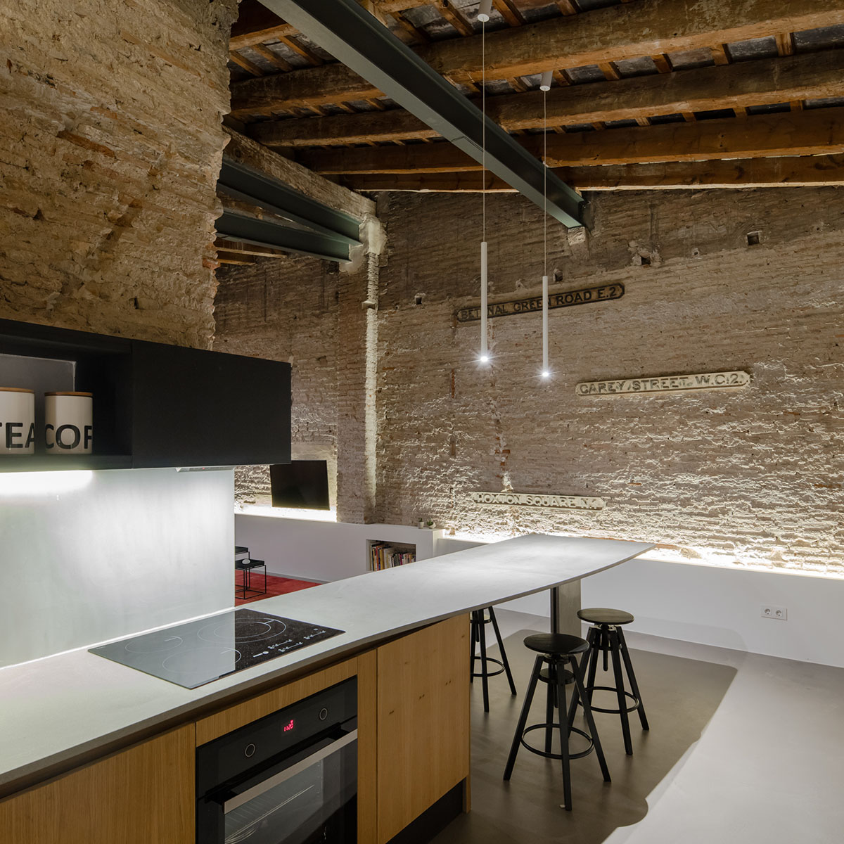
The unit simply includes a small kitchen with a long bar-table, a large living room, a very simplistic bedroom and master bedroom. The most important eye-catching thing in the house is that all spaces are well harmonised in terms of texture, colour and materiality.
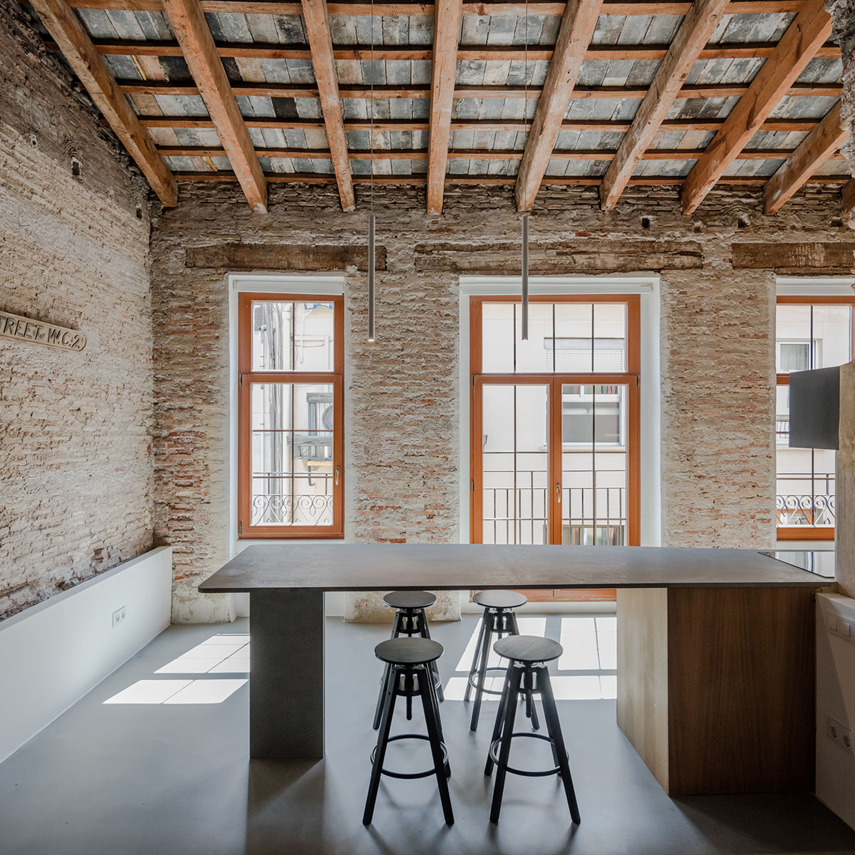
“We opted to introduce non-conventional partition walls, making the entire depth of the space visible and interconnected," said Roberto Di Donato Architecture.
"The space is constantly flowing from one area to the other, with the separation between night and day areas provided by two tall wooden elements. These custom designed elements also contain the bedroom wardrobes and three sets of doors allowing varying degrees of privacy."
"The ceiling height was also deemed a particularly valuable element in the renovation. The structure of the roof was restored and kept fully exposed, no element of the new design gets in contact with it, underlining the respect for the past and also enabling the full sense of space and volume of the apartment to be perceived," added the studio.
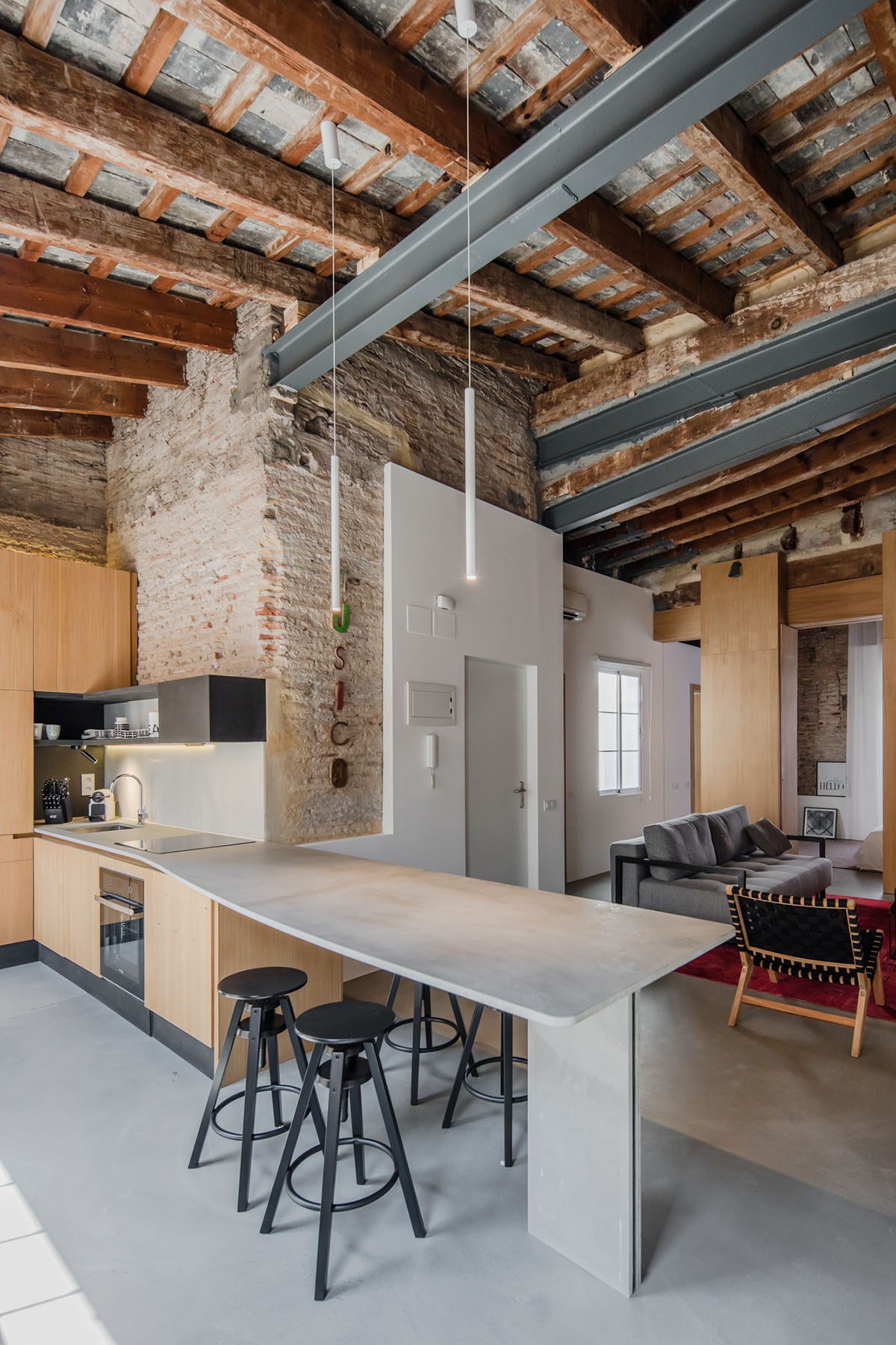
The studio utilised a tool by providing a special “direction” on design elements to emphasize the special quality in the interior. All the new construction elements have been introduced with a strong and clear direction in space.
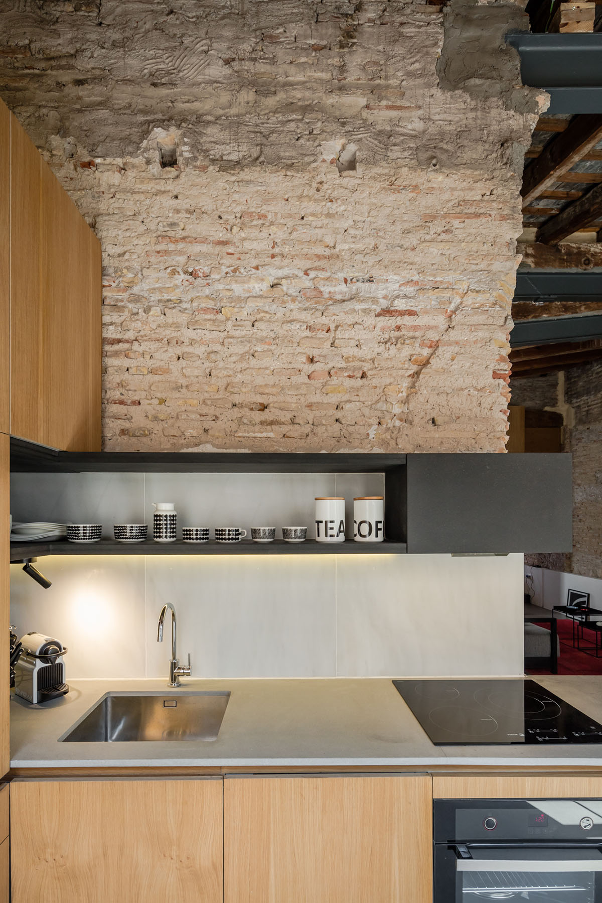
The wooden wardrobes, the full-height white curtains, and the tall ladder are accentuating the verticality of the space. In turn, the long kitchen worktop, the white plasterboard pedestal and its line of light are enhancing the horizontal dimension.

With a reduced space, brief and budget, the project succeeded in introducing a contemporary design language, while enhancing the character and the materiality of the old space.
The architects added essential new features, but they preserved existing “wounds” and layers of transformations built over the years, and with new modern additions, they enhanced the sense of continuity throughout the building’s history.


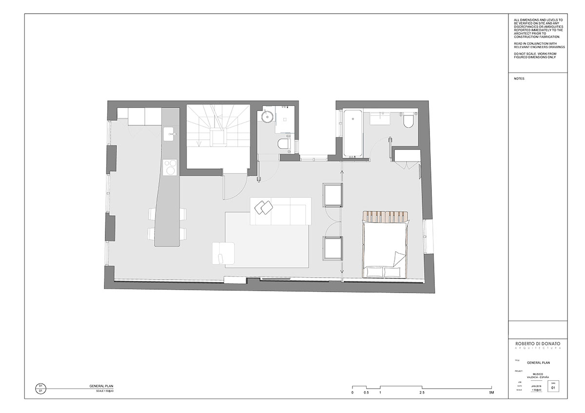
General plan

Sections
All images © João Morgado
