The arches around the facades, preserving existing elements alongside adapting the interior and exterior to the new homeowners' wishes, the natural materiality, the color palette, all make this family home (located in a pastoral neighborhood in one of the Sharon cities) an especially experiential and powerful one. The architect Boaz Snir, who is responsible for the redesign, shares the process
Welcome to a house built in the 1980s that was purchased by a couple with two children and recently completely renovated from the ground up to suit their needs. Before finding it, they had turned to architect Boaz Snir and together with him examined a number of properties – the romantic arcade framing the facades is ultimately what tipped the scales.
"When we first visited the house, naturally it looked dated but it was hard to ignore the potential – the impressive architectural structure, the large yard, the number of rooms and the size of the spaces made for an excellent planning canvas and ultimately we adapted the house precisely to the family's taste and needs. In the next stage, interior designer Ayelet Shavo joined the process – I focused on deconstruction and changes to the structural elements and dividing up the interior, and she focused on choosing materials and dressing the home," Snir recounts.
Before the renovation, the house (spread over 4 levels) contained quite a few engineering components that cluttered the division of spaces and required treatment. For example, supporting columns in the middle of the public space that created separation between the kitchen and living room. Moreover, upon entering through the lobby, guests went directly into the kitchen space, and the architect wanted to change that: "The columns created a block between functions and additionally, it makes much more sense for the living room to be the first space exposed to when entering, so we switched the locations: now the living room and dining area are at the front of the house and the kitchen is located in its inner section on the floor, also including a large pantry accessed through a concealed door in the cabinetry front. This created an uninterrupted, column and beam-free spacious area, open and ventilated," explains Snir.
Another prominent element that changed completely is the staircase spanning the levels: "The old-fashioned concrete stairs we replaced with a modern steel staircase. At the house entrance I designed a guest bathroom which I wrapped in fixed carpentry – a sort of wooden box whose section near the entrance door contains cabinets, shelves and a bench for removing shoes. On its other side there is a concealed door leading to the actual bathroom facilities, a decorative niche with a mirror and concealed lighting, and a dedicated area where the home's audio-video and smart home systems are housed," he says.
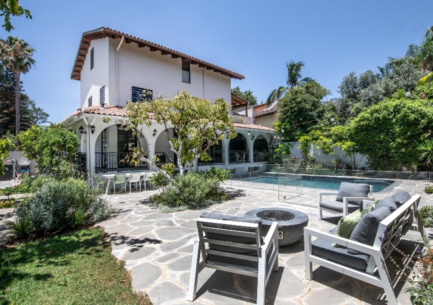
The Spanish arches framing the house's facades, the ones that cast a spell on the new owners, were decided to be preserved, and got a colorful upgrade: "Before the renovation the house was entirely painted in cream, brown and earth tones which we chose to replace with a contemporary palette based on shades of grey, white, black and light brown. The facades were painted a light color and the brown wooden beams framing them were painted in opaque white, adding visual crispness and making the home modern and contemporary," he explains.
"The goal was to create an elegant, prestigious yet at the same time warm and pleasant living environment, a chic and modern yet simultaneously not too austere and very inviting domestic setting. We left the original tiled roof as is – it was in good condition and greatly contributed to the building's authenticity, thus also preserving its past while integrating relevant additions that are faithful to the present and will hopefully remain relevant in the future as well," says the architect.
"The original openings, small windows and heavy pocket doors leading to the yard were changed and significantly expanded in order to create as unmediated a connection as possible between the two domains. Overall, throughout the planning process we worked to find the optimal vantage points from every angle: what is the view that meets the eye from each corner of the house and how do all the elements succeed in jointly creating symmetry and harmony while maintaining a material and chromatic balance. We also focused on ways to bring in as much natural air and light as possible, examining how they would blend into the home's different wings throughout all hours of the day," Snir explains.
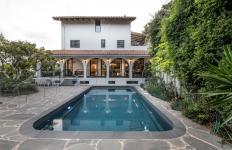
"The traditional front steps were replaced with asymmetric modern cantilevered basalt stone stairs fitted with concealed lighting. The exterior tiling was also changed to slabs of local basalt stone from northern Israel. The heavy wooden entrance door was swapped for a modern-classic iron one, and overall we were careful to integrate as many natural, local elements as possible in order to give the home an authentic, indigenous look without compromising on European, modern nuances. Olive and citrus trees were planted throughout the garden, and the old pool underwent comprehensive renovations in which we replaced the dated cladding and installed a glass railing along the perimeter," describes the architect.
The four levels are divided into a basement service floor; entrance level containing the open-plan living room, dining area and kitchen, and guest bathroom; first floor planned with the children's bedrooms sharing a bathroom and a guest suite; and the master suite on the top floor for the parents.
"Similar to the entrance level, on the bedroom floors we also changed the entire room layout, transforming the fairly disorganized space into something flowing and logical. We created large, bright bathrooms with natural ventilation, replaced the old railings with modern ones, and designed an intimate family corner on the kids' floor. To add a dimension of warmth, we used oak parquet floors throughout, selecting a multilayered herringbone pattern in the entrance level and darker, variable sized planks in the bedroom levels," says the architect.
"The sloped wood ceilings in the attic-level master suite, painted white – a choice that amplified the feeling of openness and height in the space. We designed an open yet intimate loft-like space for the parents that includes a sleeping area, walk-in closet, bathroom and vanity corner – separate functions that remain connected thanks to transparent glass doors. The proportionality in this area matches that chosen for the home's openings, made of aluminum with rectangular divisions, adding another layer to the space highly reminiscent of the Bauhaus style," concludes Snir.
2023
2023
For: A couple in their 30s with two young children
Architectural design: Architect Boaz Snir
Styling and dressing: Ayelet Shavo


