"Boundary" is a bridge between the individual and the world, enabling us to establish connections with others and the environment. — Brandi Snyder
"Margin" is the scale of space and the tone of communication between humans and the environment: rational, emotional, orderly, romantic... The chief designer of the Suzhou Space Art Gallery, Mr. Lycent Lai, precisely controls the curves, angles, and dimensions of the "margin" with meticulous skill, adjusting the atmosphere and texture of the space. The construction of the Suzhou Space Art Gallery is a reinterpretation of the "margin." Mr. Lycent Lai breaks through the usual approach of defining space with boundaries, extending the imaginative realm of the work.
When the designer first encountered the space, they were amazed by the abundant natural light and the spacious area of the building itself. However, the original space was chaotic and disorderly. Thus, Mr. Lycent Lai conceived the idea of reconstructing the spatial boundaries, transforming the fragmented space into a cohesive whole. In this design, semi-enclosed walls are frequently used to divide spatial levels, utilizing structural design to separate functional areas. This allows spaces to be interconnected yet independent, enabling unrestricted interaction between people and nature
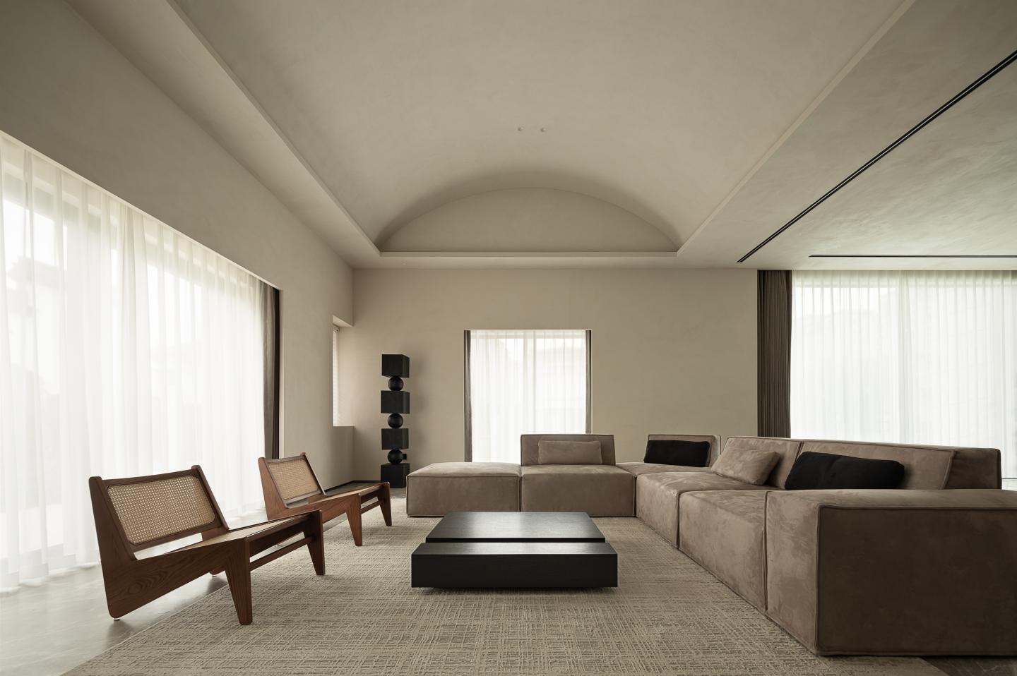
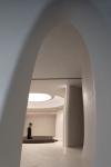
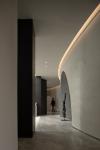
Natural light penetrates through the floor-to-ceiling glass, blending between the textures of cotton and linen and vegetable-tanned leather. It combines with soft and tranquil materials and colors, injecting warm and full light into the space. The ground floor space uses a combination of positive and negative arcs to distinguish the entrance hall and living room, forming a semi-enclosed living room with curved functional walls created by four columns. It is relatively independent yet connected to the dining room and elevator hall. Light travels through concealed gaps, becoming a thread connecting various spaces, extending the infinite natural imagery in a flowing manner, stirring the imagination about the space.
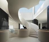
As the sunlight falls from the skylight, the spiraling staircase resembles a gradually unfolding tree or freely flowing clouds, creating an elegantly casual landscape in the space. The rhythm of light and shadow scatters between the undulating steps, like musical notes over piano keys, harmonizing the balance between dreams and reality, playing a continuous melody in the peaceful and leisurely passage of time.
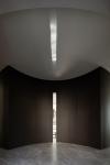
The designer shifted the second-floor staircase, creating a spacious master bedroom. The contrasting color tones between the bedroom and the office area, divided only by a hinged door, create a juxtaposition of movement and stillness. The restrained and orderly dark wood complements the gentle and sensual light-colored bedding. This allows the spirit and emotions to extend infinitely within the confines of the room.
The arginally diffuse space, much like wandering through boundless dreams, bridges the components of illusion and reality through the texture, color proportions, and material qualities. The designer meticulously controls material details, using artistic paint with natural wood veneer and natural stone to precisely balance visual elements of strength and softness, cold and warm, virtual and real, depicting the imaginative margins of dreams.
Architectural master Jacques Couelle once said that architecture has its sovereignty, not defined by human-imposed right angles and smooth surfaces. In the interpretation and presentation of this case, freely flowing curved lines reconstruct the spatial movement, allowing people to feel like strolling through boundless fields, experiencing the intersection and intertwining of light and airflow within the interior.
The rational and restrained black and gray tones sharply contrast with the pure and simple beige, subtly outlining the edges of the dining and leisure areas. The blending of dynamism and tranquility, much like the black and white keys of a piano, creates a harmonious composition.
As the evening star faintly appears, and the bonfire gradually brightens, dispelling the hustle and bustle of sunlight and breeze, the sunken sofa lounge area, created by the underground structure, becomes more comfortable and pleasant. In the semi-enclosed space formed by load-bearing structural columns, everything is filled with a tranquil and cozy feeling. Finding the most comfortable posture on the sofa, one can engage in casual conversations with family, read a book, or simply relax, with the rising flames floating along with the mood, and the subdued light blending with the atmosphere.
The scale of the basement is open, with an area of nearly 700 square meters. The designer integrates the leisure and entertainment functions of the residence into this space. Following the consistent approach of using columns and curved lines to create fictional partitions, the leisure area, reading area, swimming pool, and garage are arranged around the central area. The continuous curves and corners dissolve the artificial design's intentional sense, emphasizing space boundaries while giving people a pure and natural temperament, enhancing the emotional interaction between space and individuals.
Water is ever-changing, imitating forms as it wishes. Integrating water into the interior means allowing water to interpret infinite changes within limited space. The designer dissolves rigidity in tangible places, defining order in intangible places. By elevating the height of the swimming pool with straight lines and angled blocks, the water forms a deep mirror surface while maintaining order and restraint in the space. This contrast with the freely expanding space boundary highlights the design's moderation, revealing artistry in the ebb and flow, the curves, and the straight lines.
2023
2023
Project Name:Art Space Gallery
Location: Suzhou, Jiangsu
Area:1300 sqm
Completion time:December 2023
Design Company: Lycent Design Studio
Chief Designer:Lycent
Assistant Designer:Jingjing Ma, Xingping Tang, Naigu Xu, Lisa Wu
Photographer: Established-Gao yi
