The main purpose of the project developed DIN interioriorismo´s design team for the Hollywood Hotel was to carry out a total reconditioning of the building in order to remove the trace of its 25 years of operation and present it with a new image and ready to operate with the highest standards to reach the half century.
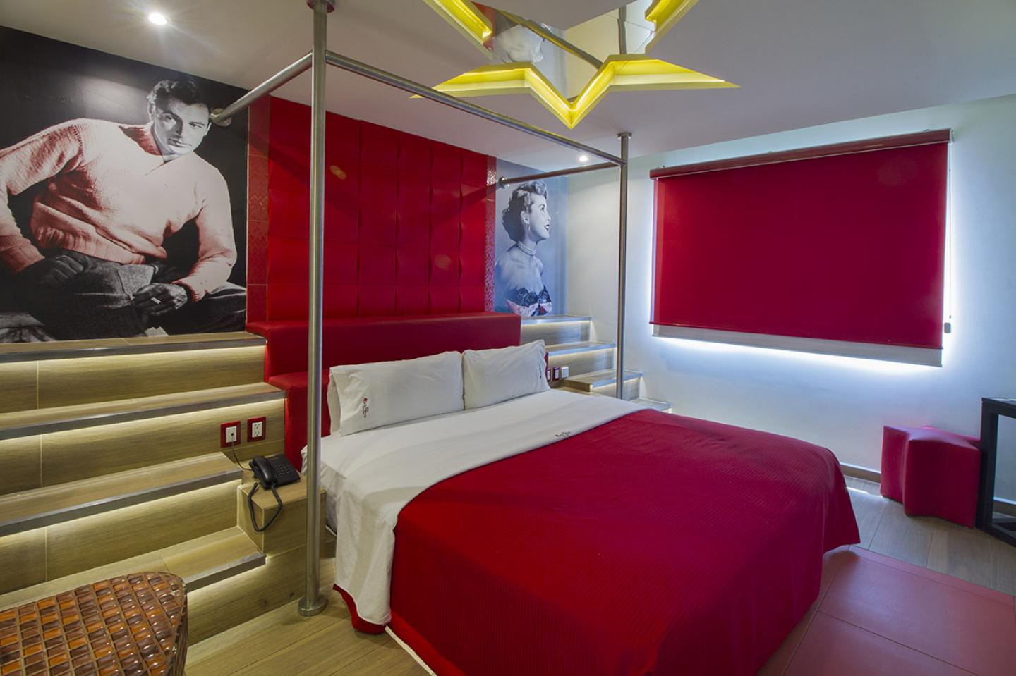
The name of the hotel is a very strong iconic reference that was not seen in its previous image, but it was not intended to draw any attention to it. Analyzing the history of this city, it was decided to use the elements that shaped the golden age of the United States cinema and use them as a guideline for the new project.
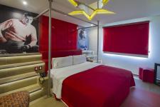
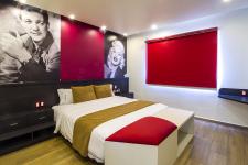
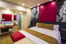
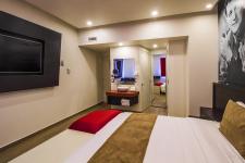
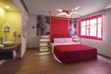
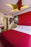
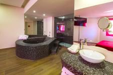
The remodeling resulted in different configurations for the rooms for which it was decided that the constant to maintain was the color palette and finishes. The black & white classic contrast is emphasized with color red reaching an atmosphere full of brilliance that passes through the plafonds, the Venetian mosaics and some elements of the furniture a wink to characteristic glamor of those times.
The result is a space standing out Aurelio Vazquez and his team whole experience, where all the functional and aesthetic elements have been consider for the guests to stage stage their own personal film in each visit.
El proyecto que desarrolló el equipo de DIN interiorismo para el Hotel Hollywood tuvo como principal objetivo llevar a cabo un reacondicionamiento total del edificio para quitarle la huella de sus 25 años de operación y presentarlo con una nueva imagen y listo para operar con los mejores estándares para llegar al medio siglo.
El nombre del hotel es una referencia icónica muy fuerte que no se veía en su imagen anterior, pero tampoco se buscaba se hiciera alusión a esta. Analizando la historia de esta ciudad se decidió utilizar los elementos que dieron forma a la época de oro del cine estadounidense y emplearlos como hilo conductor del nuevo proyecto.
La remodelación dio lugar a distintas configuraciones en las habitaciones para lo que se decidió que la constante a mantener fueran la paleta de color y los acabados. El clásico contraste del blanco y negro se acentúa con el color rojo logrando una atmósfera llena de brillo que pasa por los plafones, los mosaicos venecianos y algunos elementos del mobiliario como un guiño del glamur característico de la época.
El resultado es un espacio en el que resalta toda la experiencia de Aurelio Vázquez y su equipo donde todos los elementos funcionales y estéticos necesarios han sido considerados para que los huéspedes protagonicen su propia película en cada visita.
2018
2018
Category: Hotel
Location: Mexico City
Year: 2018
Area: 2, 770 sq m
Photography: Arturo Chávez
Interior design: DIN interiorismo
Interior desinger: Aurelio Vázquez
Arturo Chavéz