This house is very tiny.
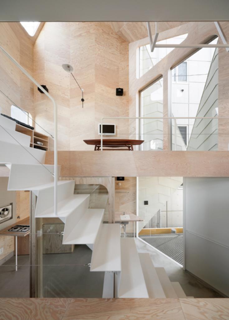
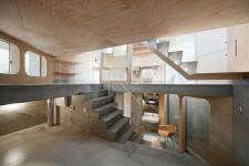
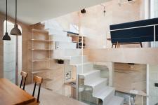
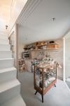
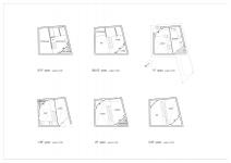
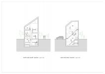
The footprint of the house including a biscuit shop is only 26㎡. This entire interior is divided into seven sprit levels void of partitions and linked by a staircase in the middle. From the shop on the ground floor, a metal staircase links to the kitchen and dining, then living and finally a sleeping space at the top shared by all the family members. A second set of concrete steps continue from the ground floor to the basement, housing the bathroom and store.
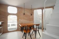
The space on each split level is small - barely enough to put the most essential of furniture, but they feel sufficiently roomy. Each space is isolated as a different level and connects to one another, hence the residents live in many different small spaces as well as one large spaces.
Almost all interior surfaces are made of larch plywood. Each panel is cut into a parallelogram and laid out in a herringbone pattern. This pattern is repeated on the ivory façade with galvarium steel sheets. The pattern consistency applied to both the exterior and interior evokes a more three-dimensional experience.
Today people communicate, get information and watch television by mobile phone or smart phone in public space, for example, in a train. Members of the family already have their private media even though they do not have their own private room, so they do not think it is inconvenient.
With each space being so small, having no walls proves advantageous – the residents can move quickly from one space to another. This constant activity could be compared to “mutters of Twitter” where short messages are sent out through the internet. Each space is very small, but acts in these small spaces are varied and these small various acts connect with one another. Sometimes the wife stands talking with a customer in the cookie shop on the first level, then drinks a cup of tea at the dining space on the 1.5 level, then moves up to the second level and watches TV, all in little time.
I hope that this house looks like a closed flower bud squeezed into the metropolis.
2009
2010
design by FLATHOUSE
Photo by Takumi Ota
