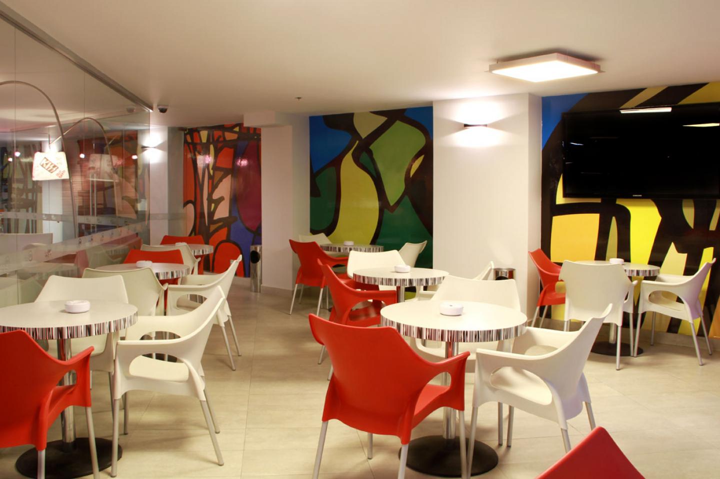
This hotel is located in the historical center of Mexico City, just a few blocks away from Alameda Central, the oldest park in the city. The hotel is surrounded by a mixture of different styles and periods so the main target of the interior design was to create a new contemporary and global atmosphere. The project created by DIN interiorismo has a language that describes the ideal place for business and pleasure travelers that enjoy being in the heart of this cosmopolitan and dynamic city.
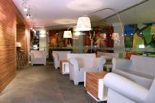
Aurelio Vázquez, director of the firm, teamed up with the talented local artist Cejas, to create a complete graphic language that was incorporated to all the areas in the hotel. Color is the main character and its presence is balanced with simple modern shapes in all the furniture and accessories. In the ground level the guests arrive to a broad reception area and the main corridor that goes to the lifts through the restaurant and bar. The materials selected for this floor are natural stone for the floors and zebrano wood covering for all the walls that give a nice texture that incorporates every area.
For the rooms the color palette is neutral with the color red giving accents in the curtains and other details in the bed and accessories. A special edition of artwork, inspired in the more representative landmarks of the historic centre, was made by El Cejas to decorate the walls of the suites. All the rooms have the adequate services and amenities to make the stay a pleasure for both business and pleasure travelers.
Howard Johnson is an international chain with a standard image, but their new philosophy is making them change to improve their image. Interior design is the answer they have found to maintain their functionality and operation rules and regulations, but giving their guests a different experience in every location. Howard Johnson in down town Mexico City is the result of a multidisciplinary team working to create projects where design is the innovation factor.
2011


