House Hoefman
Architect: Lautenbag Architectuur
Location: Heerenveen, Netherlands
Engineer: Bureau 44
Construction Company: Bouwbedrijf Siebenga
Project Area: 580 sqm
Project Year: 2010
Photographs: Diana Lautenbag
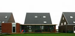
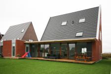
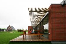
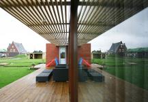
The parcel is 18 meter wide and 32 meter deep and is situated with the garden on the south side. The strict regulations of this development site define for a large part the shape of the building. However, there is enough room to give the house an individual character and to create a high quality home. Its the organization and technical detailing that makes the house special. The orientation of the site asks for a living space as large as possible adjacent to the garden, to create maximum contact between the living room and the garden. Therefore the total rear facade of the house is glass. The terrace and sunscreen adjoining the house makes the border between inside and outside as small as possible. The glass facade also creates maximum daylight into the living room. In winter this leads to a lower energy consumption. Less artificial light and less heating will be necessary. The porch is detailed in a way that sunlight in winter goes underneath and in summer the sun stays out. By using the whole width of the site for the house, maximum depth is left for the garden, and its shielded from the street. The house is 30 cm lifted from the site. At the street side, the house is more outstanding and at the back of the house, the terrace looks floating.
Materialization:
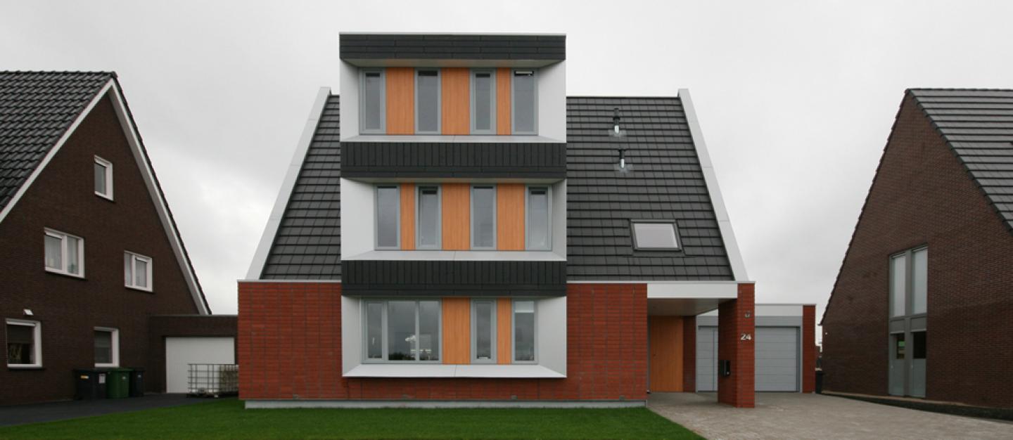
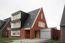
The sturdy steel plinth that lifts the home of the surface is immediately noticeable. Large, bright red in stacked bond masonry brick enhances the tough appearance. In the matt timber front facade the shiny aluminum is a real eye-catcher. The sharp angles in these aluminum frames reflect light in different directions. This gives a playful effect. The light gray PVC window frames in the side facades are placed in the plane of the brick facade to strengthen the abstract image.
Interior:
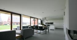
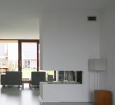
There is a lot of space inside and every inch of the space is used wisely. Carefully placed lights define space for lounging, dining and cooking. The see-trough fireplace both separates and unites the television room and the kitchen. White interiors, huge transparent voids covered with glass and parallel doors along the house also help to create more of space inside.
Installation:
The house is suit with a modern automation system. All electric devices in the house can be controlled by I-phone or I-pad. Therefore almost no switches were needed in this house. Before the owner gets home, he can for example turn on the floor heating and fireplace, make coffee, switch on the lights in the places he chooses, turn on the sauna and open the garage door. Whenever the owner leaves he can use the button that switches off all electrical devices, so there will be no waste of energy.
2009
2011
Diana Lautenbag, Sebastiaan Dassen
