New office building of FIS-SST company is located in the area of Education and Business Centre ‘New Gliwice’ that was created in the place of former Coal Mine "Gliwice" functioning there form the 18th till the end of the 19th century. The intention of the Local Development Agency, that administrator of the Centre, was to create favourable conditions for enterprises dealing with new technologies and eventually redevelop the site into a technology park. Construction of FIS-SST headquarters (the first building in the area) is the result of this revitalization process of postindustrial areas - creation of new public spaces within the Centre.
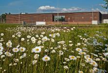
Historical buildings of the former mine facilities in the Centre occupy the western part of the area, along Bojkowska Street. Directly behind them the area was divided into parcels intended for commercial companies. At one of them new office building for FIS-SST was designed as an object of minimalist aesthetics and soft colours so as not to compete and interfere with historical design of mine buildings.
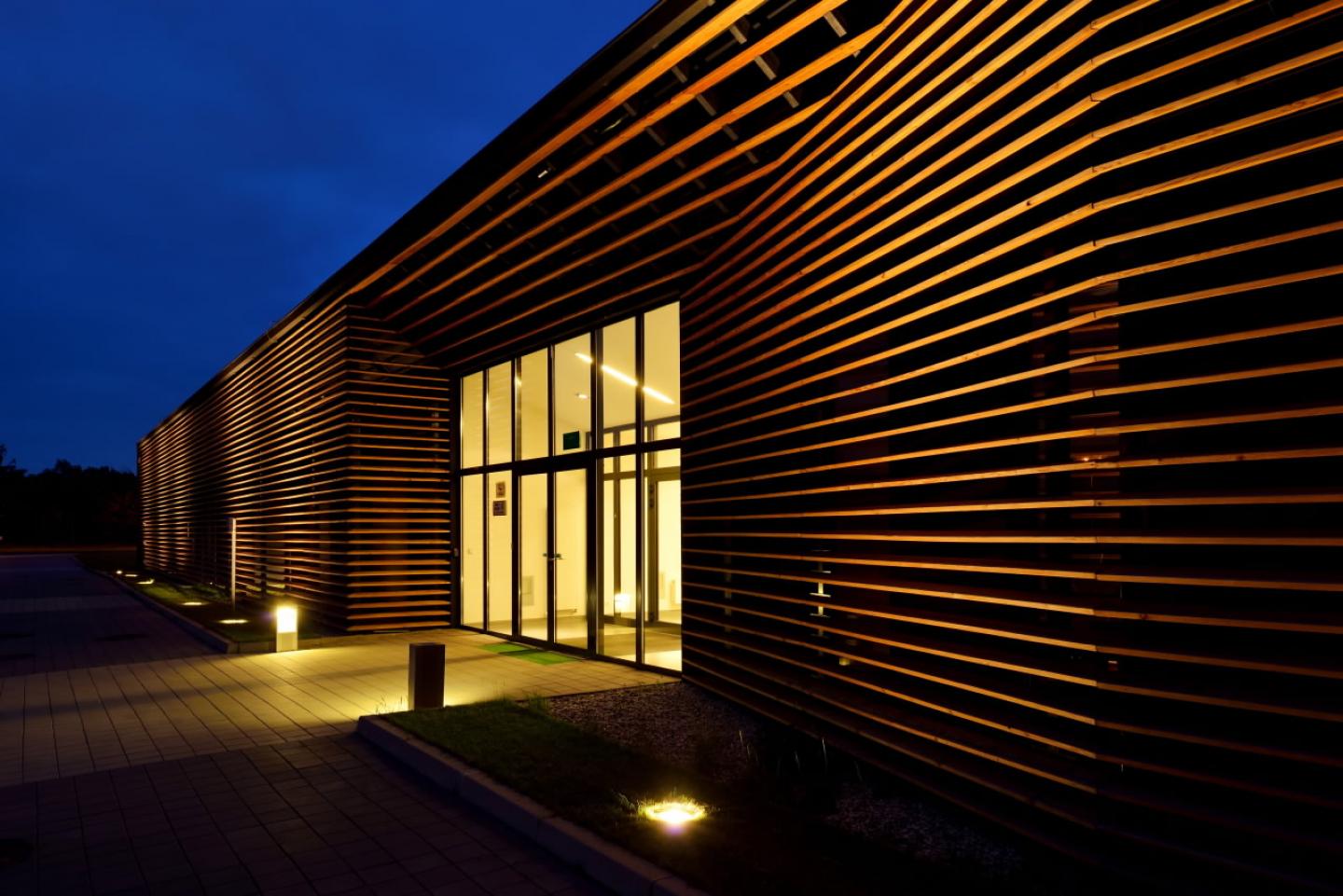
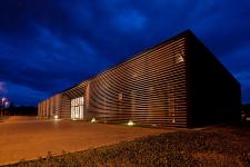
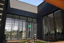
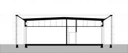
The building is in the shape of an elongated cuboid. Front and rear elevations made of wooden blinds create a consistent structure and give the building a simple and compact form. Outer walls of the building, perforated with vertical window layout , are hidden behind the shutter layer. This solution provides an impression of a single block with no apparent divisions in the facade. Blinds, apart from the aesthetic effect, protect from excessive sunlight and overheating of the rooms.
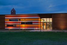
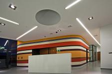
Top graphite elevations also maintain synthetic form. The eye-catching accent of the front elevation is the concavity of the shutters that opens the interior of the building (main entrance). Glazed entrance area on both sides across the building gives the impression of transparency of the interior. Additional element that accentuates this impression of “diffusion” of the external and internal public space creates a conference room wall that smoothly flows to the outside the building. The feeling is also enhanced by the colors of the walls - they refer to the palette of colours of coal mine dumps which are visible in the background of the building.
The functional arrangement of the interior is also disciplined. The hall combines the two main parts - the board and conference rooms and office spaces with social facilities. In this coherent structure a green patio was introduced as a link of office spaces.
Consistency is also emphasized by the land design. Fences near the main entrance are designed of the same elements like a wooden facade. Elements of identification - company logo - are embossed in the concrete wall of the fence.
Linear composition of the blinds consistently creating the block of the pavilion intentionally makes the object closer to the abstract cuboid rather than a classical building.
2009
2011
