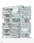
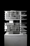
This project seeks to take advantage of the fact that this is a multi-disciplinary school. A design school is unique in that the diverse program requires a wide variety of drastically different building types (i.e. A stand alone wood shop would not be the same as a stand alone classroom). Typically in multi-discipline institutions, each program (Architecture, Industrial Design, Interior Design etc) maintains their own heterogeneous building that accommodates all activities specific to that discipline. With the future of design being undoubtedly collaborative, this project strives to perpetuate this by arranging the program not by discipline, but by building type. The result is a shift from separate heterogeneous buildings with a homogeneous discipline to four homogeneous ‘buildingettes’ heterogeneously occupied by all the disciples. The four ‘buildingettes’ are the sloped (review spaces, classrooms), the ramp (studios, library), the grid (offices, classrooms, services), ad the plenum (shops, fabrication, labs).
This create an incredibly dense, fate free cluster of program where all the disciplines are in very close proximity to one another. For example, since all the pin-up areas are of the same building type, they are right near each other, this means that at any given time an Architecture review could be taking place beside an Advertising critique.
Now because this produces such an incredibly dense building that is so specifically programmed, two decompressive axes of consolidate unprogrammed space are introduced. The first is vertical and features an elaborate stair that extends from the first level to the top of the building. The stair itself is enormous and feature casual hang out spaces on both the oversized treads and landings. The second axis in horizontal and it divides the entire building into two ‘chunks’. This creates an entire intermediate floor in the center of the building that is totally free of specified program. The use of this level would be entirely flexible, operating as a ping pong area in one corner and a relaxed space for gathering in another. The entire building is also lifted off the ground in order to create an entirely public first level. All of the program that can and would act as ‘outreach’ for the rest of the campus in located here. This is strategically placed in order to combat the too-frequent esoterisicm of the design school as it relates to the rest of campus.
The building it structurally conceived in such a way that strengthens the reading of the massing. Each of the two volumes that consist of the ‘typical’ floors are held up by four frames of gigantic trusses that each set up their own one-way system. This not only reiterates the concept of the project, but also enables the slabs to take on the sculptural qualities that they require.
2015
190 000 sq ft
12 Stories
Individual Student Project
Kean University College of Design by Lucas Boyd in United States won the WA Award Cycle 22. Please find below the WA Award poster for this project.
.jpg&wi=320&he=452)
Downloaded 156 times.

.jpg)


