The classic is the one that never goes out of style and is indispensable. However, classic does not mean forgetting the current and not responding to the present. H 129 House, designed by Mimark Architecture, is a project that digests the classical and follows the contemporary, also carries traces of the neo-classical style.
Neo-classical architecture is an architectural understanding that emerged as a reaction to the excessive ornamentation used by the Baroque and Rococo periods and aims to revive the architectural style used in the buildings of the Ancient Greek and Ancient Roman periods. This architectural understanding, which took its place in important buildings after the idea of neo-classicism, managed to make its impact felt in different parts of the world. This current is briefly acting without rejecting the classical, we can summarize the monumentality of Roman and Greek architecture as a style that reinterprets it by avoiding excessive ornamentation.
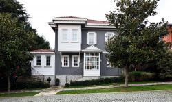
Kemer Country villa buildings offer Turkish house-style designs that embrace the present without rejecting the classic, balconies with bay windows that can be seen from the street, wooden casement windows, and reception areas with triangular pediments and columns on the fronts that open to the garden, offering a proud as well as a proud elegance to their users with a neo-classical look. In the H 129 House, all the facade details have been reconstructed, preserving Kemer Country's original eaves, faceplates, floor moldings, and joinery. The wooden joinery in the project was specially produced in accordance with the lathing section of Kemer Country.
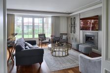
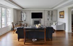
The neo-classical style, which raises 'simplicity' away from excessive ornamentation in pursuit of form and line, draws attention in all living spaces. The white color that dominates the house is accompanied by mainly wooden furniture, custom-made lighting, cabinets and accessories.
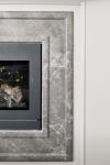
While the furniture rising in the same color on the dark wooden parquet floor in the main hall offers an uninterrupted image and a sculptural appearance, more personalized areas have been created where you can lie on the Josephine armchair and relieve the tiredness of the day. While the sitting group furniture, which is built around the fireplace, is preferred in gray tones, the masterful woodworking of the arm details of the armchairs draws attention. There are paintings of masters of Turkish modern art in the living spaces, which are simple but rich in details.
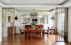
The main dining table, on the other hand, is the center of attraction of the house, meeting the task of meeting, sharing and enjoying the meal times in a prestigious way. Elegant details in the ceiling decorations, specially designed lighting for the project, and brass separators that combine privacy with its charm, enriched the family's memories by accompanying the invitations.
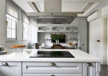
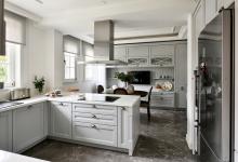
Natural material marble was preferred for the kitchen structure and entrance floors, which were added to the project later. The half island kitchen, which is preferred in kitchen design, provides separation between the breakfast table and the service preparation area. A warm and friendly 'starting to the day' environment has been created with the dark wooden table, the television and the wooden showcase that keeps the kitchen utensils located in all the grayness. The patterns on the kitchen cabinet doors and the brass details on the handles give this cute kitchen a 'special for the user' look.
You can feel the passion of the architectural team in reaching the new by preserving the existing, in this meticulously executed project from the electrical sockets on the brass frames of the house, the lighting switches, the sink feet in the guest toilets, the handles of the wardrobe and the dressers.
2017
Mimark Architecture
Mimark Architecture

