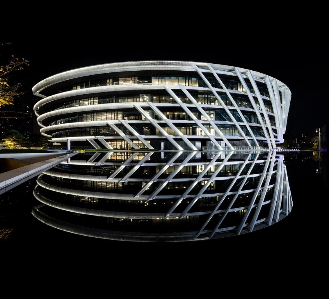
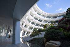
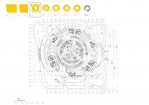
The concept is the fruition of the dialogue that has taken place between the Client and the Architect. Designing a Fashion Headquarters Office challenges a design response to create spaces and
building that not only functions in the traditional sense of an office space but a space that can inspire and nurture a community between the different Brand Departments of the Company.
A collection of spaces that ‘Unite’ the company and furthermore make the environment a family, a ‘home’ to enjoy your work and people you work with.
PeaceBird as a Company is very successful and the name itself conjures the imagination to think of ‘freedom’, ‘to be yourself, express yourself’. The sense of ‘flight’ like a bird, ‘free as a bird’. Our aim was to capture this spirit in the conceptual design so the headquarters itself also expressed this ideology and will represent the company values towards fashion and textile design in its architectural language. We also felt it necessary that the design have within it’s ‘DNA’ a contemporary Chinese essence. The architecture should embody Chinese Culture and manifest itself for a modern World and not just become a Globalized design without place or a sense of belonging.
After considering many approaches to the project we had a strong sense of feeling that this building should express itself from the inside out........meaning we wanted to embrace the energy from the design environment within the ‘heart’ of the HQ and allow this to pulsate outwards like a source of energy to the outer envelope and landscaping. In a sense we wanted to achieve a scheme that was holistic and dynamic to celebrate the company ideology. A building that takes an ‘iconic’ status within the City of Ningbo. A building and Company Ningbo can be proud of.
The flight’ of a bird can be taken in the form of many narratives but how could we express this and combine it with the creativity of the fashion company? a young, fashionable, contemporary, dynamic company! A company that represents a New China for the 21st Century. It became apparent early on that we should research what creates flight, what energy and forces allow this phenomenon to occur. A ‘Thermal’ is the purest meteorological matter associated with this and it affects many things. A ‘bird’ for example can effortlessly glide on a thermal. It can be graceful and use the most minimal of effort to achieve ‘flight’.
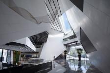
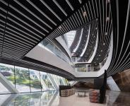
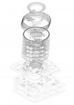
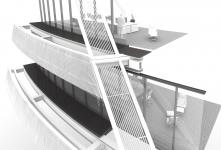
The thermal in its form is ‘sinuous’ and ‘efficient’. This movement and space became the catalyst for the concept. It operates and functions efficiently at many levels and gave us a kind of vortex epicenter to the whole scheme. Floor levels could radial outwards from this form like a Chinese Ancient fan. This approach would become the space in the building where people could ‘connect’. Voids and vertical circulation in the form of ‘super staircases’ could penetrate and rotate in the space generating spectacular spaces and sculpt the natural daylight. It allows for more ventilation through the space providing greater energy efficiency.
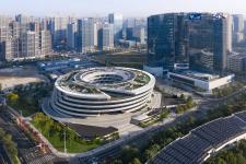
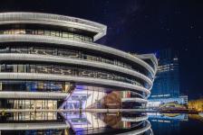
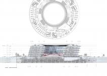
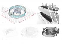
The ‘thermal’ takes on a pure circular form in plan and spirals upwards. These geometric ingredients gave us a very strong form that integrated functionality, sustainability and architecture. A ‘Loop’ is formed which ‘sucks’ you in through the entrance and takes you on a fluid, sinuous journey through the spaces of the HQ Building coming to a climax at roof level where the ‘Thermal’ movement delivers you at the roof gardens to spectacular panoramic views across the notion of a soaring upward movement.
The office plans through design studies created ‘ringed thresholds’ that filter the space from outside (private) to inside (community) converging on views and access to a modern day interpretation of the Chinese hidden garden that was so prominent in ancient Chinese architecture. This garden acts as a ‘lung’. It is the space that is revealed progressively to the eye on approach and where offices have views and people can relax when they need to recharge their creativity.
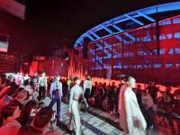
The Garden also ‘crowns’ the spaces below in the underworld of the project where exhibition, conferences and fashion shows can be accommodated. It is like a multi layered, multi-functional roof. The garden becomes more though, it takes the same holistic approach as the office spaces and movement by creating a sinuous movement through two floor levels. This allows it to respond to the views from reception and the office spaces above. A kind of landscaped amphitheater that in the summer months can be used for company events from fashion shows to lectures or ‘Cinema’ at night for the staff.
The landscape resonates through the building to the external site where the geometry echoes the movement and energy created from the spaces within. The tangential geometry from the loop sculpts the landscape and provides gradients and textured surfaces of plants, water and access roads. This architectural treatment covers the site allowing shade and camouflage for the pedestrian, vehicular and bicycle users.
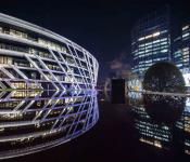
It is the final piece of the concept that ‘frames’ the view of the HQ Building giving it a ‘spirit, energy and expression of the identity of PeaceBird’. The form seems pure but in the subtlety of its detail creates a gentle ‘looped ripple’ that helps screen and shade office spaces from the direct sunlight allowing full height glazing to open up expansive views. This delicate approach has a metaphoric connection with textiles/fabrics that come alive when they designed, manufactured and worn. The movement and ‘ripple’ gives it shape and celebrates the individual that graces the garment.
Therefore, the Concept is ‘tailored’ and ‘expresses’ the needs of this project, it aspires to connect with the way people will live and work in this space and celebrate a new era in 21st century Chinese Culture which PeaceBird as a Company is part of and is defining in this moment of time.
“Fashion is in the sky, in the street, fashion has to do with ideas, the way we live, what is happening.”
~Coco Chanel
2014
2020
Building area 75,000sqm
Daniel Statham
