The project is the headquarters of İspak Ambalaj a well-established Turkish packaging company and a joint of Kibar Holding, located in Istanbul. It is a factory and an administrative building of 4 stories having a net area of 4.500 sqm of which concept developing, interior design and drafting works are all carried out by Mimaristudio.
In this new building which prioritizes comfort of the employees and reflects the innovative and colorful image of the firm, a planning approach which will serve both office employees and factory workers is prioritized. In this regard social meeting points which are open for common use are designed to be in relation with the working spaces that belong to white collar employees. Design work started with interviews with the company about their short and medium term goals, current and future needs and expectation related to their investments.
2016
2017
The three stories that can be seen from outside are designed to appear as a two storey facade by Mimaristudio. In this regard first and second floors are designed to be perceived as a single floor while ground floor facade is separated from the whole. In fact, this approach can be explained as a reflection of the function and planning which are shaped by the interior architecture of the building. The design of opaque and transparent surfaces in different sizes and layouts on the facade reinforce this perception. Another striking aspect of the architecture is the gallery space which connects entrance hall with the other two levels.This opening, which is connected by an elevator and a lightweight structure staircase, is the nodal point of the building together with the designed peripheral units. This place, which can also be called the core, extend to two directions as separate arms forming the architecture of the building.
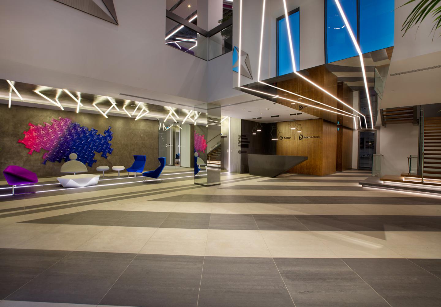
Alongside its welcoming function, the entrance floor is planned in such a way that, local and foreign guests will be both hosted here and could be lead easily to the factory area through the administrative building.
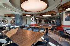
In addition to the Color Confirmation Room which will be used to host the guests and a large meeting room linked there, the laboratory where the R&D and quality studies are carried out is also in this floor. It is possible to reach to the laboratory from both factory and office sections. Also a cafeteria space which can be used by both employees and guests is placed in this area. This place, which can also be used for working, resting, and entertainment needs of the employees, is planned and designed to be on of the socializing spaces in the building.
For the lower floor, a small-scale conference hall and a gym are planned along with the locker rooms and technical spaces that will be used by factory employees. First thing that will strike the visitor in these spaces will be the comfort of acoustics and lighting. The conference room, which is connected to the gym and the lockers that serve only this area is available for group lessons, trainings and various purposes due to its flexible furniture layout.
While the work floors are designed with a flexible office approach, staff from all the levels except unit directors are placed in an open office layout to be complementary with each other. Floors 1 and 2 are planned to be mainly workspaces and the administrative offices are located on the second floor with their connected units. Also in the second floor, a short meeting space, private working spaces and a resting space which all are located in the open office area along with a resting/playing space that opens to the terrace are designed. This will be a venue for celebrations, invitations and organization and will also be an area of socialization open to the use of all office and factory employees.
One of the features of the program were meeting spaces that vary in type and scale, responding to requirements of employers. While meeting rooms are planned in different types, open and semi-open meeting points complement these areas with their design. Beverage and printing stations are located to be on easy reach of the office employees. WC volumes on all the floors are noteworthy reflecting the same interior architectural style with varying material, texture and color.
One of the most striking features of the project are the colors which are also a part of the İspak’s corporate identity. In the project where mainly two main colors of the corporate identity were used in different tones and styles, creating a generally bright and spacious working environment was desired.
In the selection of finishing materials, porcelain ceramics and epoxy are preferred on hard floors while end materials such as modular carpet and loose lay are applied on the raised floor. Walls are generally dominated by tones of white and grey but decorative paints and wallpaper are also applied. The differences in elevation was an input for the ceiling design in general, a partly open ceiling system was utilized over the open work areas which also reflected the geometric patterns of the entrance floor. This geometry, which stands out in both floor and ceiling design, can be read as a reference to the disassembled form of the aluminium coils used in the factory for flexible packaging production. Noise control is provided by the use of acoustic panels and acoustic wallcoverings in the offices where double glazed office partition systems are used for partition. Some experimental uses of color and visuals standout in the design concept which is also complemented by landscape and graphic design.
Mimaristudio developed project specific product designs as in most of their projects. These custom made products fit their places on their specific locations in the interior design. Custom made furniture design are one of the standouts in this project. While finishings with flutes and edges are preferred on lacquered panels of different geometries, painted glass and quartz panels are also considered as finishing materials that complete the design. The color confirmation meeting room, the board meeting room and the general manager meeting area are the best examples of these spaces.
LED products were main choice for the lighting design which was also done by Mimaristudio. The lighting project, where decorative lighting products as well as functional ones are used, is designed to be complementary with the interior architecture of different spaces within the building. Custom made lighting fixtures designed by Ayça Akkaya Kul standout in the places such as the cafeteria and offices of general managers and executives of the Board of Directors. Lighting products in the segmented and linear ceiling pattern of the open office ceilings are also designed to complement this geometry. Linear lighting products which are manufactured in varying angles and lengths are part of the same design along with spot light sources. The interpretation of the fixtures in relation to the ceiling geometry and different parts of the interior using different geometries was how the lighting design in general shaped. Dark Lighting who contributed to the technical planning and calculations on lighting design also provided the the manufacturing of custom made fixtures. The stretch ceiling work is applied by Tekno.
The project provides a living environment that reflects the color identity and innovative face of the employers' own colors and forms.
Architectural conceptual desig : mimaristudio
Interior design : mimaristudio
Designers : Ayça AKKAYA KUL, Önder KUL
Project Team : Tolga BOZOK, Kaan GÜLKIRAN
Photographer : Gurkan AKAY


