Office Gradient is located on Dumlupınar Boulevard, which is defined as Eskisehir Road of Ankara. Dumlupınar Boulevard, which starts from Kızılay and connects Eskişehir Road to the city center, has been transformed into a commercial axis in which commercial blocks have been rapidly dominated in recent years. While other Ministry blocks remain relatively dominant on the southern side of the Boulevard, the increasing number of shopping centers on the north side competing with each other and the potential of their urban dynamism they have created have brought along different needs or suggestions. The transformation of this main Boulevard into a commercial axis and the increase of density on the north side can be read in two ways on the level of urban politics: firstly, the position and the perceptibility of the structures showcased here reveal themselves in the easiest way. Secondly, even if they are interpreted in the form of a modest architecture, the fact is that whether they will form a coherent or inconsistent "context" between themselves and feed each other or not.
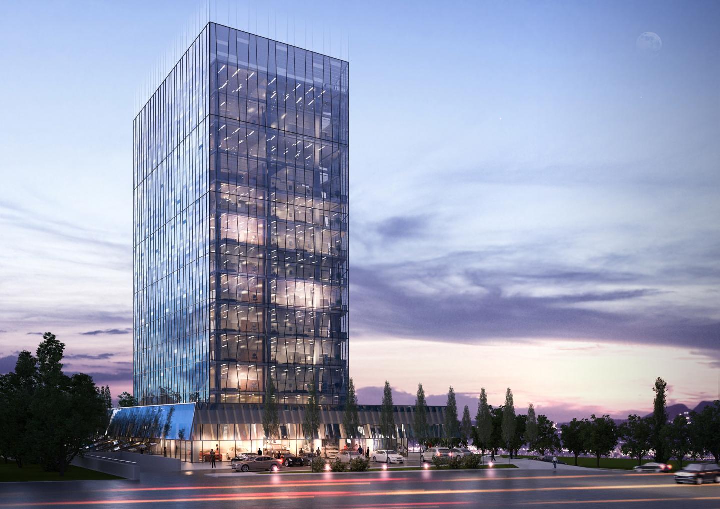
The Office Gradient structure is proposed to meet certain requirements at its own reasonable scale, which does not need to show itself dominantly, as opposed to the ones listed above. The Office Gradient, proposed as an office structure beyond the standard norms, focuses on the sustainable nature of the working space with its own passive conditioning methods, taking into account the efficiency of working conditions in today's office spaces. The office structure, which has a total of 11 storeys, has an independent reference with the surrounding buildings by breaking off its height connection. In this regard, the whole effect of the mass is eliminated as much as possible with a secondary transparent wall which is proposed. The mass is directly related to the main Boulevard on the ground floor and is also applied to the general mass, which is created in the facade shell by pulling back the large resting main block recommended on the first floor. Thus, the structure, recessed as far as possible from the main Boulevard, does not have its own effort to demonstrate itself, but as it rises, it creates an effect that is perhaps disappearing. This transparent shell, which moves independently of the plan scheme, is read only in horizontal strips that can only be perceived in detail and move on its own. In this structure, the perception of the height end effect is based on three basic design principles; firstly, the outer wall is enriched with horizontal strips moving on its own – regardless of inner divisions. Secondly, the grading effect of the distribution of transparent and colorless glazings having different permeability values. Thirdly, the effacing of the building's finish sense with the concealing of facade elevator and other technical areas hidden in the duplex floor.
The façade system, which acts as a tulle effect in the air, is also designed as a double-walled balcony area in South, West and East facades. While the use of the ground floor is fully utilized as an exhibition hall, all other floors are designed as flexible office units up to 10th floor and 10th and 11th floor as duplex office units. The parking lot and technical areas, serving the whole office, were solved by distributing it to 4 basement floors. Office units on the eastern front make their own internal balconies with a diagonal cut plan that can be read through the secondary walls, and give their façade to the main Boulevard. This distinctively-designed outer shell, beyond the distinctive visual that it creates, also forms its passive climate indoors and benefits from the natural daylight as best as possible. The plan scheme suggested in the interior is designed as flexible areas that can be arranged according to different needs. The only movement that represents the presence of mass is the glass fringe that surrounds the building and can move like the "skirt" on the ground floor, which directs to the South and Eskişehir Road in the side roads. This moving wall, which also shows here the modest architectural language formed along the general mass, protects the integrity of the structure and the architectural language, but is differentiated with the new movement system proposed at the front. Contrary to the strategies and similar inviting attitudes that Office Gradient has followed by other buildings on the same Boulevard, the building does not take the main entrance from the main avenue; the building entrance, which is not perceived as early as possible, has been solved on the front facing the green area on the South façade. The Office Gradient aims to be a new interface at city level in the most important axis of Ankara, with its conceptual and functional sustainability of working spaces, variability towards future uses and problematization of its own climate methods through a relative "exhibition" concept.
2017
2017
Project name: Office Gradient
Architect: rgg Architects
Client: Undisclosed
Location: Eskişehir Road (Dumlupınar Boulevard), Ankara, Turkey
Program: Offices, showroom, parking garage, technical areas
Floor level: 11 (4 basement floor, ground floor, 11-storey offices)
Plot area: 5,000m2
Total construction area 24,735,25 m2
Height: 48,5m
Project design year: 2017
Renderings: rggA
R.Güneş Gökçek, Ahmet Çağlar, Ozan Burak Güzey


