1A Pervomayskaya is a centrally located quarter in Tyumen, featuring apartments, business premises, and public space. The project is based in the old city centre, where theatres, museums, shopping malls, business centres, and 19th-century historical monuments are in the immediate vicinity. Despite its central location, it was long a dead-end plot, abutting onto a development site and thus breaking up the street.
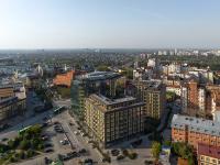
Perceived as a vista axis, 1A Pervomayskaya estate restores the boundaries of Pervomayskaya Street and reveals new city connections. Linking the central railway station in the south and the Tura riverfront in the north, the new project has become a new landmark. Additionally, the street splits the estate into two parts: a trapezoid-shaped plot in the east and a smaller triangular one in the west.
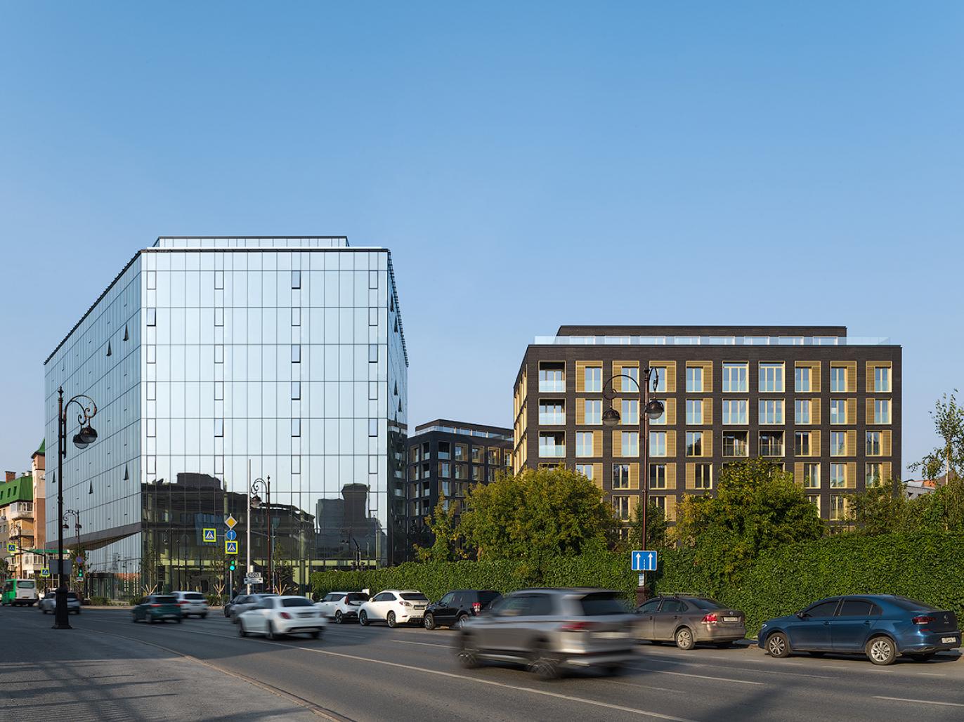
By collaborating on the project's concept and master plan, the Dutch-based KCAP and Brusnika.Design conceived it as a balanced structure fitting into the existing cityscape and complementing its historical context. A restricted plot squeezed into a densely built central district and divided in two by Pervomayskaya street posed a real challenge. To solve the problem, the architects reserved the larger site for mixed-use purposes with two apartment blocks and an office gallery. The smaller plot across the road houses a public park. Multiple heights promote vibrant street frontages with seven and eight-storey apartment blocks and a 1-storey belvedere on the roof, which can accommodate summer kitchens, lounges, and penthouse terraces. A translucent atrium gives the nine-storey gallery a matching vertical extension. The height of the buildings in the quarter correlates with the distances between them, which conserves classical proportions of city architecture. The facade colours and materials blend the new estate into its historical cityscape.
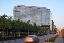
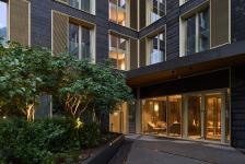
Residential houses are clad with charcoal grey labradorite, and aluminium framed windows of golden beige extending beyond the facade plane accentuate its depth. A matching perforated pane on the window is an element of decor, doubling as a textured shading device in the interior. A regular window pattern makes the houses stand out from the surrounding environment. Based on simplicity and regularity, the office gallery facade is decorated with structured glazing, which accounts for its complex shape with versatile planes and angles. Massive glazing and narrow framing turn the building into an open environment reflecting sun rays and neighbouring houses. Vertical golden beige blades accentuate the building structure and link it to the residential blocks.
Landscaping merges the two plots. The project comprises three green zones: a public park, a semi-private reception area, and a residential private parterre park. A pedestrian avenue links all the spaces, leading to the public park with its walking alleys and recreational havens. The greenery here is lush and dense due to lime and bird cherry trees (over 160 in total), and diverse shrubs. To accentuate the quarter’s entity within the cityscape, uniform paving with varying patterns links the courtyard, the avenue, and the park. This solution adds homogeneity to its constituent elements and enhances the authenticity of each zone.
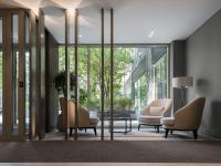
The residential houses host 73 apartments ranging from 48 to 359 square metres. Housing two to four flats on each floor, the building grants privacy to its residents. All layouts are open-plan with no rigid structures between bearing walls, which enables residents-to-be to design their space to their liking. Higher floor apartments are supplied with service lines to install fireplaces and roof terraces, which can be accessed via the extension structure with panoramic glazing. These pavilions can house a summer kitchen, a lounge, a study, or a greenhouse. The office gallery, in line with residential buildings, is open-plan with vast and open floors. This space can be divided into four clusters, with each one having access to the staircase and an elevator - the building is equipped with two. The centre of the building is taken by a common lobby crowned with a glass atrium. A two-storey car park spreads under all the buildings, with 2 to 3 dedicated parking spaces per apartment and guest parking facilities for the office gallery.
The minimalistic design and architectonic uniformity bring the estate into focus by complementing Tyumen’s historic vista. The project stands a good chance of becoming a new urban landmark.
2018
2021
Built-up area: 0,8 ha
Gross floor area: 65 000 m2
Business premises: 20 400 m2
Residential premises: 14 800 m2
Car park area: 14 400 m2
Apartments: 73
Parking spaces: 467
Master plan: KCAP Architects & Planners, Felixx Landscape Architects
Architecture: KCAP Architects & Planners, Brusnika. Design
Landscape design: Greenhance
Developer: Brusnika
