Some houses don't let our eyes rest from the moment we step into them. Everywhere we turn, we encounter another stunning design element or a proper execution of seamlessly blending trends that make a house extraordinary. The private residence we arrived at, located on a corner plot in a quiet neighborhood in the Gush Dan area, looks like a modern house from the outside, built on a narrow and elongated plot. "That's why we opted for clean and rectangular architecture, aiming to utilize the entire rectangle permitted for construction," Hila Israelevitz opens up. Together with her partner Dan, they are responsible for the architectural planning and design of the house.
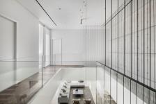
"In the building itself, we used exposed concrete that you can see both outside and inside the house, as part of the idea that the exterior and interior spaces flow into each other," she continues. "We used a mix of materials, with exposed concrete and white walls, both inside and outside the house. The exposed concrete is modern, but we treated it with delicate and modern touches, not in a brutalist manner."
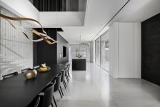
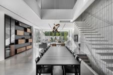
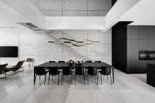
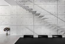
The ground floor includes the living room, kitchen, guest services, and a utility room, all planned so that the living room and kitchen are open to each other. Facing the entrance door is the dining area with a unique lighting fixture hanging over it, made of polished steel and suspended from the upper part of the house. "The first thing you encounter upon entering the house is a dining table with significant lighting fixtures," Israelovich explains. "Opposite the entrance is an exposed concrete wall with minimalist floating stairs made of steel, almost disappearing due to the use of a material very similar to the exposed concrete on the wall, and beside them are metal cables serving as the staircase railing. This entire space creates a dance - a dance between the lighting fixtures and a dance intertwined with the staircase strings. That's how we created a very intriguing play even at the first glance into the house."
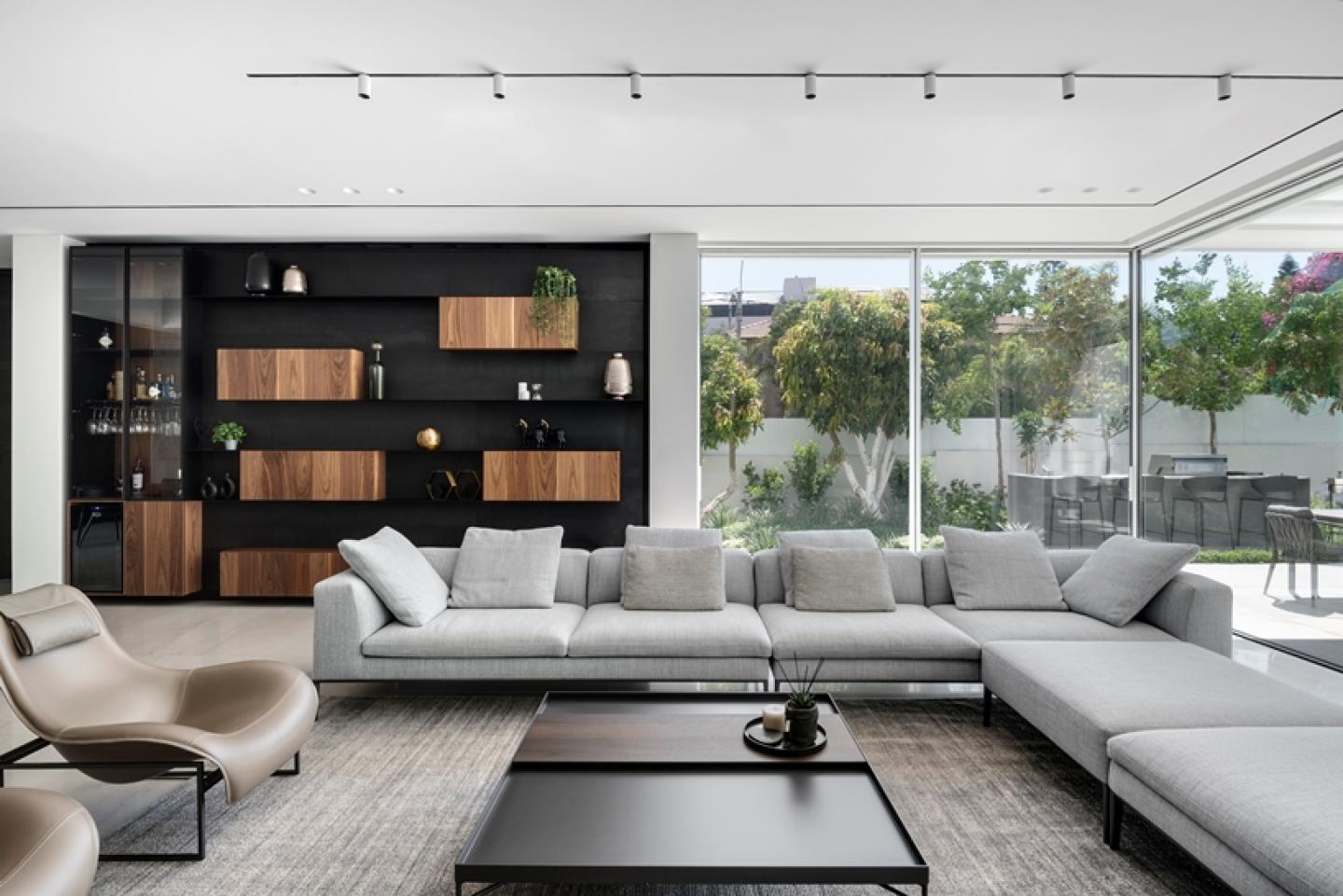
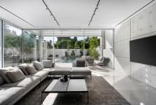
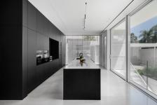
The exposed concrete wall continues into the living room, maintaining a completely clean look except for the television hanging on it. As part of the monochromatic scheme of the living room, the design fluctuates between light tones on the concrete walls and white walls, in furniture pieces and in a bright off-white floor, juxtaposed with a black iron and wood bookcase, balancing the room's light tone and adding warmth. The metal bookcase complements the black kitchen, finished in a soft nano-black appearance, almost matte, providing a silky touch sensation. At the center of the kitchen is a niche with stone, and its wall rotates towards the stairs, ascending to the upper floor. "We wanted the kitchen wall to become a covering that complements a kind of cube rising upward, because even while ascending the stairs, you can still see the wall coming from the kitchen," Israelovich elaborates.
Moving to the guest services, Israelovich speaks passionately about them. "The guest services are relatively small, so we decided to create a wall with a blackened mirror that both enlarges the space and creates an intimate experience in the service area. Additionally, we installed a standing stone sink in the services with a black mirror next to it, supported by two black iron niches that are actually integrated into the mirror. People usually don’t think much about or invest in guest services, which is a shame because a special atmosphere can be created there."
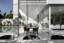
The design style is preserved in the courtyard as well, where outside the living room, there's an entertainment area with a swimming pool. "The outdoor design uses different materials but maintains the internal look, which is reflected due to the transparency of the living room. Although the house is centrally located, it still feels very open. We've created an atmosphere of spaciousness, greenery, and plenty of freedom."
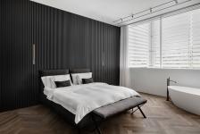
On the upper floor, covered with parquet flooring, there's a separation between two areas - the parents' area and the children's area, where three bedrooms were designed for the 4 children, maintaining the design style in all of them but in different colors. The parents' room includes a shower room, a wardrobe area, and a bedroom with a freestanding bathtub. Behind the bed, a very special wall cladding was created with black laths and cascading lamps in a charcoal-black color. The clothing wardrobes, located in their designated area, have glass doors, with one of the wardrobes having a blackened appearance, creating space. In the shower room, similar to what was done in the children's shower room, there's use of the parquet from the floor - on the fronts of the shower cabinets, where both blend in perfectly.
2022
2023
Plot: Half a dunam Built Area: 400 sqm including a patio
Residents: Couple 4 children
Architectural Planning and Design: Dan and Hila Israelevitz Architects
