The Pavilion “Wyspianski 2000” – Krakow City information and exhibition center.
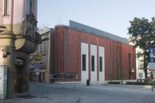
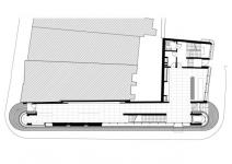
The building fills a gap in the medieval historic urban fabric of Krakow. The gap results from a demolition {in 1939} of a townhouse called “Pod Lipka” {“Under the Little Lime Tree”}, situated at the corner of Grodzka Street and Wszystkich Swietych Square. It is an exceptionally exposed location right by the stretch of the “Royal Way” between the Main Market Square and the Royal Castle of Wawel. Thus it is at the very heart of an urban layout that dates back to the city’s location in the mid-13th century, and it is surrounded by historic monuments from all epochs. The spirit of Stanislaw Wyspianski soars above all these places; his stained glass and wall paintings are to be found in the nearby Franciscan church and in the Basilica of St. Mary. Therefore the main design task was to define an appropriate composition of function and form and to define the adequate level of reference to the historic surroundings.
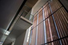
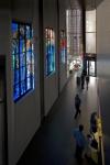
There are two main functions of the building: the disposal of information and the exhibition of stained glass - these demanded spaces of separate types. Whereas stained glass should be exposed in a high, calm and dark space, the public space for information should have an open, clear, well-lit character; it should be both well illuminated and also provide good visibility onto the Wszystkich Swietych Square and the nearby imposing building of the Wielopolski Palace {the Town Hall}. We were supposed to find a solution for those contradicting guidelines and therefore we chose an elevation of a mobile character: both transparent and closed. Moreover, the elevation’s material was intended to allow for a dialogue with the neighbouring buildings – above all with the Gothic churches of the Franciscan and Dominican Friars, both constructed of brick. The use of large planes of glass – which was our initial proposal for the festival pavilion – needed to be reconsidered. The means proposed for a temporary building were no longer justified for a permanent one. We were of the opinion that nothing new or interesting can be said by means of a glass elevation in a historical context. We had to search for a more inspiring and adequate material for an elevation. Brick and limestone became our choices because they were the construction materials of Wawel castle and the Gothic churches. We focused on brick – and a new design challenge arose. Traditional bricks were unable to meet the demands of our idea – they did not provide transparency and closure at the same time. Bricks had to be transformed and a new mode of connecting them had to be found. Therefore we designed special forms of bricks, one with a trapezoidal section. We created its prototype and tested it in the small brick manufacture “Ceramsus” in Lower Silesia.
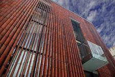
The bricks changed their traditional horizontal layout into a vertical one, and were mounted on steel rods that ran through a specially elongated opening in each and every brick. Thus a kind of external moveable curtain should be created, a kind of louvers built of brick “beads”. We designed an external brick plane that can be opened and closed according to one’s needs as the position of every brick might be individually regulated. Having such a system at our disposal and moreover having a full range of colours typical for mediaeval bricks {from deep violet to orange} we are able to build our structure from a material that is both characteristic and intelligible within the historical context. It builds a metaphor of a contemporary moment that remains closely related to history – of contemporary architecture that results from the reinterpretation of a traditional language of architecture.
2005
2007


