One of the good things that home office brought us, was having forced us to take two leaps that we still resisted: it helped us to verify that it is not necessary to have an assigned desk for each person and that we should learn to use connectivity and platforms to attend meetings remotely. Many companies had already implemented these ways of working before the pandemic, but many of the users were still not comfortable with having a different desk and colleagues every day or connecting to meetings with video conferencing devices that they did not know how to use.
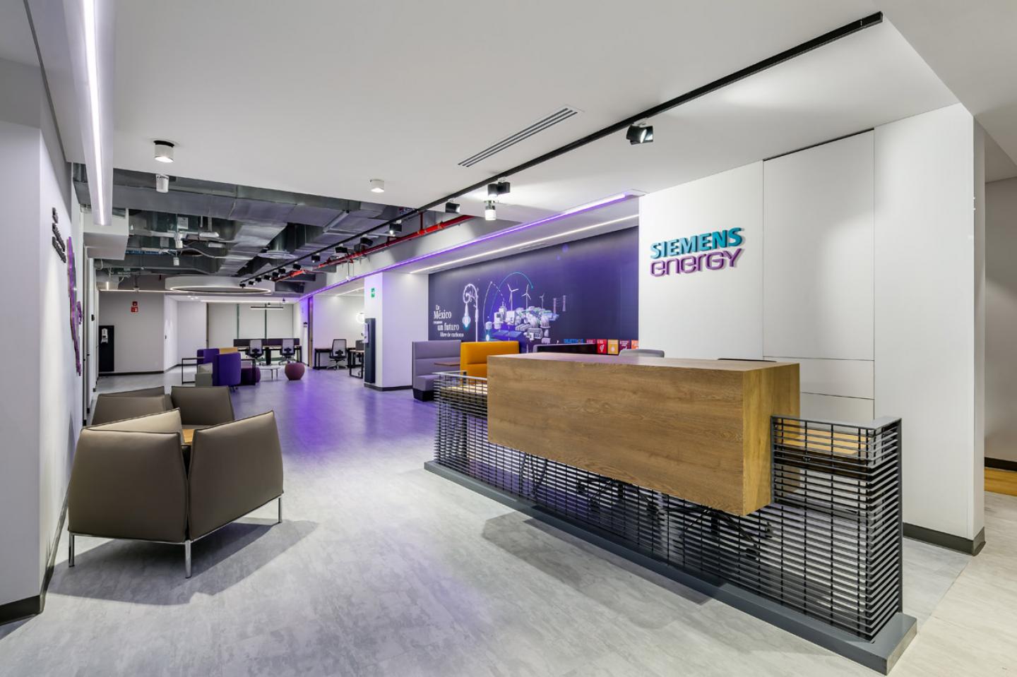
To give new impetus to the return of its collaborators, Siemens Energy is renewed, and the space known as an office does not change its function, but the way in which it is used and the offer of dedicated places to work individually and for face-to-face meetings.
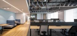
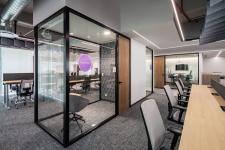
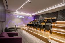
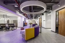
With a flexible hybrid model (without assigned places), where the majority of the staff is out of the office and comes in when necessary, it is possible to reduce the surface dedicated to the traditional format of workstations and this has allowed multiplying the areas for demonstration; such as the Simulation Room and Didihub Mexico and the meeting rooms with different furnishings to promote collaboration, innovation and concentration according to the requirements of each of the users.
The architectural plan is divided into three sections: public area (with demonstration and collaboration rooms), services and infrastructure, and work areas: one with an intermediate noise level and another more reserved for users who require greater confidentiality and fewer distractions.
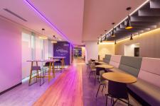
On the south façade of the Antara II building, the main circulation or “the walk” that unites the three aforementioned areas was placed, and on this, various spaces were arranged to meet or isolate —if necessary— from the conversations of the cafeteria that is the meeting point of the project, where colleagues can meet before a face-to-face meeting or to repair their mobile devices with specialized personnel or pick up their courier.
A neutral color palette makes it possible to highlight the color accents of the corporate image and that identify the use of each of the spaces. For high-traffic areas, a wood-effect and polished concrete LVT-type finish were chosen, where acoustics are an important factor and it was necessary to provide greater visual comfort, a modular carpet with marbles in shades of gray was used. To give direction and help users identify the use of the space, a complex code of ceiling lights was designed, emphasized by LED strips, decorative luminaires, and recessed luminaires at different temperatures. A purple RGB LED strip was also incorporated to guide visitors towards the exit and to give a varnish of light to the walls.
2020
2022
Project name: Siemens Energy
Category: Corporate
Year: 2022
Area: 1, 500 sq m
Location: Mexico City, Mexico
Photographs: Jorge Guadarrama
Project: USOarquitectura
Arq. Gabriel Salazar
Arq. Fernando Castañón
Collabrators: Zarahí García, Francisco Ortiz
