Interior designer Nitzan Horowitz is known for his ability to work wonders when it comes to creating dynamic living spaces with a limited palette of colors and materials. This new duplex apartment located in the Sharon region, planned and designed for a couple and their two daughters, is no different.
"The owners come from the world of construction and entrepreneurship. They live the industry and value quality and detail”, says Horowitz. “I loved the clients from the get-go, and we quickly developed a strong rapport that resulted in very fruitful discussions. After we outlined the program, their needs, and their wishes, they gave me a free hand to create a property that ticked all their boxes. The process was based on trust and mutual inspiration and the results reflect this beautifully”.
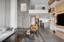
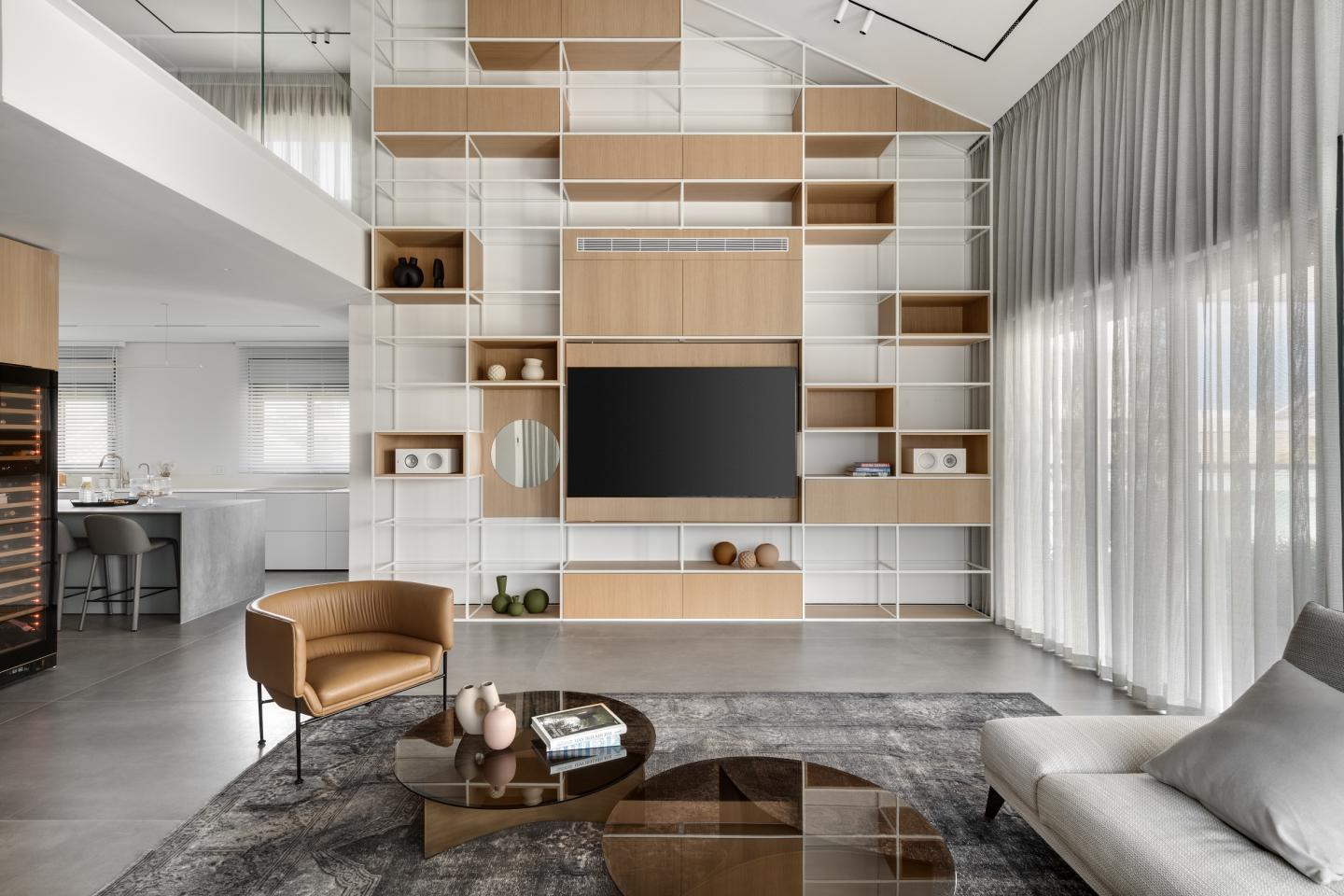
According to Horowitz, the property is characterized by impressive architectural features, but the original layout didn't meet the family’s needs. “We decided to change the floor plan completely”, he explains. “We wanted to emphasize the dimensions of the double headroom on the first level”. The uniqueness of the duplex lies in the fact that one can truly absorb both levels in one glance, and, according to the designer, his wish was to create this powerful experience. Thus, the sloping ceiling, at six and a half meters high, as well as the other high elements, were all an integral part of the concept enabling a holistic view of the entire space.
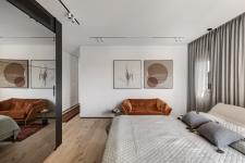
The entrance level includes an open family space with a lounge, a spacious kitchen, and a separate 60sqm master suite that includes a master bedroom, a walk-in wardrobe, a lounging area, a bathroom, and an office. The design is modern, minimalist, and breathtaking and it is evident that Horowitz was meticulous in his choice of materials throughout the property used in various compositions. These create a design continuum with a focus on gray porcelain, a white color palette that runs through the carpentry pieces and frames, and light oak veneer that adds warmth. “I used similar colors and materials throughout with the view of maintaining a minimalist design”, Horowitz explains.
The designer used the entrance and lounge walls to create vertical pieces that emphasize the double headroom. The original entrance door was replaced with a 2.8m high door that is embedded into the wall. The wall was tiled with 1.2x2.8m gray porcelain slabs that emphasize its height and run up to the ceiling of the gallery level.
The lounge library is undoubtedly one of the most interesting features in that space, emphasizing the height of the dynamic sloping ceiling: “It creates a sense of proportion between an individual and the space itself and beautifully brings together the variety of materials we used throughout the property”, explains the designer. “The library was not intended purely for storage but rather as an element that emphasizes the headroom, it is made of white-painted iron dotted with natural light oak veneer boxes with the a/v and a/c systems fitted into it”, he adds.
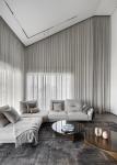
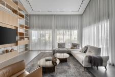
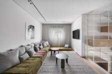
All the materials in the lounge run on the same color palette. The idea was not to create a colorful space but rather a serene and harmonious one. A modular sofa system was placed in its center, which can turn into an exceptionally cozy family lounging area in addition to the spacious family area located on the second level. An original wool vintage rug was placed under the sofa, and the curtains, which add another layer of softness to the space, were custom-made on-site due to the challenging ceiling shape & height.
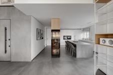
The theme doesn't stop there. Horowitz masterfully designed a kitchen element that emphasizes its height, a floor-to-ceiling unit that creates a semi-corridor that separates the kitchen from the guest toilets and the entrance to the master bedroom. This element serves as a focal point for the second level that seems to be floating above it.
Horowitz used three of the unit’s sides - the first as a storage cupboard for crockery and utensils, a second used as a utility and storage cupboard that serves the master bedroom, and the lounge-facing third side was fitted with a wine refrigerator.
The kitchen was divided into areas: along the length of the space, Horowitz designed a white storage unit for all that a modern kitchen needs, with the door to the master bedroom planned further along. A 3.5x1.2m kitchen island abundant in storage was positioned in the center and is used by the family for casual dining. When entertaining guests, the family usually does so on the well-kept balcony.
"The island can comfortably accommodate five diners and allows for dynamic interaction whilst cooking”, explains Horowitz. “Since this is a very large space, with long worktops, the sink and hob were fitted on the low counter space that faces the windows and overlooks the view”. The island is wrapped in a porcelain surface and the family, which cooks and entertains frequently, can enjoy using three integral fridges, a professional oven, a warming drawer, and additional functions for a pleasant entertaining experience.
The balcony continues the kitchen and the overall design theme with an outdoor lounge, a dining area, and a fully equipped kitchen. “We used the same clean color palette in the balcony, to stay true to the design concept from start to finish”, says the designer. “Similarly to the duplex, here too the different layers create a precise and dynamic outdoor experience”. The greenery, which creates the sense of a true garden, also contributes to the overall concept. The outdoor kitchen is made of concrete and stainless steel, and the outdoor dining table can seat up to 12 diners. The outdoor seating area, in the center of the balcony, includes a pleasant fire pit for cozy seating on cold days.
The artwork displayed around the property and created by local artists was curated to perfectly match each and every space and room in the duplex, all in organic shades of terracotta and Corten steel that blend with the blacks, the whites, and the wooden floors. “The duplex’s story is told from every corner, and each corner is a reminder of a different chapter”, emphasizes the designer.
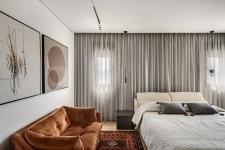
The master bedroom takes us to faraway places, designed in a more dramatic, intimate, and sensual style. Horowitz combined orange and rust elements that can be seen in the artwork, the rug, and the sofa: “The cupboard, with a mirrored facade, was positioned across from the bed and creates reflection and depth”, he explains. “The walk-in wardrobe was broken down into components, in the same manner as molecular cooking. it embraces the walls and is transparent in parts, thus doubling the space visually”. An enclosed area was created where a mirror and tv screen were positioned, and further along, there is a corridor that leads to the office.
The light distressed oak parquet in the master bedroom runs through to the en-suite bathroom, which was even more dramatically designed. The designer used a monochrome color palette in shades such as a black veneer cabinet, powerful granite porcelain countertops, and a dark Caesarstone sink.
The wooden staircase that leads to the bedroom level was fitted with a glass banister and embedded into the floor creating openness and transparency between the levels. The level includes three bedrooms: one of them serves as a suite, and another as a guest room, The pièce de résistance on this floor is a family area that overlooks the first level and enjoys the lounge library that extends all the way up.
“The family corner, in which the family can enjoy a home cinema, includes a very comfortable lounging area in a shade of green that livens the space and creates a conceptual balcony on the level”, explains Horowitz. Aluminum coffee tables were placed by the sofa, and the tall library that is erected from the first level is present in this space too, creating movement and interest.
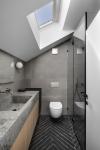
"We maintained the monochrome color scheme in the girls’ bedrooms too, and they too enjoy custom-made furniture that defines the sleeping and study areas”, explains the designer. “The design language repeats itself here too: the parquet floors are conceptually associated with the cupboards and the beds continue the theme used on first-level furniture”. The girls’ bathrooms were planned in similar materials to those throughout the property, except in different compositions. “This is how we created a slightly different bedroom on this level, which still remains true to the same overall design concept”, summarizes Horowitz.
2022
2022
The owners: a couple in their 40s’ and their two teenage daughters
The property: a 210 sqm penthouse duplex apartment 70 sqm balcony
Planning and design: Nitzan Horowitz
Oded Smadar