A wealth of textures and materials: this is how you design a timeless house
The construction industry in Israel has evolved dramatically in recent years, and as such, many properties that were built decades ago are going through considerable renovations to meet the requirements and trends of the 21st century. So did this family home, in the Sharon Region, that underwent a complete structural transformation and redesign. Designer Shlomit Zeldman masterfully created a living environment that pays homage to natural and industrial materials and textures. The most significant change made to the property was the redesign of the safety room, which was built in the center of the property and transformed into a powerful design element
We all wish for a home that would not only serve our needs and preferences but would also provide a unique living experience from the get-go. For this young family, a couple in their 40s’ and their three children, the wish became a reality.
The property was built about 25 years ago in the heart of an old neighborhood located in a small town in the Sharon region. The owners renovated the property just before moving into it a decade ago and now, the time was right to renovate once again. Their desire was to turn the property into a living environment that addressed the owner's exquisite taste and their family needs, which have changed over the years.
The couple approached the well-known Architect Shlomit Zeldman, whose clean and precise aesthetic has become her trademark.
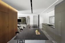
"The property changed completely as a result of the renovation. The exterior as well as the interior. The facades underwent a facelift, openings were enlarged, extensions were carried out, the old staircase was replaced in its entirety, and much more”, says. Zeldman. “It was important for the owners that the property exterior would blend well with its natural surroundings”. The dramatic change is also evident in the interior where she incorporated aesthetics that pay homage to the various textures and materials used. According to the designer, one of the main challenges was the safety room which is located in the center of the ground level, sits in between all the family areas, and prior to the renovation looked completely out of place. “We stepped up to the challenge and decided to turn the lemons into lemonade - we covered the room’s external walls with cladding made of brushed oak cubes, which we emphasized by lowering the ceiling and fitting hidden running strip lights. This turned the safety room into a decorative element that blends with the rest of the ground floor areas in optimal harmony”, Zeldman adds.
Polished Moreno gray marble tiles were chosen by the designer for the floor on the ground level, to give the space a smooth and continuous feel. The old and heavy staircase was demolished and replaced with a more elegant and modern one: “It was important that the staircase would match the rest of the property’s design language. We used a contractor and special concrete with a variety of additives that make it more solid and sturdy, even though the mass is relatively small”, says Zeldman. “The process was complex and required great levels of precision - this is how we managed to create a fascinating contrast between the heavy concrete and the elegant end result. The handrail was fitted into the staircase prior to the casting and in order to emphasize the light airy feel, we used thin steel balustrade wires.
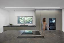
The size of the original kitchen was another challenge. According to Zeldman, in order to create a functional space for the family, she made a decision to build an extension: “We are talking about 10 sqm in total, which made a dramatic difference to the space”, she explains. The kitchen was designed in clean geometric lines, in one color, with aluminum frames. The cabinets were painted a gray mocha, the worktops were made in natural thin-veined granite, and the kitchen island was made in aluminum. All these elements blend together beautifully with the wooden walls that surround the safety room, creating a very unique setting.
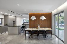
“The dining area is the first space your eyes land on when you enter the property”, continues Zeldman. “As a result, it was important for me to design it as an organic and natural work of art. To facilitate this, we very carefully chose a unique natural granite plate for which we custom-built an iron base. The minimalist black chairs allow the table to take center stage, and the green garden that can be seen through the windows serves as the perfect backdrop for this”.
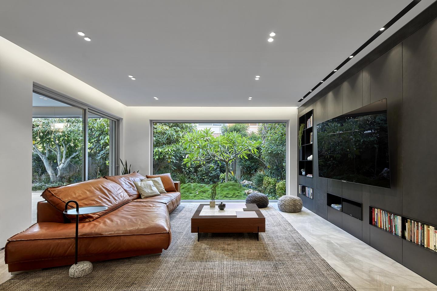
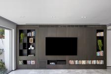
The lounge underwent some significant changes too: one of the original openings was enlarged to the max and fitted with glass allowing the luscious garden to visually embrace the interior. A powerful washed aluminum display cabinet was fitted in the center of the lounge, which also conceals the air conditioning units. The seating area is fun and inviting thanks to a cozy down-filled leather couch.
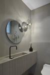
The guest toilets are located behind the staircase wall. “We continued the marble floor throughout the ground level into the guest toilet. The walls were covered in light-colored thin granite porcelain cladding and a Corian sink cabinet with a smooth surface-top and textured front was fitted. The mirror and lights were planned as one piece, round and interconnected”, notes the designer.
The children’s bedrooms, a shared bathroom, a master bedroom, and a smart utility area are located on the first floor. “The first floor is not particularly big, and so it was imperative to utilize every inch of the space in the most effective way possible”, recalls Zeldman. “I planned a utility cupboard along the corridor that contains a washing machine, dryer, and additional items such as a drinking water filter, mostly for the children’s use in case they are thirsty at night”. All these are hidden behind an engraved and epoxy-painted light facade. Smoked oak fishbone parquet floors were fitted along the entire level for an added sense of warmth. “The children’s rooms were planned with their hobbies and design preferences in mind, and the shared bathroom was designed in timeless clean and classic lines”, adds the designer.
The master bedroom was transformed into an island of calm thanks to a cozy design and the creation of an access point to the balcony. Prior to the renovation, the access points to the balcony were through the other bedrooms. These were then closed, and new access was created in the master bedroom for the sole use of the parents. “The bedroom is not big, and so creating access to the balcony made a dramatic change”, explains Zeldman. “We maintained a clean and minimalist design that makes the bedroom appear more spacious. To give it a more personal and warm touch, we placed a beautiful custom-made cabinet in the room, the work of an artist carpenter who creates cabinets and other pieces of art”.
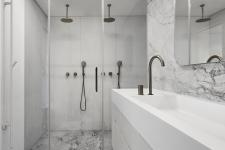
The bathroom isn't particularly big either but was given much attention in the process. “We covered the walls with super-white natural granite with a powerful pattern, adding visual richness to the clean space”, the designer explains. A large double walk-in shower with a floating bench was fitted at the end of the bathroom, with a concealed toiletry niche. The luxury does not stop there. “We also fitted speakers into the ceiling, heated floors, and a smart toilet seat that includes rinse & dry functions. A white brushed-oak veneer bathroom cabinet was fitted with a Corian top, blending beautifully in the monochrome space”, summarizes Zeldman.
2022
2022
Planning and design: Shlomit Zeldman, owner of Shlomit Zeldman Architecture & Interior Design studio
The owners: a couple in their 40s’ and their three young children
Property: 220 sqm
Renovation duration: about six months
Planning and design: Shlomit Zeldman, owner of Shlomit Zeldman Architecture & Interior Design studio
