- Program: a couple three grown-up children. The house is meant to serve three grown-up children in suites of their own and their parents. The basement includes a play/ leisure room, apartmental protected space and one of the children's suites.
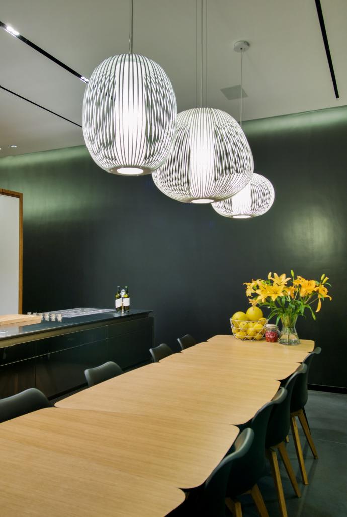
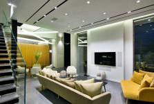
- Ground floor: living room, kitchen, dining room, guest bathroom and a pantry. The main idea in the ground floor is the division of the space into two sections: one is the living room, and the second one, hidden, is the kitchen and dining table, which face the front house's morning garden. The element that constitutes the division is a wooden cube that is detached from the lateral walls to allow for a passageway and disconnected from the structure's ceiling. This cube includes the guest bathroom from one side, and a pantry from the other side, serving the kitchen. The detachment of the cube from the house ceiling constitutes a sense of flow and continuity in the space.
- First floor: two children suites and the parent's master bedroom. The main theme in this floor is the separation in space between the children's section and the parent's section by a crossing space that separates the two sections. A bridge is the element that connects the two sections.
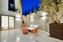
- The basement includes a suite for an adolescent, a family playroom and a service room. The basement opens to a relatively large English garden, that serves the children and their friends in full privacy.
- The structure's external layer and the architectural concept is of a house that absorbs the surrounding scenery into the structure's space throughout all floors. The external layer is made of bare concrete in combination with "wall boards" concrete.
- Our architectural vision is integrated throughout the whole structure:
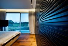
1. The house's geometry is regular, while the architectural concept of tempting the guest entering the house ("peeping through the keyhole") is achieved by breaking the regular architectural mass using deconstructive slopes in the structure's entrance hall, which is practically the house entrance. Both internal and external walls' slopes, are indeed intensified and felt inside the house, from geometric as well as material aspects, through the use of wooden boards' concrete and a sharply sloped wall inside the internal space.
2. Discovery/ concealing: we believe that houses should be discovered, not only by guests, but particularly by the house residents, time and again. As to the façade, it has more to it than meets the eye; the wooden grillwork covers up what's behind and provides privacy, while the back façade is revealed in all its grandeur. At the same time, while moving into the structure, the internal part of the home is being unfolded towards the open back façade.
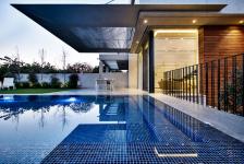
- In order to achieve the best shading, we designed wide pergolas, and in order to break their mass they were designed of a light material, tin, with complex and narrow sections, resembling an airplane wing.
2019
2019
photographer : Itay Sikolski
Plot area: 500 sqm
Built area: 360 sqm
Architects: Dan and Hila Israelevitz Architects
