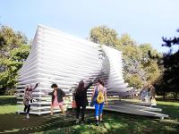
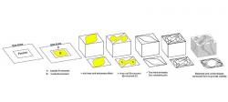
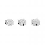
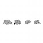
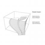
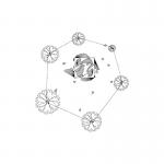
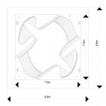
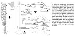
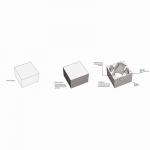
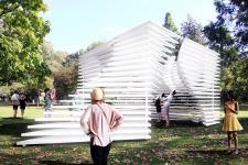
Energy can be defined and analyzed in different ways. The definitions form various fields especially considering the architecture issues, i. e. addressing clean and renewable energies and sustainable energy and design concepts are among the first issues coming to mind. However, it was tried to define the energy with an abstract view in this project. Away from the complex issues, energy is known to everyone given its usual encounter in everyday life. Walking, running, talking, playing and every other moment of life is a continuous stream of the energy conversion and consumption. Therefore, it can be concluded that human is a symbol of energy itself. It is important to know how the energy can appear in an architectural space, especially a pavilion. A pavilion located in a lively place beside the childhood Museum with audiences familiar with various annual events that take every opportunity to walk, run, play and generally enjoy the environment and consume energy. How the pavilion is a symbol of energy? Simply: by "People". The more people run, play, sit, relax, come together to make a change and explore the space, the more energy will be released to the space; the more the people, the more the activity, the more the energy. Therefore, it was tried to design the space so that to attract as much audiences as possible and provide a suitable environment to encourage them for more activity and exploration. Therefore, the pavilion is completely like a layered cube form from the outside with some embedded spaces to be explored by the audience. Layered form of the pavilion is considered for the readability purposes to provide an outside to inside view and vice versa. Entrance to the inside space can be a symbol of energy. Pavilion entrances were designed to be dynamic and were created by moving the cube body. They were located on four sides of the cube and created eight different modes of entry and unlimited varied forms. Number, direction of rotation and path of the entrances were selected so that to be readable and visible from all around to attract more audiences. In addition, the pavilion was located in the site with appropriate angles so that to ensure good visibility in all directions. In addition to playing the role of entrance, openings cause fluidity of the form and make the pavilion to take new shapes in every moment of the day. This could encourage passersby to take their own part in formation of the environment and make changes to it. Every time someone tries to enter the central pavilion space, its form should be changed that can be attractive for observers and passers-by and calls them to the space; "the more the audience, the more the activity, the more the energy". In addition, a third space has been considered inside the interior of the pavilion, a space within the pavilion body that is like a gateway to heaven. By standing in the space, the audience can sense and share the transformation of the cubic form from a closer distance. In general, it was tried to design an architectural space that involve the audiences and encourage them for more activity and exploration. Meanwhile, social ties, rest points, places for standing, leaning, sitting, talking, and cooperating have been considered. At any moment, the audience could form the required space, lean into it, sit, and create the shadow and so on. Therefore, especial attention was paid to the relationship between human and space and vice versa. The form invokes the audience activity and responds to it so that leads to a new space, and the cycle goes on continuously. At the same time, the permanent relationship between the created space and the natural environment and vice versa has always been considered. Layered structure establishes the connection between inside and outside in every moment and continuous changes of the forms, like a curtain located downwind, gives a new form to the connection at any moment
2015
2015
Project: Triumph Pavilion 2016: Energy Pavilion Site: Museum Gardens, London E2 9PA Title of Project: Performative Twist box Site Use - Site Area (m²): 80 Building Area (m²): 49 Gross Floor Area (m²): 80 Building Coverage Ratio (%): 0.6 Gross Floor Ratio (%): 0.6 Building Scale (if different from actual size): No Stories above Ground: 1 Stories below Ground: 0(NO) Structure: lightweight metal frames- membrane fabric - inox platform Maximum Height (m²): 4 Landscape Area: 1. 5 hectares Parking Lot: N/A 0(NO) Exterior Finish: inox platform- Polished Inox
Amir armani - reza pholadvand

