As an architectural practice operating in an urban environment, the large scale of our work often implies that we are unable to fully engage the end user within the realm of the everyday objects that they interact with – be they light fixtures, small furniture or specialized hardware. The momentary recognition of a pure architectural expression is sometimes all that remains in the memory of a user inhabiting a space that takes years to realize.
Thus, it is only in smaller projects where one can utilize the opportunity to fully envelop the sensory experience by creating an arresting intervention in an otherwise banal public arena. Also, it is not limited to the end product – it is present in the process of altering the site as regular passers-by sense the onset of change and anticipate the eventuality. The shift in the perception of the user is an intervention and that is the underlying strategy behind the approach to this project.
The site is located in a small hotel on a busy road that has rapidly commercialized, changing dramatically in character over the past decade. A small space of 12x16 on the ground floor was to be designed to accommodate a fairly unique proposition – a paper store that specialized in customized invitations and stationary. Having earlier collaborated with the client on stationary design, the focused nature of merchandize forced us to think deeply about the aesthetic experience that would be appropriate to the product. Since there is an artisan-like quality to the making of the paper, we wanted to reflect the same level of craftsmanship in the store, making it feel almost like a workshop that one would find in a backyard, a private haven. Concurrently, it was important for the client to be able to customize the details as they innovated with newer products.
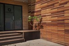
The first decision was to adopt a primary material and then use it in different finishes to create the transition between the outside, where it would need to act as a visual intervention, to the inside where it would act as the container for the merchandise. Despite being used ad nauseam by developers in the city, their approach fails to evoke the raw natural fibrous texture of the material, utilizing only the resultant color on a flat surface. From the road, the first impression is created by a slatted screen anchored by a simplistic shape, a Mickey Mouse garden hut with sides in frosted glass. This announces the presence in a subtle manner, piquing the interest without resorting to a large hoarding or advertisement. The same material texture is also on the floor plane, stepping up to an exterior patio space, adorned by a fragrant frangipani tree, beyond which the real façade can finally be seen. The turquoise color of the frosted glass is offset by the dark edges of the frame and the delicate branding set in the central panel.
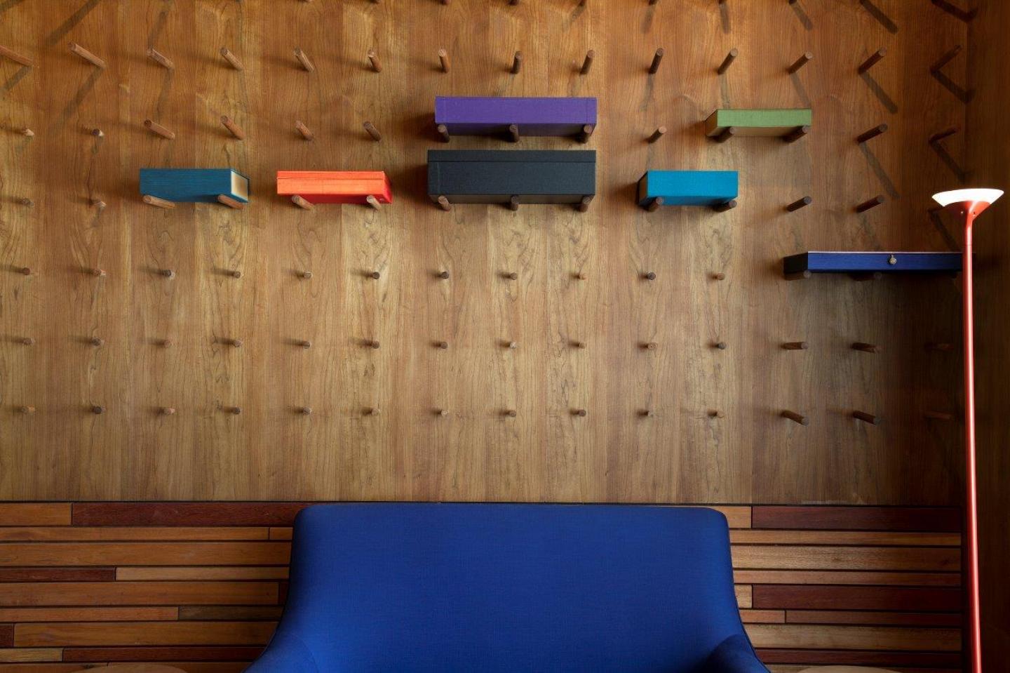
Within the space, there is a subtle shift in the materiality – the surfaces are smoother, the smoked maple ceilings and walls have been sanded down and the effort is almost to create the interior of a jewel box. Crisp black shutters define the shelves in one half of the space while the rest of the walls are dotted with smoothly machined wooden dowels. These cylindrical protrusions animate the walls with their shadows and can be moved around and reconfigured to accommodate the varied nature of the products on the walls and within the cupboards. Their varying length also helps create the impression of an imaginary curvilinear lamina, an invisible surface acting as a second layer of enclosure. The play of shadows crafts a dynamic experience along with the intensity of the light within the cupboard. A Small screen is utilized to segregate the attendant from the guest.
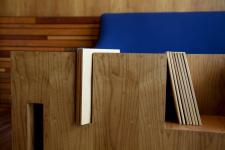
Sitting in this wooden enclosure, are a few select pieces of furniture that round off the aesthetic intervention of the project. There is a large coffee table, essentially a block of smoked maple wood with cubic subtractions and angular slots hacked into the volume, creating an abstract geometric construct where additional merchandise can be displayed. The visual mass of this table is offset by two cerulean blue Chairs with delicate pink piping on the lower edges, almost as if posing like naughty Parisian dancers. The whole composition is really just a quiet conversation between the 2 pieces of solid grounded furniture and the 2 pieces of mobile furniture.
2014
2014
Location | Greater Kailash 1, Delhi
Name of Client | Sanjeev Gupta, Archana Press Pvt. Ltd.
Principal Architect | Akshat Bhatt
Design Team | Nikhil Auluck
Total Cost | 2.5 crore
Site Area | 130 sq. ft.
Built-Up Area | 130 sq. ft.
Start Date | January 2015
Completion Date | February 2016
Photographer | Jeetin Sharma
CONSULTANTS
Structural | Isha Consultants Pvt. Ltd., Project Lead: VP Aggarwal
Mechanical
Landscape | NA
Lighting & Electrical | Lirio Lopez, Project Lead: Linus Lopez
HVAC | System AIRCON, Project Lead: Yogesh Punjani
Plumbing & Firefighting | In house
Civil | NA
PMC | Architecture Discipline
Acoustic Engineering | NA
Akshat Bhatt, Nikhil Auluck


