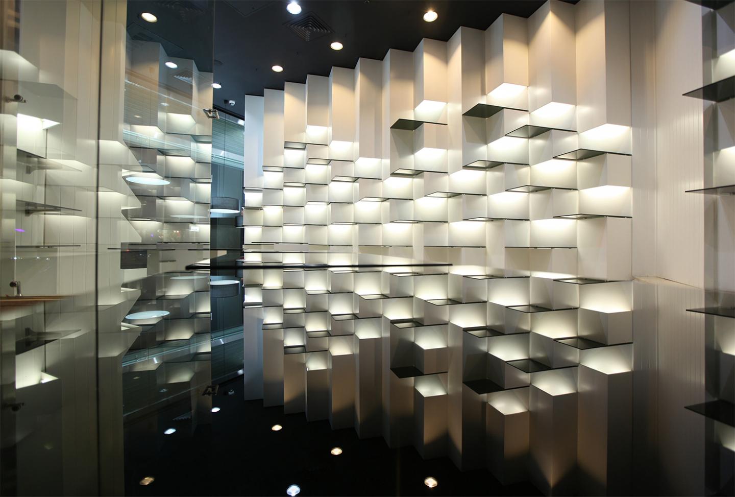
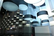
The first concept of the project was having a space for the display products from near and far, a showcase for products fine display with a suitable lighting for attract audience and on the other hand, we should pay special attention to the broad scope of the shop from far distance. Corporate color are black and white so we was used white for wall covering and black glasses for shelves to emphasize.
With this solution the maximum amount of space is with and shelves will take more attention from all direction. Another important point that had great roll to make concept IS Shariati Street location to the interior walls of the shop so it was made the other goal “the showcase had the best viewing angle from the main street.” And the solution for approached to this aim was squalor and rectangular boxes that there were in the other branch with the minimum variety for best products display.
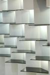
Every box was rotated around its axis at 45 degree and was attached to the walls and made the best viewing angle from the main street. By creating a vertical gentle rhythm, variation were created in the arrangement of modular forms. However these forms that was created columns triangular shape, provided a focus on the shelves by the presence inside light and their effects on those.
2013
2014
Mohammad Kanisavaran- Gol Nesa Mottahed


