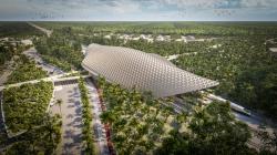
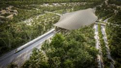
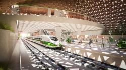
The station sits in the beach resort of Tulum, in the Mexican Caribbean, along the Riviera Maya. The primary goal in the design process was to push the sustainability agenda to the foreground and to find in that optimized performance a narrative which would speak about the qualities of pre-Hispanic Mayan Architecture through the use of light, shadows, patterns, materials and vegetation.
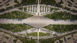
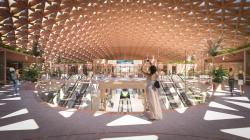
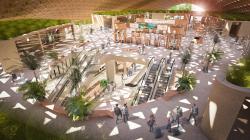
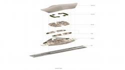
One of the key elements was to minimise the footprint of the station, so after exploring different spatial configurations, an eye shaped footprint, widest at the centre, where the main functions converge, seemed the most efficient use of space. This was enhanced by stacking the public programme of the station above the platforms deriving in a more compact scheme, connected across levels with vertical circulation and featuring a grand hall flooded with light and natural ventilation.
Another key priority during the design process was the user experience, ease of mobility, orientation and the presence of natural light. The linear configuration of the station and the symmetry naturally help, this was assisted by the roof geometry which intuitively navigates users towards the centre of the station.
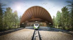
In laying out the commercial component, we aimed to design spaces which constantly celebrate the experience of rail transportation this was achieved by framing views of inbound and outbound trains, and by laying out these retail spaces on a direct visual connection with the platforms.
The climate in the Yucatan peninsula is tropical with rain and high humidity in the summer, to deal with this extreme weather, we envisaged a large open lattice roof, glazed in strategic locations, enabling public semi-open spaces that function without mechanical ventilation. The sun light piercing through the roof, projects complex geometric patterns on the walls and floors of the station, a play of lights and shadows travelling throughout the space and evoking different sensations on the users.
The openings on the gridshell respond to the radiation exposure throughout the day, smaller openings on the zenith reduce heat gains at the hottest hours and larger openings on the sides let air and light in when the temperature descends. This passive strategy negotiates the amount of radiation exposure and the amount of natural light let into the station.
The aerodynamic geometry of the roof promotes the suctioning of the ocean breeze and funnels it through the station. This is key to create a comfortable atmosphere for users without the need of mechanical ventilation.
The roof structure is a steel gridshell cladded with Glass Fibre Reinforced Concrete (GRC) panels on the top and laminated wood panels below. The resulting motives on both outer and inner sides are reminiscent of Mayan traditional geometrical patterns.
Throughout the design journey, we aimed to infuse the station with some of the best-known features of Mayan Architecture; symmetry, monumentality, geometrical alignment, and the use of limestone are all constant treats in Mayan architecture. As such we have attempted to honour this heritage by rescuing that same spatial quality just reinterpreted it in a contemporary way.
2020
0000
Area: 14,400 sqm
Construction: January 2022 – June 2023
Architects: AIDIA STUDIO
Lead Architects: Rolando Rodriguez-Leal & Natalia Wrzask
Project Team: Mariano González Silva, Emilio Vásquez Hoppenstedt, Rodrigo Wulf Sánchez
Structural Engineering: Project & Calc
Client: FONATUR Tren Maya

