The tea cosmetics brand Cosmetea subverts the previous definition of cosmetics by innovatively integrating tea with trendy cosmetics. It uses Tea Beauty Science to create modern fashion aesthetics based on natural Eastern sentiments.
The designers was entrusted to conceive a store for the brand in Shanghai. Based on the dimensions of spatial design and brand planning, construction of art and an immersive scenario experience, as well as an exploration of differences between natural and artificial realms, the pop-up represents the philosophy of relationships between existing environments and future architecture. Moreover, it promotes the brand’s creative and sustainable evolution.
A fashion destination in old neighborhood
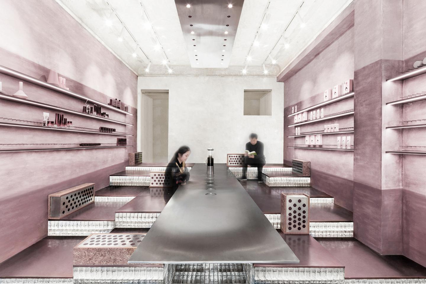
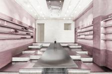
This project is located on Yuyuan Road, a hundred-year-old road that has undergone many changes and represents the essence of Shanghai’s history and culture. The site is surrounded by dense rows of old buildings. We drew on the brand’s conceptual prototype of ‘taste a beautea’ to develop new ideas, and chose the form of layered and irregular mountain ranges as well as a leisurely, quiet and welcoming atmosphere as design languages. Within an area of 75-square-meter, we created a cosmetics retailing, socializing and experiential space, which was conceptualized as a “tea house floating in the mountains”.
Surreal scenes & lighting effects
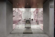
Taking inspiration from the “view framing” techniques in Chinese classical garden design, we set a modern minimalist stainless steel screen at the entrance. This adds a hazy rhythm while hinting at the “tea house” concept. It also forms a readily recognizable brand personality, which attracts pedestrians to stop and visit.
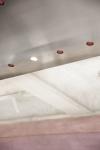
When gradually entering the store, customers will encounter a long suspended stainless steel table set in the middle of the space, which matches with the stainless steel screen. Moreover, the floating lighting fixtures installed under the old concrete ceiling, along with the unique lighting effects of glass bricks, generate surreal scenes and interplay of light and shadows.
Soft hues & tactile textures
The overall spatial tone is based on an extract of Pu’er tea’s brilliant red color, which is blended into low-saturation pink hues. The pink color palette explains the integration of cosmetics products and tea culture, whilst creating a soothing environment for modern people.
The indirect light source’s smudging gradually results in the diatom mud walls displaying a blank and imaginary Chinese ink wash painting. Moreover, the wall surface’s three-dimensional tactile texture makes people feel that they are experiencing nature’s vitality.
A flexible and variable "magic cube"
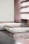
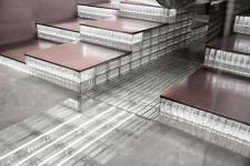
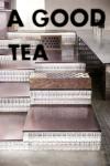
The fixed steps composed of glass bricks and metal provide an esthetic that balances lightness and heaviness, and guide customers to slowly walk upwards and freely sit down. The transparent materials enliven the atmosphere, infuses the multilevel space with a “sense of floating”, and invites customers to freely explore inside the store.
The flexibility of spatial configuration and functions is embodied in the pluggable display rack that creates more possibilities for exhibiting products, and the mobile steps made of OSB paneling and perforated metal. The movable stairs are inlaid with Cosmetea product bottle caps, and the brand logo on the caps are highlighted by lighting, which turns the recycled materials into sustainable expressions of art.
2019
2019
Area: 75 Square Meters
Design Team: Lina Chan, Yiting Ma, Jo Jiao
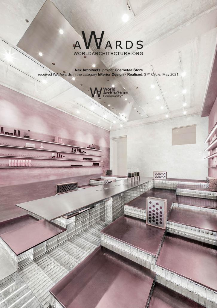
Cosmetea Store by Nax Architects in China won the WA Award Cycle 37. Please find below the WA Award poster for this project.

Downloaded 3 times.
