GAO Zhiqiang: Exploring the infinite possibilities beyond boundaries - Space Emotion Design Series - Vniau Office
The essence of space design is to pay attention to people’s emotional needs, especially in office designs.
Vniau office is designed by GAO Zhiqiang, a space emotion designer. He created an extremely comfortable and inclusive office space by modern design tech-niques, combined with technology, history and humanities.
/ Explore /
Infinite possibilities beyond boundaries
A humanistic caring, warm and emotional design work, under the continuous changes of social forms, evolves into a space in accordance with the develop-ment of the current era, which is the most solid response from the designer to the space.
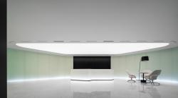
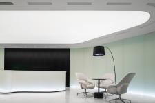
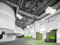
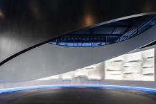
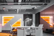
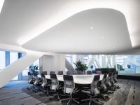
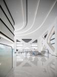
This open space makes you feel like entering into a movie scene. Large areas of black and white contrast, and smooth lines create a powerful aura. However, soft lights bring back a romantic atmosphere. The space is highlighted by vir-tuality and reality.
The development of modern technology diversified people’s cognition and iden-tification of space dimension. The designer tries to break the inherent bound-ary consciousness among technology, humanities and nature by comfortable and efficient spatial perception.
Wandering between virtual and real, light and shadow, the space presents a fu-ture sense through symbols. It shows a bold, free, open, lush, and new office format.
"Compared with technology, we pay more attention to people's emotions and feelings. We have always been advocating using the most common materials to create different spaces, and the key is depended on design." Said designer GAO Zhiqiang.
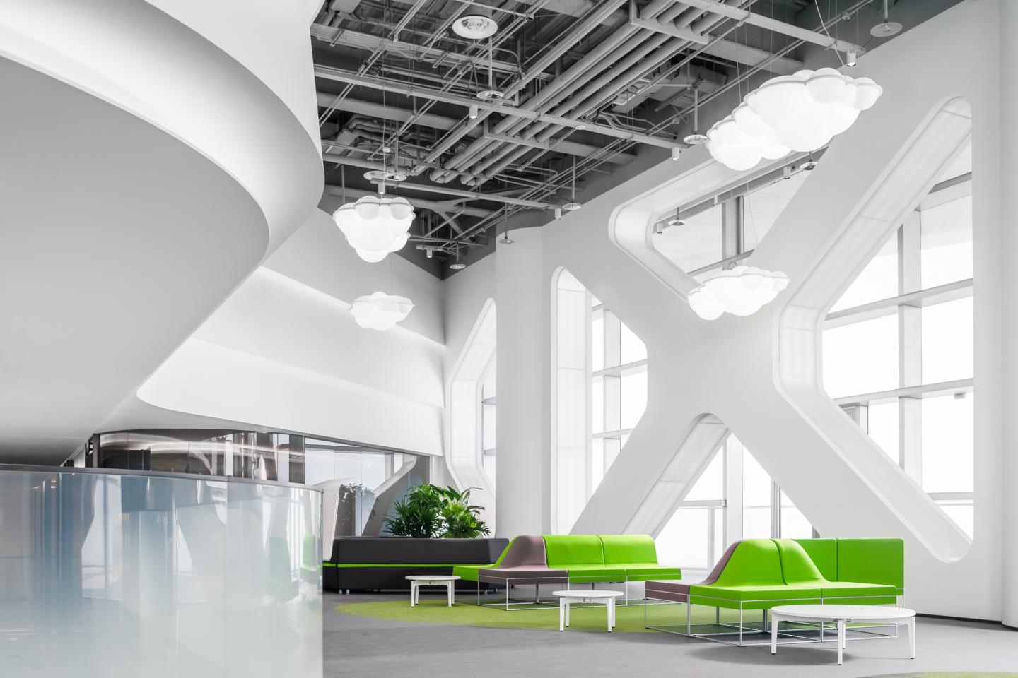
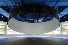
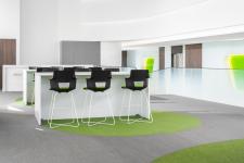
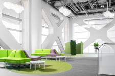
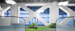
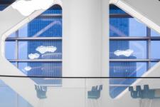
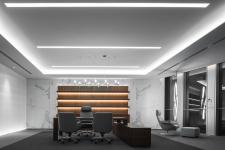
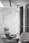
Therefore, when it came to the selection of materials, pureness presents in-finity, simplicity creates richness. Bright green brings cheerfulness, and the exposed ceiling and cloud-like chandeliers create a natural and agile visual perception. The combination of dynamic and stillness embodies the concentra-tion of the designer.
As the previous office was in Chinese style with redwood furniture, in order to have good effect of the overall space, the designer discussed with the own-er repeatedly, strive to change into a modern style, which matches more with their products, clients, competitors, brand culture and temperament of the of-fice, younger staff, etc., in the end, this design shows up.
This is a ring-shaped office space with same walls and same core tubes, which make people easily disoriented. By the principle of 5 elements - metal, wood, water, fire and earth, the designer placed the reception and exhibition room in the middle, and painted in yellow, corresponding to central earth.
According to this principle, the R & D department on the east side is decorat-ed in green, corresponding to wood, also, the market and finance department on the south side is orange, corresponding to fire. Service department on the west is white color representing metal, CEO and QC office on the north side is given black color, representing water. 5 directions are painted in 5 colors, which make people clearly distinguish departments and directions.
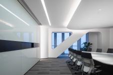
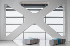
The building wall of the void area has a huge sloped beam, which causes poor visual experience. To solve this problem, the designer creates a magnificent X-shaped style by making use of the original beam structure. Its perforated sides and the luminous aluminum plates are very sci-fi, showing a similar vision of X-Men headquarters.
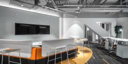
The interaction, communication and intersection among people are the key points of designing moving lines. Their optimization brings closer collaboration among departments,shorten the distance that people have to walk in the space, such as in conference rooms, negotiation rooms, recreation area, water bar, reception area.
Reasonable moving lines make discussion and communication between people, de-partments, and customers more efficient. At the same time, different spaces create different atmospheres and emotions, relax, or serious, or leisurable, etc., so as to meet needs of different moments.
In addition, the designer GAO Zhiqiang said, "We want to create a feeling of flowing clouds. Lights and curves create moving lines, and give a sense of freedom."
To remove the shackles of traditional office designs, and give a space infi-nite vitality is not just a change in form, it is more about 'people' them-selves. Here, everyone has a very large degree of freedom, and they can feel the infinite possibilities of future. Initiative and creativity are stimulated at the same time. Once people create the environment, areas interact with each other, and the power of design emerges.
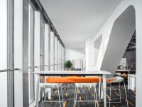
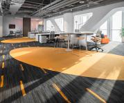
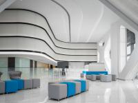
Soft curve is a visual expression of tolerance and infinite possibilities. The spatial layout breaks isolation and shortens the distance of human hearts. High efficiency while no boundaries, and everywhere has space for independent thinking and solitude. The space respects each individual and can also unit as a whole.
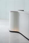
Gaudi, the most famous Spanish architect, once said that straight lines belong to human, and curves belong to the God. It is probably that the curves give birth to too many wonderful changes. In this space, the curves are formed smoothly, either on the ground or ceiling, or a room, a partition.
"Spatial emotion design" advocates bringing human attributes to spatial func-tions. By designing and shaping the space, people are able to work in the best state of physiological and psychological emotions. Therefore, AFFD is trying their best to create comfortable working environments for employees, to ensure efficient work, as well as physical and mental health of staff.
2019
2019
Gross Built Area:5000 sqm
Gross Built Area:5000 sqm
Project location: Beijing
Construction :Sundart Engineering & Contracting (Beijing) Co.,Ltd
Furniture Brand: Steelcase
Lighting consultant: ZHU Haiyan
Lighting brands: Nemo, Foscarini, Oluce, Steelcase
Carpet brands: Milliken, wayflor
Project Planning: Lele Brand Strategy
Lead Architects: Gao Zhiqiang
Design Team: CHEN Hao, CHEN Deli, PENG Xingyi, LI Ruirui
Photo credits: SHI Yunfeng
