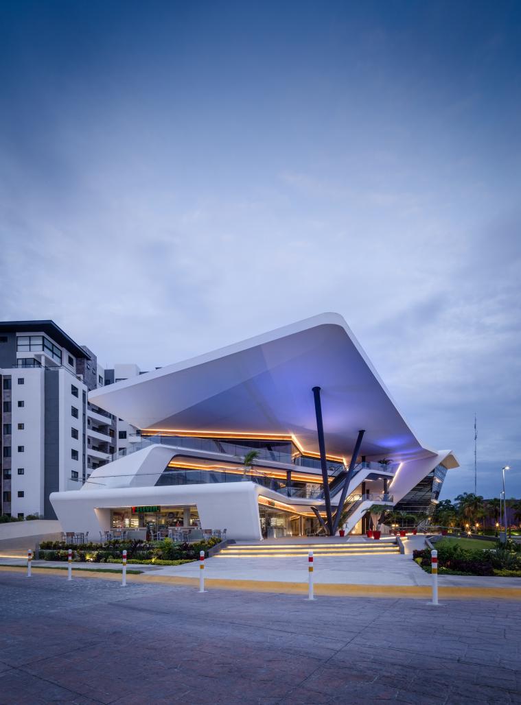
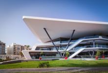
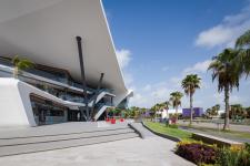
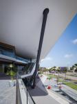
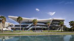
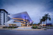
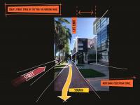
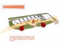
Our proposal goes beyond any initiative, by promoting the expansion of public space through a pedestrian plaza, and by complying with land occupation guidelines, the building is set back from the sidewalk as much as possible, expanding the public space to create a city. The shaded space extends from the sidewalk an additional 20 meters, inviting pedestrians to use the space for living, rest and recreation, designed with universal accessibility.
A market study conducted by the property owner determined that the project would consist of a power center building with a mix of commercial storefronts and corporate office space, offering accessible commerce and convenience to the patrons. While this business model is relatively common, we wanted to take it a step further and proposed to create a public space available to all. This took the form of a public, shaded recreational space for pedestrians and even non-consumers to enjoy. This urban terrace immediately adds value to the surrounding context.
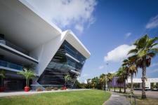
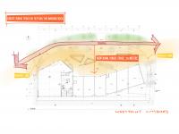
Functionality: The project had to accommodate the typical commercial storefront layout, rectangular and in battery. In order to avoid one of the most common problems in commercial centers, the lack of interest and desire to access the upper floors, it was decided to give prominence to the escalators and place them in the center as a focal point, providing greater accessibility to the users. Continuous walkways propose various routes to access the three different levels, reaching urban terraces which are oriented toward the dominant winds. These terraces are perfect for cafeterias, bars and restaurants and are connected to elevators and escalators via the main walkways. The large overhangs invite users to stay and enjoy the space. To complement the commercial area, there is a different volume containing the corporate office spaces. This volume has a different function and language than the first, generating a “glass box” structure typical of corporate buildings. The spaces are more private and conducive to offices. Internal circulations have high efficiency causing the rented space to be more cost effective. Rental spaces for modular “self service” offices to be rented and subdivided according to the needs of each company.
2017
2019
While it can be a challenge to stay within budget when constructing a building of “normal” design and cost, it can be even more challenging for an atypical building with an irregular structure such as Meet Point. In this case, it was imperative to effectively utilize 3D BIM (Building Information Modeling) technology to develop all design and construction documents, allowing the team to fabricate digital models and collaborate across all disciplines, effectively avoiding construction errors. Another great challenge was the execution of the metal structure, due to its inclined columns and angled joints. This was addressed by designing, manufacturing and cutting the pieces digitally, then assembling them on site using screws. The other major challenge was the angled glass facade of the corporate office area, which was also solved by digitally designing, fabricating and manufacturing the parts.
Sophia Martínez, Ali García, Johan Velasco, Uriel Mena, Cecilia Pablo, Eder Hernandez, José Rodriguez, Ana Avilés, Valeria Gómez , Victor y Sergio Sanz Pont.
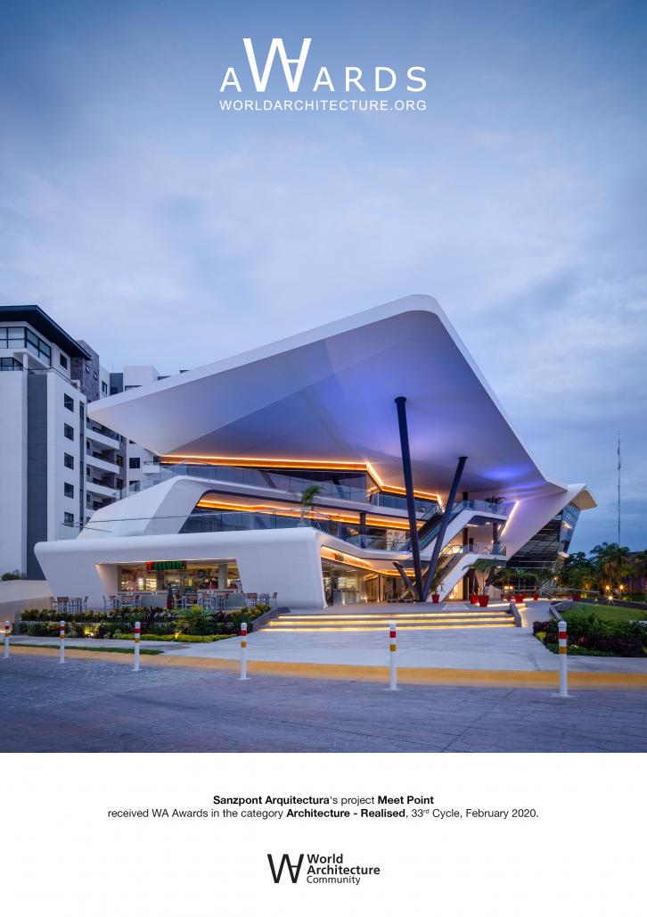
Meet Point by sanzpont arquitectura in Mexico won the WA Award Cycle 33. Please find below the WA Award poster for this project.

Downloaded 54 times.
Favorited 1 times
