Architect: Geen Punt Architecten BNA, Rotterdam
Clients: Manpro projectontwikkeling Amsersfoort & BK Bouw Bussum.
Construction company: BK Bouw, Bussum.
Engeneer: Ingenieursbureau Romkes, St. Nicolaasga.
Glass : Veromco, Soest.
Steel : Hendriks Staalbouw, Veenendaal.
Shopping centre “the Tjalk”, Lelystad
Once this shopping centre won a price for most environmental friendly building. After been used by the client asbestos were found. Partly because of this the building got a bad name and was left by its tenants. The qualities of the location were recognised by a retail based development company who decided to buy the location and redevelop it.
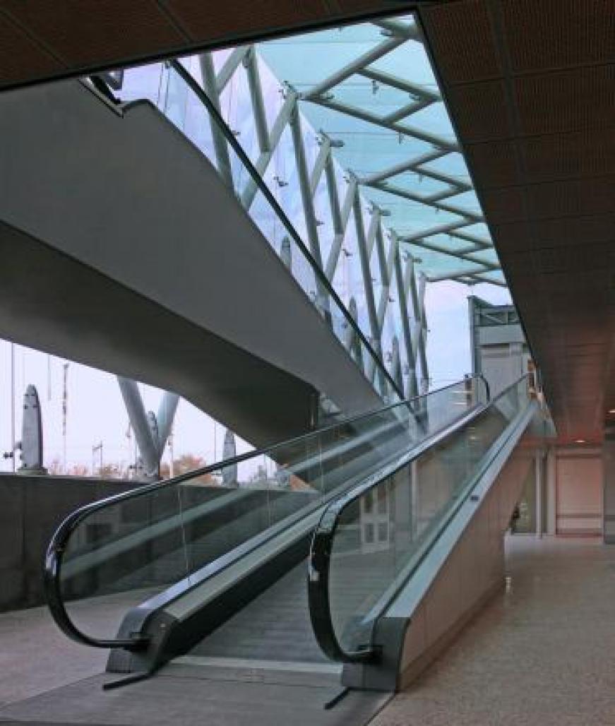
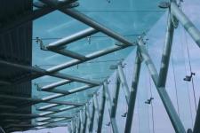
The location has a key position in the shopping area. That’s why the design had to be both attractive as inviting. By combining crossing escalators in a spacious glass entry the building looks dynamic and lively. The use of high tech steel and glass in a way that shows craftsmanship and quality underlines the idea that this is the place to be. But all this had to be done in a low budget way so it was essential to make choices.
Durability.
This project confronted us with a very essential question. Do we demolish the existing and design a completely new building or will we try to reuse the existing. During this phase we encountered the problems of the current consumer market. While building shops living on consumer products we considered it essential to take a clear position in this matter.
Currently consumer products produce a large amount of waste. With only a fragment of its components capable of reusing one sees the necessity to lengthen the lifespan of consumer products. With reusing the current building we could prevent the creation of building waste. A new building would cost a great deal more recourses than the reuse of the existing. If we realise that only 30 % of all resource materials end up in the project, being thrifty with what we have is no luxury. The interior is constructed in such a way that future adjustments are easy to realise,
The existing building, once winning an environmental price, turned out to be polluted with asbestos. This once advanced material turned out to be a hazardous element in a building. At the moment we got the commission this location had a very bad reputation. Most of the building was empty and hard to rent. We had to persuade the client with a strong icon like element that this shopping centre would be regarded as new. This element is the glass climate zone.
Social space.
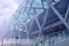
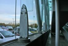
With major shifts in our social coherency resulted in buildings that have a sharp demarcation line between public and private area’s. Shopping centres are during opening hours indoor public area’s. To underline it’s public character we want the entrance structure to represent a civil object like a bridge. This brought a different logic into the construction. The construction was wrapped in a glass jacket with a minimum of elements to remain as transparent as possible. This resulted in a enclosed but public area with escalators that has a strong relation with the outdoors. Bringing the shops closer to the outdoors as well.
By linking the building with the surroundings we want to stimulate the sense of connection that is suppressed in our current mind setting. With stressing the community dimension in our projects we hope that not only the social component of shopping is met but also that the joy of meeting and seeing other people is stimulated.
Technology.
This building, although partly reused, is technological very advanced. All concrete is prestressed to reduce the amount of materials needed and to optimise volume usability. The metal facades are highly insulated and need a minimum of material. The steel is so thin that the front of the panels are not completely flat. To compensate this we made a subtle refinement in its compilation. A refined use of natural ventilation makes air conditioning otiose while preventing condensation on t
2000
2003


